• Some users have recently had their accounts hijacked. It seems that the now defunct EVGA forums might have compromised your password there and seems many are using the same PW here. We would suggest you UPDATE YOUR PASSWORD and TURN ON 2FA for your account here to further secure it. None of the compromised accounts had 2FA turned on.
    Once you have enabled 2FA, your account will be updated soon to show a badge, letting other members know that you use 2FA to protect your account. This should be beneficial for everyone that uses FSFT.

LG 48CX

Nvidia vs AMD text quality on LG CX48

As pretext to this: I am neither fan of AMD or NVIDIA or any vendor, I am only interested in quality screen output

I had used the CX48 paired with a Gigabyte RTX 3060ti since 01/2021 and had notice the decline in text sharpness compared to my previous IPS monitors but had accepted that loss as OLED inherent and the other qualities in gaming and consuming streams/videos/movies made up for that.

I recently have the possibility to test various GPUs of various vendors and I was instantly blown away when I replaced the 3060ti with a MSI 6600XT, really at the first look I realized the change in text sharpness.

I have since tested forth and back to see if it could be card specific, vendor specific or a setting. With no setting could I get nvidia cards to that level of clarity regarding text sharpness. I tried that in 01/2021 a lot when I first had the combo of 3060ti+cx48, and I tried now.
For both AMD and NVIDIA I targetted: 120Hz freeysnc/gsync, 3840x2160, YCBCCR444 10b 4L10, and confirmed that with the CX48s onscreen info (9x green button)

So for all the cards I tested (list below) I have immediately superb text clarity on AMD cards, and struggle to get that up to par on NVIDIA cards:

NVIDIA:
Gigabyte 3060ti Aorus Master
EVGA 3070 XC3
Nvidia 3090 FE

AMD
MSI 6600 XT Gaming X
Gigabyte 6600 XT Eagle OC
Powercolor 6600 XT Fighter


Attached you can find photos taken with a Huawei Mate 20 Pro, all in Standard mode, all with adjusted 4x zoom. I won't comment on my findings, but focus text and object edges/lines

Looking forward to your feedback.

Very interesting but I would again point out that your camera is up close to the screen. The closer your eyes are to a screen, the more obvious the pixel structure is going to be so everything will be aliased to one degree or another. The same thing happens with newsprint/magazine's dots or even a billboard up close. If you zoom in close enough with a camera you can see the subpixels.

At 33.5" away on a 48" 4k, 60PPD, you still get obvious aliasing and text fringing to your eyes and brain because people (most people actually can see 20/15) can still see the pixel structure as fairly aggressive. You end up using medium to high level of AA in games and on the desktop you try to tweak text subsampling or try using a different kind of subsampling from window's default.

At 80 PPD on a 48" 4k screen ~ 47", few people can see a more obvious pixel structure, AA only necessary in very high contrasted areas where light/dark meet so little AA is necessary and you can probably get away with no AA depending on the game and how you feel about it. Approaching the same view distance as the screen's diagonal measurement this results in a much better viewing angle to the extents of the screen and HUD elements (more or less an equilateral triangle/pyramid viewing angle cone) anyway so it's a win-win.

If you are really going to assess pixel fringing/aliasing or it bothers you, I recommend doing so at 60PPD+ (33.5"+) with heavy subsampling and trying other sub-sampling types, and I recommend using ~ 47"+ distance 80PPD if you want a much finer pixel structure and better viewing angle. That is for 48" 4k. 8k screen would halve those distances as the pixel structure would be 2x more fine.

View Distances
----------------------

Below 60PPD
= below 20/20 vision; most everyone can see individual pixels obviously. You likely need strong anti-aliasing to hide artifacts (at a performance hit).
= requires aggressive text subsampling tweaking, experimenting with alternate forms of subsampling, etc but it will never look as good.
= jumbo pixels to your eyes, aliased graphics, bad text fringing
= bad viewing angle like sitting near to a wall

60 PPD+ is above the 20/20 vision threshold.
..Requires moderate anti aliasing (at a performance hit) and tweaking text sub-sampling.
..The minimum view distance you can use without having a more aggresive pixel structure with jumbo pixels that result in pixelated and fringed graphics that AA struggles to compensate for and text subsampling can't compensate for enough.
..Still displays some more visible pixelization on desktop (or tv viewing) lacking AA or softening - though subsampling helps text look good enough so overall not bad looking even outside of game's AA.
..Not the best viewing angle to the extents of the screen for HUDs. It's pretty narrow.
..64 deg viewing angle at 4k.

80 PPD+
..moderate, slightly above the average visual acuity; few can see individual pixels obviously.
..Anti-aliasing is only necessary in medium- and high-contrast areas
..you still see some fringing where the contrasted areas mesh but can probably get away with more modest and less demanding AA levels or no AA depending on the game and how you feel about it
..approaching the same view distance as the screen's diagonal measurement this results in a much better viewing angle to the extents of the screen and HUD elements (more or less an equilateral triangle/pyramid viewing angle cone)
..48 degree viewing angle at 4k.

120PPD+
..better than 20/10 vision; no one can "see" individual pixels as an obvious/aggressive structure. Anti-aliasing is only necessary in very high-contrast cases if at all.
..pretty extreme and practically unusable distance for a pc on 4k screens (that will change with 8k screens someday, where all these PPD distances will be halved).
..more useful for living room/home theater room environment viewing distances where you watch media without AA and text subsampling
..32 degree viewing angle at 4k.

Viewing Angle regardless of PPD:
..in my opinion, the best case is 45deg - 50 deg viewing angle so you can actually see the extents of the screen and the HUD elements, pointers, notifications, chat, etc without turning away from center in a more extreme amount to see them.
..as a rule of thumb you get what's more or less an equilateral triangle or pyramid viewing angle cone when your view distances is nearing the diagonal screen measurement.
=================================
 
Last edited:
Very interesting but I would again point out that your camera is up close to the screen. The closer your eyes are to a screen, the more obvious the pixel structure is going to be so everything will be aliased to one degree or another. The same thing happens with newsprint/magazine's dots or even a billboard up close. If you zoom in close enough with a camera you can see the subpixels.

At 33.5" away on a 48" 4k, 60PPD, you still get obvious aliasing and text fringing to your eyes and brain because people (most people actually can see 20/15) can still see the pixel structure as fairly aggressive. You end up using medium to high level of AA in games and on the desktop you try to tweak text subsampling or try using a different kind of subsampling from window's default.

At 80 PPD on a 48" 4k screen ~ 47", few people can see a more obvious pixel structure, AA only necessary in very high contrasted areas where light/dark meet so little AA is necessary and you can probably get away with no AA depending on the game and how you feel about it. Approaching the same view distance as the screen's diagonal measurement this results in a much better viewing angle to the extents of the screen and HUD elements (more or less an equilateral triangle/pyramid viewing angle cone) anyway so it's a win-win.

If you are really going to assess pixel fringing/aliasing or it bothers you, I recommend doing so at 60PPD+ (33.5"+) with heavy subsampling and trying other sub-sampling types, and I recommending using ~ 41"+ distance 80PPD if you want a much finer pixel structure and better viewing angle. That is for 48" 4k. 8k screen would halve those distances as the pixel structure would be 2x more fine.
elvn, I understand all of the above assessments of yours and caveats you point out.

I am sitting with 90cm eye distance to the screen, Windows scaling set to 100%, so fonts/text is quite small. And in that situation text on nvidia cards is subjectively more fuzzy/blurry then on my AMD cards.
Especially "echos" on vertical lines in letters like "E, l, R" are visible with the bare eye from 90cm and the bleeding of one letter to the other causes "blurriness" on words.

Very interesting! It almost seems like either Nvidia has some issue with font rendering or AMD handles it in a very different way.

To verify, I tried hooking up my LG CX 48" to my gf's PC which has an old AMD Radeon 390. Out of the box the text rendering did seem like it was a bit better. But I feel it looks pretty close on Nvidia with Better ClearType Tuner set to RGB and the contrast adjusted, try 1200-1600 values.

In any case please report this to Nvidia and maybe they will actually do something about it because it's definitely noticeable in your screenshot!

I would be happy if more people with the means to AB BA my finding (and kasakkas) could chime in here and break it down to personal settings/devices or a general phenomenon
 
There are no standard measurments/types for windows' cleartype afaik so we can't know what yours are at. There are also a few 3rd party text subsampling apps you could try.

With cleartype... cleartype aggressive vs cleartype light, massaging the settings.. and maybe trying a few 3rd party text subsampling methods you may get different results at the 90cm distance you posted.
You could also try taking the pictures from farther away as a comparison closer to what you might actually see at 34" and 47" away.

Out of curiosity,
How does it look at 119.4cm or 120cm (~ 47"+) at 100% to your eyeballs?
That is "beyond" the 20/15 "limit" of normal human visual acuity clarity-wise (not the absolute limit of human vision though of course)
--- so a more aggressive pixel structure shouldn't really be visible anymore at 41"+. If any slight aliasing happened on the fringes of the highest contrasted areas, cleartype or AA should compensate enough at that fine of a PPD (80+).


At 80+ PPD the pixels should appear very fine to you on the screen outright or "raw" if you will.

For comparison:

80 PPD on a 27" diagonal 1440p screen starts at 41" away
80 PPD on a 27" diagonal 4k starts at 26.5" away.

80 PPD on a 31.5" diagonal 1440p starts at ~ 48" away.
80 PPD on a 31.5" diagonal 4k starts at ~ 31" away

80 PPD on a 42" diagonal 4k TV starts at 41.1" away
80 PPD on a 48" diagonal 4k TV starts at ~ 47" away
80 PPD on a 55" diagonal 4k TV starts at ~ 54" away.

120PPD is where you really can go without AA or subsampling though but that is more for TV viewing distance-wise on 4k screens. When we get 8K screens someday all of the distances vs PDD would be halved compared to 4k.

I tried a 37" 1080p at ~ 3.5 to 4' away at a desk briefly a long time ago but it was only around 50PPD at best. I ended up selling it soon after.
I used a 31.5" 1440 VA g-sync for awhile but at nearer desk distances, while usable, the text was definitely fringed at 100% scaling 1:1 even with subsampling. It wasn't really decent looking pixel structure wise until I moved it back ~ ~3 feet away to 60 PPD+ (relying on subsampling and more aggressive AA in games). I used different screens next to it and mostly used the 31.5" 1440p for gaming anyway. I'm doing similar with the 48" CX OLED dedicating it as a media and gaming "stage" while using side 4k VA screens in portrait mode for static desktop/apps/text.

80PPD+ on a 4k screen also gives you a better 48 degree viewing angle which is more like an equilateral triangle or equilateral pyramid-cone view measuring the view distance in relation to the screen's diagonal size so you don't have to turn your head or bend your eyes a great amount to see the extents (HUD, notifications, pointers, in game text, etc).
 
Last edited:
The Nvidia module is the most effective one. One thing for sure, Nvidia hardware module starts synchronizing frames with 1fps, LG - with 28fps, below that you get the usual v-sync stutter.
All VRR monitors synchronize at 1 fps with LFC. LFC is done in the GPU. There is no advantage to hardware LFC in the G-SYNC module either, because once the module begins to double a frame, it cannot respond to new frames until the doubled frame is completely drawn, resulting in the same potential stutter.
 
All VRR monitors synchronize at 1 fps with LFC. LFC is done in the GPU. There is no advantage to hardware LFC in the G-SYNC module either, because once the module begins to double a frame, it cannot respond to new frames until the doubled frame is completely drawn, resulting in the same potential stutter.
Yep. Good stuff
My recent quote :
Yeah but now they have LFC in software from every hdm 2.1 gsync/freesync capable device so we don't need it on a hardware g-sync module anymore. I do remember those days though.
 
All VRR monitors synchronize at 1 fps with LFC. LFC is done in the GPU. There is no advantage to hardware LFC in the G-SYNC module either, because once the module begins to double a frame, it cannot respond to new frames until the doubled frame is completely drawn, resulting in the same potential stutter.

Exactly. I remember this issue being brought up a long time ago on this thread and people didn't seem to understand that as long as the display supports LFC then there is no advantage to having a Gsync module for low fps VRR. The 40Hz floor of the CX isn't a problem.
 
In my opinion you shouldn't be running your frame rate ranges that low in the first place anyway, especially on pc. It's a freeze-frame slideshow of molasses. :LOL:
 
Is Color at 55 accurate with Warm 2 and Gamma 2.2 in SDR Game Mode on the 48CX? I'm in Game Console Input on Xbox Series X fyi. I know the sRGB gamut is a bit undersaturated, I think it hits 94.6% or something? If that's true, I'm thinking 55 might be accurate still while helping out with the color gamut, but I'm wondering what everyone else thinks. Or maybe leave it at 50? I have no tools to measure and have not calibrated my set, so trying to eyeball this is very difficult obviously lol
 
Last edited:
I just pulled the trigger on a Black Friday deal on C1 48". I'm a bit concerned about the low brightness of it and the burn in if I max out the brightness.
So, my plan is to get LG Premium Care to extend warranty to 5 years. Does this cover burn in?
Also, since I don't use the screen for more than 2-4 hours per day (longer during the weekend) and I use animated wallpapers, is it ok to just leave it at max brightness?

I have 65" B1 in my bedroom and find it dim compared to 85" Samsung QN85A which is in the living room. The picture is better but not by a lot. I think the peak brightness on QN85A and its local dimming (the 85" version is a VA panel so it has high contrast) helps a ton with picture quality.
But since B1 is in the bedroom and used in a pitch black room, I can live with its lower brightness. Both fantastic TVs, but I wouldn't use B1 in the living room.
 
People think the text looks bad on this screen? I must be missing something. I find text is way easier to view over longer periods w/ an oled than my prior IPS and VA screens. In fact that's half the reason I got an OLED, I find it's much easier on my eyes for long viewing periods. Working on it daily 8+ hours for the last year.

I think cleartype is a bit wack sometimes though. I am mostly on Linux where font rendering is better to my eyes.

Is Color at 55 accurate with Warm 2 and Gamma 2.2 in SDR Game Mode on the 48CX? I'm in Game Console Input on Xbox Series X fyi. I know the sRGB gamut is a bit undersaturated, I think it hits 94.6% or something? If that's true, I'm thinking 55 might be accurate still while helping out with the color gamut, but I'm wondering what everyone else thinks. Or maybe leave it at 50? I have no tools to measure and have not calibrated my set, so trying to eyeball this is very difficult obviously lol

Most accurate is color 50 at Warm 2 out of the box. This gives you factory calibrated 6500k. You shouldn't mess with those settings even when calibrating - it's better to adjust the grayscale/white point to fix color issues. It's a whole can of worms btw if you want to calibrate it further :).
 
People think the text looks bad on this screen? I must be missing something. I find text is way easier to view over longer periods w/ an oled than my prior IPS and VA screens. In fact that's half the reason I got an OLED, I find it's much easier on my eyes for long viewing periods. Working on it daily 8+ hours for the last year.
What is your scaling in windows? I am using 100%
 
People think the text looks bad on this screen? I must be missing something. I find text is way easier to view over longer periods w/ an oled than my prior IPS and VA screens. In fact that's half the reason I got an OLED, I find it's much easier on my eyes for long viewing periods. Working on it daily 8+ hours for the last year.

I think cleartype is a bit wack sometimes though. I am mostly on Linux where font rendering is better to my eyes.


Most accurate is color 50 at Warm 2 out of the box. This gives you factory calibrated 6500k. You shouldn't mess with those settings even when calibrating - it's better to adjust the grayscale/white point to fix color issues. It's a whole can of worms btw if you want to calibrate it further :).
Thank you!
 
Text will still be quite lousy on the 42" (WRGB pixel structure), so unless it's mostly a gaming and streaming setup, this display is not a great choice.
People seem to like to say this but I have owned a 48" C1 and I find text way better than either of my 32" displays. I mean I am only doing normal stuff like email, Excel, surfing etc...but I find the text outstanding. In fact I find everything about it incredible.
 
People seem to like to say this but I have owned a 48" C1 and I find text way better than either of my 32" displays. I mean I am only doing normal stuff like email, Excel, surfing etc...but I find the text outstanding. In fact I find everything about it incredible.
Which windows scaling do you use? It defaults to 300%, which of course will be "sharp" enough, or do you drop to 100% to get as much content/text as possible?
 
Which windows scaling do you use? It defaults to 300%, which of course will be "sharp" enough, or do you drop to 100% to get as much content/text as possible?

There are a few major contributors to text clarity off the top of my head:

#1 PPD. That means how high the resolution is and how far away you are sitting from it with your eyeballs. 60PPD starts at 33.5" on a 48" 4k screen. Almost everyone can see a more aggressive pixel structure but that can be managed on most screens using AA in games and text subsampling on the desktop. Approaching the 80PPD+ end of view distances the pixel structure appears much, much finer so text looks way better as you near the diagonal measurement of the screen as your viewing distance.

#2 RGB this is probably a tie for #1. Text looks tattered and ugly without RGB / PC named input (444 chroma)

#3 Tuning: Text Subsampling and Screen OSD settings/tweaking/calibration.
Subsampling is like anti-aliasing. The nearer you sit to 60PPD the more aggressive your AA and subsampling will need to be to attempt to make up for the more obvious pixel structure showing. 60PPD can look decent with good subsampling and especially outside of the desktop in games with AA - but the text still might not look the best. Below 60PPD you've lost the battle imo and the more aggressive pixelization and text fringing will never look "fixed". A 48" 4k is only a bit better than a 31.5" 1440p screen pixel size so it looks way better at 38" - 48" away.
Your brightness, gamma, contrast can also affect your text clarity some. Whether you use dark themes or not and how highly contrasted your text is vs the backgrounds can exacerbate issues, especially the nearer you sit. Some screens have separate named settings just for desktop/text reading or people tweak on of their own similarly.

#4 Scaling. I shoot for 1:1 at up to 80PPD on a 4k screen. On higher PPD screens like a 15" 4k laptop I might bump it up a little though. It can look clearer as you scale up but I don't prefer to increase text size on 40" + screens. Also, if you try to use text that is smaller than 1:1 it's going to look progressively worse. I do scale text up or down within my web browser and my 3rd party file browser on the fly at times though using my mouse wheel.

#5 I guess I should mention screen coatings and room lighting design. Obviously overly aggressive AG (anti-glare coatings) can compromise text. That is rare on modern screens but lighter AG can still have some negative effect on very high pixel densities. Smashing any screen with direct light sources can blow out parts of the screen and make them harder to read regardless of the screen coating. Your eyes will see contrast and saturation differently between a dim room and brighter room too.

#6 Pixel structure. RGB vs BGR vs WRGB. I really don't find that to be an issue but it's mentioned enough that I added it.
Many of my screens have been used in portrait mode which ends up being
RRRRRR
GGGGGG
BBBBBBB
or that flipped upside down.. and I have no issue with text in that orientation at the appropriate viewing distance.
WRGB doesn't seem noticeable to me either but I'm mainly using my 48" CX as a media and gaming stage. Games have AA and look great even if they have a lot of fine text (rpg/MMO stats and quests, dialogues.. in-game-chat interfaces.. MMO/RTS unit infos).


------------------------

Let me know if I forgot any.

The one I keep going back to is that people aren't posting an honest measurement of how far away their eyeballs are from the screen so we can know what PPD they are "using". Two people viewing a 48" 4k at two different distances are likely going to see much different text and screen aliasing in effect so without that information asking other questions about their settings seems pretty meaningless. (n)

Since this is a large screen I suspect a lot of people are trying to view it closer than is optimal and then trying to make adjustments for how aggressive the pixel structure/aliasing and text fringing look at lower PPD.
 
Last edited:
I'm using the 48CX and am wondering what OLED light I should set if I want 120 nits? I know TFT recommends 36 OL for 120 nits with the CX in PC Mode, however, Vincent Teoh recently said that for the 48CX OL at 35 measured 100 nits. Now this is quite a big discrepancy, so I am not sure what OL is 120 nits with my TV. I am in Game Console Input using Xbox Series X and SDR Game Mode if that helps. I think a recent firmware may have decreased brightness in SDR Game Mode or something, I'm not sure. I'm running 45 OL right now and it looks great for my dim environment, but I'd just like to know if I'm close to 120 nits or not, that's all.
 
#6 Pixel structure. RGB vs BGR vs WRGB. I really don't find that to be an issue but it's mentioned enough that I added it.
Many of my screens have been used in portrait mode which ends up being
RRRRRR
GGGGGG
BBBBBBB
or that flipped upside down.. and I have no issue with text in that orientation at the appropriate viewing distance.
WRGB doesn't seem noticeable to me either but I'm mainly using my 48" CX as a media and gaming stage. Games have AA and look great even if they have a lot of fine text (rpg/MMO stats and quests, dialogues.. in-game-chat interfaces.. MMO/RTS unit infos).

I haven't found BGR to be an issue for ClearType text on Windows, and ClearType actually has a setting for it. I don't see an issue on my HP Z43 which is BGR. I'm guessing the complaints are about monitors that have other problems that affect text, and just happen to be BGR.

WRGB is a completely different matter. It definitely affects ClearType text quality. The test is very simple for me. I have a 55" WRGB OLED (LG C9), and a 55" RGB IPS (LG SM9000). No scaling - using 100%. Sitting at exactly the same distance of 28", text is much better on the IPS than the OLED. There's fringing on the OLED and the characters are simply not as clear and well-rendered as on the IPS. It's not subtle - you see it immediately. The WRGB OLED is usable for text - it's not horrible. Just somewhat off, particularly when you know what it should look like, and I find it annoying to look at after a while.
 
I haven't found BGR to be an issue for ClearType text on Windows, and ClearType actually has a setting for it. I don't see an issue on my HP Z43 which is BGR. I'm guessing the complaints are about monitors that have other problems that affect text, and just happen to be BGR.

WRGB is a completely different matter. It definitely affects ClearType text quality. The test is very simple for me. I have a 55" WRGB OLED (LG C9), and a 55" RGB IPS (LG SM9000). No scaling - using 100%. Sitting at exactly the same distance of 28", text is much better on the IPS than the OLED. There's fringing on the OLED and the characters are simply not as clear and well-rendered as on the IPS. It's not subtle - you see it immediately. The WRGB OLED is usable for text - it's not horrible. Just somewhat off, particularly when you know what it should look like, and I find it annoying to look at after a while.

The nearer you sit it's like going to look like 16bit and 8bit graphics (an exaggeration but you get my point).

3DNNoSc.png


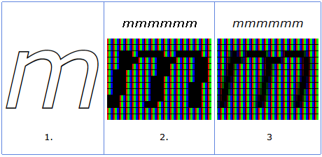
Text sub-sampling just does a fog like anti aliasing effect but the text will be fringed when viewed up close.

220px-ClearTypePixels.svg.png


mmm.gif


The test is very simple for me. I have a 55" WRGB OLED (LG C9), and a 55" RGB IPS (LG SM9000). No scaling - using 100%. Sitting at exactly the same distance

Using the same cleartype tuning on one screen will not necessarily look the same or as good on another. You'd have to run through it again, perhaps several times until you get the best you can get for each particular screen.

Cleartype-585x480.png


You can also try mactype if you haven't. Incidentally they mention some problems in chrome browser specifically where firefox doesn't have the text problem just in case you are referencing your chrome use.

https://www.reddit.com/r/Windows11/comments/ohute1/disable_rgb_cleartype_font_antialiasing/

Sitting at exactly the same distance of 28",

60 PPD starts at almost 34" away.

View Distance is a huge factor in how aggressive the pixel structure appears and how aliased text and graphics are.

I would say the minimum in order to get a decent result would be 60PPD (33.5" away for a 48" 4k) but that still requires heavy cleartype tweaking or resorting to other subpixel rendering methods. It also requires more aggressive AA in games. All screens require a lot of compensation at 60PPD. I'm not saying it definitely is but if WRGB were slightly worse at nearer distances with smaller fonts down to 1:1 100% scaling then the view distance would be more crucial and would have to be bumped a bit farther.

I'll also mention that your OSD settings/calibration can affect how aliased text looks. That is mainly how contrasted text is vs the background. Since OLED is per pixel emissive and can do infinite black depth, it will have much higher contrast between black text and white background and vise-versa than non-OLED screens so it could potentially look slightly worse (more detailed and accurate really) just because of that to start with. Laptops and monitors with tv functionality in the past usually had a "text" or "reading" named setting just for text/reading which was less contrasted and less saturated.

-------------------------------------------------------------------

===================================
View Distances
----------------------
Below 60PPD
= below 20/20 vision; most everyone can see individual pixels obviously. You likely need strong anti-aliasing to hide artifacts (at a performance hit).
= requires aggressive text subsampling tweaking, experimenting with alternate forms of subsampling, etc but it will never look as good.
= jumbo pixels to your eyes, aliased graphics, bad text fringing
= bad viewing angle like sitting near to a wall

60 PPD+ is above the 20/20 vision threshold.
..Requires moderate anti aliasing (at a performance hit) and tweaking text sub-sampling.
..The minimum view distance you can use without having a more aggresive pixel structure with jumbo pixels that result in pixelated and fringed graphics that AA struggles to compensate for and text subsampling can't compensate for enough.
..Still displays some more visible pixelization on desktop (or tv viewing) lacking AA or softening - though subsampling helps text look good enough so overall not bad looking even outside of game's AA.
..Not the best viewing angle to the extents of the screen for HUDs. It's pretty narrow.
..64 deg viewing angle at 4k.

80 PPD+
..moderate, slightly above the average visual acuity; few can see individual pixels obviously.
..Anti-aliasing is only necessary in medium- and high-contrast areas
..you still see some fringing where the contrasted areas mesh but can probably get away with more modest and less demanding AA levels or no AA depending on the game and how you feel about it
..approaching the same view distance as the screen's diagonal measurement this results in a much better viewing angle to the extents of the screen and HUD elements (more or less an equilateral triangle/pyramid viewing angle cone)
..48 degree viewing angle at 4k.

120PPD+
..better than 20/10 vision; no one can "see" individual pixels as an obvious/aggressive structure. Anti-aliasing is only necessary in very high-contrast cases if at all.
..pretty extreme and practically unusable distance for a pc on 4k screens (that will change with 8k screens someday, where all these PPD distances will be halved).
..more useful for living room/home theater room environment viewing distances where you watch media without AA and text subsampling
..32 degree viewing angle at 4k.

Viewing Angle regardless of PPD:
..in my opinion, the best case is 45deg - 50 deg viewing angle so you can actually see the extents of the screen and the HUD elements, pointers, notifications, chat, etc without turning away from center in a more extreme amount to see them.
..as a rule of thumb you get what's more or less an equilateral triangle or pyramid viewing angle cone when your view distances is nearing the diagonal screen measurement.
=================================
--------------------------------------------------------------------


It should be ok looking at 60PPD+ (~33.5"+) or so if you rely on massaging cleartype settings or using a different type of text sub-sampling, as well as applying medium to high AA in games (at a performance hit).
However I recommend using it at up to ~80PPD 47" view distance where you don't have to rely on cleartype/AA as much to compensate. I use mine at 38" - 48" away which is 66.6 PPD to 81.5 PPD. This also provides a much better viewing angle of 58 degree to 48 degree to the extents for HUDs, notifications, pointers, text boxes, etc.

-------------------------------------------------------------------

I'm in no way advocating for using LG OLEDs as static desktop/app monitors though. They are great for media and gaming.
A lot of RPG/MMO and RTS games have fine text in their character sheets, item descriptions, quest text, in-game-chat interfaces and combat logs, etc so you are still using fine text in a lot of games at 4k resolution. That very small text looks great at high PPD but they are also in directX/3D with AA available where the desktop/apps don't have AA and instead use cleartype/text subsampling. The text looks great in games to me at 38" - 48" view distance.

I've used different screen(s) for desktop/apps next to a more proper gaming screen since at least 2006. It's the best way to do it in my opinion and experience and that hasn't changed for me now.
 
Last edited:
The nearer you sit it's like going to look like 16bit and 8bit graphics (an exaggeration but you get my point).

View attachment 417153


Text sub-sampling just does a fog like anti aliasing effect but the text will be fringed when viewed up close.

View attachment 417154

View attachment 417155


Using the same cleartype tuning on one screen will not necessarily look the same or as good on another. You'd have to run through it again, perhaps several times until you get the best you can get for each particular screen.

View attachment 417156

You can also try mactype if you haven't. Incidentally they mention some problems in chrome browser specifically where firefox doesn't have the text problem just in case you are referencing your chrome use.

https://www.reddit.com/r/Windows11/comments/ohute1/disable_rgb_cleartype_font_antialiasing/


60 PPD starts at almost 34" away.

View Distance is a huge factor in how aggressive the pixel structure appears and how aliased text and graphics are.

I would say the minimum in order to get a decent result would be 60PPD (33.5" away for a 48" 4k) but that still requires heavy cleartype tweaking or resorting to other subpixel rendering methods. It also requires more aggressive AA in games. All screens require a lot of compensation at 60PPD. I'm not saying it definitely is but if WRGB were slightly worse at nearer distances with smaller fonts down to 1:1 100% scaling then the view distance would be more crucial and would have to be bumped a bit farther.

I'll also mention that your OSD settings/calibration can affect how aliased text looks. That is mainly how contrasted text is vs the background. Since OLED is per pixel emissive and can do infinite black depth, it will have much higher contrast between black text and white background and vise-versa than non-OLED screens so it could potentially look slightly worse (more detailed and accurate really) just because of that to start with. Laptops and monitors with tv functionality in the past usually had a "text" or "reading" named setting just for text/reading which was less contrasted and less saturated.

-------------------------------------------------------------------


--------------------------------------------------------------------


It should be ok looking at 60PPD+ (~33.5"+) or so if you rely on massaging cleartype settings or using a different type of text sub-sampling, as well as applying medium to high AA in games (at a performance hit).
However I recommend using it at up to ~80PPD 47" view distance where you don't have to rely on cleartype/AA as much to compensate. I use mine at 38" - 48" away which is 66.6 PPD to 81.5 PPD. This also provides a much better viewing angle of 58 degree to 48 degree to the extents for HUDs, notifications, pointers, text boxes, etc.

-------------------------------------------------------------------

I'm in no way advocating for using LG OLEDs as static desktop/app monitors though. They are great for media and gaming.
A lot of RPG/MMO and RTS games have fine text in their character sheets, item descriptions, quest text, in-game-chat interfaces and combat logs, etc so you are still using fine text in a lot of games at 4k resolution. That very small text looks great at high PPD but they are also in directX/3D with AA available where the desktop/apps don't have AA and instead use cleartype/text subsampling. The text looks great in games to me at 38" - 48" view distance.

I've used different screen(s) for desktop/apps next to a more proper gaming screen since at least 2006. It's the best way to do it in my opinion and experience and that hasn't changed for me now.

I just ran the ClearType optimizer from 28" on my LG C1 and I guess I am pretty much blind. Every single example looked super crisp, I can not notice a "picture structure" at all. Some were more bold than others but there were no shadows or halos or jaggies or anything I could see on any of it. I do not notice much of a difference in AA settings in 4K either.

I have 20/20 vision but clearly people can see things I cannot.
 
I just ran the ClearType optimizer from 28" on my LG C1 and I guess I am pretty much blind. Every single example looked super crisp, I can not notice a "picture structure" at all. Some were more bold than others but there were no shadows or halos or jaggies or anything I could see on any of it. I do not notice much of a difference in AA settings in 4K either.

I have 20/20 vision but clearly people can see things I cannot.


20/20 , 60PPD on a raw uncompensated screen still sees fairly aggressive pixel structure that requires AA and massaging text subsampling. Once you use those it looks ok.

Normal vision can actually see 20/15 ~ 80 PPD which needs AA lightly even at 80PPD at the fringes of highly contrasted areas.

Text subsampling is a form of AA so it definitely helps. As I said in my reply, highly contrasted text vs background can exacerbate fringing and OLED are both per pixel emissive AND infinite:1 contrast so you might have to sit farther away than you are used to because the text clarity and contrast are probably higher than an ips at the pixel and subpixel level. That and the white subpixel. Using dark themes and different settings for desktop/app use vs those you use for media and gaming could also help text contrast issues.

A 48" 4k screen is barely better ppi than a 31.5" 1440p screen so you really get better results sitting ~ 3' + away in order to get better PPD and finer pixels to your eyes. A 31.5" 1440p is usable at 1.5' to 2' away but it won't look optimal. For a 48" 4k sitting too near is also a really bad viewing angle besides for huds, notification, pointers, and text boxes, etc.

Doubling a reference view distance on a 1080p screen makes the PPD like a 4k screen, halving the perceived pixel size to your eyes. .. doubling a short distance on a 4k screen makes it like an 8k screen PPD wise in a way. Sitting half as far away from a set point does the opposite, making the screen's pixels be perceived like a lower resolution

I'd like to know how the oled text looks after massaging subsampling 34" away and 47" away , for the people who were complaining.
 
Last edited:
Yeah so

60PPD = 20/20 and on a 48" 4k starts at 33.5" view distance. AA and text AA/sub-sampling can make it look good enough but some people still don't prefer the text sub-sampling look at this level vs a higher rez/PPD screen or view distance where you see finer pixels to start with. The AA has to be a little more aggressive to look best in games so is also a performance hit. On a 4k screen the viewing angle is not great for gaming with any kind of huds, notifications, pointers, text boxes at the extents since it is being viewed at a 64deg angle.

80PPD = 20/15 (which most people can still see) and a 48" 4k starts at ~ 47" view distance. It still has aliasing where very high contrasted areas meet ("fringing") so requires moderate AA if you want to get rid of it. Especially on OLED's contrast or OLED in a HDR game but you can get away with less AA in games and even not use any depending on if it bothers you or how it looks on a particular game.

120 PPD = Where you really start to get fine enough pixels to your eyes in order to be able to get away with having no AA, though 200 is probably the real "threshold" for that. Until we get 8k screens this isn't reasonable distance wise for pc monitors and gaming screens. 8k will halve the PPD distances compared to 4k. Until then we are relying on different levels of AA and trying to massage text subsampling tuning until it looks "good enough" to our eyes.

For example a 48" 8k viewed at 36" away with a 60 deg viewing angle would be 127ppd. A 48" 8k viewed at 40" away for a better 55 deg horizontal viewing angle it would be 139ppd.

Imagine a display that has a resolution of less than 60 pixels/°, and try to render a 1/60° gap as a rectangle, using standard point sampling. If the rectangle falls entirely between two rows of pixels, it will not show up in the resulting image; if it happens to straddle a pixel row, it will suddenly show up. So < 60 pixels/° won't do it reliably (ignoring multisampling / supersampling for simplicity). In a display of exactly 60 pixels/°, no matter how you position the rectangle, it will always overlap exactly one pixel row, and show up reliably. Meaning, any display with a resolution of 60 pixels/° or more will be sufficient to reliably show a 20/20 vision test image. That said, at that minimum required resolution, the display will suffer from severe aliasing. Meaning, in practice, to present an image representing 20/20 vision and doing it well will require higher resolution than 60 pixels/°. There is no sudden threshold anymore above which it will be perfect. 90 pixels/° will look better, 120 pixels/° will look even better, and so forth.

On the other side it's more fuzzy, literally. A digital display is naturally point-sampled, and shows rectangles of more or less uniform brightness. The photosensitive cells on the eye's retina, on the other hand, are area sensors. Even if you had a density of less than 60 rods or cones per degree, you would still be able to detect a 1/60° gap. The limiting factor now is the dead space between the photosensitive areas, and the contrast between the feature and the background. If the dead space is ever bigger than 1/60° across, the eye might miss a 1/60° feature. But as long as a feature falls onto some photosensitive area, it will be detected, almost no matter how small it is, as long as it's high enough contrast against the background.

This is why we can see stars, which are typically much, much smaller than 1/60° across.

Contrast is important because the photocells capture light from an area. If a small feature is only a small part of an area, it needs to be much brighter or darker than the rest of the area to affect the area's average brightness enough to be detected. Meaning, the actual photocell density of the retina does not relate 1:1 to the size of features that can be seen. Features smaller than that density will still be seen, but progressively blurry as they get smaller, until they disappear.

Bottom line: "retinal resolution" is a rather slippery concept. If you're asking: "what's the smallest pixel that can still be seen?" you'll get a much larger number (in ppd) than if you're asking "what's the highest display resolution such that two adjacent pixels will be detected by two different photocells, so that they are detected as individual pixels?" The latter number is, in my opinion, more relevant. It determines whether, if you draw a checkerboard of alternating white and black pixels onto your display, will the eye perceive it as a checkerboard, or as a uniformly grey color at exactly 50% luminance? The 4k display I'm looking at right now is a good example. I can clearly see a single black pixel on a white background from where I'm sitting, but I have to get real close (and put on reading glasses) to see individual pixels in a checkerboard.
 
Last edited:
Can anyone confirm if OLED Light 36 still measures around 120 nits for SDR Game Mode with the LG 48CX? I'm using that now and it looks great, so I'm starting to believe it is indeed still 120 nits. I have no way to measure though. My room has some lights on, but it is still dim I'd say. The image looks bright enough I think, it doesn't look overly dim. So that's a good sign I guess. However, it is very confusing to me how Vincent Teoh says 35 OL is actually 100 nits. I'd really like to know for sure whether I am looking at 100 nits or 120 nits... it's driving me a little crazy. I'm thinking maybe he measured it in PC Mode and that is why Game Mode is dimmer? I am in Game Console Input, so I wouldn't be surprised if 36 OL results in 120 nits on my panel. I just wish I could know for sure if I am seeing 100 nits or 120 nits, so if anyone has any insight or can share their experiences (maybe you own a 48CX and have OLED Light at 36 as well) I'd really appreciate it!
 
Can anyone confirm if OLED Light 36 still measures around 120 nits for SDR Game Mode with the LG 48CX? I'm using that now and it looks great, so I'm starting to believe it is indeed still 120 nits. I have no way to measure though. My room has some lights on, but it is still dim I'd say. The image looks bright enough I think, it doesn't look overly dim. So that's a good sign I guess. However, it is very confusing to me how Vincent Teoh says 35 OL is actually 100 nits. I'd really like to know for sure whether I am looking at 100 nits or 120 nits... it's driving me a little crazy. I'm thinking maybe he measured it in PC Mode and that is why Game Mode is dimmer? I am in Game Console Input, so I wouldn't be surprised if 36 OL results in 120 nits on my panel. I just wish I could know for sure if I am seeing 100 nits or 120 nits, so if anyone has any insight or can share their experiences (maybe you own a 48CX and have OLED Light at 36 as well) I'd really appreciate it!
You can toggle between SDR and HDR in Windows with the SDR content brightness slider set to 10 which is guaranteed to be 120 nits in HGIG mode (0 is 80 nits). It looks about the same as SDR with OLED Light set to 35. This is consistent across my CX, C1, and G1.
 
You can toggle between SDR and HDR in Windows with the SDR content brightness slider set to 10 which is guaranteed to be 120 nits in HGIG mode (0 is 80 nits). It looks about the same as SDR with OLED Light set to 35. This is consistent across my CX, C1, and G1.
Oh, I don't have my TV connected to my computer :(

I only play on Xbox.

Maybe I will buy a long HDMI cable so I can run it across the room and test the TV with my PC (which is like 5 years old btw, not used for gaming, if that matters)! That way I can have peace of mind and know for sure whether it is 120 nits or not :D

So do you have the 48CX with latest firmware when you tested that? I think the bigger sizes might have brighter SDR Game Modes, but I'm not sure. That's great if OL 35 resulted in 120 nits with the CX. At 36 OL it def looks like 120 nits for me! I even have lights on. If it was 100 nits I feel like I would know lol. It would just look horribly dim I imagine...
 
You can toggle between SDR and HDR in Windows with the SDR content brightness slider set to 10 which is guaranteed to be 120 nits in HGIG mode (0 is 80 nits). It looks about the same as SDR with OLED Light set to 35. This is consistent across my CX, C1, and G1.
I just moved my desktop to be near my CX, which was a hassle, and it looks like my graphica card (Radeon R7) does not even support HDR... so I definitely am unable to test what you did. That's a bit of a bummer. But maybe it is safe to say OL at 36 for me is 120 nits like I think and hope it is?
 
Last edited:
I just moved my desktop to be near my CX, which was a hassle, and it looks like my graphica card (Radeon R7) does not even support HDR... so I definitely am unable to test what you did. That's a bit of a bummer. But maybe it is safe to say OL at 36 for me is 120 nits like I think and hope it is?
I measured my LG CX 48" with a Spyder 5 Pro and for me OLED Light at 20 was 120 nits. 30 is about 130 nits if I remember correctly, no longer have a calibrator so can't double check.

For me in HDR mode the SDR content brightness slider had to be at 7% for 120 nits but I don't know enough about calibrators to say if OLEDs need some special settings for accurate readings. These were all measured at the center of the screen.
 
I measured my LG CX 48" with a Spyder 5 Pro and for me OLED Light at 20 was 120 nits. 30 is about 130 nits if I remember correctly, no longer have a calibrator so can't double check.

For me in HDR mode the SDR content brightness slider had to be at 7% for 120 nits but I don't know enough about calibrators to say if OLEDs need some special settings for accurate readings. These were all measured at the center of the screen.
Thanks for letting me know, that's crazy you got some high nit readings from OL only at 20... I definitely wouldn't be surprised if 36 OL on my 48CX is like 140 nits or so lol. I can't check the HDR in Windows as my GPU does not even support HDR sadly, but yeah, today I noticed my eyes getting used to the new OL after going down from 45 which I had previously set to for a long time. It definitely looks very natural, usually decently bright I'd say, I don't feel it's dim at all. Only sometimes it looks dim. I think it looks really nice. Again, if it was 100 nits, I feel like I'd probably know it and not like it considering I have lights on. I think it's probably safe to say OL 36 is between 120-140 nits on my panel just based on your measurements, Monstieur's, and TFTCentral.
 
Thanks for letting me know, that's crazy you got some high nit readings from OL only at 20... I definitely wouldn't be surprised if 36 OL on my 48CX is like 140 nits or so lol. I can't check the HDR in Windows as my GPU does not even support HDR sadly, but yeah, today I noticed my eyes getting used to the new OL after going down from 45 which I had previously set to for a long time. It definitely looks very natural, usually decently bright I'd say, I don't feel it's dim at all. Only sometimes it looks dim. I think it looks really nice. Again, if it was 100 nits, I feel like I'd probably know it and not like it considering I have lights on. I think it's probably safe to say OL 36 is between 120-140 nits on my panel just based on your measurements, Monstieur's, and TFTCentral.

Another point of reference:
https://hardforum.com/threads/lg-48cx.1991077/post-1044974802

If you scroll down someone posted tftcentral's measurements too.
 
Interesting infos all.

I don't think the white subpixel affects calibration or how the screen settings look in SDR levels. It might not really kick in or pollute the color space slightly until HDR levels to cheat higher brightness at lower OLED energy states/heat. TFT central tested and calibrated the "2D" color gamut, not the 3D HDR color volume which I'm not even sure can be calibrated accurately on WRGB.

Just a reminder that calibration and mastering, especially HDR mastering, is usually done in a dim to dark viewing environment. Those perceived levels change in different room lighting environments.

Our eyes see brightness, contrast, and saturation differently in bright daylight vs evening and nighttime. For example looking at the face of a flashlight or cellphone/tablet on high brightness setting in bright daylight vs looking at the same in dim evening or dark night. So if you don't want how your settings look to change to your eyes, you have to adjust your settings from reference when you aren't using your screen in a theater ~ dim lighting environment, and back again when you are. That or control your ambient lighting so that it never changes.

From the tftcentral CX review:

Luminance at the default 80% OLED light level was recorded at 186 cd/m2 which is a bit too high for prolonged general use, you will need to turn that down a bit to get a more comfortable level for close up desktop use. The black depth was 0.00 cd/m2 thanks to the self-emitting OLED panel and per pixel dimming and so this gives you an infinite contrast ratio – an obvious and major benefit of this technology.

From kalston's references link, which was actually armenius referencing the tft central review, so this is an image from the tftcentral lg cx review:

445844_1617296743128.png

..
Text
=============

In regard to the previous discussion in this thread about text

The 1 meter TFT central references in the quote below as providing a more proper viewing angle and usability is 39", which is in line with what I've been saying.
They mention text size concerns at farther distances but personally I think the higher distances I use make the text better as it increases the perceived ppi (gives you a higher PPD). I have zero issues with text size being readable at 38" - 48" away. In fact I have a higher ppi 43" 4k VA on either side of my 48" CX at 100% scaling 1:1 (~73 PPD to ~88 PPD) , but that is pretty much my limit. Any farther away at those ppi and I'd have to use 125%. It's like goldilocks and the 3 bears. There is a "just right zone". Up against the wall like a bookshelf desk setup/distance isn't it, and neither is 5 - 6 feet away.

I think it makes a lot of sense when you compare it to a 27" 4k. It compares to reasonable viewing distances for a 27" 4k.
..48" 4k's 66.6 PPD and 58 deg viewing angle at 38" away is the same as a 27" 4k's at ~20.5" viewing distance.
..48" 4k's 80 PPD and 48 degree viewing angle at 47" away is the same as a 27" 4k's at 26.5" away.

Here are some excerpts from the tftcentral review about text on the 48 CX
is a an extremely large 48″ in size for a desktop monitor. Our personal opinion is that this is going to be too large for most people for comfortable and practical desktop / office use. It is more suitable for those who want to sit a further distance away for gaming, consoles, movies etc and isn’t very practical for up-close desktop work. We feel the same way about actual desktop screens we’ve reviewed in the past like 40″ and 43″ models, they are just pushing the limits of what is comfortable for a desktop monitor. You end up with a huge screen up close which although it has a decent resolution and text/fonts don’t appear too large, gives you such a large area to look at that it’s hard to make use of it properly. You end up craning your neck to look around the screen given it is so big.

If you have a deeper desk, and can manage to sit at a further distance (maybe 1m or more away from the screen) then it might be more useable as a size, but you need to have the space for it and then there’s issues around text size to consider. That’s another thing, you need to keep in mind you’re going to need a big desk and a big PC area for a screen this size, it’s not like using a typical 24 – 27″ sized desktop monitor.

The resolution is a sensible size for the screen at least and 3840 x 2160 Ultra HD makes it more viable than if it was a 1080p only. On the 48″ model (which is certainly the better choice relative to the others for desktop use) the pixel pitch is 0.2767mm which is exactly the same as a 24″ monitor at 1920 x 1080. That means that from up close from a normal PC monitor viewing distance the font size is comfortable and comparable to a common desktop monitor. That’s fine, but it means you need to be at a normal PC monitor viewing distance which then means the screen is far too large and in your face. If you move yourself back to a more comfortable distance so that the screen size is less of a problem, the text size becomes too small and so you then have to use Operating System scaling to make it bigger. This reduces your desktop real-estate and adds complications for some applications, games, and systems. Scaling isn’t always the easiest thing to use on PCs.
..
The larger CX OLED screens in 55″ and above start to become far less practical as a desktop monitor though. Their size becomes even more of a problem for viewing the screen up close, and the pixel density decreases too. We can imagine some people managing with the 48″ model, but the others are really too big for practical desktop monitor use.
..
Update 15/10/20 – After some reader comments we went back to revisit this section the day after the review was first published. Text clarity seems to vary slightly depending on what input mode you select. The panel uses an RGBW (Red/Green/Blue/White) pixel layout although this seems to have little impact in our re-testing. With the HDMI input set to PC mode in the home dashboard you get very clear text and it looks normal, like a desktop monitor would which is great news. You can see the clarity captured in the photo above at native resolution. This is with the screen set to full RGB range / 4:4:4 chroma. There does appear to be a small issue though in the PC input mode in that colour gradients then seem to show a bit of banding in darker tones. It wasn’t major, but we couldn’t eliminate it. Dropping down to lower chroma levels (4:2:2 and even 4:2:0) didn’t help the banding, and just made the text look progressively worse, especially at 4:2:0
..
Contrary to this quote below, I think you have to keep it in PC named hdmi input mode (and run higher fps if using VRR) to get the lowest input lag but it wouldn't be horrible in other modes with all of the other processing turned off. The are basically letting it switch to 4:2:2 which removes banding but compromises text. Some people in this 48cx hardforum thread we are on use 8 bit dithered to eliminate the banding in PC named hdmi input mode. Note that youtube compression can still show banding in itself (and often does) so that is bad to use as test material. Chrome might have some issues too so I wouldn't use that to test for banding either.
One way to improve the gradient performance and remove the banding is to switch the HDMI input mode to something other than PC, which then treats it like a normal media input. You get access to move settings in the OSD as well, but this does impact text clarity a bit unfortunately. We don’t believe that moving out of PC input mode changes the lag of the screen, as long as you still have things like ‘instant game response’ turned on. The gradients are better and the banding is gone, but the text clarity is a little worse. Despite the NVIDIA control panel being set to full RGB/full chroma, it looks like chroma 4:2:2 sampling has kicked in for some reason. A photo of the text clarity in this mode is shown above too. The text doesn’t look terrible, but you get a bit of blurring on coloured backgrounds as you can see above. The PC input mode is the optimal option for desktop monitor use and office work, despite the bit of banding that’s introduced.
..
To beat a dead horse.. it's really not optimal unless your setup allows you to sit (33.5") 38" to 48" away so the text will look fine enough and the viewing angle width is more usable in games.
As a desktop monitor the size is not going to be to everyone’s liking, and personally we felt it was still too large even as a 48″ option for most people. You need a lot of space to accommodate it, and sitting up close for a normal PC viewing distance is a bit too in-your-face. Text clarity was not perfect due to the pixel layout and the scaling of resolution becomes a challenge if you want to sit at a more sensible distant viewing position.

=================

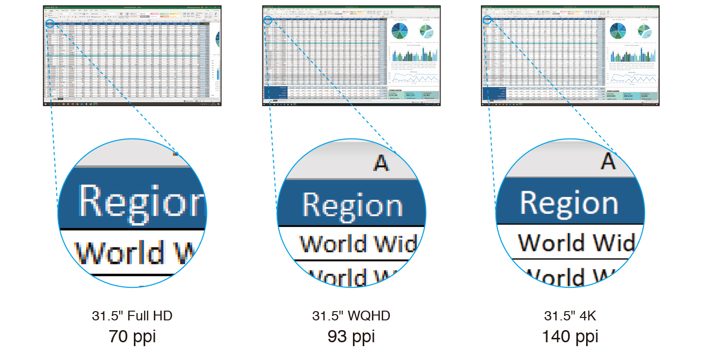
From Eizo's site... the zoom levels of the bubbles obviously exacerbate the look but it's a valid comparison.
The 48 CX's ppi is near to the 93ppi 2560x1440 WQHD one at ~92 ppi.
Sitting at an appropriate distance (60PPD to 80PPD) with subsampling tweaked will make the screen look more like the right example.

Original example and size from the Eizo site:
gOjOzJS.png


..
Edited the pic smaller:
kXpzyC9.png


..

Another extreme example.. the right higher PPI example blown up as if sitting ridiculously close showing that aliasing and text subsampling/AA "fog" is still there (you can see it in the first example too). The closer you sit the worse text will look. Scaling text to get more pixels per font character, increasing the text resolution, will help but only to a point in relation to how near your view distance is. You also lose desktop real-estate when you scale past 100% 1:1 and sitting too near goes past a good 45 - 50 deg viewing angle resulting in viewing angles that are poor for gaming with things at the extents (HUDs, notification, pointers, map, objective list, chat box, etc.). The closer you sit vs the ppi, the more aggressive the level of AA you have to apply in games to compensate too which is a performance hit.

More impactful on a desktop monitor vs a phone :watching:

Edited pic much larger:
eMbNVRy.png
 
Last edited:
So sit 38" to 48" away. I have executive depth desks in my office for this reason. You can also pull your desks out a foot and put a small stand or extension between it and the wall to get the same result. It can still look like it is meant to be that way if you just take a little care in how to do it.

Deep desks are not expensive. And a basic stand or extension to a desk even less so.

You could put up a wall mount with a little in/out adjustment and not need a stand at all.

Fringe benefit, you get a heck of a lot of desk open to clutter up.
 
So sit 38" to 48" away. I have executive depth desks in my office for this reason. You can also pull your desks out a foot and put a small stand or extension between it and the wall to get the same result. It can still look like it is meant to be that way if you just take a little care in how to do it.

Deep desks are not expensive. And a basic stand or extension to a desk even less so.

You could put up a wall mount with a little in/out adjustment and not need a stand at all.

Fringe benefit, you get a heck of a lot of desk open to clutter up.
Agreed. Wall mount ftw.
 
I measured my LG CX 48" with a Spyder 5 Pro and for me OLED Light at 20 was 120 nits. 30 is about 130 nits if I remember correctly, no longer have a calibrator so can't double check.

For me in HDR mode the SDR content brightness slider had to be at 7% for 120 nits but I don't know enough about calibrators to say if OLEDs need some special settings for accurate readings. These were all measured at the center of the screen.
I like 120 to 130 for desktop use and most games in SDR.
 
2022 cant come soon enough. I hope the 42" C2 will be pure win and no problems.

..

That 42" screen should be a little more manageable for some people but it's not that huge of a difference viewing distance wise vs PPD at the nearer 60 PPD end. It's still an appreciable difference of 6" at 80PPD where you are more or less sitting the same distance away as the screen's diagonal measurement.

60 PPD on a 42" 4k screen = 29.3"
60 PPD on a 48" 4k screen = 33.5"

80 PPD on a 42" 4k screen = 41.1"
80 PPD on a 48" 4k screen = 47"

These aren't sized suitably for use as up against the wall like a bookshelf / player~upright piano style desk setups. This kind of size demands more of a command center setup.

If you aren't sitting at least that far away, yes your text will look like crap just like a 32" 1440p up close or a 37" 1080p. You will get aliasing and text fringing that no amount of text subsampling tweaking will be able to compensate enough for.

If you sit the appropriate distances away, text and overall pixel structure will look fine once AA and text subsampling are utilized. The viewing angle also gets better viewed at a distance nearing the screen's diagonal measurement to get ~ 45 deg - 50 deg


That size wouldn't make much difference to my setup. I'd be more interested in what a curved one would bring to the table but that samnsung one rumored on HDTVTEST is 34" ultrawide so would be way too small for my setup and my liking at ~13" tall.

31.5" 4k 16:9 is ~ 15.5" tall which is better for nearer setups imo (~80 PPD/70PPD/60PPD at 31.8"/26.5"/22" view distance), .
48" is ~ 23" - 23.5" tall.
42" is ~ 20.5" tall.


The 42" could be priced better and/or affect the pricing of the 48" ones though.
 
Last edited:
That size wouldn't make much difference to my setup. I'd be more interested in what a curved one would bring to the table but that samnsung one rumored on HDTVTEST is 34" ultrawide so would be way too small for my setup and my liking at ~13" tall.


The 42" could be priced better and/or affect the pricing of the 48" ones though.

I am super intrigued by this Samsung since a 34" to 38" OLED ultrawide is right in my sweet spot. But I have zero faith in Samsung not screwing it up in some fashion...

either a ridiculous 1000r curvature, low refresh, obscenely overpriced, or horrible quality control....

... or all of the above!
 
I find 13" too short now for my personal taste. I felt like their ~ 13" heights were too short even compared to when I had a 31.5" 16:9 (~ 15.5" tall) and now I've become used to having a farther command center setup as the setup evolved. So the 34" ultrawides or other ~ 13" tall screens don't go with my setup and liking anymore. They seem like a belt to me.

You could sit nearer to them but however wide they are they are still "only" 13" tall 1440 px high and ~110ppi like a 27" 2560 x 1440p with wings.

34" diagonal 3440x1440 view distances:
28.5"-> 60PPD/ ~34.5"-> 70PPD / ~40" ->80PPD.

43" 21:10 ultrawide were still only ~ 13" tall and only 1200 px high.
49" 32:9 ultrawide are ~ 13.3" (13 and 3/8") tall and still only 1440 high.

Those resolutions could help vs graphics demands on gpu horsepower but aren't the best for deskop/app real-estate and 4k media.

A 48" 4k screen like the LG CX/C1 is around ~ 41.8" across left to right. So that's roughly equivalent to a 45.3" diagonal 3840x1600 ultrawide resolution screen when in 3840x1600 ultrawide resolution/mode. That equates to a 17.4" tall viewable in uw 3840x1600 resolution. For comparison, the neo G9 VA's screen is 13.3" tall with a 5120x1440 resolution (3840+1280 wide, or +640 px wing on each side by comparison vs 3840).

either a ridiculous 1000r curvature,

I'd really like a screen like a 38" to 48" 16:9's height and vertical resolution but longer in uw dimesions if I had a choice, up to ~ 20" tall, perhaps with the ability to curve it or a with good curve degree out of the box. One of the issues with curved screens is that resolution resolving into your PPD should determine your view distance. So the degree of the curve would depend on that and hopefully be designed for over 60 PPD in my opinion and up to 80PPD. Unfortunately you are stuck with whatever they decide to set the curve at unless someone releases a bendable one (which has been rumored before). An adjustable curve would be best since some games benefit more from using the sides for immersion (racing games, flight sims, etc) compared to RTS and some isometric games as well as deskop/app use and media playback.

The 48 CX 4k in 21:10 rez is pretty great for some games. If they made a 42" - 48" 4k 16:9 with a user adjustable curvature it would be a cool advancement though. Something like that would interest me but these other ones that have been rumored/leaked so far don't.

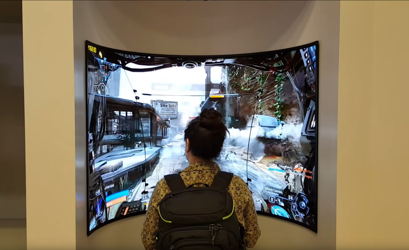
A dead end prototype curved OLED screen from years ago at CES:
417264_IlB5Ect.png

Now put several in a circle for a VR-like experience :LOL:

AR/Mixed reality glasses (or at least "goggles" slimmer than the shoe-box VR headsets) - for virtual screens in front of you and things like game hologram table areas or mapped onto real objects in real space using the glasses, etc. are still a little ways off resolution wise on most HMD brands, even in the rumored ones for the next gen. I think they'd need 8k *per eye* and be HDR( not 4k per eye SDR) so that they would be around 95 PPD at 1.3meter 4.25' focal distance virtually in the HMD before they'd really start to compete fidelity wise with ~4k desktop HDR screens. Varifocal lenses combined with foveated rendering could help a lot on 4k per eye ones though depending. 4k per eye on a ~ 100" virtual screen at 4.25' focal distance is only around ~48 PPD I think.
 
Last edited:
Back
Top