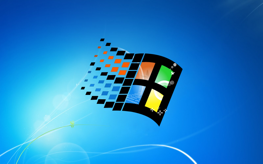
Redesigning the Windows Logo

THERE. I fixed it myself. Can I get money now?

PPweP.jpg

Sadly I actually like that over the current Win8 logo. :D
 
...You know, if the rumor that you could play 360 games on W8 are true I could've gotten past how there'll be features intended for tablets, I could've gotten over how there'd be little difference in performance compared to W7, I could've gotten over the cost of purchasing a new OS I don't really need, but with that Logo...With THAT logo, No Thank You. Call me fickle but I don't think I could ever not be annoyed by seeing that logo at start-up.
 
I was planning on buying Windows 8, but fuck it. I wouldn't be able to stand having to stare at that garbage logo every day. An OS should be a showcase for a company's accomplishments. That logo only showcases how much ass the new OS will be. It's almost as much garbage as that 100-piece puzzle we'd have to solve every day if we were to use Metro. I don't need to play Tetris every time I want to play my music. Stop being stupid Microsoft.
 
Sucks! :mad:

Everyone knows the Windows logo as the wavy window with different color in each section.
Microsoft marketing is fail.
 
I could personally care less about the logo....does the OS actually work well and have enough improvements to warrant me upgrading from Win 7 is the real question.


That's the diference between a "marketing" person and a tech or engineer.
 
Oh.. they probably spent a LOT more than that. Major Logo designs can cost into the MILLIONS.

That's just stupid, the firm I work for wanted to outsource their logo for 5K but I ended up doing it for them in house instead for free. This logo looked like it took all of 3 seconds to type and then use the perspective tool.
 
That design is just abysmal, where to begin... Here is how I know it is amateur hour apart from the fact it looks like turd.

logos usually make use of two colors, this uses one.
The kerning looks awful, it's too loose and the spacing is unbalanced between letters, look at the gaps each side of the last W

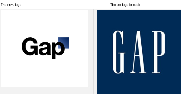
This is up there with the GAP logo that got scrapped and the 2012 olympic logo
 
they should go back to the Windows 3.1 logo, it looked far more like actual windows (it had frames unlike Windows XP and higher) and it has variety in color (unlike Vista and higher) it seems to me the logo looks more and more dead, and maybe it's Microsoft way of saying Windows won't be around much longer... :p
 
WTF did they tell the design agency?

1. Make it not stand out. At all. Period.
2. Give it one color. Ugly as well.
 
Does anyone else miss the old logo (1990-98)? Maybe it's just another one of my misplaced nostalgic fragments from the nineties. Never really cared for the XP/Vista/7 "flag".

Windows_7_Alternate_Wallpaper_by_Spritanium.png


(Wallpaper and larger version from this guy)
 
This is ugly and flat. It reminds me of the stuff that the CS majors would produce in typography class. The dot on the I is really pissing me off, it should not be higher or so close to the W.

It's just like being back in an art class critique where everyone is an expert and no one agrees :)
 
Or the only thing anybody cares about...

dx11.jpg


Damn you, Windows! If it weren't for video games I'd quit you for good.
 
This is ugly and flat. It reminds me of the stuff that the CS majors would produce in typography class. The dot on the I is really pissing me off, it should not be higher or so close to the W.

It's just like being back in an art class critique where everyone is an expert and no one agrees :)

Why'd you have to point out that "i"!? Now it makes me angry just looking at it... and it feels like "Wii" to me.
 
Wow, you wouldn't buy an OS because of the logo? That's just fucking stupid. I feel pity for you all. It's a fucking logo for Christ's sake. For an OS you DON"T HAVE to buy. I get the whole, "I don't care for this logo" but all the extra assumptions and sweeping statements after is just nonsense.
 
Silly Microsoft. They already have a good Windows logo: the one they use for their mythical Microsoft Stores (which don't really exist anywhere).

Take Microsoft Store logo; add "Windows 8" logotype. Done.

Funny thing is that flat logo is nearly 17 years old. They even reused it for the Windows Me tour video.

And yeah, I agree. They need to use that logo. It just fits with the whole metro design they're aiming for, not this "let's channel Windows 1.0" simplicity.
 
Ugly logo and iPad interface... waiting to see how bloated the final OS will be.
 
Follow up on my last post:

win8logoproper.png


Did it in MSPaint in like 10 minutes. When do I get my paycheck? :D
 
Back
Top