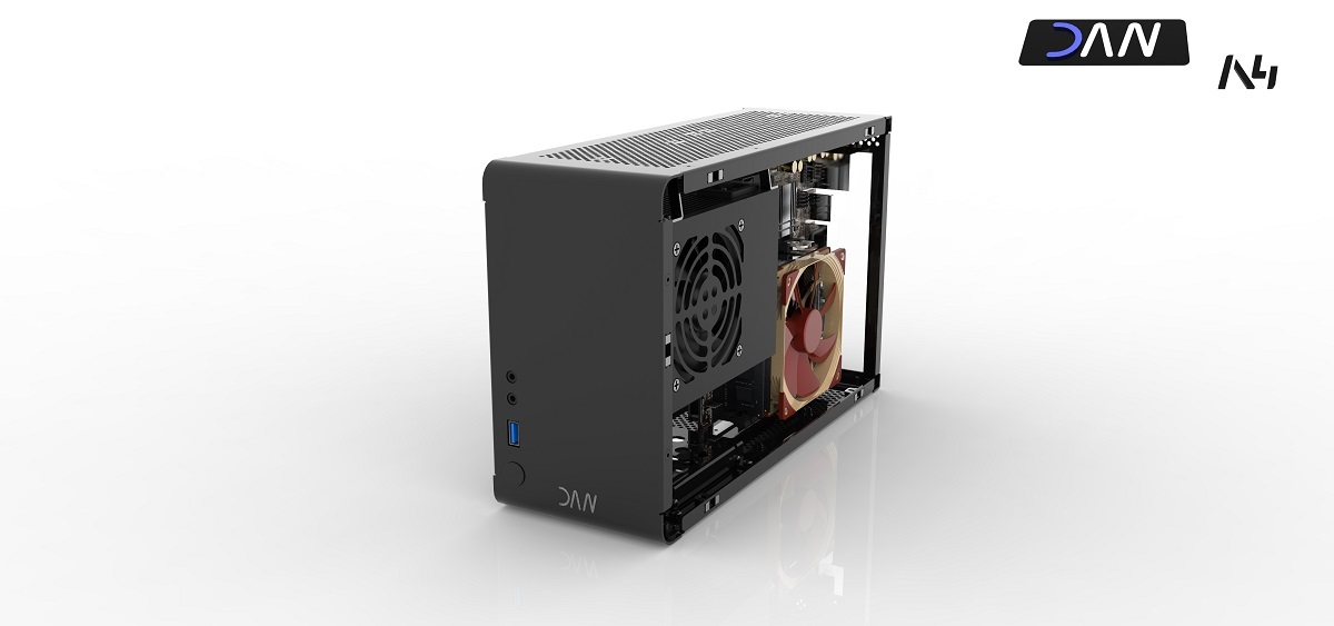
DAN A4-SFX: The smallest gaming case in the world

I guess I really don't get that. The rear USB ports are less than a foot from the front panel and make for a clean appearance when utilized... Front USB is 'nice to have' not 'need to have' and to sacrifice a clean look so you can have 4+ of them doesn't seem like a worthwhile trade IMHO.

Ive got some plans of setting computer in shelf, where there is little chance of putting any USB behind the case without actually taking the whole case off from the shelf.

Anyhow, even on desk i dont like raising my lazy butt to reach behind my case and just rather use the front usbs. Sure i could buy external hub - but that is more clutter which i couldnt want less.

So atleast i am "function over form" -sort of person, but this is ofcourse totally personal preference.
 
Couldn't there be a way to offer two panels? One with front connectors, the other one without them?

I'm not too knowledgeable in the way production works, but I would imagine that just leaving out a few cuts wouldn't raise the overall cost, right?
 
Couldn't there be a way to offer two panels? One with front connectors, the other one without them?

I'm not too knowledgeable in the way production works, but I would imagine that just leaving out a few cuts wouldn't raise the overall cost, right?

The problem is not the cut it is the i/o pcb behind this ; ).
But i am out of this i/o discussion because we have to wait what LianLi say to the custom pcb. Maybe it is to expansive to made a custom one and i have to use a default.

And i have to make clear that at this point no community wishes can be add to the Version 1. Otherwise you will get this case 2016 :p.
 
Last edited:
Couldn't there be a way to offer two panels? One with front connectors, the other one without them?

I'm not too knowledgeable in the way production works, but I would imagine that just leaving out a few cuts wouldn't raise the overall cost, right?

This is the same problem that Necere has with people wanting optical drives on the LRPC. It's too expensive to produce two layouts, you have to choose one.
 
The problem is not the cut it is the i/o pcb behind this ; ).
But i am out of this i/o discussion because we have to wait what LianLi say to the custom pcb. Maybe it is to expansive to made a custom one and i have to use a default.

And i have to make clear that at this point no community wishes can be add to the Version 1. Otherwise you will get this case 2016 :p.

Yeah that makes sense. I guess you could just leave the PCB in there, but that would be a bit stupid :)

I am very interested in this custom PCB business. It's neither hard nor expensive to get a custom PCB done, but having all connectors soldered on, that's a different story.
 
It's not so much the actual creation and assembly cost of the PCB, but that it's an external part outside of Lian Li's supply chain, which has a whole supply chain all of it's own. It could end up the case where a shortage of a certain type of surface-mount USB connector means that assembly gets delayed for the PCBs, which means production gets delayed for the PCBs (because to get a decent price means the PCB house tooling up, producing a run, then moving onto something else as fast as possible to keep from lines going idle), which means the PCBs don't arrive at Lian Li, which means that Lian Li can't do production and assembly in a single run, which means Lian Li have to delay production (because doing a run of production and part assembly, then storing all the parts and partly assembled cases, then doing another assembly run to install the PCBs and complete the case costs bucketloads more than doing everything at once because of labour and storage costs). And any of those delays could stretch even longer because production batches are scheduled, so an appropriately sized hole in the schedule needs to wait to open up even once all parts are available.

Mass production at low costs is really hard, globalised short-run production even moreso.
 
Here is the first shot of the case with the DAN front-logo. If you dont like the logo you can easily remove it.


(Click for 4K view)
 
Nice, but I wouldn't put the logo in the middle, but in opposite corner of front panel components like this:

8kxqyrm.jpg


Also please try to fix the angle of your D (pun not intended) and other letters in the logo.
 
Nice, but I wouldn't put the logo in the middle, but in opposite corner of front panel components like this:

8kxqyrm.jpg


Also please try to fix the angle of your D (pun not intended) and other letters in the logo.

I have to agree on this one. Having a non-italic logo in the lower-right really does work much better. I'd also try to have a black USB port, if at all possible.

Another thing to consider would be to offer a dark gunmetal color as an option or even the default color:
http://i.imgur.com/RtyyH62.jpg
 
What does the other followers of this thread think? Middle or right corner for the logo?
 
Last edited:
Having a non-italic logo in the lower-right really does work much better.
I'd say either italic or non-italic is good but dondan made a logo with first letter non italic, second a little italic and last italic which is not a good idea considering you have to look at this from multiple angles.
 
I'd say either italic or non-italic is good but dondan made a logo with first letter non italic, second a little italic and last italic which is not a good idea considering you have to look at this from multiple angles.

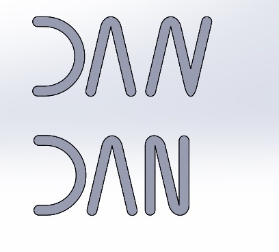
The first and second letter isn't italic (maybe looks like in the renderings) the third is italic but at the point of design i made the N out of the A by adding a third line.
 
Yeah, I get it. But rather than making the letters by hand just go and look for a nice free for commercial use font online and redraw those letters 1-1 in cad. Irregularities in text easily irritate the eye, you know.
 
These letters where made in cad, but i know what you mean. Here is a picture of the actually N and a non italic N. I find the old version much more better, but maybe only because the other is new for me.

logowakh9.jpg
 
Last edited:
Here's how it's supposed to look like with regular font
hVM4KrO.png

http://www.dafont.com/bioliquid.font?l[]=10&l[]=1&text=DAN

And her you can look for some more free fonts(100% free, for commercial use):
http://www.dafont.com/theme.php?cat=303&page=1&l[]=10&l[]=1&text=DAN

Look through that and get something you like and then play with it but keep it consistent - don't make something partially italic.

IF you're making those letters with solidworks, try importing texture as a surface look and then draw those letters on it. It'lll be easier this way.
 
I think this case is exactly what the SFF community is looking for. I enjoy travelling abroad and don't like gaming on a laptop or even browsing the internet on one. I would rather pack an ultra portable PC with full size equipment using a 21" plus monitor to use.

I am very excited for this release as I will definitely be purchasing this, maybe even to replace my current desktop rig.
 
Last edited:
Little logo idea popped into my mind:

dRGh0Jp.jpg

It looks interesting. Not sure if I'm completely digging the red and blue combination and I'm thinking maybe move everything a little to the left and separate the A4 from DAN as it sort of reads Dana 4. To me anyways.

For a case so sleek and sexy I'm thinking to use shades of blacks and Grey's instead of colours.
 
Last edited:
Just sketched up how would the a4 look like next to 'dan'. Used a different color (red) so that would not look dana 4 :p


(If a non italic font will be used this half 'A4' cannot be used at all)
 
I don't get one thing - why do you keep putting this A4 on the logo guys?

The product name shouldn't be a part of brand/company name logo. Those are two separate things. Compiling those together makes situation where each product has different brand logo.

The product name A4 isn't something really marketable, so I'd keep that just on a name plate on the back or somewhere inside.

Make a proper "DAN" brand logo separately first - you don't have loads of product lines to make distinct logos for them. Promote it somehow on the case front.

Also don't put multiple coloured letters in logo. Apart from industry standard front panel colours such as USB3.0 blue and optional audio green and pink try to keep everything black and white or greyscale. This will retain the classy look fitting everywhere.
 
@barn: Thanks for your idea but SaperPL is rigth DAN is the company name and A4-SFX the name of the case. So i can't mix it together in one logo.
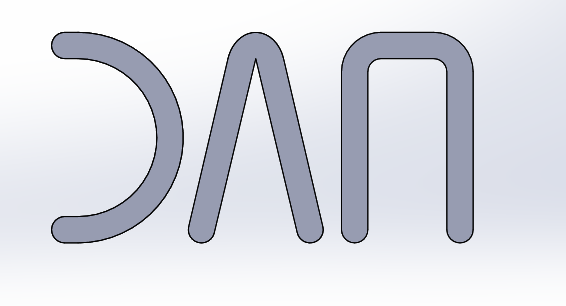
What do you think of this version of the logo?

new_logohzlf4.png
 
This may be a stupid idea, but have you tried to keep your original idea of the "N" based on the A, but putting de extra line of the N in the vertical? You may have to make some little changes in the original "A" to make this work visually...

Just one more ideia...
 
What do you think of this version of the logo?

new_logohzlf4.png

Still looks too hand-crafted. Also the lines should be thicker - take into account that it will be a lot smaller in real size on the case front.

Dunno If you got me about the font being regular thing - note that you have two different curves on D and N here, so either D should be a rounder rectangle or top of N should have bigger radius of rounding. Additionally there's only one sharp angle that's in the A letter.

Also note that distance between letters could have some relation to the letter line thickness.

Finally I would advise you to use some normal, uncut letters, at least most of them, like here:
http://www.dafont.com/the-rave-is-in-your-pants.font?l[]=10&l[]=1&text=DAN
http://www.dafont.com/phantom.font?l[]=10&l[]=1&text=DAN
http://www.dafont.com/eva.font?l[]=10&l[]=1&text=DAN
The reason is simple - are you sure that everyone will take those signs as D A N and not some weird oriental stuff?

@Barbarian_PT - I completely didn't get you - could you show us some image of what you mean?
 
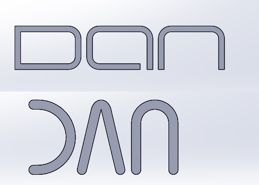
And a next try :D

logo2xgrcx.jpg


I like the upper version very much its the eva font of you last link SaperPL.
But the lines of the upper version are very thin so i think it is very difficult to make a sticker out of it. So it must be an engraving and you cant remove it.
 
You know, If you like it, but it's to thin, you can make it thicker yourself. This one (eva) looks easy to change.

As for your current try - as I said before, I don't really think making letters like this is good idea.

I'd say it's somehow like with sony vaio logo - it's not easy to read and its known well only because sony pumped shitload of money into marketing it over tv.

Additionally A and N even when they are the same height, when made small, look like N is a bit smaller than A, its like optical illusion or something.

Also A doesn't feel the same weight as N due to difference in "internal" area.

Finally if i were to do it, I think I'd make it like this:
http://www.dafont.com/electrofied.font?l[]=10&l[]=1&text=DAN
or this:
http://www.dafont.com/phantom.font?l[]=10&l[]=1&text=DAN

Not sure if others agree with me on this though.
 
Haven't posted on this but been following it since the start, just love it. The design decisions, the aesthetics, really almost perfect how it turned out.

Personally for my needs, the only change I would have gone with would be maybe making it just ever so slightly wider to accommodate a 3.5" HDD as there's still quite a size&performance vs. price discrepancy in 2.5 vs 3.5" HDD's now, 3.5" HD's are fast enough IME to avoid having to do the SSD shuffle for games, but not so sure about 2.5" drives from the benchmarks I've seen. Still, that will likely sort itself out in the coming years as density continues to improve and SSD's continue to drop, so I understand the decision even it may be a little too forward-looking for my current setup.

Hopefully this come in closer to $150 than $200 as that's getting out my range for a case without a PSU, but really this is just to congratulate you on hitting nearly every mark I could want in a PC case. Especially love the riser behind the MB instead of just sticking it below ala the steam box design so you have a thin, but ultimately very tall case that isn't nearly as portable and unobtrusive on a desk as this is while still being a powerhouse.
 
I made a quick drawing and it doesn't look nice:
2pyssp0.jpg


It was a bad idea...
Yeah :)

I don't do this myself because I know it would end up like this. But you must get it that font is a lot more than just drawing few lines.

IF you don't want to outsource this to some graphic designer then just stay with some nice free font and keep it simple :)

@Nitz Walsh - Comparing to the NCASE M1 it looks like it should be closer to the $150 due to a lot less parts. I also like the general idea of the case - its simply awesome but I'm afraid it lacks stiffness and durability and LianLi might want to reinforce the design with additional parts/creases which could bring price closer $200
 
Last edited:
(...)
Personally for my needs, the only change I would have gone with would be maybe making it just ever so slightly wider to accommodate a 3.5" HDD as there's still quite a size&performance vs. price discrepancy in 2.5 vs 3.5" HDD's now, 3.5" HD's are fast enough IME to avoid having to do the SSD shuffle for games, but not so sure about 2.5" drives from the benchmarks I've seen. Still, that will likely sort itself out in the coming years as density continues to improve and SSD's continue to drop, so I understand the decision even it may be a little too forward-looking for my current setup.
(...)

3,5'' HDD is substantially heavier. A lot of people, like me, want a case like this to walk around, in cars or airplanes. DVD drive, 3,5 HDD, etc, you can allways add through esata and usb ports...

The objective is to get the smallest gaming case, so many features have been neglected.

I agree with the rest of your post!:D
 
Back
Top