Navigation
Install the app
How to install the app on iOS
Follow along with the video below to see how to install our site as a web app on your home screen.
Note: This feature may not be available in some browsers.
More options
You are using an out of date browser. It may not display this or other websites correctly.
You should upgrade or use an alternative browser.
You should upgrade or use an alternative browser.
DAN A4-SFX: The smallest gaming case in the world
- Thread starter dondan
- Start date

illram
[H]ard|Gawd
- Joined
- Sep 19, 2011
- Messages
- 1,473
I am personally a minimalist--I always strip the stickers off stuff I buy and never use the included stickers in OEM chips and so on.
So if/when I buy the case, ease of removing the logo would be an important factor in my purchase. Nothing to do with the logo design, just more of a personal thing.")
So if/when I buy the case, ease of removing the logo would be an important factor in my purchase. Nothing to do with the logo design, just more of a personal thing.
vipz
Gawd
- Joined
- Apr 11, 2005
- Messages
- 818
I can't honestly say that I'd want any of the logos shown so far on a case I pay for
All of the examples look somewhat cheesy to me. I think at the minimum the font needs to be thicker and maybe also smaller.
All of the examples look somewhat cheesy to me. I think at the minimum the font needs to be thicker and maybe also smaller.
@Dondan
First, i want to congratulate you on how far this has come. I was a bit sceptical in the start but this is shaping up to be quite amazing.
I think it would be a shame if the logo lost you even one buyer, but I also see why you would want/need to put some sort of branding on it.
How about making the logo smaller and putting it somewhere more discrete like just in front of the mesh on the top panel? That way it won't be in the way for those who want a really minimalistic look, but it's still visible.
@SaperPL
I agree with your comments. You've obviously given this some thought.
And a next try
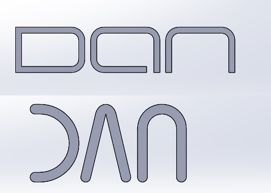
I like the upper version very much its the eva font of you last link SaperPL.
But the lines of the upper version are very thin so i think it is very difficult to make a sticker out of it. So it must be an engraving and you cant remove it.
The top logo is the best so far, I think. Shouldn't be a problem to make the lines thicker, either by using some sort of bold font-weight or by converting to vector format and doing it manually in a suitable editor (e.g. Inkscape).
I agree fully with SaperPL.
Black5Lion
Limp Gawd
- Joined
- Jan 1, 2013
- Messages
- 325
And a next try
I like the upper version very much its the eva font of you last link SaperPL.
But the lines of the upper version are very thin so i think it is very difficult to make a sticker out of it. So it must be an engraving and you cant remove it.
What about Braggadocio? I kinda like it
However, I agree with other people, that the logo should be removable.
I really like the case badge hard-ish logo as opposed to filmsy rubbery ones.
Nitz Walsh
n00b
- Joined
- May 23, 2013
- Messages
- 10
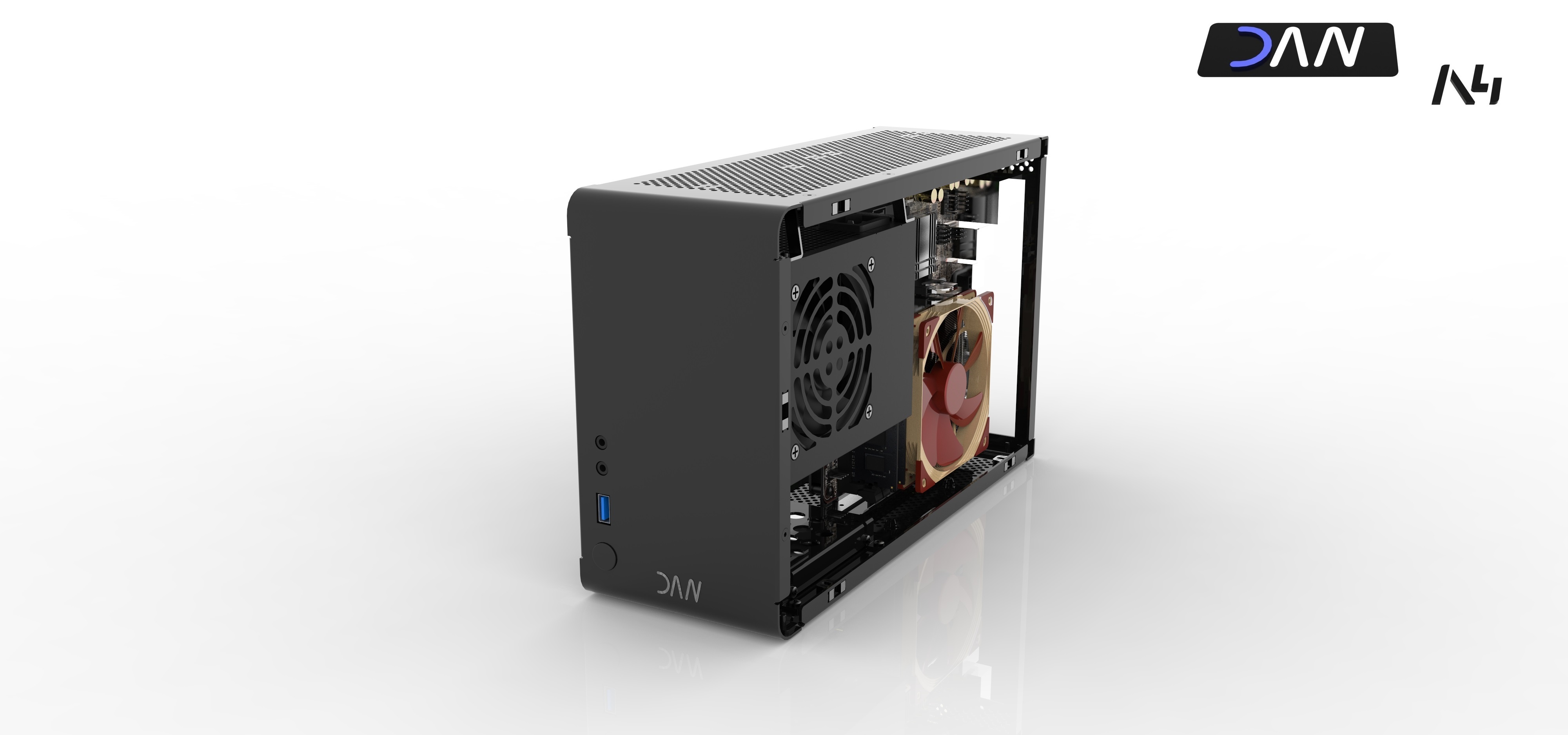
For everyone asking that the logo should be removable:
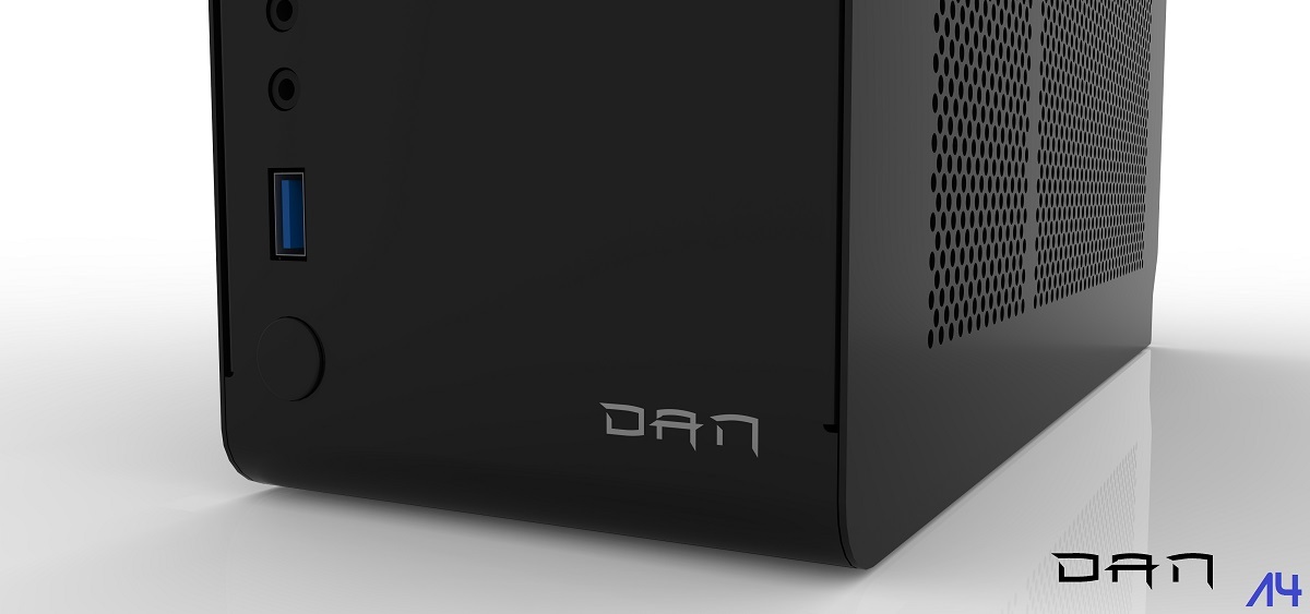
Here is the first shot of the case with the DAN front-logo. If you dont like the logo you can easily remove it.
(Click for 4K view)
iFreilicht
[H]ard|Gawd
- Joined
- Sep 23, 2014
- Messages
- 1,348
How about providing the logo as a sticker like intel ?
So people could stick this to any place they want. I personally don't like the logo in the front panel.
LianLi actually does that with the PC-Q12, I like it. Their "sticker" has a bit more depth to it, though.
energizerfellow
n00b
- Joined
- Aug 27, 2014
- Messages
- 42
And a next try
I like the upper version very much its the eva font of you last link SaperPL.
But the lines of the upper version are very thin so i think it is very difficult to make a sticker out of it. So it must be an engraving and you cant remove it.
The upper one is far and away better than anything shown thus far.
I don't get one thing - why do you keep putting this A4 on the logo guys?
The product name shouldn't be a part of brand/company name logo. Those are two separate things. Compiling those together makes situation where each product has different brand logo.
The product name A4 isn't something really marketable, so I'd keep that just on a name plate on the back or somewhere inside.
Make a proper "DAN" brand logo separately first - you don't have loads of product lines to make distinct logos for them. Promote it somehow on the case front.
Also don't put multiple coloured letters in logo. Apart from industry standard front panel colours such as USB3.0 blue and optional audio green and pink try to keep everything black and white or greyscale. This will retain the classy look fitting everywhere.
A thousand times this. This man knows what he's talking about.
dondan
[H]ard|Gawd
- Joined
- Apr 15, 2013
- Messages
- 1,751
What do you think of this? I know total different as the others but i like it.
Here is the font: http://www.dafont.com/milenio-jed.font?text=DAN&fpp=100&psize=l&l
Here is the font: http://www.dafont.com/milenio-jed.font?text=DAN&fpp=100&psize=l&l
dondan
[H]ard|Gawd
- Joined
- Apr 15, 2013
- Messages
- 1,751
As milling or as sticker?
dondan
[H]ard|Gawd
- Joined
- Apr 15, 2013
- Messages
- 1,751
Sorry i dont get it can you please show me what you mean at a picture?
And a next try
I like the upper version very much its the eva font of you last link SaperPL.
But the lines of the upper version are very thin so i think it is very difficult to make a sticker out of it. So it must be an engraving and you cant remove it.
Upper one looks better. I think the logo should be very discreet and quite small, or preferably removable. I've seen quite many nice cases having a logo sticking out like a sore thumb. Now recently the Thermaltake V1 & V21 cases.
I had no problem with the ncase logo, it was non-italic and clean. I suggest you do something similar.
Sorry i dont get it can you please show me what you mean at a picture?

The general idea of aligning stuff, just my thought
Barbarian_PT
Limp Gawd
- Joined
- Nov 21, 2012
- Messages
- 142
What do you think of this? I know total different as the others but i like it.
Here is the font: http://www.dafont.com/milenio-jed.font?text=DAN&fpp=100&psize=l&l
Best so far!
iFreilicht
[H]ard|Gawd
- Joined
- Sep 23, 2014
- Messages
- 1,348
Alignment needs to be done on the centreline because as far as I know there won't be a way to make a PCB where the USB and audio ports are aligned on the side, so you'll have to follow the centre alignment.
First one is best. Sticker please.And a next try
Not milling.Hello all
I recently just discovered the NCase M1 as I was looking var the smallest case possible to fit my current system. I have the Bitfenix Prodigy, which is one of the largest m-itx cases out there. In my opnion the whole idea of a m-itx system is to build a small gaming rig with enough cooling to keep the whole thing running smooth under load. The only problem with the NCase is that is doesn't fit a full size GPU
I then discovered the A4 and it really caught my attention. It's about as small as it gets without suffering from effecient cooling. Well done with the work so far!!!
The only thing bothering we is maybe the case front. It's clean and and timeless - yes, but personally I miss some kind of unique feature, which kind of states the unique quality of the case. Where as the NCase have the cutout in the bottom, which makes it look very slick. Maybe you could do some kind of bulge or inverted bulge (if that's even a frase) if you know what i mean. The case looks awesome, but is missing a unique element to make it stand out.
Don't know if I'm too late with this suggestion, but gave it a go anyway
dondan
[H]ard|Gawd
- Joined
- Apr 15, 2013
- Messages
- 1,751
Hi Trilas,
thanks for your message. I know what you are mean but at this point it is to late for version 1. Maybe i can do this with version 2 with an option to order only the new frame and add it to the version 1 (backward compatible) But actual i have no time to make any improvements at the frontdesign. Also it whould be very difficult because it is a thin grade of adding some uniqe elements and loosing the timeless design.
thanks for your message. I know what you are mean but at this point it is to late for version 1. Maybe i can do this with version 2 with an option to order only the new frame and add it to the version 1 (backward compatible) But actual i have no time to make any improvements at the frontdesign. Also it whould be very difficult because it is a thin grade of adding some uniqe elements and loosing the timeless design.
Hello all
I recently just discovered the NCase M1 as I was looking var the smallest case possible to fit my current system. I have the Bitfenix Prodigy, which is one of the largest m-itx cases out there. In my opnion the whole idea of a m-itx system is to build a small gaming rig with enough cooling to keep the whole thing running smooth under load. The only problem with the NCase is that is doesn't fit a full size GPU
I then discovered the A4 and it really caught my attention. It's about as small as it gets without suffering from effecient cooling. Well done with the work so far!!!
The only thing bothering we is maybe the case front. It's clean and and timeless - yes, but personally I miss some kind of unique feature, which kind of states the unique quality of the case. Where as the NCase have the cutout in the bottom, which makes it look very slick. Maybe you could do some kind of bulge or inverted bulge (if that's even a frase) if you know what i mean. The case looks awesome, but is missing a unique element to make it stand out.
Don't know if I'm too late with this suggestion, but gave it a go anyway
Not entirely sure what you mean about full size GPU's in the Ncase, plenty of 980's and titans in them, unless you mean dual GPU cards like the 295x2.
Nitz Walsh
n00b
- Joined
- May 23, 2013
- Messages
- 10
Sweet jeebus NO.Hello all
The only thing bothering we is maybe the case front. It's clean and and timeless - yes, but personally I miss some kind of unique feature, which kind of states the unique quality of the case. Where as the NCase have the cutout in the bottom, which makes it look very slick. Maybe you could do some kind of bulge or inverted bulge (if that's even a frase) if you know what i mean.
Adding extraneous "bulges" is pretty much the stereotype of awful PC case design, one of the main points of cases like these is to do away with that nonsense.It "stands out" by exactly not having such unnecessary clutter that the vast majority of poorly designed PC cases have. The entire point of this is minimalism, to add the same type of gaudy clutter that 99% of PC cases have would defeat the purpose.The case looks awesome, but is missing a unique element to make it stand out.
I mean really, do you think Apple's designs are lauded despite their lack of "bulges"?
iFreilicht
[H]ard|Gawd
- Joined
- Sep 23, 2014
- Messages
- 1,348
I think the A4 is unique enough the way it is. It doesn't need such a unique visual feature, the whole way the case works is the feature visual feature. There is no other case that has this kind of form factor.
There are cubes, there are towers and even some HiFi rack fitting slim cases. But no case in the world has a form factor like the A4, that's what makes it special and that's why it doesn't need additional visual features.
And I think Nitz Walsh is right, there are too many cases with visual features just all over the place. Still, what Trilas said about the M1 is true. The small I/O panel at the bottom and the bent lines in the front panel are very distinguishable visual features, but the M1 has a rather large front that would look empty without something like this. The A4s front is so small that the I/O ports themselves are enough to populate it.
Sweet jeebus NO.
It "stands out" by exactly not having such unnecessary clutter that the vast majority of poorly designed PC cases have. The entire point of this is minimalism, to add the same type of gaudy clutter that 99% of PC cases have would defeat the purpose.
I mean really, do you think Apple's designs are lauded despite their lack of "bulges"?
Abso-fucking-lutely, otherwise you end up with this hideous result.

iFreilicht
[H]ard|Gawd
- Joined
- Sep 23, 2014
- Messages
- 1,348
What the hell is that thing? The "Ultim4te G4mer M4chine eXtreme Fatal1ty PWNZ edition"?
What the hell is that thing? The "Ultim4te G4mer M4chine eXtreme Fatal1ty PWNZ edition"?
Hah, Deepcool FTL! The Steam Castle, also available in camo, why I do not know.

Hah, Deepcool FTL! The Steam Castle, also available in camo, why I do not know.
It's funny that they choose to release these new ugly "mini itx" cases over the awsome smaller prototypes they showed at CES 15
Not entirely sure what you mean about full size GPU's in the Ncase, plenty of 980's and titans in them, unless you mean dual GPU cards like the 295x2.
I have an Asus R9-280X and the height of this card will not fit in the NCase M1 simply because the large heatpipes on the top of the card. It's too wide to get the sidepanel closed.
Please correct me if I'm wrong, but quite sure I got the measurements correct
dondan
[H]ard|Gawd
- Joined
- Apr 15, 2013
- Messages
- 1,751
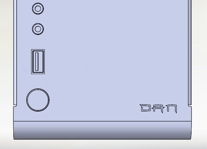
So as i said, here are two 4K renderings with the new logo. One rendering with logo on the right side and one with a centered version. Enjoy it
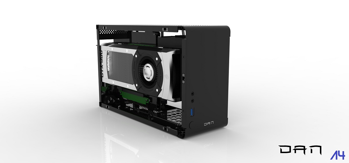
(Click for 4K)


(Click for 4K)
In regards to the bulge...that was only a suggestion You are all right when you say that the case is unique enough in itself. It's the smallest case out there to house a full size GPU. But the NCase doesn't suffer from having a cut-out in the bottom - on the contrary it gives the case a touch of luxery and makes it exclusive.
I'm NOT talking about converting the case into a freaking christmas tree
You are all right when you say that the case is unique enough in itself. It's the smallest case out there to house a full size GPU. But the NCase doesn't suffer from having a cut-out in the bottom - on the contrary it gives the case a touch of luxery and makes it exclusive. I'm NOT talking about converting the case into a freaking christmas tree
vipz
Gawd
- Joined
- Apr 11, 2005
- Messages
- 818
The cut-out on the M1 makes sense due to the underlying construction. The front panel needs to come off to access the drive space behind and you don't want the ports tied to it.
The LRPC designs we have seen so far from Necere doesn't have any cutout at the front either. I seem to remember he mentioned that he hasn't found a reasonable way to integrate it as a design element.
The LRPC designs we have seen so far from Necere doesn't have any cutout at the front either. I seem to remember he mentioned that he hasn't found a reasonable way to integrate it as a design element.
Barbarian_PT
Limp Gawd
- Joined
- Nov 21, 2012
- Messages
- 142
The second option. Right corner!
D
Deleted member 222586
Guest
I have an Asus R9-280X and the height of this card will not fit in the NCase M1 simply because the large heatpipes on the top of the card. It's too wide to get the sidepanel closed.
Please correct me if I'm wrong, but quite sure I got the measurements correct
Yup, but that is because that card is bigger than reference...
The second option. Right corner!
I agree, but I don't like the logo nor the font used.
dondan
[H]ard|Gawd
- Joined
- Apr 15, 2013
- Messages
- 1,751
As i said the logo is a sticker so if you don't like it you can remove it. But i need a logo on the case so that every customer can see this is a DAN case. It is also normal that not everybody will like the design of it but this is ok because we all like different thinks.