HP LP2475w (Possible new IPS)

I turned the brightness up to 91. It obviously hurt to look at, being so bright. I felt that MAYBE there was less swimming, but again, my eyes are in rough shape right now, in no way ideal for gauging long term comfort levels. I need to take a day or two away from the screen and come back with a fresh set of peepers, but time is ticking ...

Deeky, tonight I will make a few profiles for you at brightness 91, with target luminance at 120 cd/m2. Although it will create some banding, you could use the profiles to see if the text stops swimming.
 
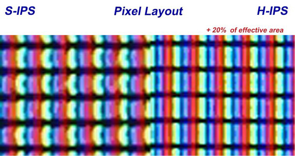
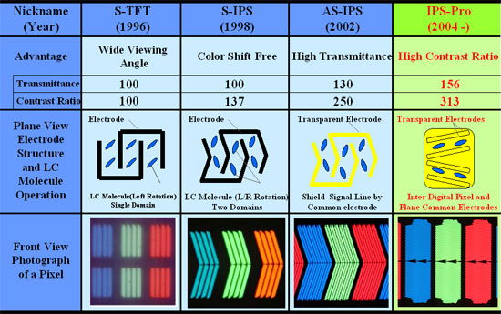
The website states that the 'Display technology type' is S-IPS. I thought it was H-IPS...


H-IPS is just modified S-IPS, technology is basically same I think. I guess H-IPS as a name is going to be obsolete?
 
Sigh... I have in front of me a brand new HP LP2475w Rev GIG 143, FW Ver GIG 068, manufactured March 2009 in China, that has the green / pink tint problem. I will wait a few hours to see if the problem doesn't go away...
 
Deeky, tonight I will make a few profiles for you at brightness 91, with target luminance at 120 cd/m2. Although it will create some banding, you could use the profiles to see if the text stops swimming.

Wow, thanks! I'd really appreciate that. In the back of my mind, I'm starting to consider the jump to NEC. Though the additional $300 is no small chunk of change, I'd rather spend it on a display now than on prescription reading glasses six months down the road ...
 
Wow, thanks! I'd really appreciate that. In the back of my mind, I'm starting to consider the jump to NEC. Though the additional $300 is no small chunk of change, I'd rather spend it on a display now than on prescription reading glasses six months down the road ...


$300? Try $500 minimum.
 
$300? Try $500 minimum.

I just checked. It's actually $400 more (a little less, actually) in my neck of the woods, for the non-SpectraView model. Smack in the middle. Though it creeps closer toward $500 when you factor in additional taxes ...
 
I just checked. It's actually $400 more (a little less, actually) in my neck of the woods, for the non-SpectraView model. Smack in the middle. Though it creeps closer toward $500 when you factor in additional taxes ...

I hate to say it Deeky, but it sounds like you are in the same position I was - I finally sucked it up and paid out for the NEC. Problem solved for me, but it really frustrates me that I had to step up so much in price to resolve the issue. That being said, the NEC is amazing (except for the dearth of inputs).

For what it's worth, high brightness did seem better to me as well - I tried to use high monitor bightness and then lower it with Nvidia CP - it worked, but it wasn't good, and it wasn't a long term solution.
 
I gotta say, so far the low brightness/contrast settings seem to be doing the trick ... but I'm withholding ultimate optimism for at least a day or two. Every time I think I've got it licked, extended use proves otherwise. I've bumped the brightness back up to 10 and nudged the contrast down to 47. The whites are much whiter, but not to the point where they singe my brain. I'll likely end up stepping the brightness down a few more notches, but I feel like I may be dialing in on my ideal settings ...
 
H-IPS is just modified S-IPS, technology is basically same I think. I guess H-IPS as a name is going to be obsolete?

h-ips_layout.jpg

ips_comparisons.jpg


From : http://www.tftcentral.co.uk/articles/panel_technologies.htm
 
The NEC is tempting, being "The Screen To Beat" atm, but the LP2475w is still my ideal. Better (slightly) overall black level and input lag are two huge considerations for me (being a graphic whoring FPS gamer who also requires a screen capable of handling Adobe CS3 with aplomb), not to mention the additional $400+ price tag. The lack of a A-TW polarizer is the only real downside (wide gamut doesn't bother me) .. the white glow in the corners can be a little distracting - but overall I rarely notice it, and I don't use the monitor for purposes requiring off-angle viewing.

0% brightness on the LP2475w results in a luminance level of 102cd/m2. I guess I'm one of the few who need it even lower, to be comfortable. Cranking the contrast below 65 (sitting at 53 at the moment, and brightness 3) appears to be helping. At first it seemed way too dark, but I'm starting to adapt. I also wonder if moving from TN to H-IPS requires some adjustment time, in terms of acclimatization and eye strain. It seems to be getting better by the day. Time will tell. Regardless, combined with a host of issues I've been having with Vista 64, Color Management, Device Manager, LUT Manager and Nvidia CP ... it's been a stone cold hassle, but I'm glad I stuck with it (so far).

Thanks to Yikes2000 for whipping up several test profiles for me, to see how brightness 91 impacts the "swimming" text. It does seem to help a little (could be my imagination), but the obvious negative impact of such a sky high brightness setting far offsets any tangible benefit. Much appreciated!
 
Last edited:
Unfortunately not. NVidia is yet to add a negative value feature for its digital vibrance control.
 
Would anybody trust one of these as a refurb? eBay has em for about 440$ (before cash back)
The add states that there is a 1 year warranty from HP included. I wonder if that 1 year warranty is as good as the three year included with the new monitors, just 2 years shorter?

I'm really thinking about getting one, I'm tired of the crappy viewing angles and banding that I get with my samsung 22" TN lcd.
 
I'm really thinking about getting one, I'm tired of the crappy viewing angles and banding that I get with my samsung 22" TN lcd.
As I guy coming from a Samsung 226BW "A" panel (w/ calibration), I can honestly say I'm glad I made the leap. Even with all the problems I've been having, it's still far and away the best monitor I've ever owned.

Speaking of which .... . .

During the course of my usual feverish calibration and tweaking, I accidentally switched the color mode to 6500k. I realize this mode is not as accurate as Custom, but damn, did it ever make a difference with regard to text readability. The "glow" has disappeared. I've cranked the brightness back to 10 (from 0) and the contrast to 63 (from 44) and I'm still totally comfortable.

Now my colors are buggered, as all the profiles I've downloaded were calibrated for Custom (as it presents close to perfect reproduction) ... but hell, at least I can visit the [H] forums and not get a screaming headache after 10 minutes.

As always, muted jubilation until extended use supports my initial impression.
 
Can those of you who experienced/ are experiencing eye strain and fatigue post what panel you were using before the HP H-IPS, like deeky has done?
 
If Windows 7 is 'colour managed', will that mean that games etc. won't appear oversaturated?

I'm fairly certain that will mean the OS and related apps will be color managed. Games are independent of the OS, it would be up to the developers to integrate color management.

I could be wrong, though.
 
I have a spyder3 calibrator, and that manages the color profile for the monitor. I'm pretty sure that overrides everything being displayed as the custom software changes the entire look of the screen.
 
I've again taken what I consider to be the ultimate step in my battle against blurry text / eye strain: I've disabled ClearType altogether. The font is ugly, but MUCH easier on the eyes. I tried this before, but immediately dismissed it due to the aesthetics. I'm gonna leave it off for the day and see if I can come to terms with the change.
 
I hate ClearType, the font just gets a red and green tint on every monitor I've tried it on (yes, I have it set up correctly). Normal font smoothing works much better IMO.
 
So would anybody trust a refurb from hp? is their refurb warranty just as good as their retail warranty but shorter?

Thanks
 
It looks like shit though. :(

Werd. It's working, though. I've been plugging away all day with next to no eye strain (InDesign, surfing, email). I'm back almost to TFT settings (10 brightness, 65 contrast). The downside: my OS fonts are hideous, albiet clear as a bell. To be honest though, the butt ugly text doesn't bother me as much as I thought it would.

So would anybody trust a refurb from hp? is their refurb warranty just as good as their retail warranty but shorter?

Thanks
My current monitor is a refurb (I'm almost 100% sure, all evidence points to yes). It's in perfect condition, totally up to date firmware and most recent revision of the hardware. Thumbs up.
 
Werd. It's working, though.

It's in perfect condition, totally up to date firmware and most recent revision of the hardware. Thumbs up.

Are you now satisfied with your monitor that you are going to keep it and use it?

I'm deciding which monitor to get and I narrowed down my choice to this HP LP2475w model due to the reasonable ~$550 USD price.

I've been following the last few pages of this thread and there sure is a lot of complaining about this model so I've been holding off until I hear what the resolution is to your blurry-text problem is and if you are satisfied with it.

Would you recommend this monitor to another person?

There's a thread that I've started to get some feedback about which monitor to choose and my decision process.

HardForum - LCD: 24" IPS - HP LP2475w, Planar PX2611W, NEC LCD2490WUXi-BK
 
It's hard to say, to be honest. Those who love this display LOVE IT. Those who hate it do so with a passion. There exist several subjective issues, problems that render the monitor useless for one user, but at the same time a different individual won't even notice. There's no way to know until you pull the trigger, set it up and take a hard look.

... unless you find someone somewhere who has it, willing to let you take a peek. Even then, there are so many revisions and firmware versions that you never know what you're gonna get.

Are you a gambler? If so, roll the dice. Chances are you'll get a unit you love, but there's always the possibility of ending up with something less than perfect. Disabling ClearType in Vista seems to have licked my text issue, which makes me think it's 100% my problem as opposed to something physically wrong with the display itself. Sure, my OS text is ugly, but InDesign and all my CS3 apps thank me, and my games are friggin' breathtaking (Fallout 3 is just beautiful, combo'd with my new GTX 285).

For the price, you can't beat it. If you aren't willing to chance it and you can stomach shelling out several hundred additional dollars for something that's guaranteed great, then the NEC or even the Planar are probably better choices. For me? I'm happy with the LP2475w. It's not perfect, but it's closer than one should expect for the price tag.
 
Yes I saw that people are very polarized about this monitor so I just pulled the trigger and ordered it from ProVantage.

I will see how it is for me when i get it next week and then judge myself. i will post details including hardware and firmware versions for reference. We will see.
 
Compare them side by side, and tell me which looks more saturated; the HP LP2475w with Digital Vibrance at default (0), or the standard gamut monitor with Digital vibrance set to max?

I dont need to test it even. Digital Vibrance at max totally overblows the saturation. LP2475w looks somewhat similar to sRGB monitor with Digital Vibrance set to something between low and med, but without the loss of shade differences on strong colors that Digital Vibrance does. Perhaps bit closer to med but that accurately I cannot say as I no longer have a sRGB monitor.
 
Last edited:
I wish Nvidia would introduce a negative value to it's digital vibrance slider. Even just a notch or two would really take the edge off wide gamut in apps that aren't color managed, for people who take issue with it. Chalk one up for ATI and their saturation control.

I honestly think it would help me a lot as well. I believe my whole text readability issue is a matter of vibrancy. Whites are too white unless I crank the contrast down to the point where they turn gray. If I had a negative vibrancy control, maybe a slight adjustment would be the solution. Without one, my only other option is to disable ClearType.
 
First IPS monitor I've ever had and I really like that the colors stay pretty uniform from most every angle. The black is good and while I haven't had a chance to try it yet I think this screen would be great for movie viewing. Plan on trying out a game later tonight.

That said, I was unaware of what I was getting into as far as the color spectrum goes. I just checked for dead pixels and the solid green and red screens nearly melted my eyes. Whites are relatively blinding too and I've messed with the settings and tried some of ones listed on TFTCentral. I'm just going to keep playing with this and hope that I can tame the screen a bit.

I read that many people have had issues with text fuzziness and I honestly can't tell you whether I'm having them or not yet. I feel I need to give the monitor a chance but there certain times when the text seems like I'm looking at it through the old school 3D glasses with the red and blue lenses. More accurately it seems as though there is a slight double image to the text. Other people have posted pictures of screens with a red line next to the text but I have no idea about what revisions this was occurring with or anything else. While I'm typing this I'm not really having any issue that I wouldn't just credit to the vibrancy of the screen but when I look up at the orange/gold text in the top left of the forum my eyes have trouble focusing at first. After a second everything seems a bit better. I really can't tell if it's just a brightness issue at this point or what.

I'm going to give it a chance and see if I grow accustomed to the lighting and everything but as of right now this screen is a bit overwhelming.

Also, the Windows ClearType Wizard seems to exacerbate the double image problem...

We'll see.

PetrolMan
 
I'm starting to shop around for a calibrator. Is there a clear winner when it comes to brand names? Or all they all basically reliable? Currently looking at a Spyder3 Pro or Elite.
 
Deeky,
i'm shopping a calibrator myself. Get a X-rite i1 LT or a i1 Display 2 .

If you can't find any of those, try a Pantone Huey pro :)

These are my 3 choices. If you get that, tell me how it worked with the HP. I've been thinking and thinking about this HP or a NEC, and i find the NEC brand hard to work with in Portugal :| So i guess my next choice will be the HP.
I was looking for something with Led backlight, but didn't find anything bellow $1500 ... sooooooo not going that path :D ( lie, there's the apple 24 led cinema... but it's not that good for what i eared )
 

Thanks for the link, but isn't it a tad out of date? "Monitors tested (as of July 2005)"? I suppose it's a good indication of where the brand names factor. I've been hopping around between reviews of individual calibrators ... I've yet to pin down a clear winner.

@Postmodum, Thanks! I'll look into those. EDIT: It seems the Eye One D2 is old, but still remains the most widely regarded. Can it handle wide gamut? Seems odd for a piece of hardware that's been around since 2006.
 
Last edited:
The folks behind ColorEyes Display Pro recommend Spyder3 for wide gamut monitors. Spyder3's literature also touts wide gamut capability. I don't have any other colorimeter to compare, but my Spyder3 seems to miss a minute amount of wide gamut red (using CEDPro), which results in pure white looking ever so slightly pink. I manually correct it through CEDPro's white point tuning feature.

Although I probably would not have noticed it without a secondary monitor (NEC 20WMGX2) sitting right next to the HP LP2475w, providing a reference point. Another interesting observation - the polarization of these two monitors are 90 degrees apart. The other day I wore my sunglasses (polarized lenses) and the NEC was visible and HP very dark. Tilted my head 90 degrees sideways, it was the opposite.
 
UPDATE(S): I've started messing with the Gamma slider in Nvidia control panel with encouraging results. Bumping it up to 1.15 makes it "brighter" without the whites becoming whiter or the blacks washing out (too much, at 0% my brightness was crushing the bottom of the scale anyhow). I've basically replaced brightness with gamma. The end result is white text that's much easier to read on dark/black backgrounds. I realize it's not the ideal solution, but it does tell me that my gamma curve is likely screwed up, somehow. I guess I'll be investing in my own calibration hardware/software. My choices are quite limited, with wide gamut and Vista x64 to consider ...
 
Last edited:
The balck level on my is excellent, the only thing I have seen come close in an LCD is the Panasonic 32LZ800 television I briefly had. The blacks are even better on this than on either of the 20WMGX2 I own. I think you just need to calibrate it and make sure your video drivers are not adding any brightness or gamma.

Try these settings...

Brightness 15
Contrast 65
Red 251
Green 235
Blue 242
DDC/CI off

...here is a good way to test black level....

http://www.lagom.nl/lcd-test/black.php

...I can only see box 3, 1 and 2 are indistinguishable.
 
Why reduced contrast? According to tests by Prad, default contrast at 80 provides the best picture. Reducing it doesnt really help black depth much either (brightness does as it controls backlight strength) but it does damage whites. I can see all the black boxes at Lagom test. Though I have hardware calibrated mine so probaply thats why.

In any case, setting brightness something between 10-20 should offer something between 0.15 to 0.20 cd/m2 black depth, which is awesome result for IPS.

Remember, if you are used to CRTs, LCD black depth will always dissapoint in darkened room as it has a slight grey tone, blame the backlight used in nowaday LCD technology. Afterall, in CRTs your black depth is virtually 0, it doesnt emit any light in the black spots. Perfect black.
 
Back
Top