Best 27" monitor for reading text (Word) and browsing the internet

insoc123

Limp Gawd
Joined
Apr 14, 2010
Messages
300
Hello. My current monitor is a 27" Dell 2713HM which native resolution is 2560x1440. I used to play games with said monitor but no more. I have always noticed that when working with my office monitor (@1920x1080) though more pixelated I like reading text at said resolution and text is bigger.

I change my 2713HM resolution to 1920x1080 but I don't know if by doing this I will get the same exact result as if my monitor was a 27" one with a NATIVE resolution of 1920x1080? I read this explanation: "Graphics will not look quite as sharp if you work below the maximum (native) resolution. This is due to something called interpolation which the monitor tries to estimate exactly where to put a pixel. That is because the number of pixels is fixed and cannot be changed so it sort of like taking a smaller picture and increasing the size of it until it fits the frame."

Does that mean that given a 27" monitor with a native resolution of 1920x1080 at said resolution it will always look better and show graphics and text better than if I used a 27" monitor with a native resolution of 2560x1440 at the lower resolution of 1920x1080?

If so, which 27" monitor at 1920x1080 would you recommend as the best for using software like MS-WORD, emailing, browsing internet and playing youtube.com videos?

Thank you a lot for your help on this subject!
 
If you're willing to step down to 24" then the new Dell UHD / 4K display would be your best bet. And there's a 28" version coming soon.
 
Thanks for the suggestion Quartz-1 but at that higher resolution (3840x2160 pixels) my problem with smaller text and icons I experience at 1440p vs 1080p would only get worse.
 
Thanks for the suggestion Quartz-1 but at that higher resolution (3840x2160 pixels) my problem with smaller text and icons I experience at 1440p vs 1080p would only get worse.

It shouldn't - the text and icons should be the same physical size but finer and thus easier on the eye (qv 150 dpi vs 300 dpi vs 600 dpi on a laser printer), and all you'll need to do is set the font scaling to 200%.

I'm eagerly awaiting the reports of the first [H] adopters.
 
No, it shouldent. Unless there is some automagic in Windows 8 that I dont know about. Physical text size will be dependent on pixel density (DPI) of the display. Getting UHD display will only make your problem worse. :p

That being said what you should try first, insoc123, is to increase text size in your OS and see how that looks. Here's how to do it in Win7: http://www.youtube.com/watch?v=I0E_2L7EjMY
Then you also learn how to zoom in programs you use.. like Word and browser of choice. ctrl+mousewheel usually works.

After you tried that and you still dont think its workable then you consider downgrading to 1080p 27".
 
Actually I have thought things better and I think the reason why I work more confortably at my office it's because my office monitor is a 24" one. The 27" monitor might be too big for just using Word or other office applications or just browsing internet pages. My head does not need to move that much with the 24".
I think I will buy the Dell 2412M monitor. Any 24" monitor better than that one? Thanks!
 
A 16:10 24" is only slightly smaller than a 16:9 27." Simply move the 27" or your self further away if it is "too big" or re-size the windows.

http://www.displaywars.com/27-inch-16x9-vs-24-inch-16x10

The Dell U2412 sucks now since there are plenty of better PWM free 1200p IPS which do not use a grainy matte coating like the U2412 does. The BenQ BL2411PT is the best all around monitor:

http://hardforum.com/showthread.php?t=1776113

However if you are fine with your U2713HM's matte coating cross-hatching the HP Z24i uses the same coating as the U2713HM/a slightly lighter coating than the B2411PT and also does not use LED PWM Dimming unlike the U2412HM.

http://hardforum.com/showthread.php?t=1776113
 
No, it shouldent. Unless there is some automagic in Windows 8 that I dont know about. Physical text size will be dependent on pixel density (DPI) of the display. Getting UHD display will only make your problem worse. :p

You obviously missed the bit where I said to put the font scaling at 200% because what you say simply isn't correct when that's done.
 
You obviously missed the bit where I said to put the font scaling at 200% because what you say simply isn't correct when that's done.

Good luck with that. I've seen that on an Asus PQ321Q and it is very inconsistent. Some fonts look fine, and some don't. The ones that scale properly work great, but certain non-Truetype, or non-vector system fonts look like a blocky mess once you go 150% or higher.

The other issue is some apps have certain system fonts being used in interface elements and they look like junk.
 
Sounds to me like you should try an AMVA panel. The deep blacks should do wonders for text.

I think the biggest enemy for text editing is the aggressive matte coat. Annoying sparkly matte coats destroy my eyes when I read.

I'm receiving a Samsung S27C750P tomorrow. It's a 27'' 1080p AMVA -- I'll let you know how that works out in terms of text.
 
Thank you all for your helpful post. I am very interested in the BenQ BL2411PT but it seems that you can't buy it in the US, at least not at amazon.com or other big sites. Could it be that said monitor has an equivalent one in the US with another model number?
 
Thank you all for your helpful post. I am very interested in the BenQ BL2411PT but it seems that you can't buy it in the US, at least not at amazon.com or other big sites. Could it be that said monitor has an equivalent one in the US with another model number?

Unfortunately, BenQ has a thing with the States, don't count on finding it.

The only equivalent of that screen that I know of is the Dell U2412M, but apparently, there's PWM. This time next year, no monitor in production will have PWM and the marketing around the fact will be as loud as when white LEDs replaced CCFL.
 
Good luck with that. I've seen that on an Asus PQ321Q and it is very inconsistent. Some fonts look fine, and some don't. The ones that scale properly work great, but certain non-Truetype, or non-vector system fonts look like a blocky mess once you go 150% or higher.

The other issue is some apps have certain system fonts being used in interface elements and they look like junk.

Some fonts are junk for LCD monitors. That is why you change them to fonts that aren't.
 
Is there a 24" 16:10 display without PWM already available in the US?

If a 24" 16:10 monitor doesn't have 1:1 mapping, what effect could it have when watching YouTube.com videos that uses the now universal format of 16:9?

Thanks!
 
Is there a 24" 16:10 display without PWM already available in the US?

If a 24" 16:10 monitor doesn't have 1:1 mapping, what effect could it have when watching YouTube.com videos that uses the now universal format of 16:9?

Thanks!

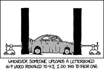
It will fill, and put bars on the screen to fill in the gaps. Presuming the author actually uploaded the video in 16:9 and didn't:

aspect_ratio.png
 
I've got the S27C750P and while the strong blacks indeed do wonders for text, they do a bit too much wonder. The contrast strains the eyes a bit. Might as well get a IPS. The matte coating is really light though and it makes all the difference regarding eye fatigue. If you're dealing with a lot of text, glossy or very light matte should be obligatory.
 
You obviously missed the bit where I said to put the font scaling at 200% because what you say simply isn't correct when that's done.
True. I did not register that part. But my answer still holds. Your advice to get UHD was way counterproductive in this case IMO.
 
SEIKI 39" 4k @ 125% fonts= great monitor for reading even in non-cleartype fonts.

The alternative is the eizo foris 1440p VA panel: true 120hz + VA= win-win situation.
 
Back
Top