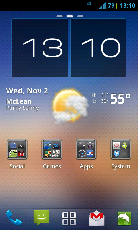
what wallpaper is this? I've seen it before but can't put my finger on it..
I think it was in CyanogenMod6.
GoogleFu presents http://www.getfreehdwallpapers.com/wallpapers/20/account_8469.jpg
Follow along with the video below to see how to install our site as a web app on your home screen.
Note: This feature may not be available in some browsers.
what wallpaper is this? I've seen it before but can't put my finger on it..
<snipped the images>
looks like a theme


Is there a way to take a screenshot of your home screen if your phone is not rooted? Apart from taking a photo with a camera that is.


iPhone 4
I like to consider myself at the forefront of the Apple haters club of America, but that is pretty swank, if I do say so myself.
That skin looked ok to me at first, but the more I examined it, the more fundamental issues started presenting themselves (mostly with the icon set).
The rest of the skin seems fine, It's just the icons that have me grinding my teeth1. All icons have been hammered to the same shape, which immediately makes them harder to differentiate at a glance.
2. Some icons (YouTube, Videos, Messages, Music) have fake non-functional buttons on them.
3. Music icon is inconsistent. Photorealistic style doesn't match the any of the other icons.
4. Music icon shows a completely different product that doesn't bear any relation to the UI it launches.
5. App-store / Apple store metaphor on the App Store icon is not well defined.
6. Phone icon shows (what appears to be) the backside of the iPhone and its camera. This metaphor does not clearly define "phone"
7. Too much detail is present on many icons (YouTube, Videos, Contacts, messages). The worst offender being the Contacts icon.
8. The use of micro-icons on folders compounds all of the above issues. Many icons, when placed in a folder, can no-longer be clearly identified without opening the folder.
9. There's some pointless element-repetition going on with the folder icons. A strange triangular glyph is faded into the background of every folder, which serves no purpose (doesn't clarify the intent of the icon in any way).
The theme is called Legacy. The triangular icon in the folder the logo the theme uses throughout. Agreed some of the icons are fussy, but they still fit the overall theme.the music app used to be called "ipod" , hence the ipod controls on the icon. Like I said, many tend to be too fussy, but as a whole, the theme looks appealing & unified.That skin looked ok to me at first, but the more I examined it, the more fundamental issues started presenting themselves (mostly with the icon set).
The rest of the skin seems fine, It's just the icons that have me grinding my teeth1. All icons have been hammered to the same shape, which immediately makes them harder to differentiate at a glance.
2. Some icons (YouTube, Videos, Messages, Music) have fake non-functional buttons on them.
3. Music icon is inconsistent. Photorealistic style doesn't match the any of the other icons.
4. Music icon shows a completely different product that doesn't bear any relation to the UI it launches.
5. App-store / Apple store metaphor on the App Store icon is not well defined.
6. Phone icon shows (what appears to be) the backside of the iPhone and its camera. This metaphor does not clearly define "phone"
7. Too much detail is present on many icons (YouTube, Videos, Contacts, messages). The worst offender being the Contacts icon.
8. The use of micro-icons on folders compounds all of the above issues. Many icons, when placed in a folder, can no-longer be clearly identified without opening the folder.
9. There's some pointless element-repetition going on with the folder icons. A strange triangular glyph is faded into the background of every folder, which serves no purpose (doesn't clarify the intent of the icon in any way).
That just makes it worse... repetition of purposeless stamped logos that impart no meaning towards what the icon is supposed to signify, scattered throughout a UI, are something to be avoided at all costs.The triangular icon in the folder the logo the theme uses throughout.
That doesn't help its case at all, the Music icon still falls flat on its face for the same reasons I listed before.they still fit the overall theme. The music app used to be called "iPod," hence iPod controls on the icon.
Call it what you want, but that icon set makes some design choice that most design handbooks would consider suicidal. You would never see an icon set so absurd in any commercial software (the icon set would never make it past usability studies).the theme looks appealing & unified.
It is really a matter of preference.
wow, talk about 'white people problems'....words words words
Don't care about design? That's perfectly fine, but there's no need to be rude...wow, talk about 'white people problems'....
And it was wrong then too. Apple flirted with breaking its own UX guidelines with the old iPod-shaped icon (nice to see it's finally fixed in iOS5), but the old iPod icon from Apple didn't have fake buttons/controls on it, and was consistent with many of the other system icons in styling.the icon for music app on an iphone prior to ios5 was a white image of the original ipod.