Navigation
Install the app
How to install the app on iOS
Follow along with the video below to see how to install our site as a web app on your home screen.
Note: This feature may not be available in some browsers.
More options
You are using an out of date browser. It may not display this or other websites correctly.
You should upgrade or use an alternative browser.
You should upgrade or use an alternative browser.
crispest text
- Thread starter colore
- Start date
B00nie
[H]F Junkie
- Joined
- Nov 1, 2012
- Messages
- 9,327
OLED most likely.
OLED most likely.
oh, maybe I need to be more precise
I am talking about a 'regular' desktop monitor, of >24" size, been able to display colors
and as for 'displays soon available', I mean few months maximum
elvn
Supreme [H]ardness
- Joined
- May 5, 2006
- Messages
- 5,291
The ppi on a 27" 2560x1440 ips combined with the glossy display (assuming you don't have light sources behind the monitor's faces) looks very crisp to me on text. The 108.8 ppi is tight, and AG coatings always bother me on text. Head-on even my led backlit 19" TN's look good in portrait mode 900x1440, at a similar perceived ppi as I have them set back a little further. They suffer uniformity issues though at some angles.
.
Your settings also have an enormous effect on text readability, both cleartype settings (in control panel in win7), brightness/contrast/gamma. That's why monitors used to come with different sets of settings (game mode, movie, web, text).. and why some people prefer basic grey-tone e-readers to a full ipad like display (for reading books). You can usually set up hotkeyed (or rightclick menu activated) color profiles in your gpu drivers for your pc if you need to.
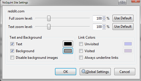
For web browsing, I personally use a firefox addon called "nosquint" for on the fly background + text color changing on most sites. I formerly used "colorthatsite", but nosquint is a quicker, simpler, on-the-fly addon that works well enough. You just checkbox the background and text color boxes, click the color boxes and set them per page, which it remembers (I prefer that rather than doing it globally). It can also set page zoom levels as well btw, though I rarely use that function. I usually set sites with white backgrounds to a medium grey, and set the text to a dark black.
.
On my VA tv, I keep 3 different sets of settings for different room lighting conditions. I set them up for video/movie watching between daylight, lamplight, and blinds drawn blackout movie watching. Two of them though great for movies are terrible for text so I usually to revert to the palest one when doing file management/menus on the pc via tv.
.
Some people prefer to turn off font smoothing in windows...
Some people use a 3rd party font smoothing app:
http://drwatson.nobody.jp/gdi++/download-en.html
http://code.google.com/p/gdipp/
Although many people are pretty happy with the modern version of windows7 + cleartype.
.
Your settings also have an enormous effect on text readability, both cleartype settings (in control panel in win7), brightness/contrast/gamma. That's why monitors used to come with different sets of settings (game mode, movie, web, text).. and why some people prefer basic grey-tone e-readers to a full ipad like display (for reading books). You can usually set up hotkeyed (or rightclick menu activated) color profiles in your gpu drivers for your pc if you need to.
For web browsing, I personally use a firefox addon called "nosquint" for on the fly background + text color changing on most sites. I formerly used "colorthatsite", but nosquint is a quicker, simpler, on-the-fly addon that works well enough. You just checkbox the background and text color boxes, click the color boxes and set them per page, which it remembers (I prefer that rather than doing it globally). It can also set page zoom levels as well btw, though I rarely use that function. I usually set sites with white backgrounds to a medium grey, and set the text to a dark black.
.
On my VA tv, I keep 3 different sets of settings for different room lighting conditions. I set them up for video/movie watching between daylight, lamplight, and blinds drawn blackout movie watching. Two of them though great for movies are terrible for text so I usually to revert to the palest one when doing file management/menus on the pc via tv.
.
Some people prefer to turn off font smoothing in windows...
try this to remove all font smoothing from windows 7
Windows Registry Editor Version 5.00
[HKEY_CURRENT_USER\Control Panel\Desktop]
"FontSmoothingType"=dword:00000000
"FontSmoothing"="0"
Some people use a 3rd party font smoothing app:
http://drwatson.nobody.jp/gdi++/download-en.html
http://code.google.com/p/gdipp/
Although many people are pretty happy with the modern version of windows7 + cleartype.
XP-style font smoothing is inferior to ClearType's subpixel anti-aliasing, particularly now that it's anti-aliasing along two axes in Windows 7 (as opposed to the single axis anti-aliasing in XP and Vista's ClearType/GDI+).
Microsoft is moving forward with Direct2D and DirectWrite, even though Direct2D is an abomination of an API, and that means ClearType-only.
ClearType's glyph rendering looks practically identical to OS X's rendering...when it works correctly.
I don't understand. You disabled ClearType, which means you disabled font anti-aliasing, which means your font rendering should be aliased. That is the result of disabling ClearType.
If you want subpixel glyph anti-aliasing, leave ClearType enabled. If you want aliasing on glyphs, disable ClearType.
GDI font smoothing was broken. It relied excessively on hinting to achieve satisfactory rendering at small font sizes. In Windows 7, you have either GDI+ or DirectWrite, the latter using bi-directional anti-aliasing so no hinting is required at small font sizes. The old font smoothing method is not in any way faithful to the original font, whereas the new ClearType method is.
I'm surprised the OP had to go to OS X to get decent text rendering, because in my opinion Windows 7 now has a very slight edge in the quality of its glyph rendering (though kerning is still fucking terrible compared to OS X).
Last edited:
Trust me, the crispest text is firstly achieved by using a monitor with a coating that is as light as possible, preferably glossy monitor to be sure. This is the only way your text will be crisp enough. The second thing is getting a high enough contrast (native contrast, not dynamic).
noobpower2
n00b
- Joined
- Dec 30, 2012
- Messages
- 3
some retail websites help you sort by ppi but most wont. anyways, unless you for some reason want specific a ppi limit you should just try to get a screen with the smallest acceptable diagonal screen size and highest possible resolution to get the highest pixel density.
noobpower2
n00b
- Joined
- Dec 30, 2012
- Messages
- 3
it's a combination of no anti-glare coating, high pixel density, and high contrast. i'd probably rank it like that as well. even with a high pixel density an aggressive or even medium anti-glare coating will blur all the sharpness away. that's why apple retina displays look as sharp as they are since they use glass surface (no anti-glare), very high pixel density relative to other panels, and reasonable contrast.
william_fontaine
Gawd
- Joined
- Oct 26, 2006
- Messages
- 744
not crispest
most crisp
most crisp
elvn
Supreme [H]ardness
- Joined
- May 5, 2006
- Messages
- 5,291
ppi calculator
You have to remember that perceived ppi (and screen size for that matter) is relative to your viewing distance. That's why 1080p tv's look fine at +/- 50" in most living rooms, due to the most common seated/couch distances from them in modest sized rooms. Also why some higher ppi laptops and handhelds extremely high ppi doesn't seem quite as extreme when its nearer your eyeballs. the ipad3 is very high ppi though, I saw one over xmas. Its a little higher than my droid x2 phone, which is quite high for a tablet. That said, I'm really not into tablets anymore. I think the hand holding thing is gimmicky and the OS's are kiosk-like (reminiscent of portal-tech or console stores in some ways ) and non-robust, also less secure. I'd rather have a full intel cpu in a hybrid windows laptop/tablet personally if I had to do it all over again.
You have to remember that perceived ppi (and screen size for that matter) is relative to your viewing distance. That's why 1080p tv's look fine at +/- 50" in most living rooms, due to the most common seated/couch distances from them in modest sized rooms. Also why some higher ppi laptops and handhelds extremely high ppi doesn't seem quite as extreme when its nearer your eyeballs. the ipad3 is very high ppi though, I saw one over xmas. Its a little higher than my droid x2 phone, which is quite high for a tablet. That said, I'm really not into tablets anymore. I think the hand holding thing is gimmicky and the OS's are kiosk-like (reminiscent of portal-tech or console stores in some ways ) and non-robust, also less secure. I'd rather have a full intel cpu in a hybrid windows laptop/tablet personally if I had to do it all over again.
not crispest
most crisp
Wrong.
The crispest of the crisp

Oh, and in terms of 'crisp text', I'd think PPI > tech used. You can get an expensive as hell OLED and that means nothing without PPI to match. Conversely, great PPI can do wonders for text regardless of panel type. Unless of course you need viewing angles to boot, in which case I'd say IPS is your best bet unless you're a duck who swims in gold coins when you get home...
it's a combination of no anti-glare coating, high pixel density, and high contrast. i'd probably rank it like that as well. even with a high pixel density an aggressive or even medium anti-glare coating will blur all the sharpness away. that's why apple retina displays look as sharp as they are since they use glass surface (no anti-glare), very high pixel density relative to other panels, and reasonable contrast.
This is the exact perfect answer. Easy to read, clear, crisp, no compensation from eyes to read in bad contrast, no brain struggle to correct the text problems resulted from ag coating blurring and coloring with random small points, pretty much everything that makes it more relaxing to read text, can only be achieved by glossy+density+high contrast.
Only one thing I would add is that the high pixel density only helps you have your brain compensate less for the text shape, and the clear type font artifacts will become small enough to not be visible, making it much more relaxing to read text.
Ever since I got my glossy screen (not tempered glass cause that is just too glossy) I have absolutely no problems at all reading text, and I can't believe how stupid I was to underestimate the importance of seeing perfectly the monitor pixels, which can be possible only if you got the lightest ag coating possible, preferably glossy.