Windows 9 Tech Preview Screenshots

Those colored tiles are hideous. One would hope there is a way to turn all that crap off. If not... I hope Classic Shell gets updated for Win 9! (using it on 8 and it's a life saver)
 
I think that should successfully shut the luddites up.
2.png
 
I think you'll be able to kill all the tiles on the Start menu, so all is well.
 
There's no reason to even have those gigantic tiles as part of the Start menu, really. They should look exactly like non-App entries when added to the menu.
 
They keep wanting to make things 'easier' and 'simple'. Well, what's wrong with this?
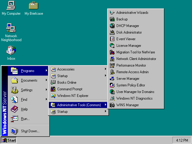
nt4start.gif
 
Wait, someone installed a 64bit win9 build on a machine with 1gb of ram?
 
It would be really nice if they would return the possibility of CPU-rendered Classic theme. As a VDI, Windows 7 blows Windows 8 out of the water in terms of overall performance and responsiveness under VMware View and PCoIP w/ Teradici cards.
 
Sigh..they are just bent on pushing that eyesore. Hopefully there is a way to eliminate the gd tiles. Seriously MS needs to fire their UI department and rehire whoever was in charge of Vista/7 and progress on that.
 
The OS still looks idiot-ified, so I'm not really holding out any hope that MS learned any lessons from the Win8 debacle.
 
Eh...it looks like they just shoved the tile screen into a menu format. I don't see what was so bad about just having the Start menu that everyone knew and loved.

For tablets/touchscreens, okay, have tiles, but make the whole thing optional.
 
Maybe someone will write a comprehensive mod that turns this crap, at least visually, back into Windows 7. Until then they can pry 7 from my cold, dead hands.
 
Sigh..they are just bent on pushing that eyesore. Hopefully there is a way to eliminate the gd tiles. Seriously MS needs to fire their UI department and rehire whoever was in charge of Vista/7 and progress on that.
Why would you want to eliminate the ability to FULLY customize the right-hand pane of the start menu, though?

On Windows 7, that pane only has a fixed set of options. Now, you can pin any system locations you want to the right-hand pane.

Want Computer, Control Panel, Documents, a network share on your file server, and your Steam folder right in the Start Menu? Pin them to the right-hand side! As an added bonus, pinned desktop applications all use a uniform tile color (which is user-selectable), so it will look very clean.
 
My opinion does not seem to be much different from many of the others here. (Hooray echo chamber!) Win 7 Start menu + plus taskbar + a really crappy version of a flattened Aero + the worst aspects of the tiles format so many desktop users loathe.
 
Those colored tiles are hideous. One would hope there is a way to turn all that crap off. If not... I hope Classic Shell gets updated for Win 9! (using it on 8 and it's a life saver)

Agreed...those primary colors are grotesque...!....;) But so far I don't see anything new in these screen shots (except the start menu, of course.) I'm using 8.1 with ClassicShell's start menu, too--and I don't use any of the ModernUI pages as 8.1 still supports all of the explorer.exe ui pages (that Win7 uses.) Look at that one screen shot here where it looks like a sound driver is being highlighted...*the whole page is blank* save for the tiny space enumerating the driver! Horrible UI design, strictly touchscreen....so long as I can use the explorer.exe ui when I want as I do now with 8.1 then I don't care about the touchscreen portion of the UI as I won't be using it.

I use a semi-transparent taskbar with 8.1--don't really miss the 7 taskbar at all. Also, looking at this, if it is legitimate, then I think the chances are excellent this will be a gratis update for anyone now using 8.1. That would be a nice gesture from Microsoft--a decent nod for the folks who stuck with them during their recovery from the original Win8 brain surgery...;)
 
There's no reason to even have those gigantic tiles as part of the Start menu, really. They should look exactly like non-App entries when added to the menu.

Still looks Fugly compared to the Windows 7 UI, but at least it looks a little more usable that Windows 8.

They need to bring back Aero as in Windows 7. It's not like it's a problem graphical load on any of the new chips, as even the built in graphics on the current Atom chips can easily handle it.
I think the theme needs a little work, but NO WAY do I want them to bring back Aero Glass. It looks garish.
 
Agreed, its ugly.
Lose the tiles and enable Aero.

As long as they do that and dont screw us in another way, I'll buy it.
Right now I trust them not, I am certain they will make it undesirable because they have the knack.
 
My favorite part is how there appears to be fixed-pixel sized icons for the system tray and elsewhere, so scaling on displays rocking 4k or another high dpi will continue to have usability problems. Good job looking forward, Microsoft.
 
Agreed, its ugly.
It's also a leaked pre-release. I doubt thisis the final theme.

Windows Vista had an olive green theme by-default during its beta period, but ended up with the Aero Glass theme everyone in here is so in love with :p
 
Sounds like they're going to have to ship Kleenex with Windows 9, too. I love it.
 
My god, can we turn off those tiles??

the tiles are there because people are stupid, so you have a big tile that says MAIL, you know click here for mail... INTERNET EXPLORER, click on that for internet explorer...this is idiocracy type stuff thats allm but Microsoft calls it innovation.
 
This looks about what the rumors said. If the major problem here for desktop users is the supposed ugliness of the UI, then Microsoft has addressed the major issues it needed to for desktop users. All of the big usability issues that people have complained about for desktop users are resolved here. No full screen Start covering up the full screen, no hidden charms, a Start Menu, such that it is except for the right side with the tiles looks very much like 7's. People will bitch and moan about the flatness or lack of Aero transparency, but regardless of how those issues work out in the end, they had nothing to do with the points Windows 8 opponent made about desktop efficiency or productivity or needing to relearn the UI.

How this works with tablets and hybrids is the big question I have. That Start Menu is great for a lot of desktop users, it certainly won't be for most tablet users.
 
the tiles are there because people are stupid, so you have a big tile that says MAIL, you know click here for mail... INTERNET EXPLORER, click on that for internet explorer...this is idiocracy type stuff thats allm but Microsoft calls it innovation.
Tile sizes are adjustable, you know. You can shrink them all the way down to 56x56 on the Windows 8.1 start screen.

The tile sizes in this new Start menu look like they've all been scaled down even further, so the small-tile size will end up even smaller than 56x56. The labels even auto-disable when you shrink the tiles, so you your complaint about everything having over-sized labels doesn't hold water either :p
 
if it runs better than 7 I'll rock it. Have 8.1 on a tablet, it's OKAY there, but not on my PC
 
How this works with tablets and hybrids is the big question I have. That Start Menu is great for a lot of desktop users, it certainly won't be for most tablet users.

Depends on if the word from July is still accurate:

The new Threshold Start menu isn't based on the old Start menu. It is instead a new Start experience based on the Windows 8.x Start screen. It will likely auto-detect your PC type on first launch, and if the system boots to the desktop—as it does on traditional PCs in Windows 8.1 today, it will provide a menu that is roughly analogous, size-wise to the Windows 7 Start menu. But if you are using a tablet or other touch-based system with no keyboard, you will boot to a full-screen Start menu that looks and works a lot like the Start screen does now.
 
The UI looks fine to me. I never got the appeal of Aero anyway, I prefer the flat look with less distractions.
 
Tile sizes are adjustable, you know. You can shrink them all the way down to 56x56 on the Windows 8.1 start screen.

The tile sizes in this new Start menu look like they've all been scaled down even further, so the small-tile size will end up even smaller than 56x56. The labels even auto-disable when you shrink the tiles, so you your complaint about everything having over-sized labels doesn't hold water either :p

what are you talking about, on the 3 screen shots you see on the right side after the person clicks on start, mail, people, news in a nice big red tile none of the screen shots looks to me like they have been resized... thats the part I'm talking about, hence MAIL, INTERNET EXPLORER... kind of like that screen in idiocracy when joe goes to the Dr. and the dr tells him, uh put this in your mouth and this in your butt uh wait the other one goes in your mouth and this one goes in your butt...AFTER joe put the mouth piece up his butt.
 
Back
Top