Navigation
Install the app
How to install the app on iOS
Follow along with the video below to see how to install our site as a web app on your home screen.
Note: This feature may not be available in some browsers.
More options
You are using an out of date browser. It may not display this or other websites correctly.
You should upgrade or use an alternative browser.
You should upgrade or use an alternative browser.
Make a logo, winner gets $20
- Thread starter magik20
- Start date
AMD[H]unter
[H]F Junkie
- Joined
- Sep 27, 2003
- Messages
- 11,395
20$ is not going to cut it for a good logo. It has been said many times before. I will try to give it a shot, though.
AMD[H]unter
[H]F Junkie
- Joined
- Sep 27, 2003
- Messages
- 11,395
magik20 said:sorry i didnt know the previous history of people looking to have logos made up..
maybe i will increase the amount if i see some ones i really like?
This would be a good idea. I will try to make some if I can get Phohoshop to cooperate.....

Thermite Paste
Supreme [H]ardness
- Joined
- Dec 17, 2003
- Messages
- 5,650
What kind of elements do you want in it? Even the thinnest guideline would help.
Elements.....
Well obivously it would have Groove Entertainment as the only 2 words in the logo
maybe make Groove on top, with entertainment below it, going from the full left to full right of the logo....
colors are interchangeable so dont worry so much about that right now, design is key at this point.
Well obivously it would have Groove Entertainment as the only 2 words in the logo
maybe make Groove on top, with entertainment below it, going from the full left to full right of the logo....
colors are interchangeable so dont worry so much about that right now, design is key at this point.
unhappy_mage
[H]ard|DCer of the Month - October 2005
- Joined
- Jun 29, 2004
- Messages
- 11,455
Well, I came up with one, but my website isn't cooperating today... Imageshack to the rescue!


unhappy_mage
[H]ard|DCer of the Month - October 2005
- Joined
- Jun 29, 2004
- Messages
- 11,455


How are those?

Just as an opinion, of course; but..
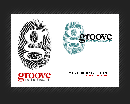
unhappy_mage's screams INPROFESSIONAL. How do you expect to print this? Keep in mind it's on a black background. MikeDeuce's screams PROFESSIONAL. Sure, it doesnt give you a first impression of a DJ company, but with a bit of tweaking it would work.
unhappy_mage's screams INPROFESSIONAL. How do you expect to print this? Keep in mind it's on a black background. MikeDeuce's screams PROFESSIONAL. Sure, it doesnt give you a first impression of a DJ company, but with a bit of tweaking it would work.
Tengis
Supreme [H]ardness
- Joined
- Jun 11, 2003
- Messages
- 6,090
What about this, or a variation of it?

Anything in the pic can be changed easily... thoughts on the BASIC design of the record/g?
Anything in the pic can be changed easily... thoughts on the BASIC design of the record/g?

Wow, trip out, very similar ideas, posted at about the same time..Tengis said:What about this, or a variation of it?
http://lexingtonfixit.com/pics/groove.jpg
Anything in the pic can be changed easily... thoughts on the BASIC design of the record/g?
Tengis
Supreme [H]ardness
- Joined
- Jun 11, 2003
- Messages
- 6,090
this?

I like this one better, but at this point I could do possibly anything with the record idea.
I like this one better, but at this point I could do possibly anything with the record idea.
Tengis
Supreme [H]ardness
- Joined
- Jun 11, 2003
- Messages
- 6,090
eno-on said:Wow, trip out, very similar ideas, posted at about the same time..
hehe, we are teh roxxor
Tengis
Supreme [H]ardness
- Joined
- Jun 11, 2003
- Messages
- 6,090
Another...

Tengis said:Another...
That's awesome, in my unprofesional opinion.
ScubaSteve
[H]F Junkie
- Joined
- Aug 15, 2001
- Messages
- 9,127
Tengis said:Another...
looks good, but I would suggest making the outer border of the record thicker, (closer to the thickness of the rest of the letter g below it )
MikeDeuce said:OK maybe I went a bit far with the groove theme (though I think of it as how spinning vinyl is a very touchy experience). Does your company work stritcly with vinyl or CDs or any type of media (or all)?
a Vinyl theme would rock, just for the classic sense of how we used to DJ
although im starting to get back into vinyl, using computers now
Tengis said:Another...
I agree with most other people here, this is the best one so far.
If you can make the G stand out a bit more, maybe change the color of it or make it bolder then i'll gladly buy that one.
Tengis
Supreme [H]ardness
- Joined
- Jun 11, 2003
- Messages
- 6,090
bolder = thicker? Bigger?
thanks!RandysWay said:MikeDeuce's screams PROFESSIONAL.
And another vote for Tengis' second one!
Tengis
Supreme [H]ardness
- Joined
- Jun 11, 2003
- Messages
- 6,090
I made the G a little bigger... and added a few things. The basic idea can be expanded upon pretty easily.


cuemasterfl
Supreme [H]ardness
- Joined
- Jul 5, 2001
- Messages
- 4,181
Tengis said:Another...
I really like that.
Tengis
Supreme [H]ardness
- Joined
- Jun 11, 2003
- Messages
- 6,090
Alright, I remade the one that seems to be liked the most and redid a few things that I thought might make it look better... just simple stuff...
These lines better? I put the old style of lines on this design, except made it a little more clean... again, for printing purposes and stuff.

These lines better? I put the old style of lines on this design, except made it a little more clean... again, for printing purposes and stuff.
Tengis
Supreme [H]ardness
- Joined
- Jun 11, 2003
- Messages
- 6,090
I sent you a PM =p
Picture in last post replaced...
Picture in last post replaced...
Tengis
Supreme [H]ardness
- Joined
- Jun 11, 2003
- Messages
- 6,090
Thanks alot, email on the way with the high rez pic... its a huge file... so... =).
edit: sent, enjoy!
edit: sent, enjoy!
wow, that's nice...I saw it and I was like.....Tengis said:Alright, I remade the one that seems to be liked the most and redid a few things that I thought might make it look better... just simple stuff...
These lines better? I put the old style of lines on this design, except made it a little more clean... again, for printing purposes and stuff.
very creative, man! Good work!amd ati FO SHO
[H]ard|Gawd
- Joined
- Dec 31, 2004
- Messages
- 1,901
wow
Nice work.Tengis said:Alright, I remade the one that seems to be liked the most and redid a few things that I thought might make it look better... just simple stuff...
These lines better? I put the old style of lines on this design, except made it a little more clean... again, for printing purposes and stuff.
Unknown-One
[H]F Junkie
- Joined
- Mar 5, 2005
- Messages
- 8,909
Just had to comment on this, it brings back so many memories about The 11th Hourunhappy_mage said:Well, I came up with one, but my website isn't cooperating today... Imageshack to the rescue!
...did you work for Trilobyte?