Feedback: IT Business Website

vischo

Gawd
Joined
Jul 27, 2005
Messages
854
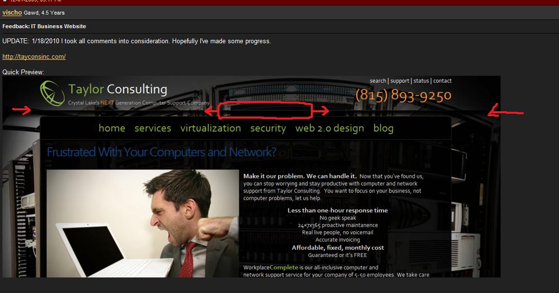
UPDATE: 1/18/2010 I took all comments into consideration. Hopefully I've made some progress.


Quick Preview:
websitewn.png


ORIGINAL:

I've put together a redesign for my IT consulting business. Please give feedback based on the design and layout.

The site uses Wordpress and I hand coded a custom template. I appreciate your time and feedback.

Quick Preview:
capturegri.png
 
Last edited:
I like it, very clean a nicely matching colors. Looks very professional.

My only first-glance critique would be page titles. I'd flip-flop them, so instead of having
something like:
Managed Services | Crystal Lake Network Management | Taylor Consulting

it would be:
Taylor Consulting | Crystal Lake Network Management | Managed Services

Only because in a tabbed browser you see your companies name, instead of the section title/category.

Just my inflation adjusted 2.5cents
 
Understood on the "too much text". I will play around with different ideas for the homepage. Any comments on the look, feel, layout?
 
I like the look and feel of it, but there doesn't seem to be much that defines the header, navigation, and body. It took until I clicked on another page to realize that \\tayconsinc was the current path
 
@CraftyChicken
AFAIK, having the keywords at the beginning is good for SEO. Until someone shows me otherwise.

@tgabe213
Will try to come up with some borders and maybe just a different color background behind the menu.
How else can I make the "breadcrumbs"?
 
I like it. Couple things, make the black background a little darker, it seems too transparent to me, I get distracted by the background. Also for the navigation I would personally like the text when you mouse over it to change to a darker color because it is an odd combination when you are moused over. Maybe go from the current color to the blue that home is (when moused over that is).
Also possibly add some kind of divider bar or like text bar between all the posts (like above or below the titles for each news article/review you post). Other than that just tiny nit picks about texts and other things. Overall I like it.
 
@Shadowssong
I have played around with some other colors for the menu items. I will try something else. I understand the green/white combination is kind of washed out.

Between posts, quick hr line with a grey color should help divide each blog post.
 
Thoughts...
- Who are your target customers? The front page wording seems more focused on geeks. Perhaps simplifying the wording on the front page (instead of throwing everything and the kitchen sink up front) would be better. Let the user drill deeper for more info, where you can elaborate and keep things on topic of what the user wants.
- Menu might be a little unorganized. Though I can't be certain as this is dependent on the page/navigation flow.
- Background image of servers seems like clutter in its current location. I'd move it to a page about servers as a content image, and put something more subtle in the background that won't pull the users eyes away from the content (ie: what you're trying to sell).
- Color scheme seems way too dark. Put something lighter in there to better pull the users eyes to the content.
 
My overall thoughts...
Too many words. Just give the basics on the front page "We take the job away from you!" kind of thing. Let them then have a "Services" page to detail what exactly you do.
For example, a quick search gave me this site. See how basic the info on the first page is: http://www.surrex.com/


As far as your breadcrum path, average joe won't get the \\path\subfolder thing... I'd just do path - subfolder


The buttons on the top seem too big when I hover over it. IDK, I just feel like it's for the elderly or something, not sure. But I would second the above, have the rollover text itself be blue.


I just don't understand the colors myself... You've got Blue (which could be rollover, current page, I understand that), Green, Red, and additional Blue for your menus and links. Just seems no consistency.


Then the footer text, really too messy with the current background. I'd darken the black background a bit, make it more opaque. Your footer needs to be on top of that black background as well IMO.
Same for the header menu, right now you've got the main page floated down, and that menu doesn't span across the whole top of the black background, if that makes sense. You've got visible background for half of the width, then your menus.
 
@PTNL
I will work on the copy. Menu will be affected because of this.
You really don't like the background? I think it looks awesome at 1080p. But I may darken it up again as well as the transparent black.
Too dark? Yes, but that was intentional. I have played around with more "white" look (white background, black text), but haven't gotten somthing that just pops as much as this design.

@TechieSooner
Agree on the copy. I will be working on it.
Breadcrumbs. This may even go away depending upon how much copy/pages/content I have.
The color scheme is green/blue/black. The red is only on Support! to draw attention. And I am playing around with the orange on the phone number to draw immediate attention.
Agree on the footer, I think I will bring the black transparent down there as well.
Header is a right float, you think the width should be 100% vs 50%

To be honest, when I first built the site, I added 30+ pages of copy and topics quickly copying other sites. I will be going back and heavily fixing/editing this.

Thanks everyone and keep the feedback coming.
 
The color scheme is green/blue/black. The red is only on Support! to draw attention. And I am playing around with the orange on the phone number to draw immediate attention.
To me, green= links, blue=current (or rollover).
So having the "status" up there be blue seems to break that.


Agree on the footer, I think I will bring the black transparent down there as well.
Header is a right float, you think the width should be 100% vs 50%
Yes on the header, I'd do it at 100%... Just looks weird as-is. You also have it set to black it looks like versus allowing the background image through... That makes it have a black line between the header and the main page content.
 
while the colors do look good, I do not think they represent a business professional's website. You should go for a simpler white background, black font. Maybe round the corners of the main box to give it a polished look. Break up the body of the text by having the header/ navigation look seperate.

Check out Booz Allen Hamilton or Northrop Grumman sites for better examples of what I mean.

As is your design looks good, it just looks like it appeals to a younger more tech savy audience. I'm not sure that is your target business.

edit: I see you have changed it a little since the screen shot. I would still round the corners and change the black background to white and the white font to black. And pick a simpler color scheme for the headers and accent colors. And as good as it looks, dump the server rack background. It takes longer to load and detracts from your words.
 
Last edited:
Investigating larger or more successful competitor sites may yield other design choices/tweaks.
 
The site looks good for a professional blog, but not necessarily for a sales page. Some constructive criticism:

1. Individual Wordpress articles should be better separated for the eye to separate the different topics. Right now they flow together.

2. Too many words as others have said. But more importantly nothing particularly pops and says "read me." This is the worst of both worlds. It's one thing to have too many words on a page, it's even worse if the reader's attention isn't drawn to where you want it to be. Some background colors inside your transparent body is an example for you to make certain text pop. Keep in mind a reader is only going to spend a couple seconds per page. And if you don't point them to where they should look they'll just go to another site and not read anything.

3. Your website is extremely slow to load for me. Even clicking your menu links takes a few seconds. I am on cable from north east USA. I personally wouldn't pay for IT webdesign/server services from a company that had a slow loading website.

4. The Contact Us form text boxes should be lined up and made a bit more neat.

5. I would center the images/links in the white box across the bottom.

6. Too much empty space at the bottom of the site.
 
@sheesh721
Thanks for the feedback.

I will be taking a thoughts into consideration as I take some time to update/change.

3. Your website is extremely slow to load for me.

I am going to move from Dreamhost. I've never had any real issues, EXCEPT the speed or should I say consistent slowness.

Recommendations? How does everyone feel about MediaTemple?
 
My thoughts:

1. Site took way too long to load - it took no less than 5-7 seconds and almost looked like server trouble until the last split second.

2. Too much text - even on the pages under construction - its like information overload.

3. Black BG should be darker - the BG photo fights for attention.

4. Maybe the front page would look better if you added some columns or boxes where info can be separated better. As it is, it all kind of just runs together.

5. Looking at the image posted on Dec 1st and the site today, I honestly don't see any changes despite excellent advice given by other forum members. Why aren't you taking into consideration what has been said?
 
I like the overall design of your site, but like others have said, there is too much information on the home page. As a suggestion you could put the latest blog entries in a sidebar which would be easier to see and differentiate from other content.
 
I got buried in that last page so let me copy:

@sheesh721
Thanks for the feedback.

I will be taking a thoughts into consideration as I take some time to update/change. Website updates are on a long to-do list.

I am going to move from Dreamhost. I've never had any real issues, EXCEPT the speed or should I say consistent slowness.

Recommendations? How does everyone feel about MediaTemple?

I like the overall design of your site, but like others have said, there is too much information on the home page. As a suggestion you could put the latest blog entries in a sidebar which would be easier to see and differentiate from other content.

I have been thinking about doing more of a 2 column layout, so I like your idea here.
 
"Frustrated With Your Computers and Network?" The blue is too dark to read well. And why is it a link to the page you're already on?

And why include links at the bottom that take you off the site to xhtml and css validators, especially when your css doesn't even validate?
 
What's with that black horizontal bar above the main page?? I don't like that

Might consider a white or light shadow behind your phone#. I don't know how it'd look but I'd play around with it, I think you could make it stand out a bit more than it is.

The content is weird... You've got left justified everything, and then you have a centered
list.


These might be IE8-only issues, but something you should look at...
The search button at the bottom of the page is laid ontop of the search field.
The "Read our whitepaper" form is all stacked on top of each other, space between the boxes would be good. It also seems the PDF icon is just too big but maybe that's just my taste.
Not crazy about the font the way it looks in the bottom, for the tags and calendar and stuff.


But overall much better :)
 
Overall, improvement. Congratulations on the work you've performed as every change I have noticed has been an improvement.

You have a big open site, yet the body font seems a bit small.

I would change line 45 of your style.css to 1.1 or 1.2em Doing this will help your the readability of your font, but you'll once again have to scale back some of your content from the home page. I would recommend also resizing your graphic to 400 pixels in width. I see you already resized it from 499x333 to 449x300. I would go slightly smaller still. This will enable you to expand your font size a little and keep more content.

The bold in the "make it our problem. we can handle it." and "afordable, fixed, monthly cost" etc on your intro statement does not clearly make those statements stand out, nor does it separate information for the eye. I still think you need to separate your information a bit better. Upping the font size does help with this slightly, but still not enough. When it comes to "Make it our problem" you may even want to experiment with changing fonts.

I agree the pdf Icon is large, but I like large icons like that. I like that the pdf icon makes a bold statement like the rest of your site. I do, however, believe the icon looks out of place with the small form you have next to it. It looks like you're using a Wordpress plugin to create that form. I would modify it to increase line spacing, line up the input boxes, and perhaps center the entire form+icon on the page.

The "find it" button overlaps your search. This is a quick fix, but you may want to add the rule to your CSS.
HTML:
<p><input type="text" value="Search keywords" name="s" id="searchbox" onfocus="this.value=''"></p>
<p style="text-align:center;"><input type="submit" value="Find it" class="submitbutton"></p>

As a personal preference I have never been much a fan of tag clouds on business websites, at least not directly on the homepage.

Overall, my biggest advice is to break up the different text portions better. When using a CMS it is often easy to get accustomed to the WYSIWYG editor, but you really should try to incorporate png graphics or secondary CSS on your intro statement.. especially for what you are doing. It will help break up your text a bit and make it easier to read as well as clearly define what you are trying to project. There is nothing wrong with borders/backgrounds to separate content.
 
Last edited:
For comparison reasons I am going to pick a random site that I can use it to help explain my layout suggestions. I am in no way advocating for you to copy their template, just to use their mentality in terms of layout.

http://www.wikihow.com/Take-Action-to-Get-a-Canceled-TV-Show-Back-on-the-Air

Right up top you have a clearly distinguished menu from the rest of the site. It stands out because they used a separate background color as well as a border. They also made it very easy to tell where exactly you are. The menu locations are clearly defined as well as what site the user is currently on.

The intro portion of the site is clearly defined from the rest of the site. In your case your content is different, but it should be clearly separated from the rest of the site. You have chosen to bold certain portions of the intro, there is nothing wrong with putting them in a ribbon or some graphical use on a background to make it stand out.

If you look at the headings, they are clearly defined once again (steps, tips, warnings, etc). They wrapped it up all up, literally.

Even the footer is a good use of sitemap (not labeled as such) and they have a clever use of search and categories layout.
 
Overall, improvement. Congratulations on the work you've performed as every change I have noticed has been an improvement.

Thank you.

I would change line 45 of your style.css to 1.1 or 1.2em

Agreed and done.

The bold in the "make it our problem. we can handle it." and "afordable, fixed, monthly cost" etc on your intro statement does not clearly make those statements stand out,

What about doing something like this? In CSS of course. Wouldn't embed the text in the image.

capturehe.png


It looks like you're using a Wordpress plugin to create that form.

I need a better contact form plugin, one with better xhtml/css. But I can't seem to find one. I'm working on making this look better and more usable. ie Highlight selected fields, auto erase default input etc.

As a personal preference I have never been much a fan of tag clouds on business websites, at least not directly on the homepage.

I'm working on making a completely separate template for the homepage.

Overall, my biggest advice is to break up the different text portions better.

Would you elaborate? Make the headers more defined?

Thanks again.
 
Last edited:
Drop the highlighting of support in red; you don't want to draw attention to it as though there is an issue. If an issue is worthwhile a user will search for it, if it's blatantly obvious people will complain about non-issues.

Consider changing your home page to something more dynamic like News/Innovations .. something.. different than home, its abused terminology that tends to get the content people can't logically place elsewhere.

The information that is less static should be sunk into an about us or information type of page.

The home page as it is looks like an ad, it comes off like you're trying to wow people.

The support industry is not about wow, to penetrate that market you need to provide excellent support at a reasonable cost, but reaffirm that they're always there when you need them.

Being overly hype driven on your home page will make you sound too desperate. Make it concise.
 
Back
Top