Okay so I'm a sophomore web design student at a local art school. I'm looking for feed back on this initial screen design, it's just a picture and has no functionality. This is actually going to be the first working website I make for my studies.
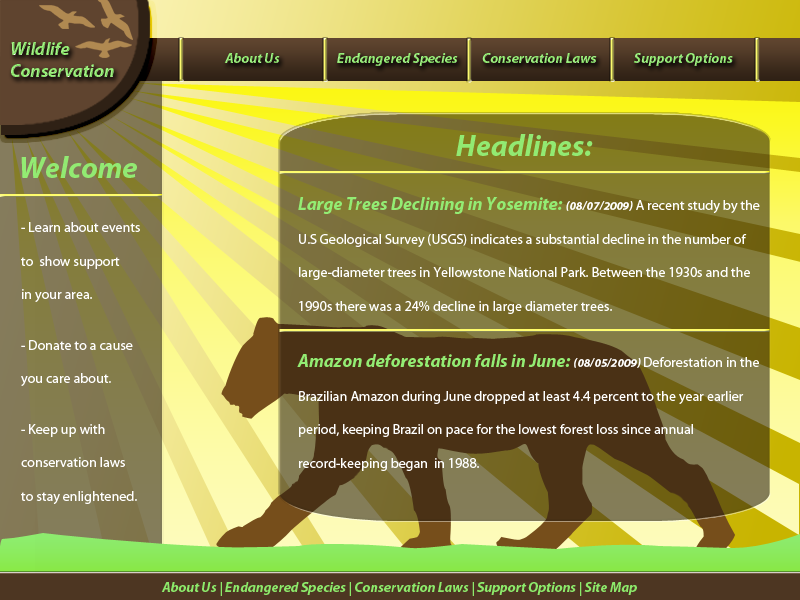
Heres a very brief description of what it is: In class we sort of put our ideas for web sites into a hat and had to pick one to make, my topic was "Wildlife Conservation" so I'm doing my best to adhere to the theme. The color design is close to split triadic. The background features various yellow, the containers and sub highlight color is brown, and the main highlight color is green.
The assignment was to make a basic homepage layout, this will undergo edits before the other pages are created.
I'm not very good with the pen tool yet, so the one drawing in the center of the page will improve.
** I ask you to critique me as a professional because these are the standards I will be held to the rest of my life, so disregarding the fact that I'm a student, what would you think?**
A preemptive thanks to anyone who responds!")
Heres a very brief description of what it is: In class we sort of put our ideas for web sites into a hat and had to pick one to make, my topic was "Wildlife Conservation" so I'm doing my best to adhere to the theme. The color design is close to split triadic. The background features various yellow, the containers and sub highlight color is brown, and the main highlight color is green.
The assignment was to make a basic homepage layout, this will undergo edits before the other pages are created.
I'm not very good with the pen tool yet, so the one drawing in the center of the page will improve.
** I ask you to critique me as a professional because these are the standards I will be held to the rest of my life, so disregarding the fact that I'm a student, what would you think?**
A preemptive thanks to anyone who responds!