• Some users have recently had their accounts hijacked. It seems that the now defunct EVGA forums might have compromised your password there and seems many are using the same PW here. We would suggest you UPDATE YOUR PASSWORD and TURN ON 2FA for your account here to further secure it. None of the compromised accounts had 2FA turned on.
    Once you have enabled 2FA, your account will be updated soon to show a badge, letting other members know that you use 2FA to protect your account. This should be beneficial for everyone that uses FSFT.

Contrast eye strain

cerbul

Limp Gawd
Joined
May 14, 2012
Messages
242
First I am going to say what monitor exactly I am looking for.
First, I am a programmer, and I work with text a lot.
Second, I am a gamer, is true that I don't play fps games competitively(although I did), but all I can say about this, is that a Samsung S24A350H, 2 ms response time, is more then enough for me. From here I can assume that anything up to 5-6 ms response time is just fine for me.
Third, I do watch a movie every 2 weeks on average, but as long as a monitor is good enough for fps gaming, only black levels can remain a problem.

I have a problem with my current monitor, Samsung S24A350H, works just fine in games/movies, but when I work with text, my eyes are really stressed, and after 2 months I was unable to get used to it. I tried everything that crossed my mind, starting from calibration, guides, different premade profiles, etc.

The reason I did come here is the fact that after I visited a big company that had many monitors to check, I came down to the conclusion that monitors like: Apple Cinema Display, Dell Ultrasharp-2 3 models, Eizo (a color edge and a few flex scan monitors) all were really alright for my eyes, making it extremely easy to read text.
I also started to blame the coating, but I noticed that a few of the Dell models were just fine for my eyes, even though I could notice the hard coating, but curiously, the text was crisp/black enough that I could read without problems.

Based on this experience I started to think that the problem comes from the contrast capability of the panel, and not the technology used in it. I saw IPS, PVA and TN panels that were just perfect to read text on. Contrary to this I saw an LG IPS panel that was just as bad as my Samsung to read text on.

Is it correct what I am saying? Is the poor quality of the panel being the problem(I know that I have a cheap monitor) or should be something wrong with my monitor? If I raise the contrast of my monitor up to 100, the image becomes yellowish, and is "glowing" strong, just like when you make a photo with over exposure parts. Only when I reach very big levels of contrast I am able to read the text a bit easier, but my eyes hurt cause of high level of brightness. Is my monitor defective? or is the poor quality of the screen the problem. Is it realistic to blame the contrast capability of the panel for my eye strain? Or is it something related to the low cost, and any more expensive screen will do just fine?

Please advice me if a monitor Eizo FS2332 is good enough for text reading, and please note that when I am asking about text reading I don't care about presets for text reading being build in, as I assume I can do that manually if needed or find a general software that can do it. What I am really talking about is to be sure that the contrast or something else(what else could be?) is good enough on that monitor so that I can easily read text.

I would really appreciate if anyone could give me some hints about what exactly makes it hard for me and probably for other users to read text, as I am clueless, especially that various types of AG coating, be it light or heavy does not affect the text readability on some of the more expensive monitors.(I do understand that if "that" something is at the inferior limit, ag coating will make it worse, but in the same time, a panel that is poor quality will be hard to read text on, even if it were glossy).

Thank You

P.S. Just so other people know, as I was "blinded" by the specifications of the TN panel. A TN panel has a realistic view angle of as low as 60 degrees, anything over 60 degrees will suffer from gamma shift, and the colors will look bad. Don't let yourself fooled by the specifications. Even if you have your head positioned perfectly in the middle of the screen, if you don't cover the entire screen with your 60 degrees angle, you will notice the gamma shift. When you move your head just a tiny bit up or down, (2 3 cm will do it), you will notice the image getting darker or whiter, depending if you go up or down with your head. (no one really wants to know my frustration on this "viewing angle" specification and the truth behind it).
 
Last edited:
With eye strain, there are generally two quick steps you should take:

1. Lower the brightness and contrast of your monitor. Most eye strain is caused by your eyes quickly shifting between high and low brightness areas. You really want your monitor brightness to be as low as you can comfortably use it. I have mine set to 40 cd/m2. It looks unbelievably dim right after lowering brightness to 0, but after a a few minutes, I begin to get used to it.

The contrast ratio of printed text ranges from 10:1 (newspaper) to 50:1 (copy paper). It is astronomically lower than anything we experience on LCD screens.

Take a look at Eizo's "Paper Mode": www.eizo.com/global/support/wp/pdf/WP010-002PaperMode.pdf

And a webcomic: http://www.eizo.com/global/products/library/manga/pdfs/Guide_to_preventing_eye_fatigue.pdf

You can also try f.lux, a well regarded piece of software: http://stereopsis.com/flux/

2. Adjust your room lighting. You don't want extreme variation in light; lights directly behind your monitor, or reflected from the front of your monitor, can cause eye strain. It's the difference in brightness that's the key; bias lighting etc. can help mitigate this.
 
You may be sensitive to the flickering of your display backlight. If you can, try raising the display brightness to full and reducing the brightness to a comfortable level by changing the "contrast" option in your video card drivers. This will have the side effect of reducing the contrast as well.

More info here.
 
You may be sensitive to the flickering of your display backlight. If you can, try raising the display brightness to full and reducing the brightness to a comfortable level by changing the "contrast" option in your video card drivers. This will have the side effect of reducing the contrast as well.

More info here.

I tried to do this but even if initially I felt like there is less "light" coming out of the screen, I still get eye strain. When I reduce the contrast, the image becomes foggy, instead of getting darker, this is one aspect that I find strange. I didn't get the same foggy image on my ATI video card from work. At home, where I intend to use my monitor I have Nvidia. The only way I was able to keep the black levels was to reduce both brightness and contrast from Nvidia control panel, but there is no gain to this as I loose all details for deep blacks.
Even if I find it strange to have such behavior, I think is not the flickering causing me problems. On a crt monitor that flickers pretty badly I didn't have any problems with this.
Am I expecting too much from this monitor to keep deep black details while reading text, or is a limitation that I should accept and live with?

As an answer to the other post, I am trying to explain the fact that if i lower the brightness I still get eye strain, as I find the difference between black and white too small, causing even more eye strain. Honestly, in 2 months it was a bit easier to get used to huge level of brightness instead of lowering it, but I know that is not healthy on the long run for my eyes. I find it simply impossible to get used to having brightness reduced. I would rather have my white intense but less glowing, so that I don;t feel like I am looking directly at the sun.
 
contrast should almost always remain at default value and only exception of this rule is when factory value is wrong. For evaluating that use this and this

and for the main issue: some monitors are just bad for eyes, especially W-LED technology can be really bad in that area. It is not flickering but excessive blue component W-LEDs generate that is tiring blue cones. Some monitors filter it better and some not but generally W-LED are more tiring at given brightness than eg. CCFL. Reducing brithtness will help but it is not good solution because like you noticed: image looks like crap...

best you can do is to get decent CCFL VA panel. There are no new monitors but fortunately there are a lot of great second hand S-PVA or S-MVA 24" monitors that are not only cheap but also better for text than anything you can get right now. If you find hard you might get unused one with some warranty. Eventually NEC 2490WUXi (without 2) it would be just killer monitor even if it's not VA.

From new monitors I don't see many choices... those with good cating use W-LED and those that use WCG-CCFL use bad coating... truly hopeless situation...

ps. if you can get Samsung F2380MX it is good text monitor with contrast at least 3 times what you get from other monitors (= good for text!) and generally nice colors. But beware, buy only MX version as others have terrible factory calibration...

I have mine set to 40 cd/m2.
100cd/m2 should be much less tiring. Do you have photophobia? :eek:
 
Last edited:
You are reading black text on a white background right?

As XoR said the blue component might be too bright for you. If you are not doing anything color-critical you might try lowering the blue channel in the display (or video card driver) by 10-20% and see if that makes a difference.
 
I have problems with both reading black text on white background as well with reading white text on black background.

There is a big part of truth in the blue color of it, as I did reduce a lot the blue after 2 weeks, and my time in front of the monitor increased from 10 minutes to 1 hour. I had a blue background image that I was using to compare, and I didn't notice that there is too much blue. The issue though is that anything I used to calibrate it indicated that there is not enough blue, but when I had the resulting icc profile applied, the image was too blue. There is something wrong with this I am sure, probably the fact that the light that comes from the monitor is blue by itself. I start to believe that LED is not a solution, or not at least until I get used at home with blue lighting instead of incandescent one. (all the lights inside my home are incandescent). The method I used to notice that there is too much blue was to make a magnified picture with my camera on a gray area, and the result was that I was seeing blue color being too bright, or in other words, blue color seemed to be leaking out of the pixel. Curiously, the image was still gray. The thing that I conclude out of this is that the blue color in my LED monitor is not blue enough even if it "glows" out of the pixel? It is just like the manufacturer concluded that the blue color is not blue enough, and increased the level of "brightness", to reach the intensity level required to reach the level of red and green. There is also the chance that my monitor might be defective, or is a limitation of the technology. I have no clue about it.

Unfortunately I can't afford 2x monitors, a PVA for text reading/programming, and an IPS for gaming/movies/color work. And TN panels I will never buy again in my life. So I will have to chose either an IPS that is good for text reading, or a PVA that is good enough for gaming. Any advices? Or to ask another way, what is more realistic to find? An IPS that is good for text reading? Or a PVA that is good for gaming?
 
I have very serious allergies to flat screens and light I use a CRT for most everything and game only on my days off I read LOTS of message board posts on the net and tried to find


I just upgraded to the newest 301.40 Beta Nvidia drivers and my eyestrain is gone seriously.
I have really really sensitive allergies to light photosentive. I complained on the Nvidia forums about eye problems and the drivers do effect 2-D display of text and other objects.
I have a regular EVGA 550ti graphics card.

I have my monitor more then a arms length away from me with 125% increase in desktop size in IE9 and the desktop. I do LOTS of reading online.

I have a ASUS 21"like this one here I couldn't stand it at first but I adjusted the settings to 52 B 30 C and 20 B 30 C in Nvidia settings. It's a LED LCD I can't use regular CFL tube monitors I black out and have vision problems.

http://www.amazon.com/Asus-VE228H-2...PHDM/ref=sr_1_1?ie=UTF8&qid=1337161226&sr=8-1


Also use the ASUS monitor in Night View mode most of the time unless a game is too dark for the different tempeture.
 
As an Amazon Associate, HardForum may earn from qualifying purchases.
If your surround by Dairy Queen Flouresant lighting get rid of all of them and use incadesants.
 
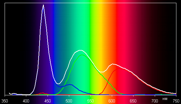
problem with blue in W-LED is with it's light spectrum
spectrum.jpg


I had the same problems with W-LED A-MVA, excessive blue and it wasn't that it was "too blue" like in wide gamut. There were just no ideal whitepoint and I still had feeling there is too much blue even if image was already yellow from reducing blue component. At the same time blue wasn't really very saturated as it felt rather pale...

My old Spyder2 was reading very high blue values and calibrated screen to the point it was completely yellow and now interresting part: this spyder2 don't have problem with more sophisticated RGB-LED monitor with builtin sRGB profile and reads it as ~6500K and ~sRGB gamut :eek:

this is general idea of RGB-LED light
RGB-LED_13415_image001_2.gif

here all color components have the same properties so if we see 250cd/m2 all cones get exactly the same type stimulation hence 250cd/m2 not only make any fatigue on eyes but whole greyscale looks just like that: grey. Also no subpixel bleeding of any color. Unfortunately monitors with RGB-LED are rarity and are very expensive, especially buying one for text would be overkill ...

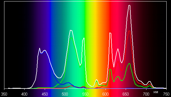
and here on the other end: WCG-CCFL
spectrum-srgb.jpg

guess what... it bleeds subpixel red like crazy, especially on all vertical lines...
also it have this warmness in all colors, even blue is warm on those....
Good thing is that WCG-CCFL is not really tiring to my eyes like W-LED does, but I couldn't use it with text anyway. AG might be main reason but maybe not...

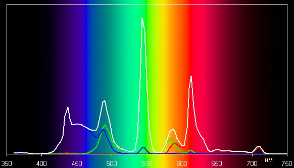
with normal CCFL there are also different light spectrums. Some are better and some not
spectrum.jpg

this is definitely not good monitor...

one thing is sure: most LCD sucks...

ps. best bulbs are these:
1288_mieszkanie-zdjecia_1_jpg_zdjecia-artykul-zarowka-art.jpg

not so energy efficient but eyes are more important!
 
Last edited:
I had almost the same problem as u did. I had a crappy TN 22 pannel ,and after 20 minutes my head was hurting. I looked into buying a better monitor,and i found that the best around are IPS monitors. Next problem is that almost all ips monitors have AG coating,wich again its said to cause eye strain... After more reading i found the apple cinema display 30". Safe to say after few months of use,my headakes are gone,going from 22 to 30 is huge,but the display its just easy on the eyes. I still get dry eyes(i was having this also before along with headakes),maybe not the beat technology ,or the newest monitor out there,but much much better on the eyes than what i had before. I also had an hp24 zwr for one weak,and the AG coating was horible,reading text on white was just killing my eyes,so i sugest i stay away from monitors with AG coating... Unfortunately there aren't many options remaining,but that eizo monitor seems like a good choice. I would also recomend nec and also trying the ACD 30".(not to mention the real estate u get when programing on a 30".
 
The 30" Cinema Display has the same antiglare coating as any other 30" monitor.

I have no doubt that some people have an adverse reaction to antiglare coating, but it is well-understood that reflections on glossy screens contribute to eye strain.

Regarding the 40cd/m2, the monitor is actually slightly lower than that; it's the lowest OSD setting, a combination of minimum backlight and digital white point reduction. The contrast ratio takes a hit. These are good things for working with text.

Some editors/ide have color schemes designed to improve readability and reduce eye strain. You can see some here: http://ethanschoonover.com/solarized
 
i had one HP ZR24zwr for 1 week and that one had a very agresive AG,anything on white was just hurting my eyes.Maybe that 24 model had a different panel,but the ACD is no where near that HP.
 
The 30" Apple Cinema Display used the same panel as the Dell 3007WFP, LG.Philips S-IPS (LM300W01). It has the same antiglare coating.
 
I find quality TN panels to be superior for text than IPS, especially when it comes to eye strain. The TN panel feels like "film", whereas the IPS stuff feels jumpy to me.
 
...I use "nosquint" addon for firefox to make some particular site backgrounds grey and text a sharper black with only a few clicks (plus zoom text amount slider) on a per site basis which it saves. You can also use "ColorThatSite!" addon for firefox to micromanage site colors even more - and the two addons can be run concurrently. This helps vs the "staring into a flashlight" effect when you have your brightness/contrast set to pop more.
.
You can mess with cleartype settings, and you can switch your default fonts in windows and/or your browser, or on a per site basis with those addons in browser. There are also a few alternative font renderers that some people like to use instead of cleartype but I never bothered.
.
...Some of my older monitors had different modes - Game / Multimedia / Text modes, with the text mode being much paler contrast/brightness. My TV also has three modes which I use during different times of the day, or depending what type of content I am watching.
...Your video card drivers might have different profiles you could set up that can be switched either using a hotkey or clicking on system tray menus. So you could set that up and make an easier-for-reading-text profile to swtich to on the fly.
..
For my desktop monitors I generally leave them with a little more brightness/pop for imagery and just use the addons for browsers, rather than having two sets of settings. I do turn the brightness down a lot compared to out of box though, which is usually ridiculously bright. I keep some lighting behind the monitors at all times, so that the lighting doesn't vary much throughout the day. That way the monitor settings remain the same to my eyes rather than the contrast/brightness changing based on room lighting. I also keep no light sources behind or above my monitors or myself (at my main desk anyway). I do this by keeping my corner desk facing out from a corner rather than against the wall like a bookshelf. This avoid direct light reflections and direct light pollution on the face of the monitor(s) in general.
.
.. Personally I have no problems reading text on various monitors I have. TN's , IPS, mostly glossy but one is a large matte one. I did have an aggressive AG coated monitor at one point and found reading text on it horrible though.
 
I might be old fashioned, but I really find it disturbing to have to use custom colors for websites, especially on per website basis. I understand using different profiles for, text, gaming, movies, website, that would be nice to automatically change depending on what application is focused at one time, but 95% of my website work is searching information/documentation/examples for my work, and I can't live with a per-website color modification solution.
I never had this problem on my CRT monitors, but I "consumed" 3x 21 inch CRT monitors in the last 10 years, and I am forced to move on towards the new "awesome" technologies that we have no choice but to pick deal with.

Is there anyone having similar problems to what I am experiencing, that can actually say something like "I used this monitor model XYZ that hurt my eyes and I changed to ABC monitor that is just fine for my eyes/better detail/contrast/etc and the problems are completely gone"?
 
Is there anyone having similar problems to what I am experiencing, that can actually say something like "I used this monitor model XYZ that hurt my eyes and I changed to ABC monitor that is just fine for my eyes/better detail/contrast/etc and the problems are completely gone"?

Yes.

Several years back I very briefly owned a Viewsonic TN monitor. It was fairly brutal on the eyes in addition to having poor all around image quality. My solution was to pick up a Samsung S-PVA monitor and an NEC 20wmgx2 and have my own monitor shootout, if you will. The NEC won by a fairly large margin and was also very easy on the eyes. It served me well for many years.

All those models are long gone, but, the point I'm getting at is that if you're a little more demanding than the average user, you're going to have to do a little hands-on experimentation until you find something that satisfies you. Just pay close attention to the return policy of any store you're working with.

Regarding the Eizo FS2332, I haven't seen it, but what I've read looks good at first glance and Eizo is a brand I respect. I'd probably feel comfortable giving it a shot if I were in your shoes.

One other point that hasn't been mentioned yet - the sharpness setting. If it's set too high, and it most certainly can be too high by default on certain displays and modes, the result can be pretty unpleasant for the eyes. Test patterns can help you get this setting into the right ballpark.
 
Last edited:
I won't go back to 20 inch monitor, I need 23 or 24 inches, and I will only pick a 22 inches if I really find the "perfect" monitor, which I read all over the internet that it does not exist....
So I understand from here that AS-IPS is a good choice quality wise, but can't find it in any panel other then the 20 inch ones.
 
Last edited:
That won't be an issue, given that the 20WMGX2 has been discontinued for a very, very long time. As for the AS-IPS panel, to my knowledge the panel maker has long since moved on to making newer and different variations of the IPS panel type.

I mentioned the monitors in my example mostly to illustrate the advantages of comparing and viewing a couple alternatives in your own environment and lighting conditions, connected to your own computer or other source.

Aside from the Eizo, were you looking at any other options?
 
My problem is that I saw many ppl not having a problem with various types of panels, and I am tempted to believe that for me can be a combination of not using any LCD in my life before, working with too much text, maybe I even have eyes problems, or I might have used too good CRT monitors for long time and I can't accept compromises.
I need to buy a total of 3 monitors:
1 for home - gaming + programming - this one has to be 400-600 $
1 for work - only programming, 400-600$
1 for work but not for me, this one has to be for color critical work, unfortunately the budget for this one has to stay close to 800$, maybe I can go a tiny bit upper, but I don't think I can get any apple monitor...

For home would be the hardest pick, as I need the monitor to be working nicely for both gaming and programming, and on top of that I have less light, and especially in the evening when I am forced to work with light down(little baby sleeping), I get eyes strain.
For work for programming, I would go ahead and buy whatever panel I find IPS or PVA that has good contrast and is not hard on my eyes, regardless of the response time. If I find a decent solution for home, I will try to buy the exact same one for work, so that I don't have any differences.

I prefer to go with IPS technology, I have no clue if W-LED or CCFL/etc, I have absolutely no idea which would be the best solution. At work I got no chance to go with any glossy screen cause I got a window behind me, but might consider this option as I work only with text, (I don't play games/watch movies at work, so is easier).
I will stay away from anything I hear to have hard coating, as DELL, though I saw some older models of DELL that are really decent.
So here is what I thought about so far:
- NEC 2490Wuxi - ofc impossible to find
- NEC 2490Wuxi2 - I consider this to be a solution as I don't think I will have any problems with ips glow, and is out of my budget, will only buy if it would be the only solution left.
- Hazro HZ24W - not sure yet, but it seems that it has an A-TW polarizer, and is a decent IPS.
- Eizo FS2332 - I read on their website that there are some problems with this model and with the FS2335w, so I am not sure what to do. The 1st main reasons I would go with Eizo is the fact that I assume a better quality panel from angle/no bleeding/light uniformity point of view, simply cause I do expect them to have higher standards for the price, and the second reason is the fact that I saw in action a Color Edge version and has really decent coating.(or again, I might be tricked by the quality of the image and not notice the maybe hard coating on it)
- Samsung S24A850D - samsung PLS I am sure that will be the cheapest IPS ever, and might even be annoyed by the low angles of it, but I am considering it for the simple fact that it has a semi glossy/matte screen.
- NEC PA231w and PA241w, I am actually considering this one also as a solution for color critical work.. might be wrong tho.
- ASUS ProArt PA246Q might also be a good solution for it.

Since many ppl are just fine with some types of panels, doesn't mean I will be fine with them, and what I am experiencing with my S24A350H I have not seen anyone else on the internet having exact same problem. I found someone in my town with a calibrator, and that dude is also fixing monitors for a living, so I hope that he notices something about it, or I really hope that the calibrator will say "dude, this monitor is broken, can't calibrate it". Fingers crossed. (yes, i reached THAT level of annoyance that I really do hope is broken..)

As you can see, I got many options that I search information about, and I don't even know if I will get used to any of those or not. One thing is for sure, I need to pay more if I want a decent panel. I worked for 1 hour on an Apple screen, and was awesome, but can't get one cause of the budget. Eizo Color Edge (forgot the write down the model, but was a 22 inches one) was great. The Dells are a bit strange. All the older models were better for my eyes, but did have really low contrast(image look like an old picture), and the newer models were harder to read text on, cause of the coating making the whites look dirty. I really don't know what to believe about them, so I am staying away from them.
I also saw also an LG236v IPS, and was totally dissapointed with it, both poor quality tilting, and the image was even harder to read text on then my Samsung, but indeed there was no calibration on it. I will stay away from the cheap IPS models.
I don't know what else to say, but I got a lot of mixed up ideas that don't match, due to very limited contact with those monitors, and due to the fact that I didn't use any LCD until now. If anyone can add better options to those that I stated above, or "cut" some of them based on personal experience, please let me know.
Also, will let you know the result of the calibration as soon as I have done it.
 
What brightness is your monitor set at?

High contrast will not help reduce eye strain. Eye strain is usually caused by too dark text on too bright a background. If you are working in text, you should make sure that you are not reading dark text on a bright, pure white background. There are a number of options to achieve this, from the f.lux program I mentioned earlier, to skinning your editor, to configuration options on your monitor itself. When working with text, you want to lower the contrast, not raise it. Think of the kindle, which has a 10:1 or 20:1 contrast ratio.

TN panels often have significantly higher measured contrast ratios than IPS. There is no way that the problem you are having is caused by insufficient contrast on your monitor.
 
I mentioned several different angles you could attack that. Making the screen more pale while working with text was one of them.

...Some of my older monitors had different modes - Game / Multimedia / Text modes, with the text mode being much paler contrast/brightness. My TV also has three modes which I use during different times of the day, or depending what type of content I am watching.
...Your video card drivers might have different profiles you could set up that can be switched either using a hotkey or clicking on system tray menus. So you could set that up and make an easier-for-reading-text profile to swtich to on the fly.
.
.
Personally I prefer to use the other methods I mentioned in the other parts of that post, and to use different monitors for different tasks:
...apps, imagery, browsing = high resolution and ppi ips,
....gaming motion = 2ms high/very high RTC TN (or a FW900 graphics professional CRT)
... other misc text/chat/readouts/vol mixers/playlists/progress meters/erc = portrait mode monitor(s) of any type which don't display much imagery at all usually. (Mine are $110 ea. 1440x900 TN's set back a bit to better match my main 27" monitors).
... Movies/Shows = a real TV (VA lcd or Plasma for better black levels and detail in blacks) with a modest surround sound system.

I know this isn't a realistic option for everyone. For several years I used a 1920x1200 27.6" TN that was under $400 , next to a fw900 crt (A condition model that was around $440 shipped at the time off ebay warehouse dealer). I used the TN for most text, apps, browsing, etc.
.
I think brightness is the worst offender, which relates to contrast. Another person mentioned sharpness which sortof relates to cleartype and aliasing, which can be customized as well.
 
What brightness is your monitor set at?

High contrast will not help reduce eye strain. Eye strain is usually caused by too dark text on too bright a background. If you are working in text, you should make sure that you are not reading dark text on a bright, pure white background. There are a number of options to achieve this, from the f.lux program I mentioned earlier, to skinning your editor, to configuration options on your monitor itself. When working with text, you want to lower the contrast, not raise it. Think of the kindle, which has a 10:1 or 20:1 contrast ratio.

TN panels often have significantly higher measured contrast ratios than IPS. There is no way that the problem you are having is caused by insufficient contrast on your monitor.

I am tempted to believe that you are right, however, no matter how low I changed the brightness(using 44 atm) I still get too much light leaking out of white backgrounds.

The calibration results with a calibrator were pretty poor, unfortunately trying to calibrate the screen to 120 luminance gives pretty foggy-bright colors. Should I try different value? Crt has 100?

However, I tried again my monitor on VGA cable, and curiously, the text looks almost fine.
Then I changed back to HDMI cable, and I changed the HDMI black level to normal. Guess what, text is more readable. With HDMI black level set to low i am "comfortable" with a brightness set to 44, while when setting black level to normal, the brightness has to go up to 75. This was the most CLOSE way to get a better readability on the text.
When I use HDMI black level to low, the games/movies look awesome, but the text is impossible to read. If I lower the brightness to the level where I can see no more light "leaking out of pixels", the image is already too dark, and whites look gray. In the other hand, if I change to VGA, I can go much higher with brightness, in order to obtain correct whites, and is much closer to what my old laptop is.
Anyone can help me with this issue? I messed around with RGB/YCbCr444 in Nvidia Control Panel, and it seems that I get access to HDMI Black Level on my monitor only when is set to RGB. However, it feels like none of the "Normal" or "Low" level of blacks, solve my issue, and the most readable text is using VGA (please don't answer me to stick to VGA, cause I will defo do that anyway until I find a solution ).
Games look better on HDMI, and the images over all are looking better, but it seems that the level of blacks/correct whites are only decent on VGA cable. Anyone can help me with this?
 
Last edited:
Update:
I made the driver fix trick from Nvidia forums, for the second time, but I didn't think first time I did it about changing back to 16-235 mode for testing, as I was considering this mode totally unwanted. Surprise: it partially fixed the problem:
The thing is, windows desktop colors look fine, almost as good as VGA when using HDMI cable + RGB mode (nvidia driver) + 16-235 from Monitor Black Levels.
When I change to YCrCb444, or if I use RGB + 0-255 from Monitor Black levels, colors look totally wrong, causing eye strain. The bad effects that I get are those:

- all light colors feel overbright, and no matter how much I reduce the brightness they still seem to leak too much light out of the pixels.
- all blacks from the desktop fonts look gray, while curiously, games+videos have correct deep blacks.
- when reading white text on black background in games, the colors are waaay too bright, and leak light out of the pixels.

When I use a desktop wallpaper, it will look washed out with 16-235 mode, but text is readable, while test is fine.

The fix that I was able to do from Nvidia forums only fixes this particular mode: HDMI + RGB + 16-235 Black Level, while there is no other configuration that is able to show correct colors when using 0-255 black levels.
One other aspect of the problem is that the "fix" doesn't give as good results as isntalling a VGA cable instead, but is acceptable for reading text. However I am not happy with halfs of measure, and I will not rest until I get my things working correctly. And you can imagine how angry I am after 2 months of my life wasted without being able to tell what is wrong.

Anyone able to help me with this? Does ATI has the same problems? Will there be a fix for it with Nvidia? Is it likely that my monitor is not defective and is a problem with Nvidia?
 
there is nothing wrong with Nvidia

first of all, does it have DVI connection? If it does use it instead of HDMI.
HDMI is TV standard and some monitors go as fas as use crazy image postprocessing when connected to HDMI. The fact that you have RGB/YCr444 16-235/0-255 settings is proof something is really wrong !

also use this to set sharpness. If you can't get uniform colors then use level that is more blurry rather than more sharp. Also this and this. If at 0-255 you see all black levels and don't see white levels then you have probably altered "contrast" setting on your monitor. Reduce it until you can distinguish all levels.

if your monitor needs 16-235 on HDMI then changing it to 0-255 won't make black blacker or white whiter but just cut 16 shades on both sides making image appear more contrasty. Even if it seems "better" with games/movies it's wrong and just never use it!
 
there is nothing wrong with Nvidia

first of all, does it have DVI connection? If it does use it instead of HDMI.
HDMI is TV standard and some monitors go as fas as use crazy image postprocessing when connected to HDMI. The fact that you have RGB/YCr444 16-235/0-255 settings is proof something is really wrong !

also use this to set sharpness. If you can't get uniform colors then use level that is more blurry rather than more sharp. Also this and this. If at 0-255 you see all black levels and don't see white levels then you have probably altered "contrast" setting on your monitor. Reduce it until you can distinguish all levels.

if your monitor needs 16-235 on HDMI then changing it to 0-255 won't make black blacker or white whiter but just cut 16 shades on both sides making image appear more contrasty. Even if it seems "better" with games/movies it's wrong and just never use it!


Okay, here is what I have:
My video card connections:
1. DVI1
2. DVI2
3. Mini-HDMI

My monitor connections:
1. VGA
2. HDMI

a)When connected with DVI to VGA, all is good.
b)When I connect either DVI to HDMI or Mini-HDMI to HDMI is getting tricky.
And here is what I get in this situation:
I get in Nvidia Control Panel the option to choose from RGB and YCrCb444.

When I choose YCrCb444 I don't have any option to change my monitor black level, but the colors are totally wrong. I am not insisting on using this.

When I choose RGB I get the option enabled in my OSD to change monitor black level to either "Normal" or "Low".
When I change it to "Normal" black level, the desktop colors look fine for reading, but I notice the fact that desktop background and everything overall is more "foggy" and the blacks are not really black.
When I change the black level to "Low", it changes to 0-255, the black is black, but the text on my Chrome browser looks gray, and the colors overall are wrong, making it hard to read anything for a long time.
So what cable should I use?

Also, I was able to see a single color when looking from a distance with a setting of 60 Sharpness. This is the only setting that worked like this, 1 step up or down won't let me see a single gray image.

However, I did a test last night, as I got my hands on an ATI Card with HDMI connection. I installed the graphics card, and everything went correctly, and one huge change I noticed on the YinYang brightness/contrast calibration image that I use for testing, I was able to see the whites being overburned with 85 contrast, and it actually made a difference when I reduced the contrast to 40, and all details became visible.
This didn't happen before on my Nvidia card. I was like "Ahaaam, so my nvidia card is broken, fine, tomorrow I ask for a replacement." and I put back my Nvidia into computer.
Surprise !!! I don't know what happened, but I was all of a sudden able to change the contrast and just like I was able with ATI card, and I was like "This cannot be, what did it change that now I am able to modify the contrast properly, while before lowering the contrast wasn't doing anything else but making the image more foggy. I am talking about the contrast of my monitor.

How this happened? I have absolutely no clue, and I am still shocked at it. Could it be drivers? Did my monitor have problems and now recovered? I really don't get it how could this happen. Did my problem with text reading got sorted? Seems much better now, not sure 100%, as I need to set it correctly first, and test it for a while. But seems to be much better. Is it possible that is a problem with my monitor that got solved by itself? Was it something to do with Windows 7 or is only monitor related since I am modifying settings in the OSD of the monitor.

Forgot to mention that I installed/reinstalled/Driver Sweeper/Cleaner and also installed drivers with Clean Install, and I tested all the drivers that I saw that ppl reverted to on the internet just to fix this problem.

I am getting today back the hardware calibrator to see what results I get. What luminance/temperature should I aim for?
 
Back
Top