New Gmail App UI?

Zarathustra[H]

Extremely [H]
Joined
Oct 29, 2000
Messages
38,961
Jesus,

What were they thinking? The new UI is atrocious and very hard on the eyes.

Is there any way to revert?
 
Eh, it's not so bad. I like the fact that I can now combine my work exchange account as well as my yahoo account into one app. Sure the colors are a little funky, but I like not having to keep a separate app for all my accounts.
 
Eh, it's not so bad. I like the fact that I can now combine my work exchange account as well as my yahoo account into one app. Sure the colors are a little funky, but I like not having to keep a separate app for all my accounts.

I agree. The combination is nice.

If there were even a way to change the default colors it wouldn't be quite as bad.

My droid turbo is very saturated in its colors, and that red main screen feels like it's going to burn my eyeballs sometimes.

Something nice, light and pastel would be much more useable.
 
OMFG, glad I didn't update! I'll wait on revision.
 
OMFG, glad I didn't update! I'll wait on revision.

It may not be bad for everyone.

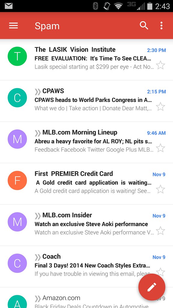
I screen shotted my spam box as an example. Actually doesn't bother me on my desktop screen, but on my Droid Turbo it is effing intense.

15760841672_9cb70a5f34_b.jpg


Test this on your phone screen and see if it bothers you maybe?
 
It's difficult to convey what it looks like on my phone, as it looks very civil and not bad once posted here.
 
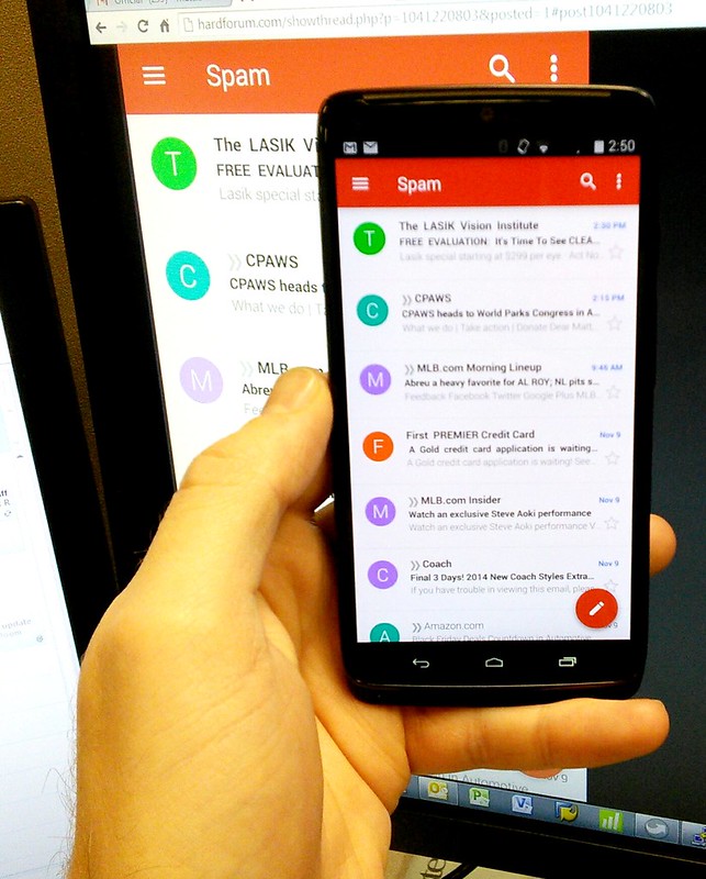
Held my Turbo up to my monitor and took a pick with my nexus 7.

Still doesn't illustrate just how harsh and intense it is, but at least it gives you an idea of the differences:

15759364395_2cfdf9070c_c.jpg
 
I would love a setting to turn the contrast down. Feels like they've whacked the brightness and contrast up for a TV showroom.. OMFGHD!!!

Looks like I'll switch to manual low brightness when android 5 rolls out.
 
Thanks for posting.

It looks Fisher Price to me with the circles, and intense colors I guess I would call it. I just have a moto g right now, I can imagine others...

I'd like a black background option for this ideally.
 
I would love a setting to turn the contrast down. Feels like they've whacked the brightness and contrast up for a TV showroom.. OMFGHD!!!

Looks like I'll switch to manual low brightness when android 5 rolls out.

Yeah, I wish there were a saturation and contrast slider, along with the brightness slider.

Maybe some 3rd party app can do this?
 
Here's hoping that the developers over at google - well - google themselves after a release like this and collect feedback :p hopefully this thread will pop up
 
It's Material Design!

On my tablet the stuff on the left side takes up so much room that my actual e-mail content pane is idiotically small. And they way overuse whitespace.

All brought to you by Google, the company that just doesn't care.
 
Yeah, the Gmail app is much more useable (even if I don't care for the new style) on my Nexus 7 than on my Droid Turbo, due to it being much less saturated.
 
The new Gmail app is smoother and better looking than the original. What is the issue.
 
It's Material Design!

On my tablet the stuff on the left side takes up so much room that my actual e-mail content pane is idiotically small. And they way overuse white space.

All brought to you by Google, the company that just doesn't care.

I noticed that too on my HP Touchpad. 50%+ is used for navigation, and the content is squished to the right. Hopefully they revisit it and make some changes. Even being able to swipe left to hide navigation would be way better than cramming everything in.
 
I think it's nice on my Nexus 5. I think the issue with the Druid Turbo has more to do with the AMOLED saturation than the App colour itself.
 
Zarathustra[H];1041220824 said:
Still doesn't illustrate just how harsh and intense it is, but at least it gives you an idea of the differences:

doesn't bother me at all on my turbo.

It looks Fisher Price to me with the circles, and intense colors I guess I would call it.

just wait until android L
 
If you don't like the new Gmail, you're gonna hate the direction Google is taking with the whole UI. Material design is all bright flat colors. I like it, personally.
 
If you don't like the new Gmail, you're gonna hate the direction Google is taking with the whole UI. Material design is all bright flat colors. I like it, personally.

Ugh. Hopefully the damage can be mitigated with a custom launcher.
 
OK... figured out what bothers me most about this new UI design...

All I can think of with this bright white and intense colors is...

Cloud Cuckoo Land!

I'm surprised Lego didn't jump on this, might have been better.

Still eeewww....
 
While I am not a huge fan of it at all, it is tolerable on my Nexus 7. On the Droid turbo it positively hurts my eyes.
 
Zarathustra[H];1041221621 said:
While I am not a huge fan of it at all, it is tolerable on my Nexus 7. On the Droid turbo it positively hurts my eyes.

I don't mind it on my Note 2 L900. Easily readable which is nice.

See how it looks on my Nexus 6 in a week or so ;)
 
For some reason I can't get inline images to work since the Gmail update.

Android is becoming a fundamentally broken experience.
 
I like the fact that I can now use it as a universal inbox with accounts from Hotmail, Yahoo, etc.
I've been bouncing around between a few different Android mail clients and Gmail is probably the best of 'em now.
As far as the look goes, it's okay I guess. I just like that there are no weird delays like with most other clients.
 
For those looking to add an exchange account, you have to install an additional exhange APK. That wasn't initially apparent but it's an easy process.
 
seems like the biggest feature was now addition of sponsored emails in the promotions folder... more spam too
 
Back
Top