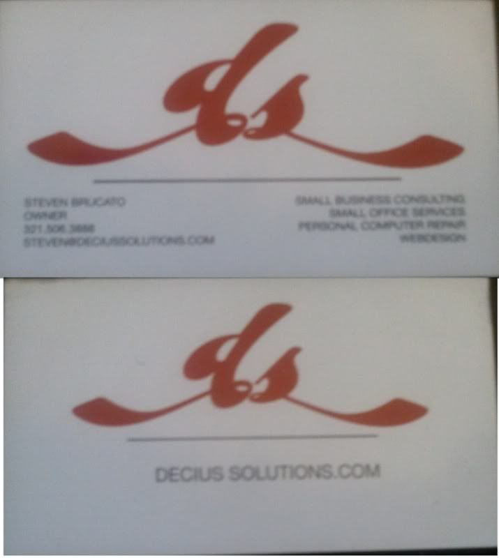
A newbs shot at a business card

sdotbrucato

[H]ard|Gawd
Joined
Oct 7, 2005
Messages
1,722
card.jpg


I've never been able to do anything pleasing with print media, but it's rebranding time for my small consulting business, and this is all i could come up with.

Just really looking for some ideas or insight.

TIA
 
I'm not a huge fan of the bevel on the logo. I think you're going for a 'shiny' effect, but I think you might better served by making the logo a little more reflective than beveled. Other than that it's pretty good. The colors seem to work well.
 
White on a flat, deeper red would be good. Or red on white. Either way, the colour needs looking at again.

I'd also recommend a nice sans-serif typeface for the info below. It'd imply professionalism a little more, and would complement the logotype.

asdsadasdasdasdasyj9.jpg


Just a quick dickabout to show what I mean. Details on the reverse, and so on. I shrtened the tail on the "d" because it made it feel unbalanced, and it's a bnit aliased because I just raped the logotype off with the magic wand tool quick and dirty like. I didn't think to read what you do, though, so it might not fit particularly well with the line of work.
 
also second the white on red idea. Black on red doesn't really provide a whole lot of contrast. remember, these are going to potential clients... you want the information to almost "pop" off the card. A well designed card will do that for you sub-consously

Also, the font is too 'fancy/sloppy' IMO... you want contact information to be as ledgable as possible. Not that your isn't, but it doesnt scream professional either. All in all, not bad :) keep it up

not sure if you did that in photoshop or not, but if you did, use illustrator instead

oh, and another tip... if the person your doing the card for wants to spend a few exta dollars, design a back for the card too (maybe a large logo on the back, and a smaller "watermarked" logo on the front behind the contact information). It's always more impressive when you see a lot of work and thought went into a card, opposed to the cheap white kinkos variety :)
 
Awesome, thanks a lot guys.

I did do it in photoshop, but only because Im more comfortable with it. When I do the final I'll have it in Illustrator so I can replicate it and such later on.

If I were to do the image on front, information on the back, how would you guys suggest I lay out the reverse side?
 
Here's how I laid out my hypothetical business card. It may help you out in some way:


This could possibly be a way to do it, except refined a hell of a lot more:
bcardko8.png


Red on white is probably a nicer way to go here, at least on the rear of it.
 
Awesome, thanks a lot guys.

I did do it in photoshop, but only because Im more comfortable with it. When I do the final I'll have it in Illustrator so I can replicate it and such later on.

If I were to do the image on front, information on the back, how would you guys suggest I lay out the reverse side?


use your imagination. Try to think of something that really ties the card together... get some feedback from your customer on his thoughts too, while he may not know exactly what he wants, you could get an idea based upon what he likes and dislikes. You can also look around google images for unique business cards to inspire you a little (I do this often when I get proverbial "writes block"... cards and logo's alike)

post it when you finish it, I'd like to see what you come up with... if you have any questions or need any other help, just ask :) One thing I've found is, don't rush it either (it will show)... if you start feeling a little burned out, take a break from it for a few hours and come back to it later. Sometime you get great ideas at the most random times (laying in bed while trying to fall asleep for example).

good luck
steve
 
For a single sided option, I would go for something very simple like this:

singlesidednd5.jpg

That works nicely, but single-sided business cards always feel unbalanced to me. I guess it might be due to a limitation on printing, for cost or whatever, but having an identity on one side and the info on the reverse might make it easier to focus on the two elements independently.
 
^^^ much nicer, the other one the red is far too bright, it looks like something for a sex shop or something!

you want to use more professional, toned down colors.
 
Don't put your pic on the card. Looks cheesy, like real estate agents do where they think it's going to get them business because of their looks or something. And a business card shouldn't be 90% about the logo. It's about the contact information you need, not advertising.

Stick to one-sided, not everyone's going to turn it over to look at the other side.
 
That works nicely, but single-sided business cards always feel unbalanced to me. I guess it might be due to a limitation on printing, for cost or whatever, but having an identity on one side and the info on the reverse might make it easier to focus on the two elements independently.

Single sided cards sometimes seem a little cheap and or unbalanced but you can counter this by printing on a fairly thick stock and using an embossed printing on the logo bug, then even though it isn't printed on the back, it still has a presence on the back of the card in the form of an indentation. Of course thicker paper and embossing will very quickly raise the price for the printing way beyond what even a nice double sided glossy printing would cost.

Either way, I just wanted to throw out a single sided solution since everyone up until my post had been focusing on a double sided solution.

Also as a side note, the dimensions on the OPs picture was incorrect for a standard business card. OP, your picture was 3.5 inches x 2.1 inches, a standard card is 3.5 x 2. Even if you were adding a bleed, it would only be 3.75 x 2.25 (1/8 inch all around is a good bleed for a business card)
 
Wow, great concepts to work with guys! I really appreciate the effort in helping me. I tried to draft something up in Illustrator, and the font that Im using, isn't giving me the font effects. In Photoshop I'm getting the tails on the lowercase letters, in Illustrator not so much.

I thought this might be an alt-text type of deal, but it doesnt appear so. Anyone have any insight?
 
well, what you can do is get it close, then select the object in illustrator, right click and convert to shapes/outlines

then just use the control points to make it look how you want it to. You can move, add and remove them at will :)
 
MeatyCheesyBoy's solution works the best to me. Personally I feel like the logo could use more defining. Right now the shape looks a little hippy-ish, and not very computer consulting/repair. The most important things to consider in a logo is that it is describable and memorable.
 
MeatyCheesyBoy's solution works the best to me. Personally I feel like the logo could use more defining. Right now the shape looks a little hippy-ish, and not very computer consulting/repair. The most important things to consider in a logo is that it is describable and memorable.

Definitely. I'd still go with a shortening of the tail on the "d" to bring the weight of the logotype more towards the middle, though. The colour's a definite winner, and the sans-serif typeface is as strong as predicted.
 
OP I kinda liked your design but I don't know if it is something I'd use for a computer business.

Oneos version of it is good too.
 
decius.png


basically I took the header from my website (which is under construction as well) and made that into the card. took the tail from the "d" shortened it, and then put it on the "s" for a more uniform balanced look. added a little backshadow to the text and badge, and went with a more classic Helvetica font.

I'm thinking about possibly using frosted transparent plastic cards. i have a printer that has offered me a great price (~$0.50/card when buying 100.)
Comment, thoughts, concerns?
 
I like it... not much else I can say, not a graphics or design guru, but I like the last result there. Has an eye-catching style about it, but here's what I would do with that exact design if I wanted to make a change to it:

Move the center logo up a bit, and reverse the order of the text in the lower right quadrant, so:

PC Repair
SOHO Consulting
Small Business Consulting

If you move the logo up, the text from the "Small Business Consulting" line wouldn't "fit" so, reversing the order of the text would alleviate that issue. This is what I whipped up with PSP a few moments ago so forgive the amateur "cut and paste" editing:

finishededitsuf8.png


I removed the space between Decius and Solutions.com because... well... it ain't supposed to be there and renders the domain name and URL dead in the water. :D

I also think - opinion here, careful - you say "Consulting" twice, which is obviously redundant. Consider rewording how you wish to list your actual services, or just choose another way of saying it altogether.

Since think the logo itself, the "ds," should be centered on the card, and now it is, give or take a pixel or two. And the "shield" black area wasn't quite centered, from top to bottom. The bottom point threw off the balance, so... either consider moving the "shield" up a bit to more centered aspect, or, as I did, I just gave it a hexagon-like appearance by flipping it to the top so now it's totally centered on the entire card body itself.

The idea of a frosted plastic flexible card kicks ass, as soon as I read that I thought "Yeah, that will work nicely with this color scheme..." so... my suggestion is if the price is ok with you, definitely go for it AFTER you make some changes, of course. :D

The Wife asked me what I was doing as she's the more creative and graphic design oriented person. I said "Oh, a lot of cutting and pasting for something..." and she came over to see the final result. She gave me a thumbs up and a stupid grin, so... either she likes it or she's hinting that I should leave such things to her... I have no idea at this point. ;)

Now that I'm looking at it, however, it seems "too busy" in the lower right side, too much text there, throws off the balance. Perhaps moving the text upwards somewhat, above the "swish" on the logo on the "s" side... hrmmm... seems like it should be above the "swish" to keep the balance... bleh, here's take two:

finishededitstaketwobv4.png


Now the problem is 4 lines on the left, 3 on the right. If you say "Steven Brucato, Owner" on one line, and uncap your name on your email address (people don't cap the first letters on email addresses... bad form, bad form!!!) everything will balance out across the face of the card, from left to right and top to bottom. You might consider not capping the domain name either, just deciussolutions.com - but it's your call... errr... card. I mean, the logo itself is lowercase "d" and "s" so... stay with it.

Just my two cents... and a lot of data on the Clipboard... :)

And........ I got a hug and a kiss for the final final version, she said that's what she would have done to balance it overall, and she also says yes to the 3 lines on each side as well. Guess I can't complain.
 

I'd like to thank you for your meaningful post. Your professional insight has motivated me to do much better. I plan on going back to school for graphic design, and perusing a career in computer graphics. Thank you once again. /end

Sorry in one of those moods.


Average Joe, youre right about the balancing, just not sure if I like the hexagonal shape of the badge. I'll keep moving things around and post back when I sent the design to the printers. Thanks a lot guys!
 
Well it appears my post asking for recommended printers is gone.

The printer I was going to use withdrew his offer. Does anyone know of any quality printers that do plastic business cards that arent going to bend me over backwards?

=D
 
you might want to rethink the plastic business cards

i know it seems nifty but you lose one of the most useful features of a cardstock business card: you can write on the back

if i were going for something more unique, i'd look into spot varnish or fifth color metallic pricing...still would get that wow factor, at a lower price point and still retain functionality

as for print shops that will do plastic business cards, no clue

you could potentially have them screenprinted then die cut if you kept eveything to spot colors and avoid working in process(cmyk)

for standard business card printing i use m3printing.com or clubflyers.com

both do a decent job, turnaround is good, and the prices are very competetive
 
I'm thinking about possibly using frosted transparent plastic cards. i have a printer that has offered me a great price (~$0.50/card when buying 100.)
They may have a nice "wow" factor, but $0.50/card is a lot of money. If you go to a trade show or such, you can easily pass out 100 cards in a day.

you might want to rethink the plastic business cards

i know it seems nifty but you lose one of the most useful features of a cardstock business card: you can write on the back
That is a good point.
 
I'd like to thank you for your meaningful post. Your professional insight has motivated me to do much better. I plan on going back to school for graphic design, and perusing a career in computer graphics. Thank you once again.
That is some pretty funny stuff
 
finishededitstaketwobv4.png


That font is terrible on the left and right, I have to squint my eyes to read some of it.
 
Spacing is tight on the font, that's a given; an actual printed card (if that design was printed) would be easier on the eyes... all analog and shit, no pixelation. :D
 
Back
Top