Problem with consistant web page rendering PC vs Mac...

jmroberts70

2[H]4U
Joined
Oct 15, 2002
Messages
2,953
=========CLIFFS=========
1. site designed using HTML tables
2. you all suggested I go purely CSS
3. I learned CSS and re-designed the site. You can see the new format here:
http://www.bedofnails.tv/test01/home.htm
4. I'm still tweaking the CSS code to run properly
=========CLIFFS=========

Please check out this example:
http://www.bedofnails.tv/test01/

So I've been working with a friend trying to build this site and I'm finding out that his view and mine are completely different. I'm running a PC and he's running a Mac Book Pro with OSX (10.4.11).

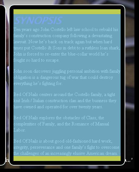
Here is a screenshot of how it's supposed to look:
bedofnails_screenshot01.jpg


Here's what I get from his Mac running Safari:
bedofnails_screenshot02.jpg


...and here's his Mac running Firefox:
bedofnails_screenshot03.jpg


I'm at a loss here. I tested the code on IE, Firefox, Chrome, and Safari before ever sending it out and I'm still seeing completely different fonts and layout. I'm seeing a taller table in Safari --even though I specify the exact width and height of the background table to prevent the background image from repeating itself and yet here it is! I've specified what I thought were "web-safe" standard fonts and yet both Safari and Firefox wind up with totally different fonts --neither of which were the actual fonts I specified. What gives? Any ideas what I'm doing wrong?

I was hoping to pull this site off with straight HTML and not Flash but it just seems like I've lost total control of the page renderings here!
 
Last edited:
Revise page without tables - use CSS instead. Change charset to unicode.

All that seems wrong is that Safari is rendering the font too large, which is stretching the table a little more (this creating your problem with the picture box being stretched as well).
 
You're running in quirks mode since you didn't specify a DTD, so consistency goes right out the window.
 
Revise page without tables - use CSS instead. Change charset to unicode.

All that seems wrong is that Safari is rendering the font too large, which is stretching the table a little more (this creating your problem with the picture box being stretched as well).

Hmm... The fonts look totally different. The fonts on the Mac running Safari look like a rounded aerial while the Mac's Firefox looks more like a Times New Roman (especially the "SYNOPSIS" text at the top of the box on the right. Anyways, I'll look into doing this with CSS. I'm not familiar with the idea of building a site without tables for placement of objects with pure CSS work but I'll give it a try...

You're running in quirks mode since you didn't specify a DTD, so consistency goes right out the window.

Ok, I added the following bit of code to my page:
<!DOCTYPE html PUBLIC "-//W3C//DTD XHTML 1.0 Transitional//EN" "http://www.w3.org/TR/xhtml1/DTD/xhtml1-transitional.dtd">

It looks like it added a small space above and below the body of the paragraph (as highlighted by Firebug (shown here)...
bedofnails_screenshot04.jpg


I can't quite figure out where the space came from though (or how to get rid of it)...
 
Also, you appear to be explicitly specifying fonts. In general, don't. Leave it to standard fonts and you'll avoid problems where various machines don't have various fonts (like you're hitting now).
 
[sigh] well, from all I've just read, it looks like I'm going to need to finally hunker down and learn CSS. I've messed with it before but only modifying existing code --never starting from scratch. Wish me luck! If you have any suggestions for either a good tool or some guide sites, I'd really appreciate it... Here's what I'm grinding through right now:
http://www.mardiros.net/liquid-css-layouts.html
 
You have an extra space there because your <p> tag has a margin that's > 0. Set the <p>'s margin to 0 and you won't have the space. However, I would suggest not using <p> inside <td>, and going even further, not using tables at all.
 
Ok, I've spent most of the evening learning CSS from the ground up (thank you w3schools.com!!). Here's what I have so far:

http://www.bedofnails.tv/test01/test2.htm

My question now is how to do the boxed content below. I know that there is a way to do rounded corners in CSS but it doesn't work in IE yet so I can't go that way. In tables, it was a fairly simple process in a table but I can see it may actually be easier with CSS as all I may need to worry about is dropping the corner images in the box and use simple border specifics to deal with the space in between. Do you guys have any suggestions for a good way I can do these elements?
 
Rounded corners are still lame to this day. This should help get you started:
http://www.devwebpro.com/25-rounded-corners-techniques-with-css

For getting your box content, I would start off doing it without rounded corners and then round them afterwards.

Start off with a container div that's the width of both the left and right side then add in left and right aligned divs (by floating) for the actual boxes. Make sure to clear your floats afterwards too if you plan to have content below it (you can do this by applying "clear: both;" to the container div).

Awesome link and thanks for the assurance I'm going in the right direction. I was thinking of doing my boxes as you mentioned so at least I'm understanding the concept correctly!!
 
I'm guessing you made progress since your latest reply? Here's a few tips:

Try not to use a specific name like synopsis as the class name. The whole point of a class is to reuse it. Unless you planned to have completely different dimensions for each page?

Also stop using <br /> to add line breaks when you're only dealing with paragraphs. Like in your synopsis content, each paragraph should be in its own <p> tag and you can define a "margin-bottom: x;" to fiddle with the spacing within this tag.

If you want different spacing for whatever reasons then you can just do:

Code:
p.myclass { margin-bottom: 12px; }

then...

<p class="myclass">Hey look at me, stuff below me is pushed down 12 pixels.</p>
 
Ok, progress is going well. Thanks everyone for all your help. BTW, does anyone have a good, simple way to round these corners and still be compatible with IE?
 
Ok, progress is going well. Thanks everyone for all your help. BTW, does anyone have a good, simple way to round these corners and still be compatible with IE?

Your options are either using javascript to do it(jQuery is something to check out, they have a few rounded corner plugins), using images (blah), or using CSS3 (which as I'm guessing you realize wouldn't work with IE6/7/8).

Personally, depending on who is going to be look at the site, I'd either

1) Do with square corners, and change other parts of the styling that you can control to make the page look better

2) Use CSS3, and just make sure the page still 100% functional in IE.

3) http://dowebsitesneedtolookexactlythesameineverybrowser.com/
 
looks pretty good!

To be honest, I'm not a huge fan of your font choices but that's a personal preference thing I suppose :).
 
Well, it's been an exhausting few days. I think I've got most of the code working properly --and rendering correctly across both platforms and multiple browsers. Thanks so much for all your help getting me here. I would have had a horrible time trying to figure this all out without you all!!

Here's the current layout:
http://www.bedofnails.tv/test01/home.htm
 
Don't burdon yourself with trying to make everything look EXACTLY the same in each browser. If you do this you will have to settle with the lowest common denominator *cough IE cough*. The way you want to design websites is called "Progressive Enhancements" as opposed to "Graceful Degradation".

Here is how it works, write good clean semantic HTML. Then apply your basic css styles. Most browsers should look pretty close to identical at this point. Now go ahead and apply your more advanced css styles like rounded corners and drop shadows, multi-layered backgrounds, etc. if applicable. Modern browsers will correctly render what you are going for, while non conforming will not get the nice effects. It is ok that that they look different because they are still fully accessible and functional.

Also, don't use TRANSITIONAL in your declaration, don't bother with STRICT anymore either. Simply use <!DOCTYPE html>. This is the declaration for HTML5. All browsers will still render correctly, even IE, and you will be able to use the most modern features of each browser as they become available.
 
Back
Top