Live testing of the new site design?

Status
Not open for further replies.

Chimel

Gawd
Joined
Jul 19, 2010
Messages
981
Wow, are you being hacked or are you testing live on us readers? ^-^
If the latter, some quick feedback:

  • I prefer when the hardocp posts are listed above the hardforum posts on the right pane. It is the hardocp main page, not the forum's.
  • With the new high banner, I don't see a single real post anymore, just the 4 features. I have to scroll down one page in full screen to start seeing the posts.
  • If you plan to add another banner, definitely work on the FEATURED section, move it to a left pane or something. That's way too many banners.
  • Happy 10 years anniversary. But I'm pretty sure I saw [H] members registered over 10 years ago... ^-^
 
The new look is defiantly different, but not unwelcome. However I total agree with #2 & #3 above.

I did not know it was the anniversary, but Happy Anni if so :)
 
Just one request if possible...

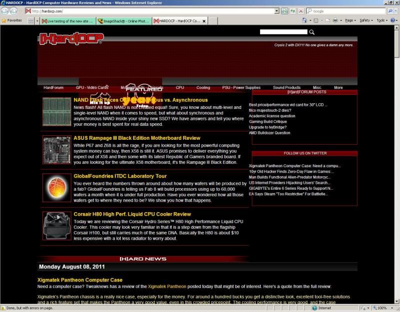
It seems that the layout on HardOCP.com is definitely in transition, and I'm wondering if it might be possible to adjust the CSS so it's slightly narrower for devices (like the Nook Color, the iPad, etc) that actually have a width of 1024 physical pixels. I have a secondary monitor attached to my laptop (laptop is 1680x1050, secondary is 1024x768) and I note that when I load the page it'll just cause some of the content to be hidden under the scroll bar, as this snapshot shows:


But, if you're testing I'm sure you'll figure all this out as time goes by. I know that because of the iPad a lot of websites have retooled their layout to accommodate that 1024 pixel wide style device (and there's a lot of others too, like the Nook Color and other Android tablets) and everything just kind of "fits better" when it's roughly 1000 pixels wide.

Regardless, I like the new look...
 
Wow, are you being hacked or are you testing live on us readers? ^-^
If the latter, some quick feedback:

  • I prefer when the hardocp posts are listed above the hardforum posts on the right pane. It is the hardocp main page, not the forum's.
  • With the new high banner, I don't see a single real post anymore, just the 4 features. I have to scroll down one page in full screen to start seeing the posts.
  • If you plan to add another banner, definitely work on the FEATURED section, move it to a left pane or something. That's way too many banners.
  • Happy 10 years anniversary. But I'm pretty sure I saw [H] members registered over 10 years ago... ^-^

OS, browser, and version?

FYI, this is not a test, this is "the way it is." Testing is done.

I am not sure what you mean by your text above, it is confusing to me.
 
The new look is defiantly different, but not unwelcome. However I total agree with #2 & #3 above.

I did not know it was the anniversary, but Happy Anni if so :)

10 years ago and our "anniversary" have nothing in common. OCP has been around since 1997.
 
IE 8.0.6001 with my works websense and XP SP3 looks all grapped up.

hocp.jpg
 
Small issue with main page. On main page where it says mix it up and 10 years ago. Those can be seen but are hiding underneath the top Review about the Nand flash. WIn 7 X64 Enterprise with IE8.
 
The Hardforum button at the bottom of the main page is linking to www.hardfolding.com instead of the forums.

Great for boosting participation but might not be what is intended. :D
 
there is a weird lag issue going to the front page using chrome. it loads the page fine then sits there for about 10 seconds where i can't click on anything or scroll. other than that everything looks and works fine for me.

chrome version 13.0.782.107
 
I agree with Joe Average. Setting the content width to 1024px rather than something like 1000px gets content stuck behind the vertical scroll bar. Yes, his screenshot shows he's using adblock, but even with the ads there your content is displaying behind the scroll bar once the ads are finished (ie, scrolling down past 3 or 4 news posts) and it just plain looks bad.

Every other site I frequent displays cleanly. (I keep my browser window set to 1024px.)

On the plus side, the changes make the site display better on my droid than before, so that's good.
 
Page is slightly more than the size of the vertical scroll bar too wide on my system in firefox 3.6.18 @ 1024x768, which creates a horizontal scroll bar on the bottom, and cuts off the right-hand boxes which (im assuming?) should be around the 'forum posts and twitter menus' boxes. Site hasnt fit my browser width for nearly 9 months now. Even after the change. :(
 
Ubuntu 10.10
Firefox 3.6.18

By default, I use Firebug to run my browsers at a width of 1024x.

As mentioned before, the container div is set to 1024, so there will always be a horizontal scroll bar for people running their windows in that size due to the lack of room for the vertical scroll bar. This should probably be set back to 960-1000.

At this resolution, the lack of padding on the left side of news posts has them pushed all the way up against the side of the window. There is some padding on the left of the featured items, it is just the padding on the news items themselves.

hardocp.png
 
i hope this is still a work in progress. new title bar looks great but hate the elongated posts and think the posts should be confined to a DIV or something. not an example but similar layout to thedirty.com
 
Well, I like the new format so far. Hope to get an Android tablet soon, and hope the new site fits well in the display. May have to shrink the width a few pixels like people are suggesting so you don't get the horizontal scroll bar.
 
Windows 7 x64, Firefox 5.0 with only one toolbar, no menu bar etc. to keep it lean and display the most content.
Well I saw a test post on the main page at the time I posted, I see it has been removed now. Together with the new look I thought you were doing some testing.

I meant the two sections "[H]Hard|FORUM POSTS" and the news posts "FOLLOW US ON TWITTER" on the right pane have been inverted. I found it handy to look at the news posts pane to see if anything has changed when I refresh the main page. No point following you on a RSS feed since I read most of your news anyway, so I made [H] an App Tab on Firefox to keep your main page permanently on.
Looking quickly at the news in the right pane is also great since I can't see the actual news anymore without scrolling down one page.
Not sure why they were relegated behind the 6 latest forum posts, as it was working just great previously. Besides, the forum is so big now that seeing the 6 latest forum posts is not really helpful. It's too brief a snapshot. And moving the 6 latest news downwards closer to the actual news section makes them almost redundant and unnecessary.
No big deal, it's just that usability is a bit of a passion to me! ^-^

I count 5 heterogeneous elements (that's what I meant by "too many banners") before the actual news posts. Starting from the top:
  • The icon and search bar
  • The [H] title bar with the MOTD
  • The huge banner with the "10 Years Today" icon (the icon is so gigantic I thought it was a temporary anniversary icon before I clicked on it to see what was behind.)
  • Some menu bar
  • The 4 latest features in the FEATURED section that takes most of the screen
Then I see the [H]ARD NEWS section title, the day, and the title of the first article, that's it. I have to scroll down to see any news.

I think that maybe you could combine the 4 first bars into 1 or 2 only, and maybe reduce the height of the FEATURED section so that all 4 pictures and titles would fit on the space taken by a single feature.
The news would then flow much faster to the view. Hardocp main page is kind of a tech blog, so the blog posts (the [H]ard news) should probably be given more importance. IMHO etc.

Or I could break the bank and buy a bigger monitor... ^-^

Thanks for the feedback.
 
I actually kind of like most the changes. The only thing that feels a little off is either the placement or the size of the ads. I'm not exactly sure what would be preferable. Think I'd like the hardforum posts to be on top, but I'm not sure if that affects advertising revenue.
 
Small issue with main page. On main page where it says mix it up and 10 years ago. Those can be seen but are hiding underneath the top Review about the Nand flash. WIn 7 X64 Enterprise with IE8.

Are you running in compatibility mode?

The Hardforum button at the bottom of the main page is linking to www.hardfolding.com instead of the forums.

Great for boosting participation but might not be what is intended. :D

Will get that fixed.

there is a weird lag issue going to the front page using chrome. it loads the page fine then sits there for about 10 seconds where i can't click on anything or scroll. other than that everything looks and works fine for me.

chrome version 13.0.782.107

I cannot reproduce this and I use Chrome personally.

I agree with Joe Average. Setting the content width to 1024px rather than something like 1000px gets content stuck behind the vertical scroll bar. Yes, his screenshot shows he's using adblock, but even with the ads there your content is displaying behind the scroll bar once the ads are finished (ie, scrolling down past 3 or 4 news posts) and it just plain looks bad.

Every other site I frequent displays cleanly. (I keep my browser window set to 1024px.)

On the plus side, the changes make the site display better on my droid than before, so that's good.

3% of our readers use 1024, these readers will not be catered to, sorry.

i hope this is still a work in progress. new title bar looks great but hate the elongated posts and think the posts should be confined to a DIV or something. not an example but similar layout to thedirty.com

We did this by design and very much like our results. I am sorry you do not like this new design element.
 
@macksomerville and @Kangg, try disabling the ad blocking software or upgrading to IE9, the 2 icons Mix It Up and 10 Years Today display fine on my IE9.

You can also reduce the zoom factor for this particular site, but that will affect readability if you're stuck with low res.
I tend to do the opposite for sites with fixed widths, zoom in until the page fits the whole browser width, as having huge black bars on the left and right and a small content section in the middle is ridiculous. Especially with today's wide screens.

Haha, I hate this type of design, HTML was supposed to make the content flow naturally on all sizes of devices, browsers and window frames, why would one simulate obsolete paper publishing formats on the web?
 
Haha, I hate this type of design, HTML was supposed to make the content flow naturally on all sizes of devices, browsers and window frames, why would one simulate obsolete paper publishing formats on the web?

Have you tried publishing 5000 word original content articles on the web with a format that is not fixed? HAHAHAHAA. Let me know how that works for you.
 
3% of our readers use 1024, these readers will not be catered to, sorry.

But you're not stretching to fill larger than 1024 either. There's no advantage to running a higher resolution on your site. It seems you're not catering to anyone at all.
 
The search box on the front page is not working for me.

Not Found

The requested URL /search/ was not found on this server.

Additionally, a 404 Not Found error was encountered while trying to use an ErrorDocument to handle the request.
Apache Server at demo.hardocp.com Port 80
 
But you're not stretching to fill larger than 1024 either. There's no advantage to running a higher resolution on your site. It seems you're not catering to anyone at all.

Had you built the site you would know why we are doing it the way we are doing it. We knew people with 1024 screens would have a horizontal scroll bar. We accepted that and moved on. There are some other elements that get broken if we squeeze it down. Sorry, but that is the way it is.
 
Looks fine to me on Chrome @ 1680x1050, on my desktop, haven't tested it on my laptop yet.
 
The front page is hanging for me as well in Chrome. Though I do have a java script filter and a certain other addon that may affect the loading of ads.
 
Well it's only a matter of programming and maybe the limitations of the Vbulletin software.
Your embedded videos are currently, what, 600-700 pixels wide or so?, so there's no need to force the minimum width of the main news pane to more than that.

Actually, I found out that all your videos and pictures are aligned to the right: When you reduce the width of the browser window, the videos and pictures are cut because there is this large incompressible margin on the left. Maybe you can change the alignment to left or center.

I don't use 1024 width but 1280. In any case, a wide screen solves only the horizontal scroll bar issue mentioned by others (if you use full screen or larger than 1024 width windows), but it does nothing to the visibility of the news. Both the news and the 6 latest news summary in the right pane are now invisible without scrolling down systematically. I don't mind scrolling down, I do it all the time already, it's the "systematically" part that's a pain if you have to do it just to read the first news.

OK, it's my last comment on the new design, I didn't plan this to become a rant thread.


We do not use vBulletin CMS. The current layout is not going to change. Thanks for your input.
 
The front page is hanging for me as well in Chrome. Though I do have a java script filter and a certain other addon that may affect the loading of ads.


Working perfectly for me in Chrome. Maybe turn all your stuff off then see? We simply cannot support every "filter" and add on made.
 
The front page is hanging for me as well in Chrome. Though I do have a java script filter and a certain other addon that may affect the loading of ads.

Worked fine for me in Chrome and ads loaded fine, I don't use adblockers.
 
Hey Kyle, I'm having one problem on and off all day, clicking the hardforum link at the top of the page won't always work. The mouseover shows the link, but clicking it does nothing. No crazy firewalls/scripts/etc...just stock Chrome. Happens on my laptop and desktop. Other than that it's been looking/working perfectly for me.

This one:

forumlink.png


I can typically reload a few times and then it works. I tried clearing cache and it still happens.
 
Hey Kyle, I'm having one problem on and off all day, clicking the hardforum link at the top of the page won't always work. The mouseover shows the link, but clicking it does nothing. No crazy firewalls/scripts/etc...just stock Chrome. Happens on my laptop and desktop. Other than that it's been looking/working perfectly for me.

This one:

forumlink.png


I can typically reload a few times and then it works.

I have had one other person report this but in a different manifestation. We cannot duplicate it. If you can get me any more information, please let me know.
 
something's wrong with your graph. I refresh the page 5000 times a day at work and it's 1280x1024. :D
You'll note that the graph says "visits" and not "page views." There's probably a certain timeframe where refreshing the page does not count as a new visit.
 
As a 1024x768 user, im some degree of disappointed in the new layout when its so close to fitting, and yet is still deliberately a few pixels too wide to fit. I get that the site wants to cater to the majority, but why bother to have the site display at or near 1024 to begin with if you arnt going to cater to the 1024 crowd as well by dropping down to a level that fits them also? Im not a website designer, but i dont see anything on the site that couldnt have fit just as well in a ~3% smaller smaller area.

Hardocp over the years has remained a good resource for a lot of things, and i shouldnt feel this way, but it honestly has been feeling more and more unfriendly the last year or two. The layout for the last two iterations have been unfriendly to us lower resolution users, and the response by staff with regards to those users seems almost hostile and gives the vibe of 'screw you if you dont like it, we knew it wouldnt work for you when we made it.'

Maybe thats not the intention.. but for me i find myself visiting less often these days simply because of that combination. And while i realize thats no big loss in the grand scheme of things, there was a time when the site didnt have that sort of elitist vibe going on. Used to be more about 'making something out of nothing' as opposed to catering mostly to the high end enthusiast users who drop the most money on hardware. Maybe thats simply a byproduct of the site growing and becoming more profitable to run; not sure. But i digress, i didnt build it, and i dont run it so i cant expect to have much say in it.


We originally designed it that way and it caused us some formatting problems so we moved away from it.

Sorry you feel that way.

I am fairly sure I have always been of the "Don't let the door hit you in the ass mentality." Nothing new to see there.

We will have a mobile site soon that will be better for your liking. At that point we will likely move to 1280 for the main site.
 
To people who are complaining about the 1024, you can change it yourself using a plugin called Stylish if you know CSS, or if one person does it and adds it to the shared area.

Dunno if Kyle is opposed to such?
 
Status
Not open for further replies.
Back
Top