HP LP2475w (Possible new IPS)

Hey guys IMHO this is actually a stunning screen. It really only has one problem, the text. This is the reason I now am 99% sure I'm sending it back (have to decide this weekend) I don't believe there is anything wrong with my sample but to be fair, as you can read in previous posts there is different opinions on the text. Some don't find it a problem. That’s why I would urge you to have a look for yourself.

I would hate to see it go because it excels in every other aspect.

Wide gamut doesn’t represent any real life problem provided you owne an ATI card as you can see in my previous posts. But I’m not really the guy to ask if this screen qualifies for color critical work

It’s a fantastic gaming screen. It has no noticeable ghosting and what I was most afraid about this screen was the input lag and its effect on fast paced online gaming. But I have to be fair and say. I really don’t feel it anymore and I have lost no skill or edge in comparison to my crt when playing online.

I can't comment on the defects you mention as mine doesn't seem to suffer from any of these..

And yeah LCD buying is pure Hell…. I believe this is my 9th screen..I forget…

The text issue you are talking about, could you explain that a bit futher? Or link to somewhere i can read about it?
 
The text issue you are talking about, could you explain that a bit futher? Or link to somewhere i can read about it?

I'm a little reluctant as we only seem to be a little group actually concerned about this issue :rolleyes:
But then again I feel it's fair to point it out as it is the only and I mean the only problem I have found with this display. It's perfect in every other aspect. To add to that I find the text issue serious enough to return the monitor :(
The effect is best decribed as fuzzy text. There seems to be a yellow or redish glow to text which makes the text fuzzy to read, It's making me dizzy.

The text issue has been discussed previous in this thread and a little here: http://forums.overclockers.co.uk/showthread.php?p=12545478#post12545478

But remember the text might not seem so bad to you ;)
 
I'm a little reluctant as we only seem to be a little group actually concerned about this issue :rolleyes:
Or you're the only ones noticing it. I'd be concerned if I saw a problem, and your insinuation that I don't care is offensive. Do you have any pictures of the effect to show what you consider fuzzy and crisp? I can try to photograph mine for comparison.
 
I wasn't trying to offend. Really only tying to be polite. I respect that others don't find it a problem. You should also respect those of us that do find it a problem..

I have posted serveral pictures..

text.jpg
 
I wasn't trying to offend. Really only tying to be polite. I respect that others don't find it a problem. You should also respect those of us that do find it a problem..

I have posted serveral pictures..

Problem is, I posted a similar photo without this effect, so it could just be that the people with problems have a slightly duff panel (which is quite likely, seeing as LG.Display seem to have quite bad QC at the moment).

For people worrying about text, here's Biosphere's pic, next to mine:

text.png
text.jpg
 
I wasn't trying to offend. Really only tying to be polite. I respect that others don't find it a problem. You should also respect those of us that do find it a problem..

I have posted serveral pictures..

text.jpg

Except this picture clearly show absolutely broken text rendering. When you posted another pic similar to mine, it didn't. Is the monitor in portrait mode here?

Did you investigate to see if this is position related, or font specific. Something just doesn't line up given this picture and your other picture.

If my text looked like this picture I would be returning the monitor as well. It is just strange that you have some text that looks like this and other text that looks normal.
 
Ugh, I hate hearing about this text issue. I'm so anxious to get mine to see if it will have this problem/if I will notice it. :/

But it would be great if we could get to the bottom of it.
 
I wasn't trying to offend. Really only tying to be polite. I respect that others don't find it a problem. You should also respect those of us that do find it a problem..

I have posted serveral pictures..
"Roll Eyes (Sarcastic)" is not being polite. If there is a problem I'm not seeing and it bugs you, exchange or return the monitor. My only concern is that you might be inaccurately describing a defect as the norm.

Anyway, didn't you post a followup that showed the jagged edges were an artifact of that specific picture?

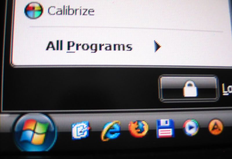
I tried to reproduce your image, first without ClearType then with:


No jaggedness at all, and clean edges all around. While there is some fringing on unfiltered text, it goes away after enabling and tuning ClearType. The blurring in All Programs seems to be an effect of the bold font as it's not visible on the other lettering. If you look at the program icon there's also a blue fringe at this magnification that nobody ever mentions, but neither is visible until I get within a couple inches.

philjohn: Despite my poor pictures your example is how mine appears by eye.

Snowdog: You can tell it was taken in landscape because of the vertical red line on the left, in portrait that would appear on horizontal edges.
 
How is this "text problem" anonying in other daily bases used applications?

E-MAIL
WORD
FIREFOX/IE
NOTEPAD
MSN, SKYPE

Or is just in START menu?

Etc etc?
 
How is this "text problem" anonying in other daily bases used applications?

E-MAIL
WORD
FIREFOX/IE
NOTEPAD
MSN, SKYPE

Or is just in START menu?

Etc etc?

Don't you have one now? Is your panel affected, and have you run the cleartype tuner (and/or made the registry tweaks posted previously)? Mine has no problem at all with text as my photo I posted above shows.
 
I'm a little reluctant as we only seem to be a little group actually concerned about this issue :rolleyes:

Hi there, im from Czech Republic, have this LCD one week for good price 460 euros directly from HP eshop and can confirm that im another one, who is actually returning this LCD due to problem with reading text in EMAIL, WEB, etc.

I use native resolution, standard font size, no cleartype (tried, dont like it), i wear glasses, im sitting about 70 cm from LCD.

I dont know how to describe it, but after 5-10 minutes of work i feel headache. I tried lot of brightness / contrast / rgb settings (from TFT review, from Prad.de review, from this forum), nothing helped.

So from my view after one week (30 hours of running LCD) text is SHARP, but something on the background is wrong and makes my headache.

In my work i use 19 PVA panel NEC from 2002 year, so maybe thats it, if you work all day on PVA, then change it to H-IPS at home .. it could be problem. Next to this NEC i use in other place which im visiting on weekends 19 S-PVA Eizo 1921. Again, no problem with text on both PVA panels. When i started work with these PVA's i spent 1-2 minutes with brightness / contrast settings and thas was all i did, i could use them all day without problem. Not like this HP which i tried set up much more time ..

Or maybe problem is that this one has 0,270 mm and 19 LCD ha 0,294 mm i dont know ...

So today im sending LCD back and will use again my old 21 CRT Dell, pfff ..

Overall this HP is great, i love many video inputs it has, but i spend 90% of time in office / web use so i need to be able read all day without headache :)
 
To be honest, looking at those picture doesn't tell me anything. Seems to be exact the same, beside the different conditions it's taken in. If there really is an text issue, i probably wont see it before i've started to use the monitor for a bit.

So i think this is gonna be my new display, and i hope that i won't notice any text problems, i don't tend to be picky anyway.
 
i wear glasses

...

maybe problem is that this one has 0,270 mm and 19 LCD ha 0,294 mm i dont know ...

To be honest, I think that's more likely to be the problem. Have you had the opportunity to try other 24" monitors. Also, as a little experiment before you send it back, can you try putting the windows DPI settings up to see if that makes a difference (just to help other people on here thinking about this monitor).
 
To be honest, I think that's more likely to be the problem. Have you had the opportunity to try other 24" monitors. Also, as a little experiment before you send it back, can you try putting the windows DPI settings up to see if that makes a difference (just to help other people on here thinking about this monitor).

well, this is my first 24 LCD experience. I tried higher DPI, but did not help, font was worse than default DPI to my eyes.
 
Hello guys, had anyone here used Spyder 3 Elite to calibrate this LCD? What are the results? (I guess no one here tried both i1Display2 and Spyder 3 Elite on this one to compare? :) )
 
The people having, how best to put it, visual issues with this monitor have my sympathies.

With over 20 years of daily work with PC's I thought I was immune to such effects, then about 3 months ago I bought a dell 2408fwp. It arrived on Saturday and was put to use. When I awoke on the Monday morning the room was swimming before my eyes. I suffered focus problems and dizziness until I switched back to my CRT. I appear to have an issue with the 2408 and possibly the contrast shift on all VA panels.

This reminded me of the headaches I had suffered from earlier in the year. A standard PC with a standard 'supplied with' TN monitor. First 3 weeks were fine, the PC was then moved to a different area with different lighting. From this point my headaches started around 1, 2, 3 pm every day. At the time I blamed the chemicals that were in use near by, but during the middle week there were no chemicals around. Looking back I bet the headaches were a direct result of the lighting.

I should point out I don't generally suffer from headaches and have never suffered from dizziness, focus problems.

LP2475w. It arrived on the Saturday and was put to use. I remember posting to some thread on the Sunday evening that my eyes did feel a little strained but that could have been due to the major PC session of that weekend . Now, after a week and another full weekend of use I can report no major, or minor, issues with contacts or glasses.

So, three monitors, nothing wrong with any of them. Nothing wrong with my eyes either but some combinations just do not work for me. At the end of the day the only way to find out if a monitor is right for you is to try it and, if possible, live with it for a week or so.
 
Sounds like it could be related to staring at a large fluorescent light for hours on end. What kind of lighting do you guys have in your work environment? I know some people are bothered by the punctate spectrum of fluorescent bulbs compared to the rather smooth emissions of incandescent (eg: http://web.ncf.ca/jim/misc/cfl/spectra.jpg), maybe the intensiy of the WCCFL backlight is exacerbating this.
 
Sounds like it could be related to staring at a large fluorescent light for hours on end. What kind of lighting do you guys have in your work environment? I know some people are bothered by the punctate spectrum of fluorescent bulbs compared to the rather smooth emissions of incandescent (eg: http://web.ncf.ca/jim/misc/cfl/spectra.jpg), maybe the intensiy of the WCCFL backlight is exacerbating this.

Could be. We've moved over completely to Compact Fluorescent bulbs in my household, except for my little son's room which has a dimmer switch (and dimmable CF seem impossible to buy in the UK), and I don't have a problem with them, but I know a very small percentage of people suffer quite badly with side effects.
 
I had nearly the same effect with the Dell 2405. Headaches, dizzyness. The high shift in horizontal viewing angles creates a phony 3d type effect that makes VA panels a non starter for me.

I never had an issue with TN though (unless I put it in portrait mode then the same issue).

I now have an NEC 2490 and it feels the most like CRT. Quite happy with it.
 
Just wanted to clarify. All text is affected. Not just the start menu. Regardless of font or cleartype tuning. It's just hard to catch on a photo.

As I have also posted macro pictures of text it's confirmed that nothing is wrong with my monitor.

Again it's important for me to stress that not all people experience the text as having any issues/ or is bothered by the way text looks on the HP

I have owned other 24" 1920 x 1200 screens and can confirm that it has nothing to do with dotpitch.

However I still think it's important to address this issue as people should know about this potential issue before buying. This issue is not to be neglected or underplayed. It's real and annoying to some. The question is really only if your among the people it would bother. Again I would recommend people to buy from a place with a return policy so they would have some time to experience the monitor "live"

I certainly wish someone had stressed this problem to me. It would have saved me a lot of time, trouble and money ;)
 
I now have an NEC 2490 and it feels the most like CRT. Quite happy with it.

<chuckle> The very first thought that went through my head as the Windows desktop loaded on this monitor was 'Hay, this looks just like my CRT'. Must be an IPS thing. If they could up the contrast by a small factor of 10 giving a black level around 0.01cd/m then I genuinely think this LCD technology would actually catch on ;)
 
Hey Guys,

I am trying to evaluate this monitor against Double Sight DS-265 and the Planar PX2611 on this thread: http://www.hardforum.com/showthread.php?p=1033096632#post1033096632 . If anyone has seen this monitor side by side, or compared it, to any of these other two monitors I would appreciate your opinion, especially why you think this monitor is a better or worse choice than either of these two. I have tried to read each individual thread (really I have) but people are posting faster than I can catch up, and at 50+ pages each its very daunting.:confused: You can leave comments here, or preferably, on the thread linked above. I would appreciate any insight anyone can share.:D

Kind Regards,

Mario
 
so you people are doubting this LCD is good for money?

Absolutely.
There are just a few models better than this one (NECs 90-series in all aspects, possibly glossy Hazro and iMac and the Dell 3008 due to resolution only). No LG, no Planar, no DoubleSight, no TripleSight ...
2475 has it's cons, but low price justifies everything.


Maybe this quote will help you ;)
 
So i'm a proud owner of new LP2475w.... and dammit, those reds are really bloody :D. Ruins Team Fortress 2 a little bit, maybe i should make a specific profile for this game with lowered red :).

Except that, it's pretty good, no gaming issues (tried C&C3, TF2, GRID).
 
Just a follow-up of my post a week or so ago... I was evaluating the LP2475W against my old Dell FP2000 and just-purchased Dell 2408WFP and was able to see them all side by side.

Summary: I sent back the 2408WFP and kept the LP2475W, but to my eyes neither beats the FP2000 in text quality or viewing angle.

I had an A02 revision 2408WFP with the sharpening set to 40%. I don't use ClearType, and could notice a red stripe along the right side of black type, and left side of white type. I was disappointed, and thought the LP2475W might be better, since it is an IPS screen like my old FP2000 which has awesomely clear text. However, sad to say, the LP2475W looked fairly similar to the 2408WFP in this regard. I do tend to sit fairly close to my monitor (35cm). Obviously, I am seeing the left-most red stripe of each pixel. I know people have mentioned that they think some 24" screens don't show this, but I am of the opinion that it is due to two things: 1) The larger dot pitch compared to the 20"; and 2) The wide-gamut screen. With close examination with a loupe, the red phosphors of the wide-gamut screens are startlingly more vivid when compared to my FP2000. Since I don't do color-critical work, I don't bother with a hardware calibrator. I used my ATI Catalyst control panel to reduce the saturation (to 72) and it looks pretty good. I'm beginning to get used to the look of the type, and unless I slide back over to the FP2000, it doesn't bother me. It's actually amazing how picky I found myself, considering the horribly fuzzy CRTs that I sat in front of for years...

Other notes:

1) I didn't see any dead pixels on either screen.

2) I didn't notice any lag on either screen. However I have not tried any games yet.

3) The buttons controlling the OSD are nicer on the HP. They activate with a softer touch, and their layout seems to make it easier to navigate through the menus, choosing various options.

4) The screen of the LP2475W is more deeply recessed than the other monitors, although I don't find it a problem in any way.

5) The LP2475W has a more noticeable "screen-door" effect when looking at white areas compared to either of the other monitors.

6) Although both are wide-gamut monitors, the LP2475W is not as neonish as the 2408WFP and was more natural-looking.

7) The LP2475W's horizontal viewing angle is, as expected, far superior to the 2408WFP's -- movies are actually watchable from off-axis. However, the vertical angle is worse in one regard -- I have the top edge of its screen roughly level with my eyes, and unless I tip the screen up quite a ways, the task bar gets noticeably darker towards its bottom edge. Strangely, my FP2000 shows no darkening whatsoever, even if I look down at the bottom of the screen from a 45 degree angle.

8) I don't see any side-to-side color shifts or gradient banding on the LP2475W. The 2408WFP had slightly inferior gradients.

9) On the LP2475W, light grays (such as Windows Vista's column highlighting) are distinctly pink, although the color temperature of the whites looks nice. Guess I am going to need a LUT-modifying program to adjust this.

10) I haven't noticed any buzzing or noises from the LP2475W.

I 100% agree. Especially about the viewing angles, text, pink greys and the very predominant "screen door effect" (the worst I have seen to date)

First honest review ;)
 
Is the screen door extremely noticeable in regular usage? How close do you sit to the monitor?

And the pinkish grays must be adjustable, no?

You're getting me worried now. :p Mines supposed to be coming tomorrow...
 
I'm going to jump the gun by the end of the weekend but I'd like to know, definitively, if the text issue is across all monitors. From the pictures posted it seems to be isolated. And if I were to get a monitor with the fuzzy text, could I exchange the unit under HP's warranty? I've been trying to give them a call but I never manage to find free time before their call center closes.

I'd like to know the warranty info because I will not be buying from HP direct, as it costs over $100 more than elsewhere after tax/shipping.
 
Lightning: SDE isn't noticable to me until ~2 feet, but I sit further back than that. "Pinkish grays" refers to the shift in color temp from left to right, I notice this only on solid color shades above 50% luminance when looking from more than 6 feet away.

skitlets: Text "issue" is most likely on all monitors but very few see it. Regardless of who you buy from it comes with HP's 3 year warranty packaged in the box, as for getting service through them I can't say but people recommended earlier that you set up a business account to bypass consumer support.
 
I had an A02 revision 2408WFP with the sharpening set to 40%. I don't use ClearType, and could notice a red stripe along the right side of black type, and left side of white type. I was disappointed, and thought the LP2475W might be better, since it is an IPS screen like my old FP2000 which has awesomely clear text. However, sad to say, the LP2475W looked fairly similar to the 2408WFP in this regard...
The wide-gamut screen. With close examination with a loupe, the red phosphors of the wide-gamut screens are startlingly more vivid when compared to my FP2000.

http://www.hardforum.com/showpost.php?p=1033062513&postcount=953

I have told about that several times.
Little understanding though.
 
Lightning: SDE isn't noticable to me until ~2 feet, but I sit further back than that. "Pinkish grays" refers to the shift in color temp from left to right, I notice this only on solid color shades above 50% luminance when looking from more than 6 feet away.

skitlets: Text "issue" is most likely on all monitors but very few see it. Regardless of who you buy from it comes with HP's 3 year warranty packaged in the box, as for getting service through them I can't say but people recommended earlier that you set up a business account to bypass consumer support.

Thanks =). I'll pull the trigger most likely tomorrow after I sleep on the decision. Shame the DS 265W never followed up on its previous incarnation.
 
revision A02??? does this exist? never heard of this. do you mean 2407wfp??

The first revision (A01) 2408WFP's could only adjust their sharpness (using the OSD) in 25% increments, and 25% was w-a-a-y blurry and 50% too sharp (halos around the text). Dell finally heard the outcry and changed the increment to 10% in the second revision, which I believe started shipping around July or August. I still don't know why you need sharpening controls for a digital input signal, though. There's no way to shut it off.
 
Lightning: SDE isn't noticable to me until ~2 feet, but I sit further back than that. "Pinkish grays" refers to the shift in color temp from left to right, I notice this only on solid color shades above 50% luminance when looking from more than 6 feet away.

Actually, when I mentioned the pinkish grays, I meant everywhere on the screen. My LP2475W shows no side-to-side color temperature shift. But if I put up the Lagom White saturation test ( http://www.lagom.nl/lcd-test/white.php ), all the checkerboards (except the first, 200) are pink.
 
Um, yeah I would hope so if those grays were pink then there's something wrong or you have it mis-calibrated as HotdogStorm said. Thanks for reinforcing that I made a good decision Hotdog lol... the day is going slow since I'm picking mine up tonight...
 
Back
Top