HP LP2475w (Possible new IPS)

Err, no LCD ever does that. All panel formats lay out the subpixels in a physical order on the same plane, usually of RGB. To get convergence as you're describing it would require three separate LCD layers and only introduces more possible manufacturing errors. Jam your face up against those other two monitors and you'll notice the same exact effect.

Thanks for the explanation of how LCDs differ from CRTs. The only problem is that I'm sitting in front of this HP with my old Samsung right next to it with the same test pattern and I can clearly see that the HP has that red color to the left of all white lines and dots, yet the Samsung does not exhibit this aberration. The text and linear graphics on the HP seem almost out of focus and make my eyes go buggy. I brought in several friends to look at it and they all agree. The Samsung is sharp and clean while the HP has a red color fringe on the left side of white graphics where white meets black.

Could the pattern of the LCD color sub-pixels on the HP just cause it to display this problem? Could the sub-pixels be larger on the HP in comparison to the Samsung, thus resulting in the red fringe being noticeable?
 
text.jpg

Is it just me, or do I see that red color fringe to the left of the white lines on that image? This is what I've been mentioning. It does the same thing to text... making me dizzy.

I really do love the over all color and brightness, though.
 
Is it just me, or do I see that red color fringe to the left of the white lines on that image? This is what I've been mentioning. It does the same thing to text... making me dizzy.

I really do love the over all color and brightness, though.

This is the same thing I saw on my (now returned) HP ... I don't think you have a one off bad display ... unless it was a whole batch!

I agree it has great colors but pity it cant do the little things like maybe display clean text :)
 
Could the pattern of the LCD color sub-pixels on the HP just cause it to display this problem? Could the sub-pixels be larger on the HP in comparison to the Samsung, thus resulting in the red fringe being noticeable?
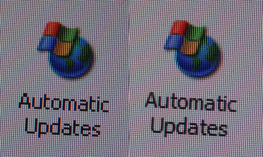
Going by deadman3000's macro picture of the subpixels I'd rule out the arrangement because they're all equally sized and distanced. The dot pitch on the HP is .24 (94 DPI), finer than anything but laptop screens, so the subpixels are all smaller and that can be ruled out too. I honestly can't say why it would be more obvious unless it's just the color red having higher contrast or a manufacturing defect.
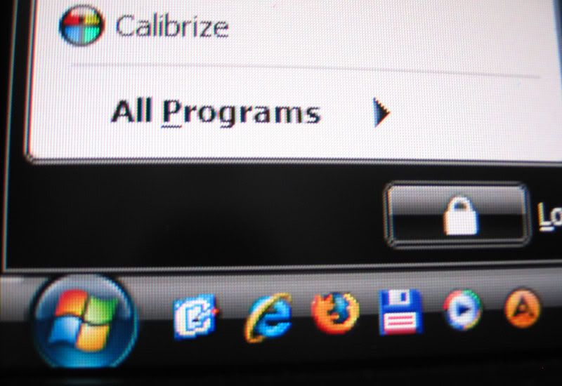
macro shot of vista start menu
Is the text visibly jagged or is that image exaggerated by exposure? Mine looks nothing like that, and the red shift is a lot more pronounced.
 
Well, all this talk of imperfect text on the LP2475W is really bumming me out.

On the strength of my 5.5-year-old Dell FP2000, as well as the glowing reviews, I ordered and received a Dell 2408WFP a week ago. I knew it wasn't going to work out within 15 minutes. Despite getting the A01 revision, with sharpening adjustable in 10% increments, no setting produced the rock-solid, perfect text of my FP2000. (What the heck is sharpening even doing on a DVI input signal? It's digital, guys! One pixel on the computer = one pixel on the screen! How hard is that?) Also, I can't believe how sensitive these PVA panels are to changes in viewing angle ("178 degree viewing angle" -- what a crock). If I move even 20 degrees horizontally off axis on the 2408WFP, the contrast and color go to shit. It's most visible while playing a movie -- dark grays turn greenish and all the normally-invisible, blocky artifacts pop out -- I honestly can't see how more than one person could enjoyably watch a movie on this thing unless maybe they sit 10 feet back and are practically in each other's lap. Very disappointing. My old FP2000 darkens slightly off-axis, but that's it. 6-year-old technology, and, except for the size, it beats the pants off their new stuff.

So, after doing some research (ah, my FP2000 had an IPS panel -- where are all the 24" IPS screens?) and based on the first 40 pages or so of discussion here, I ordered a LP2475W (from techonweb; $609.29 with free shipping) a couple days ago. Hoped it would solve both problems; now I'm not so sure. At least I'll be able to compare it side-by-side to the 2408WFP and FP2000 when it arrives.
 
Please do post your comparisons. I was ready to order, but the slightly fuzzy text has got me worried too. Perhaps I should just stick with my two CRTs. I just wish they were widescreen.
 
Please do post your comparisons. I was ready to order, but the slightly fuzzy text has got me worried too. Perhaps I should just stick with my two CRTs. I just wish they were widescreen.

I think the thing that really sucks is that these displays are not commonly available to view at a PC shop.

I wasnt exaggerating about my opinion of the poor text + heavy AG coating ... but having said that many people are quite happy with the text (and the coating).

I initially purchased based on this forum too ... even the NEC2490 which I have now and are very happy with.

The only advice then is just buy from someone you can get a full refund, if on the off-chance you are not happy.

Maybe there are only a few of us that have problems with the HP display, whilst there may be hundreds that are happy ... maybe a poll would sort this out once and for all :)
 
It's digital, guys! One pixel on the computer = one pixel on the screen! How hard is that?)

It's not hard. It's impossible. Unless everything (totally) on your screen is written in same size/same style font. It will look like 30 years old airport Arrivals/Departures panel.
It's impossible.

Also, I can't believe how sensitive these PVA panels are to changes in viewing angle ("178 degree viewing angle" -- what a crock). If I move even 20 degrees horizontally off axis on the 2408WFP, the contrast and color go to shit.
You probably have not seen the Dell 2408 review of March 9, 2008.
You are right though.
 
Is the text visibly jagged or is that image exaggerated by exposure? Mine looks nothing like that, and the red shift is a lot more pronounced..

The picture is actually a pretty realistic representation of the way it looks "live"

So you are sure you don't see little red pinpoint pixels to the left of the white dots in that test pattern? That may be good news... if others do not have this problem, then I may try swapping this display for another of the same model.
No I'm not. I didn't seem to see anything on the pattern but the picture of the startmenu could indicate a general problem :rolleyes:


I just don't understand why more people didn't catch this defect earlier ? I was waiting and reading threads about this monitor before buying. But as always I had to buy it myself to find the predominant bug. Which is the text.
Everybody seemed so hung up on the wide gamut thing which is really no problem if you have and ATI card (as I proved in previous post)

Only poster I could find who caught the text problem was (hmm..should have listened:
I bought this monitor last week.

The stand is not that ugly, like said before, it just looks professional but the height and cable management are nicely built.

I don't have any colorimeter yet, so I can't tell you anything about black level etc.

It doesn't make any buzzing, neither heating that much.

But, I found that the sharpness of the text (not only) is not that good, on mine.
That's hard to explain (can't take pic.), so I made you an exemple:

http://img79.imageshack.us/my.php?image=lp2475wtextqa6.jpg
(I exaggerated the effect, so you could see the difference.)

The text seems blurred, especially with black background, and inside a black text.
 
For those with text issues, I suspect the following is already part of the ClearType tuning process but give it a go, FontSmoothingGamma is the setting to change.

http://www.pctipsbox.com/fine-tune-cleartype-settings/

Remember to select Decimal when entering values in the recommended range. I don't know how valid that range is, I did try a value of 100 and I'm currently using a value of 8192 (= 2000 in hexadecimal, I forgot to select decimal ) with almost zero fringing on close inspection. You need to reboot for the change to take effect. I'm using XP btw and my initial value was 1000, ymmv under vista.

Does it affect the colour outline ? You bet.
Will it fix your problem ? I don't know, I don't notice the outline at my normal viewing distance.
 
Ok, here's a (bad - not a photog and using a Canon point-and-shoot) shot of some text on my 2475, I'm definitely not seeing the problems other people are mentioning with text, and hopefully this image shows that.

text.png
 
The text looks fuzzy on MBP running OSX leopard. Also tried my PC running XP... same result. So that eliminates operating systems and video cards.

Pity I never had the HP and NEC2490 side-by-side, the NEC looks so much clearer.
 
I guess the quest for the ideal 24" all rounder continues.

What about the NEC 24WMGX3? Can it's MVA panel deliver?
 
The text looks fuzzy on MBP running OSX leopard. Also tried my PC running XP... same result. So that eliminates operating systems and video cards.

Pity I never had the HP and NEC2490 side-by-side, the NEC looks so much clearer.

Could you perhaps do a photo of the NEC 2490 Text ?
 
Biosphere. Are you running native resolution through DVI because your text does look a bit off. Also try turning off Cleartype for your pic, that will help reveal the issue.

Here is text on my NEC 2490. Cleartype ON and then Cleartype OFF (they are separate images you can download and flip between them). Text looks excellent to me. It is in the category of the best I have seen. I am very picky when it comes to visual (witness my 2 years of LCD complaints in this forum :D ), but I see no glare or sharpness issues with my text.

You will note cleartype actually makes text more blurry and introduces some color fringes. But it makes some really tiny fonts fatter easier to read. It is a tradeoff. But personally, I wish they would come up with better tiny fonts that didn't need this. On [H] forums it doesn't seem to help at all.

cleartypeonxp7.jpg
cleartypeoffgx4.jpg
 
For those with text issues, I suspect the following is already part of the ClearType tuning process but give it a go, FontSmoothingGamma is the setting to change.

http://www.pctipsbox.com/fine-tune-cleartype-settings/

Remember to select Decimal when entering values in the recommended range. I don't know how valid that range is, I did try a value of 100 and I'm currently using a value of 8192 (= 2000 in hexadecimal, I forgot to select decimal ) with almost zero fringing on close inspection. You need to reboot for the change to take effect. I'm using XP btw and my initial value was 1000, ymmv under vista.

Does it affect the colour outline ? You bet.
Will it fix your problem ? I don't know, I don't notice the outline at my normal viewing distance.

WOW! That helped me a lot. I see no red/green edges anymore. The text looks thinner, but I like it. I have value 2000 in hexadecimal. I'm running 64 bit vista and the default value was 0. Thank you very much. :)
 
WOW! That helped me a lot. I see no red/green edges anymore. The text looks thinner, but I like it. I have value 2000 in hexadecimal. I'm running 64 bit vista and the default value was 0. Thank you very much. :)

Doesn't that just do the same thing as adjusting the Microstoft Cleartype tuning tool?

http://www.microsoft.com/typography/ClearTypePowerToy.mspx

A lot better than editing your registry.
 
Yes, I am in the unfortunate position of needing a large monitor with excellent text ... as I work 8-10 hours a day as a software developer. So it seems that other features are more important in these higher end monitors, which is understandable.

At the moment there are 100s of rubbish TN displays in the market ... for the last few years I have had Eizo monitors which had great text clarity ... but Eizo seems to have gone to heavier AG coatings and not jumped on the IPS bandwagon.

So have tried the iMac24 (thick glass, mirror city), Dell 2709W (all round terrible), HP 2475W (much better than the dell, but terrible text) and the NEC 2490 (the winner so far!)

And I think the sad thing is that with Apple and Microsoft going towards touch displays ... thick glass seems mandatory in front of the panel.

A couple of questions for you:

First, are you sure that TNs don't do the job for you for software development? Unless the top-to-bottom contrast shift bugs you, which is certainly possible, they should be able to be very sharp. Some of the text examples on digitalversus look pretty good. I'm in a similar boat as you, and the color-accuracy advantages of IPS panels don't seem worth it to me for my work. But then, I've never sat in front of a TN panel for long periods.

Second, I'm curious about why you don't like the reflective glass panels. You've probably gone over it already, but did controlling room lighting not do the trick at controlling reflections? I ask because I find that glossy panels are far better for me -- crisper text, better contrast -- but I have the luxury of a dedicated workspace where I can control the lighting. Nothing fancy -- just a couple of torchieres with dim lights that face up. I can understand why glossy screens would be painful for people who are restricted in where they can put it, and not willing or able to change the lighting in the room.
 
Biosphere. Are you running native resolution through DVI because your text does look a bit off. Also try turning off Cleartype for your pic, that will help reveal the issue.

Here is text on my NEC 2490. Cleartype ON and then Cleartype OFF (they are separate images you can download and flip between them). Text looks excellent to me. It is in the category of the best I have seen. I am very picky when it comes to visual (witness my 2 years of LCD complaints in this forum :D ), but I see no glare or sharpness issues with my text.

You will note cleartype actually makes text more blurry and introduces some color fringes. But it makes some really tiny fonts fatter easier to read. It is a tradeoff. But personally, I wish they would come up with better tiny fonts that didn't need this. On [H] forums it doesn't seem to help at all.

cleartypeonxp7.jpg
cleartypeoffgx4.jpg

I'll try a take a new photo tonight but could you please tell me exactly where in the OS your photo is from ? I'm running XP. Would like to grap a photo of the exact same place..
 
Sorry my cam is just not up to the task. This the best I could do.

Without cleartype to the left:
text2.jpg
 
Sorry my cam is just not up to the task. This the best I could do.

I think it shows enough that there is no strange issues with rendering, previous photo might have been interaction with camera resolution or something. I am talking about cleartype off in this case. Pixels appear properly alinged with no bleed into the next pixel.

But it does appear that the red pixels might be a bit more prominent on yours (source of fringing complaints from some?). My capture is slightly closer and still red doesn't stand out that much on mine. Then again, it may just be exposure differences.

Anyone who sees color fringing should first turn off cleartype which definitely produces color fringing. You will probably notice you are color fringe free but decide to turn it back on for the thicker fonts.

Yeah I agree that it seems red pixels might be a bit more prominent on mine. Still my eyes don't lie and I definitely feel something is wrong with text rendering. I feel the eye strain when reading text on this screen. However I don't believe anything is wrong with my monitor sample. Too bad really. I guess it's going back and so the hunt continues...:rolleyes:
 
Hello there, I have this monitor but I am completely lost in the color management. I have tried to simply adjust the settings of the LCD like brightness, contrast and RGB in the OSD menu as per suggestions from TFT Central, but I still think the colors are too bright and saturated, especially the red is too red and green is way too green. And I do not know how to fix it. I don't have any hardware calibrator so the calibration has to be dependent just on my eyes. I have seen several different profiles posted in this thread but how do I use them? Almost all the guides on the net say that when the profile is saved, something must be loaded into the LUT of the graphic card but I absolutely don't know how to do that. I think I am doing something wrong. Isn't there any guide on the internet for absolute beginners where everything is explained step by step? I can't find anything.
I am running Win XP. Graphic card is Nvidia GeForce 7900GT.
 
OK, this monitor is officially off my list, after testing 7 (seven) of them, none came out even close to good (bad batch, I suppose) - severe banding, green/red corners, bleeding, dead pixels, etc. The bad thing is that shipping from abroad means only one display, and you have to pay for it, but noone guarantees that it would be any good.

Any ideas for sub 700 euro gaming + graphics design monitor? aRGB or sRGB - I don't care...

Banding :confused: I didn't think that was one of the problems people have been seeing. Are you using the Lagom tests? Seems that their banding test has a little banding in it (open up in an image editor to verify for yourself), a smooth gradient in PS has no banding whatsoever (with the obvious caveat of only being able to display 255 levels of gray so depending on the width of your image you may have 1 or more pixels per colour).
 
yeah, on 2 or 3 of the displays the bandinг was ridiculous... color lines and even blacks, merging with the background in the end...
 
@mildante,

I'm sure someone with a lot more knowledge than I will provide you with more detailed information. Meantime here's some links to get you started courtesy of philjohn:

http://forums.overclockers.co.uk/showpost.php?p=12526623&postcount=302

http://forums.overclockers.co.uk/showpost.php?p=12555423&postcount=359

Hi ecat, now I am confused - is this forum actually the same as the overclockers one? Can I use the same login?

I have tried the LUTManager and the profile posted by philjohn but the colors were still too bright. So I have tried Calibrize (calibrize.com) - also posted at overclockers and even though it is quite simple it helped me to cool down the colors a little bit. However I do not understand what exactly it is actually doing becasue the RGB values in the OSD menu of the monitor remained unchanged. However it saved some profile into the Windows folder and it is loaded everytime I reboot. Should I also manually load this profile into any application that allows it? For example Nikon Capture NX?

No need, as long as it's set as the default in the Windows Colour control panel applet you should be good to go.
 
philjohn: Perfect, I was afraid I have to load it manually to all these color managed programs. And what about games? Will they use the profile or will they delete it from the LUT and will I have to reboot after the gaming session?
 
OK, this monitor is officially off my list, after testing 7 (seven) of them, none came out even close to good (bad batch, I suppose) - severe banding, green/red corners, bleeding, dead pixels, etc. The bad thing is that shipping from abroad means only one display, and you have to pay for it, but noone guarantees that it would be any good.

Any ideas for sub 700 euro gaming + graphics design monitor? aRGB or sRGB - I don't care...

You have had a troubled time :(

Banding is a funny issue and can be caused by incorrect monitor settings, video card settings too. I am in no way questioning your claims, I just want to point this out.

The other issues are clearly faults. Here in the UK I believe, I could be wrong, the monitors are covered by 'Next Day Onsite Exchange'. The bad news is the exchange monitor could be a referb :( The good news is the exchange monitor is delivered by an engineer who will set it up for you and no doubt have a little time to evaluate the monitor with you. I have no idea how much mileage you can get from this. Has anyone here ever called upon an HP Warranty ?
 
philjohn: Perfect, I was afraid I have to load it manually to all these color managed programs. And what about games? Will they use the profile or will they delete it from the LUT and will I have to reboot after the gaming session?

Nope, just reload LUT Manager and load the profile again. No game I know of currently is colour managed/aware so they are still a problem with wide-gamut panels.
 
Gotta post in here. For all those who wish to use a color profile in games, download this program.

http://www.hex2bit.com/products/product_mcw_dl.asp

When opening this program, you can calibrate your monitor by eye (useless feature, I know.) or you can keep your current color settings and save them, and this is what you want to do if you have already calibrated your monitor and you have your ICC profile loaded and working. So write a name to your new profile and save. Then select your profile, load it, and check 'Load at Windows startup' and 'Persistent profile, dont let the current profile change'. There is also a box for option Apply Fix to override driver level color correction, but I dont what it does or when it is needed. Perhaps this program doesnt work on every graphics card without it?

Anyway, games cant reset your color settings now. In Morrowind which I played yesterday, even Gamma slider has no effect. When I adjusted gamma setting to brighter, screen got brighter for a only second and then reverted back to original brightness.

Handy little prog from wide-gamut users I believe. :)
 
Nope, just reload LUT Manager and load the profile again. No game I know of currently is colour managed/aware so they are still a problem with wide-gamut panels.

Ok, understand. I am not using LUTManager but the Calibrize loading utility so it will do the trick as well I guess. Thank you philjohn
 
Gotta post in here. For all those who wish to use a color profile in games, download this program.

http://www.hex2bit.com/products/product_mcw_dl.asp

When opening this program, you can calibrate your monitor by eye (useless, I know) or you can keep your current color settings and save them, and this is what you want to do if you have calibrated your monitor and you have your ICC profile loaded and working. So write a name to your new profile and save. Then select your profile, load it, and check 'Load at Windows startup' and 'Persistent profile, dont let the current profile change'. There is also a box for option Apply Fix to override driver level color correction, but I dont what it does or when it is needed. Perhaps this program doesnt work on every graphics card without it?

Anyway, games cant reset your color settings now. In Morrowind which I played yesterday, even Gamma slider has no effect. When I adjusted gamma setting to brighter, screen got brighter for a only second and then reverted back to original brightness.

Handy little prog from wide-gamut users I believe. :)

Hello, thank you for the tip :) Wasn't there also some other utility that was discussed here earlier? Some Power..something ... I forgot the name of it. Does anyone know which one is better and more user friendly?
 
Powerstrip. Its a tool where you can adjust about anything graphics card related, like overclocking, colors, custom refresh rates, all kinds nifty settings to adjust (and screw up in the process if you dont know what you are doing) etc... Its not free program, though im not sure if there is any time limit on using its demo version. MCW, which I linked, does only one thing so if keeping your calibration forced on is all what you need, this is good and free program for it.
 
Back
Top