Google Chrome's New UI Is Ugly, and People Are Very Angry

Megalith

24-bit/48kHz
Staff member
Joined
Aug 20, 2006
Messages
13,000
Not everyone was a fan of Chrome’s Material Design refresh when it debuted in September with the release of version 69, but there was some good news, in that users could revert to the old theme by visiting the chrome://flags page and modifying a setting. Unfortunately, Google has incited the wrath of those who hate mobile-first, eye-searing UIs by removing that option this month to force its adoption. The company’s engineers are advising complainants to switch to another browser, as those who downgrade to an older version to get the old UI back are opening themselves up to security risks.

For the past two to three weeks, social media sites like Reddit and Twitter have been flooded with complaints about Chrome's new UI and users wailing about not being able to switch back to the old style. Most of the complaints that Chrome users are bringing forward are legitimate. It is incredibly harder to find a desired tab on the tab bar with the new UI, compared to the old one. Furthermore, Chrome's new UI also broke users' ability to mute tabs, which is an inconvenience of its own.
 
UI changes are always the most complained about. You have a fraction of people who just do not like change. Then you have some with valid complaints that usually get addressed in future updates. Then you have the majority that will never complain as it is not that big of a deal in the end. A lot more important things in life to care/worry about.
 
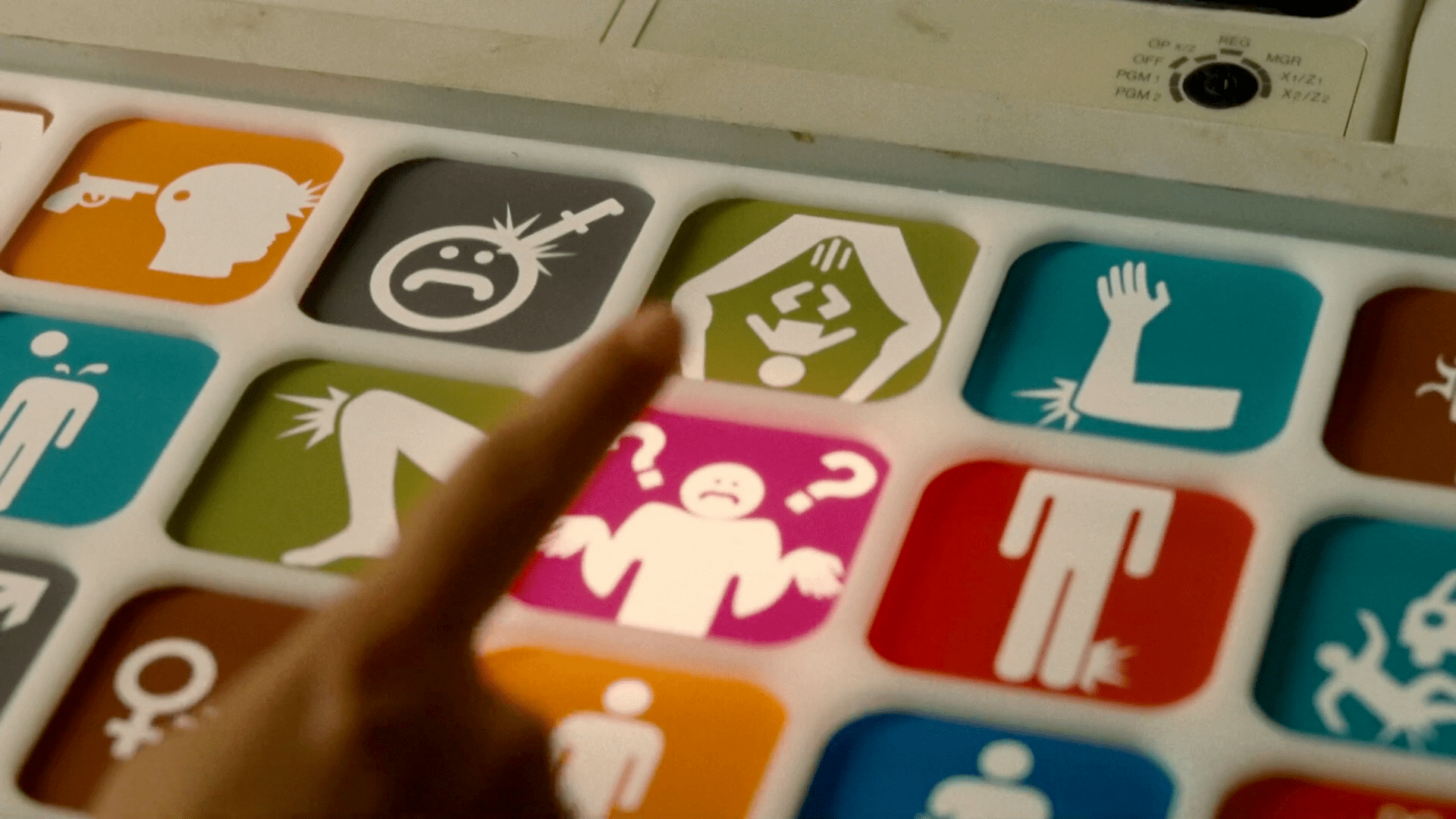
UIs are looking more and more like they were designed by Fisher Price. The old go-to, Idiocracy:

Idiocracy_triage07.png
 
Worker: "Sir, people don't seem to like our UI direction, should we address it?"

Manager: "Yes, remove the option to go back to the prior UI and tell them kindly to fuck off."

I'm sure this is calculated though. They likely (hopefully) see the metrics of how many users were still using the prior UI (via the flag) or refusing the update. That quantity was less than what it costs to maintain both UI's going forward. If it was a significant number, they'd hopefully reconsider. But then again, managers are not always the brightest.
 
I got tired of Googles obsession with blinding me with white and changes that I didn't enjoy like this... So I went with Vivaldi (Firefox is for "other things") and much nicer with choices but it does seem to have WAY worse performance in loading and showing web pages and slower to add new tabs and time before I can start typing the URL and so on but I'm getting used to it and prefer that annoyance to Google and chrome (I know Vivaldi is chromium based)
 
I will never use crap like this, especially when force injected.
It makes me laugh.
 
I'm back on Firefox because Chrome doesn't play nice with my new rig. I've lost zero sleep over it.
 
The UI changed? I honestly never noticed that it was different. Chrome has been pushing for a minimalistic, simple, look for years. As someone that appreciates minimalistic design, I approve of this approach.
you might be like me with custom them that loads up with every new install.....or its seems like mine turns dark after logging in and settings are synced..Hard to notice in dark mode lol?
 
The hyper-white theme is in poor taste and flies in the face of common sense.

There's also this little gem.

Google, don't let the interior decorator become the architect.


My thoughts exactly.

I'm not going to lie. The concept of mobile first UI design bothers me, as I don't want my highly capable advanced computer looking like a silly little phone, but I find this bothers me more in webpage design than it does in the window decorations of the browser itself.

The White color - however - that is eye scorching, wasteful (battery wise) and just ugly in general and I hope it does a horrible horrible death.

I've been using Googles chrome since the early oughts when I switched from Mozilla, as Chrome was much faster, but it might finally be time to switch away.

One of the reasons I liked Android when I first started using it was because it was for power users, allowing customization and themes that the control freaks at Apple didn't. Google seems to have lost its way trying to force their way on their users, rather than let their users enjoy the experience they like best, and what's worse it's not just limited to phones, but alwso moving to the desktop.

Seriously, Fuck that.

The only problem is that even if I switch browsers, I still can't get the good old web design back. Google ruined that for us when they decided to uprank mobile web pages in their search results.

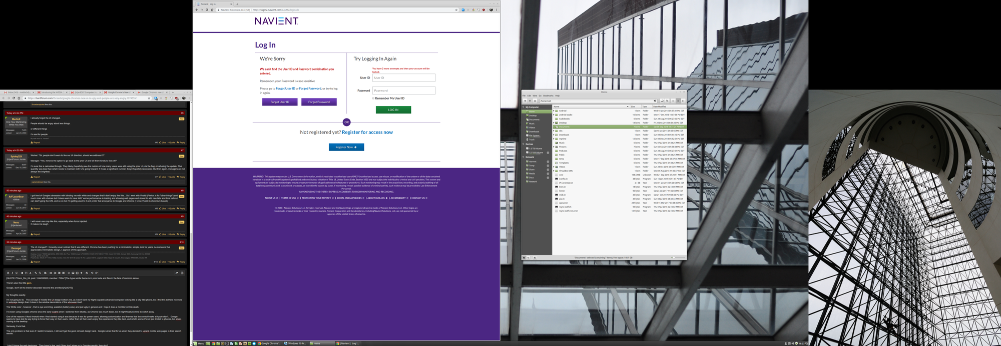
So now I get huge stupid nonsense like this when I try to pay my student loans, instead of a proper webpage designed for a proper desktop:

upload_2018-12-29_18-23-50.png


The oversized and over simplified design elements may look and work well on a phone screen (this is debatable, I've always preferred full desktop sites on my phone) but on the desktop they look like it is designed for the bortderline retarded who can't deal with reading fine print. I hate it with a passion.


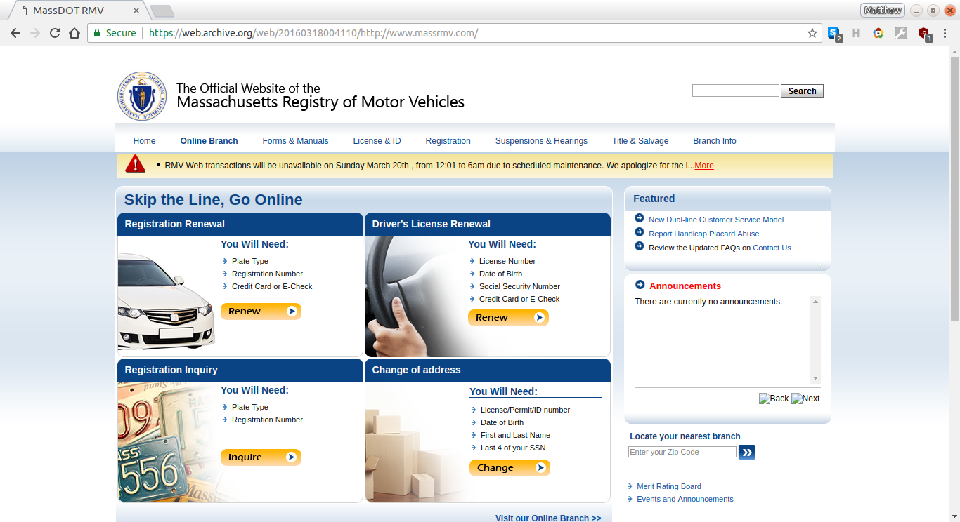
Similarly, as I posted in a recent thread here, when I went to the Mass RMV's (what we call our DMV for some reason) webpage on my 1366x768 laptop, I used to get this nice information dense webpage with everything I need in one place:

150474_upload_2018-8-21_16-6-4.png


Now, when I load the same page, I get this:

150472_upload_2018-8-21_15-59-59.png


No useful information at all, until I scroll down, when I get these ugly oversized fat fingered retard screen buttons for everything, so that it doesn't even fit on one page:

150473_upload_2018-8-21_16-1-56.png


This trend makes me want to stab people.

I don't blame the web designers. They have to live, and if they don't show up in Googles results, they don't. I fully blame Google for this, and them relentlessly trying to force their vision of the future on people who don't want it.

It's good Google dropped the "Don't Be Evil" mantra years ago, because today they are pretty much the definition of evil, strong-arming and forcing their ways on everyone. I hope they die in a fire.

Seriosly, fuck mobile. It has done nothing but make tech worse over the last 10 years.
 
Last edited:
Not sure what the fuck is there to complain about. It looks pretty similar. I guess people always want to bitch about shit that matters the least. One thing I wish google implemented was run feature when we do downloads. So I don't have to save them to actual folder and install them and then delete them. That is one thing I appreciate about IE. Like installing drivers that you don't need to keep and it goes to temp files and then gets erased. Unless its a zip file that requires extraction. UI? Seriously it just more flashy but the same.
 
I have a custom theme on my Chrome, and the new UI design makes it impossible for me to distinguish which tab I'm actually viewing. It sucks, and the fact that they removed the choice of selecting your UI is just like Microsoft removing the choice of classic desktop in Windows 8.
 
I don't use Chrome, but a company making software you use worse and giving you no recourse to go back is perhaps the programming trend I'm least fond of.
 
My thoughts exactly.

I'm not going to lie. The concept of mobile first UI design bothers me, as I don't want my highly capable advanced computer looking like a silly little phone, but I find this bothers me more in webpage design than it does in the window decorations of the wbrowser itself.

The White color - however - that is eye scorching, wasteful (battery wise) and just ugly in general and I hope it does a horrible horrible death.

I've been using Googles chrome since the early oughts when I switched from Mozilla, as Chrome was much faster, but it might finally be time to switch away.

One of the reasons I liked Android when I first started using it was because it was for power users, allowing customization and themes that the control freaks at Apple didn't. Google seems to have lost its way trying to force their way on their users, rather than let their users enjoy the experience they like best, and what's worse it's not just limited to phones, but alwso moving to the desktop.

Seriously, Fuck that.

The only problem is that even if I switch browsers, I still can't get the good old web design back. Google ruined that for us when they decided to uprank mobile web pages in their search results.

So now I get huge stupid nonsense like this when I try to pay my student loans, instead of a proper webpage designed for a proper desktop:

View attachment 131462

The oversized and over simplified design elements may look and work well on a phone screen (this is debatable, I've always preferred full desktop sites on my phone) but on the desktop they look like it is designed for the bortderline retarded who can't deal with reading fine print. I hate it with a passion.


Similarly, as I posted in a recent thread here, when I went to the Mass RMV's (what we call our DMV for some reason) webpage on my 1366x768 laptop, I used to get this nice information dense webpage with everything I need in one place:

View attachment 131466


Now, when I load the same page, I get this:

View attachment 131467

No useful information at all, until I scroll down, when I get these ugly oversized fat fingered retard screen buttons for everything, so that it doesn't even fit on one page:

View attachment 131468


This trend makes me want to stab people.

I don't blame the web designers. They have to live, and if they don't show up in Googles results, they don't. I fully blame google for this, and them relentlessly trying to force their vision of the future on people who don't want it.

It's good Google dropped the "Don't Be Evil" mantra years ago, because today they are pretty much the definition of evil, strong-arming and forcing their ways on everyone. I hope they die in a fire.

Seriosly, fuck mobile. It has done nothing but make tech worse over the last 10 years.

Firefox Quantum under Linux and Firefox Beta under Android are fantastic. I haven't used Chrome since Quantum was released.
 
I don't use Chrome, but a company making software you use worse and giving you no recourse to go back is perhaps the programming trend I'm least fond of.

This just tends to come along with dominance. I am not the biggest fan of chrome, but sadly google just has the brand recognition to come along and people fall for it. Its just herd mentality. Google just has the eco system even though it may not have the best browser.
 
up until recently firefox used to allow you to apply a full custom theme. The lack of flexibility/options was one thing that I always hated about chrome. Shame firefox went in that direction as well.
 
up until recently firefox used to allow you to apply a full custom theme. The lack of flexibility/options was one thing that I always hated about chrome. Shame firefox went in that direction as well.

You can fully customize firefox and you can still apply themes?
 
Its all said here already but yeah.. i think ' modern ui' is a regression in computing.. and didn't notice or care to notice chrome changes.
 
UI changes are always the most complained about. You have a fraction of people who just do not like change. Then you have some with valid complaints that usually get addressed in future updates. Then you have the majority that will never complain as it is not that big of a deal in the end. A lot more important things in life to care/worry about.

Unless of course, it is Windows, then any change is bad. ;) :D Did not even know Chrome changed since I do not use it.
 
Unless of course, it is Windows, then any change is bad. ;) :D Did not even know Chrome changed since I do not use it.

Coming from the person that thinks Win32, the NT kernel and NTFS is all good in the name of backwards compatibility with legacy products, that's quite the contradiction. :rolleyes:
 
The only device I use Chrome on is my tablet. I'm fine with the change. It's not that different than the old one.
 
Anyone who says UI changes aren't a big deal....

Are you still using Windows 8?
 
I never liked the look and "feel" of Chrome, and the new look I like even less. Forcing change on people is bad, forcing stupid superfluous (aesthetic) changes on people is bad and stupid.
 
It would be nice if they'd at least "un-kill" a pretty standard Windows feature of allowing double-clicking of the top left corner to close the window that no longer works. (Just restores now as if you double-clicked anywhere on the top bar)
 
I got tired of Googles obsession with blinding me with white and changes that I didn't enjoy like this... So I went with Vivaldi (Firefox is for "other things") and much nicer with choices but it does seem to have WAY worse performance in loading and showing web pages and slower to add new tabs and time before I can start typing the URL and so on but I'm getting used to it and prefer that annoyance to Google and chrome (I know Vivaldi is chromium based)
Did you just tell us you watch porn in firefox? Why?
 
Why would you purposely use Chrome if you didn't want Google to make decisions for you and modify software behind your back?
 
You can fully customize firefox and you can still apply themes?
there were two types, some crappy 'personas' that was pretty unimpressive, but they used to have full, custom themes. they eliminated the full themes with the quantum update i think.
now i think there is just some color changes to the tool bar area, basically.
 
there were two types, some crappy 'personas' that was pretty unimpressive, but they used to have full, custom themes. they eliminated the full themes with the quantum update i think.
now i think there is just some color changes to the tool bar area, basically.

What else is there to theme? You can still go into Hamburger Menu > Customize and basically change every aspect of the browser.
 
The UI changed? I honestly never noticed that it was different. Chrome has been pushing for a minimalistic, simple, look for years. As someone that appreciates minimalistic design, I approve of this approach.
Minimalist is fine, but changing the UI so that it actually takes up more space or shows less information in the same amount of space kind of flies in the face of minimalism. Stuff like rounded corners for tabs or for the URL bar wastes space rather than saving it. Then you have things like the tab row taking up more vertical space now than under the previous iteration of the UI.

At the end of the day, it's not a huge deal, but if you want a minimalist approach then it's better to implement it in a non-wasteful fashion, imho.
 
Chrome has been horrible for the last couple of months. They did something that absolutely thrashed the dev tools. They are doing something way beyond UI colors and shapes.
 
Back
Top