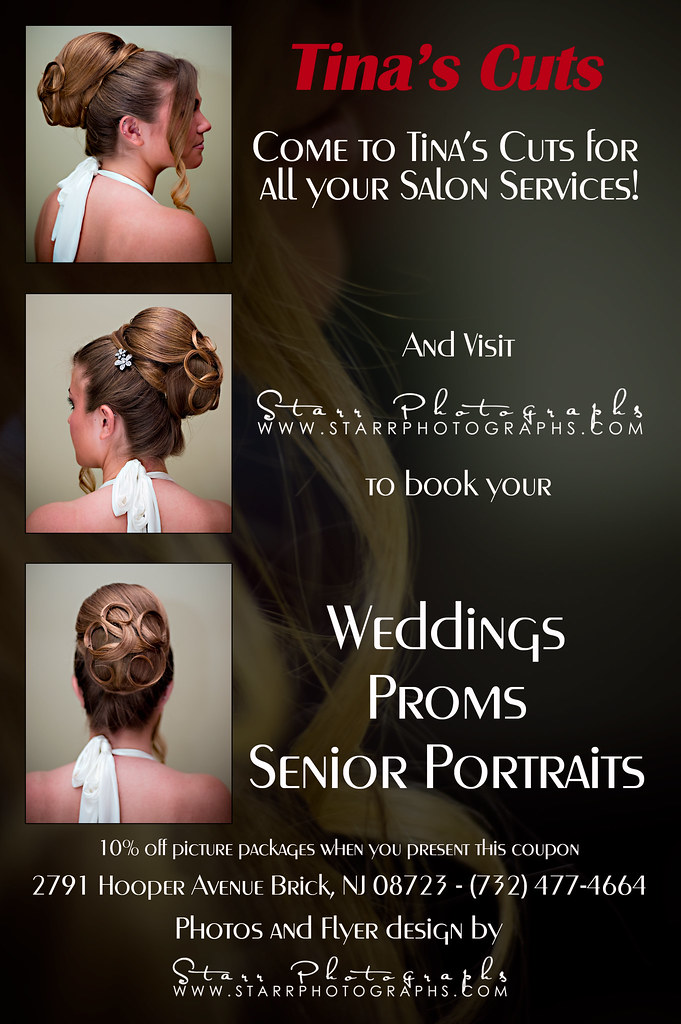
Flyer

ben chi(f4)

2[H]4U
Joined
Mar 4, 2008
Messages
2,339
What do you think?

4535689761_24ed5ac8c1_b.jpg
 
it's hard to say what i think of the flyer because i'm so distracted by my concern over that girl's sunburn...looks brutal.
 
Has a nice look to it. Some of the text at the bottom gets lost in the hair. What about adding a very small black border to the letters?
 
I gotta agree, the reds in skin-tones are over-saturated, and make it look like she has a horrible sun-burn. Need to make the skin-tones a little more natural.

Also the typography is very scattered looking. Need to pick a font and stick with it. All the text besides your logos should be the same font, same size (no more than 3 font-sizes total), and the same tone, either all-black or all-white (never use the border-lines around text if you can help it). I would pick a font that is different from the ones in the logo's so the logo fonts pop out a little more.

Then you need to either darken or lighten the background photo to give more contrast from the text. I think it might look better if you use black text and lighten the background a little, but play around with it to see.

There are a few ways to make text pop off the background without resorting to strokes or shadows directly on the text. I would try to do something a little more subtle to the photo itself to keep the text clean and readable. Try blurring the photo in select areas so the detail of the photo doesn't interfere with the text, and burn/dodge larger areas of the photo (or add a layer and paint in some subtle black/white) - you want to do all the editing in a way that the end user doesn't see it at all in the end product, and it looks like it all just worked out by itself.
 
yeah.. wtf dont' know what happened to that.. doesn't look like that in photoshop...

4535689761_ebd020ef56_b.jpg


there?
 
Last edited:
Oh, yeah lots better. :)

Only thing I would still do is go back to the background and brighten up a few of the details that aren't behind the text to make those pop out a little more and match the white detail in the text to tie those together - since the ad is about hair, really make it shine. All those little fly-aways to the left of the words "And Visit", around the word "Wedding", and a little below the "Senior Portraits" line could be dodged up to a near-white tone (need a little sharpening too) and would work really well with the composition. Also, the area around the lips is a little too dark now - looks a little unnatural - the lower lip, like the hair detail, could be brightened way up to improve composition - just be careful where the highlight overlaps the text.

Oh, now that I'm looking at spacing - need to move those top 2 text blocks down some so they are centered horizontally with the top thumb-nail photo. That should give you plenty of space to highlight lower lip. Might as well tighten up the rest of the text areas while you're at it: tighten the line spacing (leading) on all 3 of the lower text sections, make sure the middle ones are all centered on their respective thumb-nail, tighten leading and move the bottom section down a hair to give it more breathing room from the bottom thumb-nail.

Ok - I'm done nit-picking now. :)
 
Last edited:
Back
Top