Chrome 64 for Android: White Navigation Bar!?!

Zarathustra[H]

Extremely [H]
Joined
Oct 29, 2000
Messages
38,857
This is absolutely hideous!

At first I thought it had to be a bug or mistake or something and that it would soon be fixed, but then I came across this.

What the hell are the people over at Google smoking anyway?

This might be the straw that breaks the camel's back for me, forcing me to look for an alternative mobile browser...

This is so awful it hurts my eyes!

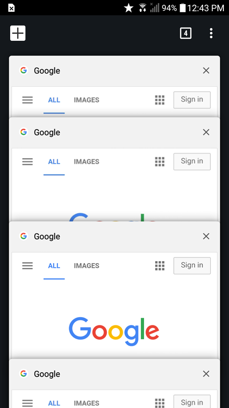
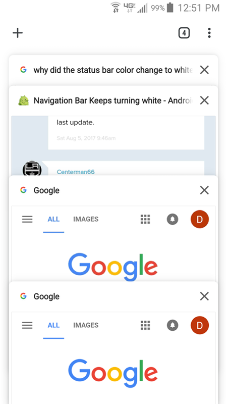
Screenshot_20180125-141342.png Screenshot_20180125-141502.png
 
They claim this is to limit burn in, but that is just stupid.

Burn in happens when you have the same thing on the screen for long periods of time. This white would burn in, just like black.

If they want to limit burn in, make it semi-transparent and let content scroll across it.

That ought to be much less of an eye sore too!

Black doesn't burn-in on AMOLED displays, which is what all Pixel devices use. So the white icons on the black buttons do temporarily burn in when the nav bar is up for a while. The white nav bar with grey icons is the almost (should be black) inverse of that, so it helps negate whatever burn-in is already there when they flip it like that.

But I agree; that would be stupid and annoying for me too. I'm not seeing it on my Nexus 6P fortunately, but I'm rooted/ROM'd and still running a Nougat ROM too. I'd say there is a flag you can toggle to change it back in (chrome://flags). One thing I like about the ROM I'm on too is that I can toggle "immersive mode" in the notification shade at any time and minimize the nav bar and notification bar in any app I want too. You may be able to do that on stock Android too though, I'm not sure. I could have swore Chrome used to let you toggle immersive mode from within the app too, but I'm not seeing it anymore in the menu or settings.
 
Black doesn't burn-in on AMOLED displays, which is what all Pixel devices use. So the white icons on the black buttons do temporarily burn in when the nav bar is up for a while. The white nav bar with grey icons is the almost (should be black) inverse of that, so it helps negate whatever burn-in is already there when they flip it like that.

Well, the black doesn't "burn in" per se, but the rest of the AMOLED screen sees wear, and becomes dimmer over time. So, if there is one area of the screen that is always black, it stays newer and brighter than the rest of the screen, and that will look like burn in.

But I agree; that would be stupid and annoying for me too. I'm not seeing it on my Nexus 6P fortunately, but I'm rooted/ROM'd and still running a Nougat ROM too. I'd say there is a flag you can toggle to change it back in (chrome://flags). One thing I like about the ROM I'm on too is that I can toggle "immersive mode" in the notification shade at any time and minimize the nav bar and notification bar in any app I want too. You may be able to do that on stock Android too though, I'm not sure. I could have swore Chrome used to let you toggle immersive mode from within the app too, but I'm not seeing it anymore in the menu or settings.

It should happen as soon as you get Chrome 64 I think. Check what version you currently have?

I've overall been pretty disappointed with Chrome in Android when it comes to flags. When the ability of mobile sites to set the color of the menu bar, I hated that, and was looking for a way to disable it, but there was none.

There is also, still no way to disable AMP, which drives me absolutely nuts.

Google seems to want you to do things their way and their way only, and I hate that. That's why I don't buy Apple products...
 
Imo it should be see through with heavy blur. Kinda like fluent design acrylic thing on Windows 10.
 
Imo it should be see through with heavy blur. Kinda like fluent design acrylic thing on Windows 10.


I like that idea.

The key is to give the pixels a similar a mount of load as the rest of the screen, yet at the same time make it distinctive enough of a visual cue, so the buttons are easy enough to pick out. I think a good blur could do this.

They have been changing out the navigation bar to a white one across all of the google apps. On the others it doesn';t make as much of a difference, as it more or less matches the UI of gmail, etc. but in web browsers it stands out and is really harsh. Looking at screenshots of it really doesn't do it justice, but when it is on my phone, I find it very bothersome on darker webpages, and I spend a good deal of my web time on darker themed webpages.
 
Last edited:
Yea, I just noticed this today. Looks horrible on dark web pages...
 
Yea, I just noticed this today. Looks horrible on dark web pages...


Yeah, and the thing is, it may seem like a small thing to complain about, but due to higher PPI and brighter and higher contrast screens on phones, it is much more jarring on the phone than a screenshot on here can do justice.
 
Yup this is terrible. Took me a while to figure out what it was; I too thought it was a bug or something my launcher did or some setting that got reset.

What was it before? Black or transparent?
 
What was it before? Black or transparent?

All the Google apps used to use a black background on the navigation bar, but now they are transitioning them all to white. You Chrome was one of the last to get the treatment.


You barely notice in the other apps as it blends in with the white UI in them, but in Chrome, especially if you frequent web pages with dark themes it is absolutely jarring.
 
They are likely a/b testing it. Mine is still black.

I do wonder why they do not make it to adapt web page's body background colour. Should be the simplest solution.

By the way, Microsoft Edge is actually a really good alternative. It's fast, efficient and dark theme is available.
 
Last edited:
They are likely a/b testing it. Mine is still black.

May just be a delayed rollout. Are you on version 64 yet? I've noticed that app updates are typically phased in. They don't hit everyone at once.

I do wonder why they do not make it to adapt web page's body background colour. Should be the simplest solution.

Yeah, that, or even have it match the color of the tab, for sites that use the color code to change their tab color.

A smooth blur of the underlying webpage for the menu bar would be my choice, but that might shorten battery life due to the extra processing needed.

By the way, Microsoft Edge is actually a really good alternative. It's fast, efficient and dark theme is available.

I generally only turn to Microsoft products as a last resort.

I might try mobile Firefox or Opera though. Haven't gotten around to it yet.
 
May just be a delayed rollout. Are you on version 64 yet? I've noticed that app updates are typically phased in. They don't hit everyone at once.


Yeah, that, or even have it match the color of the tab, for sites that use the color code to change their tab color.

A smooth blur of the underlying webpage for the menu bar would be my choice, but that might shorten battery life due to the extra processing needed.


I generally only turn to Microsoft products as a last resort.

I might try mobile Firefox or Opera though. Haven't gotten around to it yet.
Been rocking 64 for a while now and it's black. What I hate about Chrome right now is the top bar. It stays constantly visible after a while and never auto hides itself when scrolling unless I close that tab and reopen it.

IMO, Firefox still sucks on Android. Edge is way smoother, battery friendlier and the UI is actually rather nice You should give it at least a try.

screenshot_20180205-1fvs8s.png
screenshot_20180205-1hcs6d.png
 
Last edited:
I'm a fan of Firefox for Android, I like the extensions and privacy control with uBlock origin, Cookie AutoDelete, and Video Background Play Fix (the last one is so I can play YouTube videos with the screen turned off or while switching between tabs and apps) I use it on desktop as well so I can send tabs between desktop and phone, and vice versa. And when I'm done with a browsing session, I exit via the quit button fso it wipes my history and cookies. Javascript performance isn't as good compared to Chrome, and I see a lot of complaints about scrolling behavior (personally never had a problem with it), but hopefully the Quantum redesign with Firefox 59 can fix some of the issues in March.

As far as burn-in, I haven't noticed any on my 1st generation 5" Pixel. But I am using it at low brightness almost all the time. If I ever felt like I needed to even out the navigation bar, I just turned on the invert colors option and let my phone sit with the screen on.
 
And Google seems hellbent on making things worse.

With the rollout of mobile Chrome 69, even more design elements are white, without any option to change them

Before with 68, Left and after with 69 Right. (not my screenhots)

upload_2018-9-13_15-0-10.png
upload_2018-9-13_15-0-57.png


There is no option I can find anywhere to change this to something more sane.

I'm starting to hate google and android. I originally switched exactly because I was pissed at Apple for forcing things on users, and now Google is doing the same.

If I could - today - I'd be looking around for a third option. I'm fed up with this shit. I hate white backgrounds and I hate primary colors. I chose android because it was customize-able and I could have my phone my way.
 
I mean, seriosuly, considering most phones these days have AMOLED screens, white is the absolutely worst color for a background.

They should be making everything as much as possible black, a true #000000 hex value. Battery life would be greatly helped, and peoples eyeballs would not be scorched either.
 
  • Like
Reactions: DF-1
like this
And Google seems hellbent on making things worse.

With the rollout of mobile Chrome 69, even more design elements are white, without any option to change them

Before with 68, Left and after with 69 Right. (not my screenhots)

View attachment 103759View attachment 103760

There is no option I can find anywhere to change this to something more sane.

I'm starting to hate google and android. I originally switched exactly because I was pissed at Apple for forcing things on users, and now Google is doing the same.

If I could - today - I'd be looking around for a third option. I'm fed up with this shit. I hate white backgrounds and I hate primary colors. I chose android because it was customize-able and I could have my phone my way.


Well fuck.


There used to be a flag allowing me to disable the modern awful white switcher background. As of today there was an update and it is gone.

My eyes bleed.

What the fuck Google? Are you all smoking fucking crack?

I want to stab them all.
 
Meanwhile DDG's mobile website has like 6 different themes to choose from with 3% of the marketshare and Google which controls almost the entire stack from fingertips to datacenters can't offer us this stuff in their half their sites or their browser.

zzzz
 
meh i already got use to it and forgot it changed, lol. my screens brightness is turned way down though so it doesn't really bother me anyways.
 
I hate white screens. Unless you are trying to mimick a white piece of paper, IMHO a white background should pretty much never happen anywehre. I don't think I'll ever get used to it. Not to mention the extra power used on AMOLED screens.

Some google apps are thankfully getting "dark mode" settings, but the rollout seems to be slow. Youtube and the SMS app have them already, but I want it on everything.

I originally chose Android because it was the enthusiasts system. You could pretty much customize and change anything to your liking. Google seems to be messing with this right now forcing uniformity on everyone, and I absolutely hate it. If there were another realistic option, this would totally make me switch, but there is no way I'd go to Apple.
 
Back
Top