Hands-On With Windows 10’s Preview Build 9926

HardOCP News

[H] News
Joined
Dec 31, 1969
Messages
0
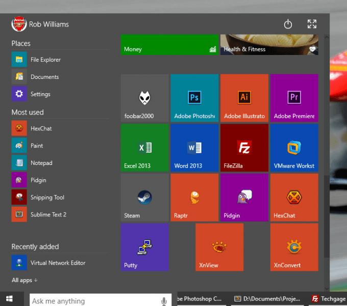
The crew at Techgage have spent a little quality time with the Windows 10 preview build 9926 and they want to share their experiences with you.

Hot on the heels of its major Windows 10 event, Microsoft released a brand-new preview build to the public, versioned 9926. Given what we were told at the event, we knew that Cortana, a revamped Start menu, and updated Notifications pane would be featured. But is that all? As it happens, no. Not even close.
 
Personally, I'm not interested in cortana, an xbox app on my PC or the windows store running in the background. The new Windows Update is just scary. It seems they are planning to install whatever software and hotfixes they want. It appears MS has adopted a 'You don't have to think, we know whats best for you' attitude rather than delivering on its customers needs. I'm sure MS will save a lot of money with the 'One OS for all' idea but I don't think it'll work out. The dumbing down of Windows is just sad. Hopefully game devs and graphics card manufacturers will continue to develop for Linux based OS, then I can leave windows behind. Of course they've tried to cover that base with the rash of DX12 articles that have hit the net recently. Oh, and the giant tiles look ridiculous, makes me feel like I'm back in kindergarten.
 
"The taskbar looks great."

Yep, it looks like Android 5.0.
Android doesn't have a taskbar... the giant black bar along the bottom of the screen on Android does not and has never shown currently running tasks/applications.
 
Aesthetics are still 2 steps backwards from win7 imho...

Cmon, most of us have 1/2gb video cards and you give us a UI thats like it can be rendered by...

DOS?

I want at least the eye candy look of win7.

and the bottomprogram tabs...

JEEBUS THEY ARE ALL THE SAME COLOR WITH NO BOXES

no, just NO.
 
Don't like the new Start Menu at all, I'll just stick with StartIsBack when I update to Windows 10. The colors and the flat look are just ugly. Also eats up way too much space on the desktop.
 
yeah the new start menu is pathetic, people asked for start menu to be back, but no one asked for a bastardized mix of of start menu and start screen.
 
yeah the new start menu is pathetic, people asked for start menu to be back, but no one asked for a bastardized mix of of start menu and start screen.

This!

The last build's start menu was pretty much right on, only thing that was missing was the control panel.
 
So, I have it installed straight up on my main computer at work as a dual boot. So far, it works a lot better than the last available build and seems to be more stable. A specific tablet mode switch is available if you want to run the apps full screen automatically.

Also, the type search function works better but doing a \\network_path does not work. Still, available options are there to customize it and have the full screen start menu if you want it. They are slowly moving towards a single control window as well which is good. I love being able to poke around a new OS and see what is going on. :)
 
This!

The last build's start menu was pretty much right on, only thing that was missing was the control panel.

I assume this was it:

http://www.extremetech.com/wp-content/uploads/2014/10/windows-10-start-menu-orange.jpg

I liked that myself.

I don't like this one due to the lack of dividers, although the gray underline helps a bit. Not a problem when you only have a few programs open, but I can see when you have a lot open it may get hard to tell what is what.

About the start menu, can you remove all of the Modern apps and make it a thinner profile like 7?

Any word on if you can edit/create files in the Programs Files without disabling Modern apps?

I personally like the way they are going with the new menu although at first, I was put off. You can remove or place whatever you want on the right side of the menu and even better: you can place a tile pretty much anywhere as compared to before.
 
I like it, coming together nicely.

I agree with this completely. At first, I was not so sure but, they are making the improvements where they needed to and, although I like the start screen, I kinda knew it was not going to remain the same anyways.
 
I'm not sure shrinking the ghastly tile menu and cramming it on the start menu is what people meant by returning the start menu to workstations.

The whole Windows 8 style is an eyesore to begin with, bring back Aero Glass already.
 
I'm not sure shrinking the ghastly tile menu and cramming it on the start menu is what people meant by returning the start menu to workstations.

The whole Windows 8 style is an eyesore to begin with, bring back Aero Glass already.

qft. I still chuckle when thinking back to some of the excuses the apologists were making when MS dumped Aero during the Win8 dev preview: "They needed to remove it to save battery". True comedy.
 
Yes but, the icons are not the final versions, that is certain. What they will have, I do not know. I assume you reported this concern well using the beta, right? :confused:

I uninstalled about 2 versions ago with various issues i was having and have not installed it since.
 
Aesthetics are still 2 steps backwards from win7 imho...

Cmon, most of us have 1/2gb video cards and you give us a UI thats like it can be rendered by...

DOS?

I want at least the eye candy look of win7.
if you want a gaudy interface with fake 3D glass, I'm sure Stardock's WindowBlinds product will accommodate you :rolleyes:

I'd like my OS to stay the hell out of my way with an unobtrusive, simple, and clean UI. The OS's purpose is to run applications, not be a source of eye candy.
 
This!

The last build's start menu was pretty much right on, only thing that was missing was the control panel.
On the last build if you right clicked on the start button control panel was right there also a user could click on the start button in the search area type "control panel" . Then right clicked on the icon select pin to start and CP would be pinned to the start / mini metro section of the start area.
The right click on the start button and gain access to a lot of system tools was a nice move / add on for win 8.1 and thankfully they kept it in Win 10 .
 
I played around with the new tech preview this weekend. It's definitely a work in progress.

Desktop:
It's pretty much the same as Win 8.1 The taskbar seems to function identically. I don't like the search bar on by default, but that is easy to disable. Doing so does not remove the feature, it is still active on the start menu.

I am very pleased to see they got rid of the massive borders around the windows and they added back the shadow effect. Those were two gripes I had in Win 8.

I like the addition of a "full screen" button for some apps. It makes some sense. Being able to window "metro style apps" makes them MUCH more useful. The size you can make them while windowed seems to be limited, so that needs work. The important thing is that it allows me to use new Metro ("universal") apps along side my traditional apps without getting in the way of my workflow or seeming to be apart of my normal environment.

Start Menu
It still needs a lot of work. I think it's a step in the right direction, but it's very rough in its current form. Being able to make it full screen is nice and will be useful for tablets.

Visually, it seems to wide. The amount of tiles you have pinned to it should dictate how wide it is, but that's not the case. The search bar seems awkwardly placed, but it's functional.

The App list on the left isn't well thought out. Specifically when you are looking through "all apps" It's just an alphabetical list with no way to quickly get to another letter. It needs work.

Cortana
Buggy, not nearly done. Voice activation doesn't really work. It doesn't know how to integrate with most apps yet. I love the idea and promise of it, it's just not even close to there yet.

I want to ask it, when is my next meeting and have Cortana read by appointments back to me. It is so far from a personal assistant that I can only imagine that 90% of this feature isn't in yet.

Control Panel
Far from done. Many unfinished sections where clicking "advanced" just opens a blank window. The Features list shows a long list of stuff with no categorization.
Windows update doesn't allow you enough control. Hopefully this will change soon. I don't always want to automatically apply all hardware and software updates.

I understand that they want to get everything on one control panel. That is a good goal. They just need to make sure that they don't reduce the flexibility of the control panel to do so. Of everything I have seen in Windows 10, this has me the most concerned. I can deal with having to relearn where everything is, but I still want the granular control without having to edit the registry available.

Stability, Gaming, Use, etc...
Once I had everything installed and patched, everything appears pretty stable. I had one app Install but not place links in the start screen. Occasionally, windows wouldn't open when I clicked on a minimized app on the taskbar. These are some of the know bugs I found out.

I installed Steam, a couple of online games and a benchmark app. No problems with any of them. I was even able to stream games to Windows 10 from Steam games installed on my primary pc. I ran the heaven Benchmark for a couple of hours with no issues.

Overall, things are shaping up.
 
I assume this was it:

http://www.extremetech.com/wp-content/uploads/2014/10/windows-10-start-menu-orange.jpg

I liked that myself.

I don't like this one due to the lack of dividers, although the gray underline helps a bit. Not a problem when you only have a few programs open, but I can see when you have a lot open it may get hard to tell what is what.

About the start menu, can you remove all of the Modern apps and make it a thinner profile like 7?

Any word on if you can edit/create files in the Programs Files without disabling Modern apps?

That would be better.
 
Yes but, the icons are not the final versions, that is certain. What they will have, I do not know. I assume you reported this concern well using the beta, right? :confused:
I doubt most the people complaining here or on other sites even took the time to report any kind user exp input or tech issues.
MS has made it pretty easy for most users to provide them feedback ...I mean hell MS placed a big azz ICON , Windows Feedback , on the Start / metro section.
 
It runs great on my old hardware too. Only issue I had was my old 6800GS wasn't recognized. Manually installed the last NV driver for it and off to the races
 
Control Panel
Far from done. Many unfinished sections where clicking "advanced" just opens a blank window. The Features list shows a long list of stuff with no categorization.
Windows update doesn't allow you enough control. Hopefully this will change soon. I don't always want to automatically apply all hardware and software updates.
Overall, things are shaping up.

Perfect / sweet post ... MS has a lot to think about with the new control panel and need to really pump out some hard work on it .
MS Updater has to be locked down... at this stage of the Beta and until the OS is completely baked they will have to lock it down for the public releases. They have to do this to make sure any and all add-ons , tweaks and Sec updates are on every test pc out there no matter if a user likes it or not... it's the nature of the beast for betas. Even if a feature is messy it should be there so they can get feedback then force the update for it get feed back repeat over and over ... if the let people skip out on something they won't get the feed back they need goes with everything else ....
I wonder if the MSDN win10 version will be or is looser than the public version on what can and can not be tweaked .
 
\Cortana
Buggy, not nearly done. Voice activation doesn't really work. It doesn't know how to integrate with most apps yet. I love the idea and promise of it, it's just not even close to there yet.

I want to ask it, when is my next meeting and have Cortana read by appointments back to me. It is so far from a personal assistant that I can only imagine that 90% of this feature isn't in yet.
It's a very incomplete implementation. I have Cortana on Windows Phone 8.1, and she does everything you'd expect out of a personal assistant.

It looks like they ported her but have yet to hook-up all the back-end functionality. Similar thing was seen on Windows Phone during early previews of 8.1 when Cortana was first added.
 
lol @ settings screen. Even OS X doesn't try that hard to dumb it down.

I'm sooooooooo sure this is one of the long awaited enterprise features that will make IT fall in love with it.
 
Pretty excited about this build so far. Win 8 didn't wow more too much, liked it, enjoyed it's risking profile nature so I didn't have to set it up for my wife but win 10 is wowing me quite a bit.
 
I haven't loaded it up yet. Can you change the colors of the tiles? To me, it would look pretty good if you could make the orange, purple, and blue say... Greyscale/transparent.

I'll never understand why Microsoft splits up configuration settings. It's even like this now in win7/2008. There are things hidden away in computer management that IMO should just be in the control panel. I don't care what it looks like - just put it all in once place. Heck split it into three sections of the same window (everyday, power user, sys admin settings) but put it all in one place. /shrug

Did they put back the backup and imaging stuff that they removed from win 7? That'd be nice if they did - they finally got it right in 7, then killed it :(

All in all though - as long as it doesn't do the jarring switching from desktop to metro apps in full screen - it'll be ok for me.
 
I haven't loaded it up yet. Can you change the colors of the tiles? To me, it would look pretty good if you could make the orange, purple, and blue say... Greyscale/transparent.
Tile color for legacy / desktop applications is automatically determined based on the primary color of the application icon.

Tile color for modern applications is determined by the application developer. They can choose to auto-assign the system accent color or force their own. The application developer can also choose to include configurable tile options within their app.
 
Aesthetics are still 2 steps backwards from win7 imho...

Cmon, most of us have 1/2gb video cards and you give us a UI thats like it can be rendered by...

DOS?

I want at least the eye candy look of win7.

and the bottomprogram tabs...

JEEBUS THEY ARE ALL THE SAME COLOR WITH NO BOXES

no, just NO.

Total agree...

Flat. No effects to help quickly identify the forward UI/window (receiving mouse/keyboard events). I've learned to live with the diminished UI effects due to remote consoles and hypervisor. But, for a native machine... WTF?

How do those folks cope (seriously).
 
Android doesn't have a taskbar... the giant black bar along the bottom of the screen on Android does not and has never shown currently running tasks/applications.

Let me clarify ... it "looks like" Android 5.0. Even the coloring is the same.
 
No effects to help quickly identify the forward UI/window (receiving mouse/keyboard events)
The forground window has a massive shadow and the titlebar changes to your accent color... It's kinda obvious.
 
Let me clarify ... it "looks like" Android 5.0. Even the coloring is the same.
The coloring of the taskbar is a user preference. The user has chosen black as their accent color.

Similar thing can be done on Windows 8.x. Does it look like Android now too :rolleyes:
 
Aesthetics are still 2 steps backwards from win7 imho...

Cmon, most of us have 1/2gb video cards and you give us a UI thats like it can be rendered by...

DOS?

I want at least the eye candy look of win7.

and the bottomprogram tabs...

JEEBUS THEY ARE ALL THE SAME COLOR WITH NO BOXES

no, just NO.

Total agree...

Flat. No effects to help quickly identify the forward UI/window (receiving mouse/keyboard events). I've learned to live with the diminished UI effects due to remote consoles and hypervisor. But, for a native machine... WTF?

How do those folks cope (seriously).


Completely with you.
It looks... horrible.
I dont want this on my PC.
 
Personally, I think OSX looks professional, Win10 looks childish. Literally.

I'll keep messing with it, but there's absolutely nothing about it that appeals to me or anyone else I work with.

Hoping that might change by launch day, but I'm not holding my breath either.
 
Tile color for legacy / desktop applications is automatically determined based on the primary color of the application icon.

Tile color for modern applications is determined by the application developer. They can choose to auto-assign the system accent color or force their own. The application developer can also choose to include configurable tile options within their app.

So lame. Simple option to change the background color of a tile gets rid of the "Fisher Price" looks arguments. It's a stupid thing really - I want my OS to run stuff well, looks are secondary. But jeez Microsoft...
 
Windows-10-Start-Menu-680x601.png


It just dawned on me that the new Start menu is simply a condensed version of the Windows 8/8.1 version. There are no sub-menus that tree or cascade, so it's fucking useless. Please tell me that you can at least create a "Programs" division on the left. There also needs to be an option to customize tile colors. Auto-generated colors are NEVER a good idea.

Windows-10-Updated-Folder-and-Icon-Design.png


Who the hell designed these icons? They also completely ruined the minimize, maximize, and close buttons.
 
Looks like they hired Bart Simpson to design icons. Hopefully they're placeholders. Windows had needed new desktop icons for 15 years.
 
So lame. Simple option to change the background color of a tile gets rid of the "Fisher Price" looks arguments. It's a stupid thing really - I want my OS to run stuff well, looks are secondary. But jeez Microsoft...
As a developer, I want my app's tile to look as-intended and convey the branding experience I want to my users.

If Microsoft takes away my ability to enforce my app's tile image/color, I'll be up in arms.
 
Back
Top