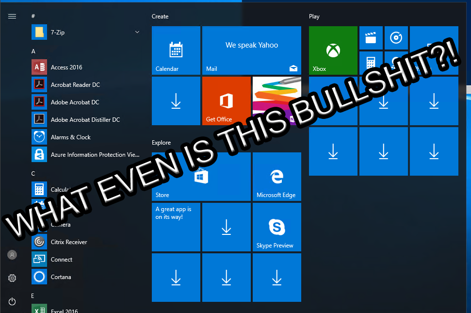
Windows 10 New Start Button redesign

I want a start menu that is hierarchical in nature like in XP or Win 7. I only use 'legacy' applications on my computers so all the 'associated' applications/documents that come with the main application will be in the same directory. I also like to be able to curate my start menu.

Even though I have a start menu, I still have icons on the quick launch tool bar (after re-enabling it!) and on the desktop. Quick launch stuff is the stuff I use daily, the desktop stuff is used weekly and the start menu stuff is used somewhat infrequently.

oh i agree, i definitely don't want that crap that's rumored to be the change in the original post. honestly in it's current state i feel it's it's the perfect balance and there's no reason for it to be changed.
 
oh i agree, i definitely don't want that crap that's rumored to be the change in the original post. honestly in it's current state i feel it's it's the perfect balance and there's no reason for it to be changed.

I have no issue with having additional options, which this seems to be. We will see though, we will see.
 
Do the insider builds always have "xbox" in the version number?
 
I looks like Linux & Apple had a baby.....

530-90_54dd869d5b836.jpg
 
Honestly, that start menu looks very much like what the GNome interface uses in Linux, at least the most recent one, anyways.
I always thought Win 8 looked a lot like Gnome 3. So it never really upset me as the Ubuntu builds I was using at that time for work all had it so Win 8 was like ooooh Microsoft following Linux on this one kinda blatantly.
 
I just skimmed, but it sounds like he meant a new start menu. The only change to the button is that they made the task bar lighter and the windows icon darker. I have no opinion on the menu, since it won't affect me, so long as I can search for what I want (and it looks like I can).
 
Its also about Forgetting all about user interface visual 'hints' and visual prompts for what is operational/active.
Oh, they're not forgetting their visual hints :) All the icons are grey and backgroundish except the only icons that they visually hint that you should be paying attention to: Edge and the MS Store! The only colored icons in a sea of grey.
 
Honestly, that start menu looks very much like what the GNome interface uses in Linux, at least the most recent one, anyways.

thats the plasma layout

Yes they went from doing a terrible Gnome impression... to a terrible KDE impression.

MS really should just stick to their standard start bar. I get it's boring and it really is impossibly stupid. But at least a few vocal boosters will poo poo any change. Just give them what they want. lol
 
Looks like I'll be sticking with Startisback for a long time to come.

Windows 10 has so far never had a decent start menu, and that certainly isn't one. I don't know why Microsoft are doing anything with the start menu at all because it was far ahead in visual design, efficiency, and functionality in Windows 7 than all the Windows 10 iterations.

It's a good thing 3rd-party start menu replacements exist.


using Startisback also.W10 start leaves a lot to be desired
 
As long as Open Shell still works, they can make whatever ridiculous changes they want. The first two things I do on any Windows 10 install:

1. Install Open Shell and choose the Win 7 Start Menu.
2. Add the freaking This PC/My Computer icon back to my desktop. It really irritates me that it isn’t there by default.

Considering that icon has not been on the desktop, by default, since Windows Vista, you must have been irritated for a long while. :D I personally do not use replacement start menus, since they do nothing but add extra bloat, slow things down and have occasional issues. Back in OS/2 Warp days, I did buy Object Desktop but, that actually integrated itself into the existing desktop and worked really well. I also added button bars on my Amiga Workbench 2.04 and the Windows 95 desktop.
 
Considering that icon has not been on the desktop, by default, since Windows Vista, you must have been irritated for a long while. :D I personally do not use replacement start menus, since they do nothing but add extra bloat, slow things down and have occasional issues. Back in OS/2 Warp days, I did buy Object Desktop but, that actually integrated itself into the existing desktop and worked really well. I also added button bars on my Amiga Workbench 2.04 and the Windows 95 desktop.

Yes, I know - I have been irritated by the omission for a long time.

I despise the Win 10 start menu so I have to use a replacement to keep my sanity.
 
I personally do not use replacement start menus, since they do nothing but add extra bloat, slow things down and have occasional issues
FUD. Lose the Baghdad Bob kneejerk thing, there's no reason to be personally offended by people having choices.

There's nothing more bloated and ugly than W10's default start menu, nevermind the face full of multicolored metro tiles you get if you dare open it.

The start menu replacements are Win32 based like Windows' start menu used to be, before MS devolved it to slow XAML at some point. StartIsBack for example is way snappier than W10's default frankenstart.


upload_2019-7-28_22-49-44.png
 
Last edited:
MS really should just stick to their standard start bar. I get it's boring and it really is impossibly stupid.

Keep It Simple, Stupid is a thing for a reason.

The real stupidity was taking a UI everyone knew and generally liked and turning it into a big advertisement for Microsoft's terrible app store and AI assistant.

But at least a few vocal boosters will poo poo any change.

Some developers are so arrogant that they will poo poo any criticism.

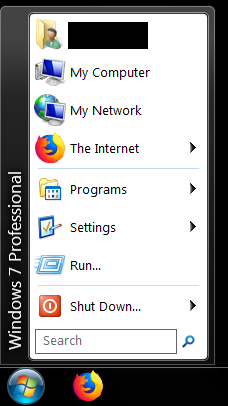
This is Classic Shell in classic mode with their Aero glass skin:

Menu 1.png


This is objectively a better start menu. Simple, intuitive, easy to use and organize. Why can't Microsoft even offer the option for something like this? They give BS excuses about the difficulties of maintaining code or say the complainers 'don't like change,' but the real issue is that some treehouse dwelling mouth breather with no real understanding of the product decided that the start menu should be a billboard to sell more crap.

The user experience is no longer the main focus because improving the user experience doesn't make them more money. The result has been a gradual erosion of the Windows platform to the point that users are rightfully afraid that updates will delete their data and break their computer.

 
FUD. There's nothing more bloated and ugly than W10's default start menu, nevermind the face full of ugly metro tiles you're greeted with.

The start menu replacements are written in Win32 like Windows' start menu used to be, before MS switched it over to crappy XAML at a certain point. StartIsBack for example is WAY snappier than W10's default frankenstart.

Lose the Baghdad Bob kneejerk thing, there's no reason to be personally offended by people having choices.

View attachment 177081

Your FUD statement clearly indicates that you have been personally offended. Not FUD at all from my perspective and experience, they run slower and add bloat on top of Windows, simple as that. The fact that I do not agree with your opinion does not mean I have issues with someone using something else, I just do not like those replacements because of what I have already mentioned.

FUD is something I could not prove but, this is easily provable. It is like Android launchers, they add bloat and other stuff on top of what is already there and does not replace the existing launcher.
How much do those add ons take from the system? Windows is already full of bloat and malware. Just take out some of that?
 
FUD is something I could not prove but, this is easily provable. It is like Android launchers, they add bloat and other stuff on top of what is already there and does not replace the existing launcher.

Erm, I use Nova Launcher and it most certainly replaces the default launcher. One is not running 'on top' of the other.
 
I use Classic Start Menu set to Windows Vista on 10 and it is the best start menu Microsoft has ever developed. Fully-customizable, super key to search, recently used and pinned shortcuts to programs in the main column.
 
Shouldn't the title say menu rather than button or am I missing something here?
 
Honestly I rarely use the start button to find things. With a fast usable search bar I normally type the first few letter of the program I want to open and smash enter. It is pretty fast.

Even when I don't remember the specific program I'll start typing what I think it is...ie, looking for "minidisk partition wizard" I'll start typing "partition" and Windows normally finds the rest and gives it to me.
 
The Windows menu system was at its best in 3.1. It wasn't perfect, but it was better than the start menu introduced in 95, which got progressively worse (IMO) each version change until Windows 10. Now this is not just my personal opinion, but based on what I have observed on computers for the last 25 years. Look at any ordinary user's desktop - it is cluttered with icons. People don't want to use the start menu, they want it right there in their face ready to be seen and used. I see this on Windows computers and on Macs. All current smart phones are using a menu system to launch programs similar to what was found in Windows 3.1. It is really a human intuitive system, and moving back towards that (as Windows has been doing since 8) is a good thing.

One of W95's selling features was you could put folders in folders on the desktop to reduce that clutter (640x400 wasn't much space after all). It's funny how long this argument over desktops has been going on. Some people are filers, others are pilers, and neither are "correct" it's just what works for them.
 
Considering that icon has not been on the desktop, by default, since Windows Vista, you must have been irritated for a long while. :D I personally do not use replacement start menus, since they do nothing but add extra bloat, slow things down and have occasional issues. Back in OS/2 Warp days, I did buy Object Desktop but, that actually integrated itself into the existing desktop and worked really well. I also added button bars on my Amiga Workbench 2.04 and the Windows 95 desktop.

I don't know who worked on OS/2 Warp's UI but they were clearly Amiga fans; it felt much more like Workbench than Windows (and had Rexx built in!) Everything's been downhill since! :oldman::troll:
 
Erm, I use Nova Launcher and it most certainly replaces the default launcher. One is not running 'on top' of the other.

Your thinking appears not to be correct in this instance. The default launcher of whatever phone is in use is not disabled but still running, even with another launcher in use.
 
One of W95's selling features was you could put folders in folders on the desktop to reduce that clutter (640x400 wasn't much space after all). It's funny how long this argument over desktops has been going on. Some people are filers, others are pilers, and neither are "correct" it's just what works for them.
I personally like the "folder in folder" approach, and was basically setting up a bunch of folders on my desktop during my Win 7 days, but even at that, I like a clean desktop. The customization of the Win 10 start menu has pretty much eliminated my foldering, as it is much faster to get to programs I use most frequently (except games, I still have a folder on the desktop for that). Personally, and I know I am in the minority here, I felt that the start menu got progressively worse with each revision of Windows after 95, with the Windows 7 being the worst.

Of course, besides my personal preference, I am amazed at how almost every non-technician's computer I work on has so many icons on the desktop, I wonder why they even bother to have a background image!
 
MS has a bad habit of taking things that work and few have complaints about, and trying to 'fix' them.

Why are the tools that remove MS's madness so popular? Will they ever get the message? Nope.

A waste of all that talent that could be put to better use like getting rid of all those tiles.
 
Last edited:
I think windows 7 was the best. Fud? No it's the truth which doesn't mean it still works.

You think, which means, in your opinion, which I have no issue with. However, I cannot agree with that and that is fine as well.
 
You think, which means, in your opinion, which I have no issue with. However, I cannot agree with that and that is fine as well.
I mean the best is subjective, the other part is not. Looking up malware there are a few things that would be under that definition.
 
Literally haven't used the Start Menu in years beyond just hitting windows key and starting to type something to search.
 
Literally haven't used the Start Menu in years beyond just hitting windows key and starting to type something to search.
Same here. I guess if you aren't very good at computers, you might need to point and click?
 
I didn't get upset about any of the new start menus. I got upset about the amount of crap that lived in them after a fresh build.

I got annoyed because Microsoft wanted me to log into the Microsoft Network, which came with its own version of desktop abilities.

I got upset because I couldn't get rid of Cortana.

I got downright pissed because I couldn't move my music folder out of my libraries (and that Microsoft had to come up with a new name for virtual links.)

And as someone who does long, boring server administration tasks, I got downright violent when I found out I couldn't play some stupid Microsoft card games without logging in to the Microsoft Network.

It still boggles me that in 2019 Microsoft Windows does not have a simple but practical multi-stage backup system built into the operating system (not System Restore, a real backup.) It baffles me that Windows doesn't have a built-in version control library that app developers can tap so that any Windows app can enable versions (I know Visual Studio has an extensible one, that's not the same thing.)

And I am still surprised at how often I miss my command prompt. Especially since a good developer will organize unnecessary files if he knows the user will view his folder structure with an old text-based command prompt. When I open a folder in Windows Explorer why can't the window place the prompt at the end of the file tree so I can just type a search like *.txt or *.conf ??


P.S. Of course, Microsoft is also the company that gave us the Windows Paper Clip. As if a talking paper clip is the first thing I think of when I want help with an application.

P.P.S. And that's another thing about Windows 10 that pisses me off. Why does every system screen have a troubleshoot button that ends with, "Windows 10 couldn't find any problems, do you still need help?" Do I still need help?? Why do you think I pressed the useless button??
 
I do love the search bar on Windows 10. I use it alot to open apps and settings.

I wish there was a way to add key words to apps and documents so that they could be found in the Search bar....executables in particular. Like if I can't remember the name of Audacity for some reason, I can add music,record,sound as key words to the executable. Something like that.
 
Back
Top