Please for the love of god.....can i go back

Status
Not open for further replies.
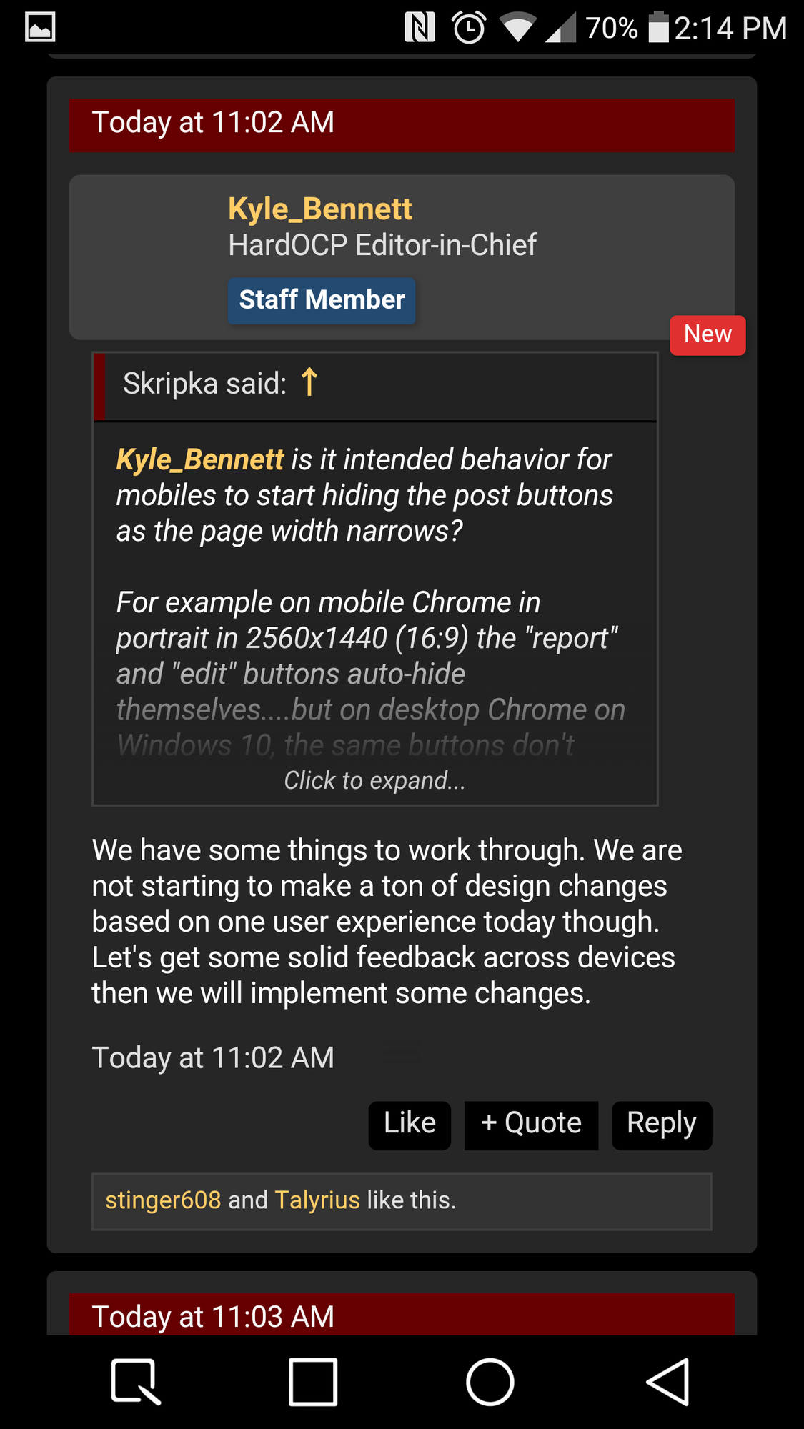
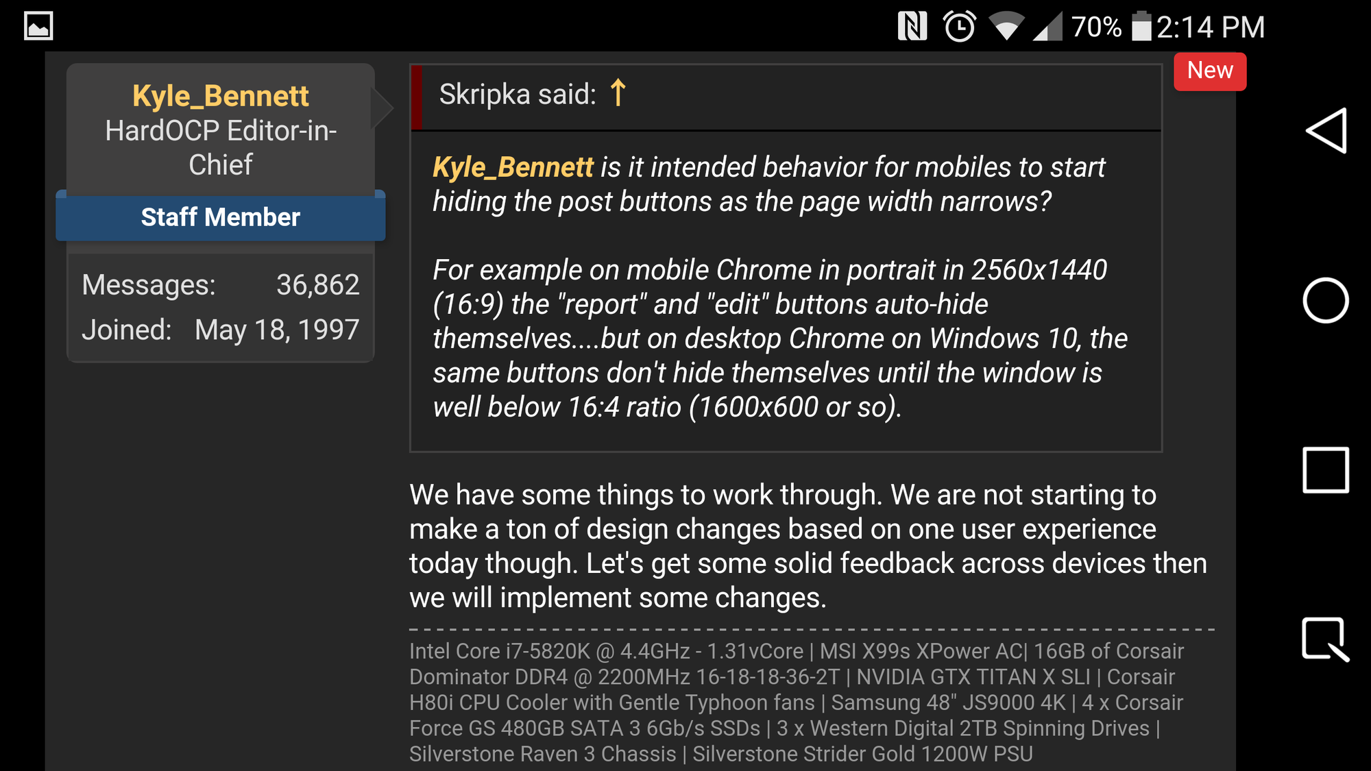
Using the subscribed threads feature is probably a lot better for this purpose. Just lick 'Watched Threads' at the top.

but there are threads that I don't want to subscribe to...what if I only post in a bunch of threads once or twice...it was always easier to search for my name and any thread that I posted to would show up in bold making it easy to see and navigate to...the 'Post Reply' button also seems buggy as most of the time I need to click it twice before it 'takes' and posts...nothing major and I guess it'll just take some getting used to

Edit: I think some changes were made since I last came online this morning and now it seems easier to distinguish new posts with the bold lettering

BTW a good way in the past was using folders for subbing. You keep main sub thread folder and have secondary thread folder for the threads that u didn't want to check regularly.
 
Guessing that a yellow < prev and next > would help find pagination at first glance. A tad larger and buttons would be a good natural divider. Shorter footer would prevent missing the message box during drunk navigation
 
Nice to see that there is finally a good contrast between unread and read threads. So that is fixed.
 
Thank you for the changes! A huge step for the better!

Time stamps and post numbers are duplicated, no need for bottom ones.
Read/not-logged-in thread font color is a bit too dark.
Quote/Reply/...buttons stick out a bit too much - maybe dark grey instead of black background.
 
Last edited:
I am definitely enjoying the widescreen format with my LG G4.
 

Attachments

  • Screenshot_2016-02-16-14-14-13.png
    Screenshot_2016-02-16-14-14-13.png
    527.8 KB · Views: 24
  • Screenshot_2016-02-16-14-14-06.png
    Screenshot_2016-02-16-14-14-06.png
    702.1 KB · Views: 8
You'll get over it.

:D

I notice that the two "[H]ardFORUM POSTS" sections of the front page (to the right of the featured article section) are not updating.
 
Just logged in and said "What the"... then "Cool"... then "What the.." It seems pretty nice for the most part. I'm sure a little tinkering around and I'll get used to it.
 
I like the new design. No issues here as far as wasted space or insufficient contrast between new and read threads. Looks great.
 
Well maybe if enough of us complain they will go back. Who ever sold you all this idea told you it was a lump of gold but in actuality
its just a polished turd. I have not been active in a few years, and as soon as I come back this is what I get. The mobile version utterly useless. None of the user features are there anymore, and if they are they are way to complicated to find.

I'd recommend a typewriter
 
An upgrade is nice but a few things I liked/missed about the older layout.

Mainly the bold text of unread threads vs those that were read/have no new replies. They don't really seem to stand out anymore. Everything seems a bit large and made more for mobile/touch screens rather then a computer monitor.

Then there's the lack of color for the quote/reply buttons, on the old forum thees were a dark orange (same color as the forum thread titles) and it made it "pop" out from the black background, whereas on this one it's just black against a dark gray so it kind of blends together.

One thing I miss is the user-cp, maybe I just haven't found it yet The Alert system is nice when someone quotes you but I liked being able to click the user-cp to see all the threads that I've posted in that have new replies (not just people that quoted you or such) so I can keep up with threads I'm interested in. Is there something similar to this in the new forum? Basically a page that shows you all the threads you've posted in and ones with new replies.

Regarding Avatars, I can understand both sides, it can be a pain having to sift through offensive ones (IE nudity or other things) but on the other hand on forums I use that allow them it does make it easier to recognize posters by their avatar and make it easier for people to remember others. Maybe a middle ground where avatars are allowed but turned-off by default and people that want them have to enable it to see them and the avatars go through a moderator or such to make sure it's a safe for work image and nothing bad or something. Heck could even just have a limited selection of avatars to choose from like some forums do so it's 100% safe to use and there's no moderation needed or anything of the sorts. I think that'd be capable of making both sides happy, those that don't want to see avatars don't have to and those that want them can use them.
 
The one thing I am missing from the old forums is how it basically marked all the forums you visited as read so only the new posts or updated threads were highlighted. Is there a way to get that functionality back? I looked in prefs but I didn't see an options to that effect listed.
 
some things seem better, but something is strange with the font. its like my eyes can't focus on it. I try to look at a sentence and my vision kind of slides off it. I don't know how to explain it, but it is a odd feeling trying to read something but unable to focus on it. is that maybe something to do with the contrast?
 
Not liking this at all....so much wasted space and its hard to read....go back Please!!!
 
Also, it's automatically subscribes me to a thread i post in.

I'll have to play with these settings a bit.
 
Also, it's automatically subscribes me to a thread i post in.

I'll have to play with these settings a bit.
That is NOT the default setting so You would need to check your user profile.
 
I have to agree with some of the criticisms. I never had an issue reading the old forum. I'm finding the fonts (and/or something I cant place) very hard on my middle aged eyes. I could barely finish scanning this thread without feeling a headache coming on. I also find my neck getting stiff because the majority of the text is on the left side. The red bar is also distracting due to its size.
 
Time stamps and post numbers are duplicated, no need for bottom ones.

I was thinking the same thing, but I suspect they're duplicated at the bottom for very long posts. They don't seem out of place if you view a post that's 100 lines of text, or that contains a few photos.
 
I have to agree with some of the criticisms. I never had an issue reading the old forum. I'm finding the fonts (and/or something I cant place) very hard on my middle aged eyes. I could barely finish scanning this thread without feeling a headache coming on. I also find my neck getting stiff because the majority of the text is on the left side. The red bar is also distracting due to its size.

Something about either the font or its size. I find verdana much easier to read than arial.

Same exact font, font size, font color, and background color, that we had on the old forum.
 
  • Like
Reactions: 50Cal
like this
I was thinking the same thing, but I suspect they're duplicated at the bottom for very long posts. They don't seem out of place if you view a post that's 100 lines of text, or that contains a few photos.

We are addressing this.

Good point. Is that not a feature of the software, or is it disabled?

We are addressing this.
 
Was sort of annoyed with it at first, but now that I am getting used to it, it seems OK.
It seems I can no longer even see posts or threads posted by people on my ignore list. Not even placeholders. It's like they are not even there. :D
 
I still remember the switch from the phpbb forum software to vBull in 2000....moaning, bitching and even some kudos on the new layout. It wasn't perfect right out of the gate, but with some inventive tweaking and shutting off unneeded and unwanted bells and whistles over time, the forum grew to be a sleek and trimmed down platform. It didn't happen overnight, it took time to get it right as most things do. The switch to Xenforo is a great move because vBull had taken the forum as far as it could. Be patient and watch the forum transform into a faster, leaner version with greater expandability for future growth.
 
There is tons and tons of wasted space in a desktop environment, but it looks much better in a mobile environment than before. One of the reasons I liked this forum was because it held the same layout as for as long as I can remember, nice and plain and simple. This new layout on the desktop environment is going to take some getting used to. Although it would be interesting to know, is the mobile traffic what is driving this layout Kyle? Are you getting more mobile traffic than you are getting desktop traffic these days?
This. After seeing so many sites and forums go through horrible "redesigns" I was so glad Hardforum kept the same look for so long. It was comfortable and you get used to a certain look over the course of years and years. I'll never understand the purpose behind these redesigns that no one seems to ever ask for. Oh well, I guess on the plus side, I won't waste as much time on here.
 
The other thing I'm missing is the ability to change/add the topic to your individual posts.

I blame Kyle! ;)
 
I kinda like it, that's my honest feedback at the moment. At first it was like looking at something foreign, which is natural. A few minutes tinkering here and there, and it feels okay. I would just probably make the font a little bigger, maybe bolder.

But overall, I like it.
 
Once in the thread it isn't so bad, I kinda like it. The thread list view might make me not return. I was an Anandtech user wasy back in the day but after a major UI change I stopped going cold turkey. I hope the same isn't said for her.

Not a fan of not being able to tell which threads I have already visited and the thread view just looks too big. Font and all.
 
Yep, its supersized for iPads. Hopefully there is a desktop theme in the future that is more condensed.

The thing that really gets me is it being hard to read, is it AA on the fonts? I dont know what it is, but the old forums were easier on the eyes.
 

Attachments

  • Untitled.jpg
    Untitled.jpg
    78 KB · Views: 14
Status
Not open for further replies.
Back
Top