The Branding Gods (Mostly) Love Google’s New Logo

Megalith

24-bit/48kHz
Staff member
Joined
Aug 20, 2006
Messages
13,000
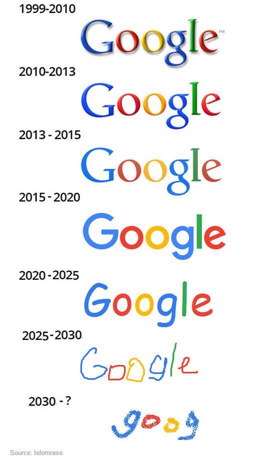
Would you agree with these guys on the aesthetics of the new Google logo? One designer isn’t afraid to state what many thought—that it’s “child like.” What I do like about the logo is how well it scales, particularly down.

The result definitely is an improvement from a design standpoint. It is cleaner and more modern using a custom sans serif instead of the the old quirky serif typeface. My one complaint is that the typeface is so friendly that it, with the primary colors, looks almost child like. The old serif added some gravitas which you could argue one of the world's biggest brands does need.
 
Yep -- Time to stop coming to the [H]. These new stories lately are softer than Rosanne's son.

Its the end of the world as we know it.... and I feel fine.


its news in general. some days are slow some are good.. The world in general is more generic, atleast computer news wise..
 
So the branding gods are mostly preschoolers... ok whatever. I don't really care anyhow.

But I'm more than a little tired of primary colors. Last child going though pre k now. Ugh so completely tired of this kid crap.
 
Yep -- Time to stop coming to the [H]. These new stories lately are softer than Rosanne's son.

New to the tech news? It's the weekend and nothing newsworthy in tech happens on the weekend.
 
Yep -- Time to stop coming to the [H]. These new stories lately are softer than Rosanne's son.

*looks at time as a member*

TombstoneBye.gif
 
Ahem; Meant to say front page. The forums aren't full of girly gossip.
 
Just goes to confirm what we all suspected.

People in marketing are morons.

20554518394_ce1b5fcae2_o.jpg


"Marketing is too important to be left to the marketing department."
-- David Packard (of HP)
 
I;m i the only one that hates these flat boring designs ?
Windows 10
Google logo. it looks like something from the 4 bit area
 
nah next it will lose all color saturation like the windows logo in the last ten years.
 
This is what companies do when they try to "stay relevant". It's like McDonalds trying to sell itself as an upscale cafe instead of a greasy fast food joint. It's the result of a board of directors screaming at their CEO's, "We're losing market share, so DO SOMETHING!" and this is the kind of thing that happens: Nobody has any good, concrete ideas because there's really nothing that can be done, but they have to do something - anything - to try to placate their corporate masters. When substance is lacking, they spin, push PR campaigns, make new logos and slogans, and do everything they can to look like they're doing something while under the hood nothing has really changed.

tl;dr: It's just a turd polishing itself yet again.
 
It's weird to me how much attention is gained over such a small change to a logo.

Regardless, I think it's the best looking logo google has ever had. Not that its particularly striking, just the best of what's been. Serifs are ugly, as are stupid 3D floaty bevel effects. Becoming simpler and cleaner is a good thing.
 
I think the new logo is representative of where computing is headed these days. Everything is being dumbed down for the lowest common denominator, and software is being stripped of power and customisability.

Windows, MS Office, iOS, Android, Firefox, Chrome, Sparten and everything else is now designed for brain dead five year olds, so why not have a logo to suite the new philosophy. Linux is the only remaining bastion of powerful, customisable and usable software.
 
i like that they ditched the serifs. i wouldn't mind them using fewer colors.
 
I;m i the only one that hates these flat boring designs ?
Windows 10
Google logo. it looks like something from the 4 bit area

But doesn't any design become boring after you seen it constantly? Simpler designs may looking boring and childish on their own but as more elements come together they have advantages. I've seen a number of people comment on how ugly the new Windows Calculator is in Windows 10. Indeed it's no thing of beauty but it's a calculator? What do visual adornments really add to it, no pun intended? And the great thing about the simpler design is that unlike the old Calculator, the new one RESIZES! Everything scales nicely to scale across any screen size, windowed or full screen. Sure more visual adornments could be added to make it look fancier but in the end it's still just a calculator. And eventually for most people all the effort enhanced visuals simply become "boring" anyway as one sees it more.

Coders have been taught forever that simpler code that's functionally equivalent to more complex code is better for a number of reasons such as maintainability, reusability, etc. I look at modern design principles similarly.
 
It's weird to me how much attention is gained over such a small change to a logo.

Regardless, I think it's the best looking logo google has ever had. Not that its particularly striking, just the best of what's been. Serifs are ugly, as are stupid 3D floaty bevel effects. Becoming simpler and cleaner is a good thing.

Entirely agree. I work in design for a living and simple clean design wins for me every time. Serifs are old fashioned, drop shadow and bevel effects are entirely overused in the industry (Thanks Photoshop filter effects).
 
Entirely agree. I work in design for a living and simple clean design wins for me every time. Serifs are old fashioned, drop shadow and bevel effects are entirely overused in the industry (Thanks Photoshop filter effects).

I have a real job and prefer functionality, which google has been successfully removing alongside all of this "clean design" BS.

What once took up a small corner of the screen takes up half of it (maps), what once was a row of buttons (search tools) is now a huge splotch of useless white space that requires several clicks to make appear again, and at some point long ago I was actually able to see who responded to a comment I made on youtube. But ooooh its pretty.
 
Back
Top