Firefox 4 is out... sorta

Okay, went ahead and did it, few things I need help with:

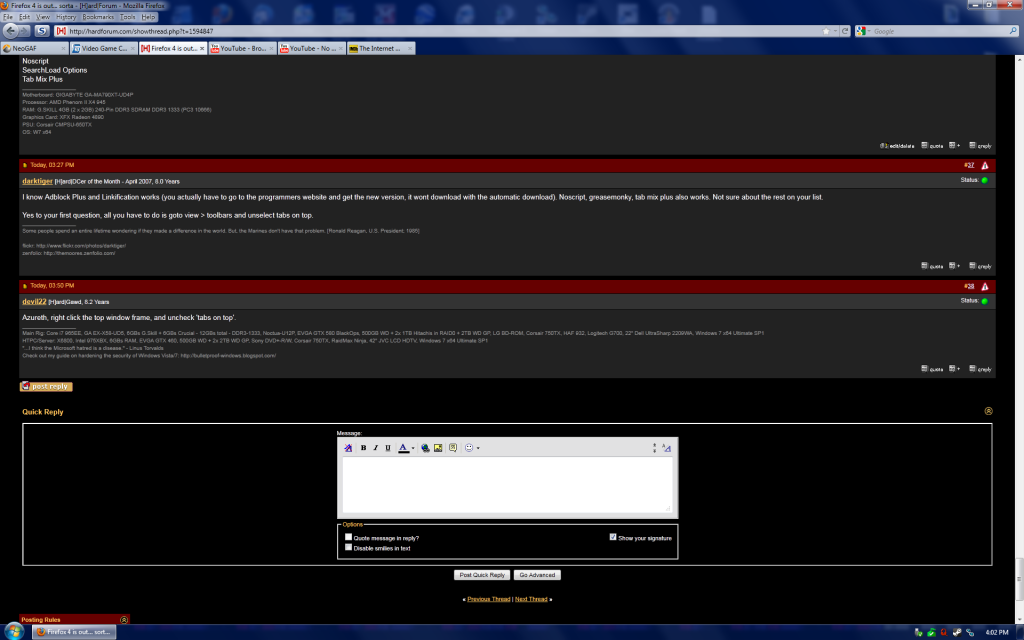
1. How do I get the bottom bar back that shows like my adblock/no javascripst stuff back?

2. As you can see the top has lots of extra space and I'd like it to look more like what it was before. How do I change it?

Untitled-2.png

There's an add-on which will bring back the actual status bar. Forget the name though, something like status bar 4ever or 4-ever status bar.
 
Well, the status bar as it is isn't the real issue now. I would just like it so the top looks more like it was originally rather than having that huge open space and have most of it use my aero theme.
 
Well, the status bar as it is isn't the real issue now. I would just like it so the top looks more like it was originally rather than having that huge open space and have most of it use my aero theme.

To get rid of the transparent background for the open space do the following:

1) Type in %appdata% in the Windows search bar. Press enter.
2) Navigate to Mozilla->Firefox->Profiles->"randomnumbersandletters".default->chrome. There should be a file called "userChrome-example.css" in this location.
3) Create a new file and name it userChrome.css. Save it to this directory. (Open up notepad. Click save as and save it into the chrome directory as "userChrome.css".)
4) Add the following in the file:

Code:
@namespace url(http://www.mozilla.org/keymaster/gatekeeper/there.is.only.xul);
/* The above code is required once in the userChrome.css file. You can delete this comment, however. */

window, page, dialog, wizard, prefwindow {
-moz-appearance: -moz-win-browsertabbar-toolbox !important;
}

5) Restart Firefox


You should end up with something like this:
http://img24.imageshack.us/f/firefoximg2.png/
 
Last edited:
I just tried it and immediately downgraded back. It breaks automatic graphics switching on my MacBook Pro. As soon as I open it up it goes to discrete graphics even while displaying a blank page. Turning off hardware acceleration had no effect. I wasn't crazy about the new layout either.
 
Okay, let me say a few words...
  • Why is there still no official x64 build for Windows? They promised that some time ago, and now they say they might do that when version 5 is out?
  • What the fuck is the issue with the acceleration? Text looks practically unreadable and it actually works better when disabled! Yes, indeed, I have a real GPU. Or ain't a HD 3000 series not enough to handle a browser nowadays?
  • Have you seen it crash where Firefox 3.6 doesn't? I have. I had lecture today and the professor wanted to show us something. Well, he couldn't.

The work is far from done, but at least the browser looks modernized.
 
Nobody needs a 64 bit browser, period. You can rationalize how much you want one from here till you turn blue in the face, or whatever, but it's not a priority since the vast overwhelming majority - like 99.4% - of people that surf the web/etc don't have a need for such a browser. It'll come in time...

I don't get what people are seeing with the acceleration thing and the fonts, it looks exactly the same to me, and yes I have the Direct2D acceleration going in full swing - looks fine to me, but I've got a calibrated display and ClearType is also in play (not that ClearType has anything to do with the Direct2D acceleration in Firefox/IE9, however). I'm beginning to think something is wrong with people more than Firefox/IE9...

I haven't had a crash with Firefox 4 so far, and that's since the very early betas on through the final, and that's also with using portable versions and upgrading as every new build became available, all in the same folder. Works for me, not sure why other people have any issues at all. Every one of the 23 addons I use works without a single issue, and they've done so since beta 1 (and yes, I do keep on top of builds that come direct from the developer's websites/etc - the ones that don't appear at the Firefox addons website which could be the difference).

It works for me, pretty much flawlessly.

I didn't go into using Firefox 4 (or 3, or even 2) thinking it should be the perfect browser for me out of the box - I understand that Firefox is a basis and the addons/extensions and the customization it's capable of are completely up to me after it's installed, and as such when I say Firefox is my browser of choice I don't mean that from the possessive sense; I mean it from the sense that it's mine because I customized the hell out of it and it looks and works nothing like the default install...

YMMV, as always.
 
I don't get what people are seeing with the acceleration thing and the fonts, it looks exactly the same to me, and yes I have the Direct2D acceleration going in full swing - looks fine to me, but I've got a calibrated display and ClearType is also in play (not that ClearType has anything to do with the Direct2D acceleration in Firefox/IE9, however). I'm beginning to think something is wrong with people more than Firefox/IE9...

As soon as I fired up FF4, before I knew FF4 change font rendering, it was the first thing I noticed. Then I did some searches and it is clearly a well known issue. You probably just haven't been looking closely. It has the biggest effect on small fonts. Especially light on dark fonts. The DirectWrite font engine needs work. Fonts are thicker, fuzzier and letters are more crammed together.

Here is a clear example that should be obvious (HW on left, HW off right).
http://social.bioware.com/forum/1/index
fonts.png


Both IE9 and FF4 render this way, but there is an important distinction. When I went to the above page with IE9 it used GDI rendering by default, and it did so on almost all the worse examples I could find. Microsoft seems to be using a white list to decide when to turn on DirectWrite rendering so it doesn't look bad on these pages, it reverts to GDI.

In FF4 you have to turn off HW Accel and restart. In IE9 you can switch the rendering engine by overriding the document type with F12.
 
Last edited:
To get rid of the transparent background for the open space do the following:

1) Type in %appdata% in the Windows search bar. Press enter.
2) Navigate to Mozilla->Firefox->Profiles->"randomnumbersandletters".default->chrome. There should be a file called "userChrome-example.css" in this location.
3) Create a new file and name it userChrome.css. Save it to this directory.
4) Add the following in the file:

Code:
@namespace url(http://www.mozilla.org/keymaster/gatekeeper/there.is.only.xul);
/* The above code is required once in the userChrome.css file. You can delete this comment, however. */

window, page, dialog, wizard, prefwindow {
-moz-appearance: -moz-win-browsertabbar-toolbox !important;
}

5) Restart Firefox


You should end up with something like this:
http://img24.imageshack.us/f/firefoximg2.png/

how do i create a new file don't get it.
 

Ok a lot more complicated than that, but it does look to essentially have a black list, to force compatibility mode. I don't want to dig into this, but are they depending of IE specific identifiers? If so, YUK.

Anyway the main point I wanted to make was that the rendering differences are real, not just a problem with people, like Joe was stating.
 
They've really made a disastrous mess with these compatibility modes, but that's for a different thread.

As for the new ClearType rendering, the issue has less to do with the quality of the glyph rendering than it does the kerning, which ends up being extremely problematic for small font sizes. Though I'm generally in favor of it, it still needs a bit of work. For large text, though, the quality is exceptional and long overdue.
 
And... I still don't get the point: I can read either of those text selections without issues, must be me dealing with monitors of all kinds since the 1970s, from monochrome to greyscale to pure digital and everything in-between, I don't know. I don't focus on such things to such extremes I guess. Bleh.
 
And... I still don't get the point: I can read either of those text selections without issues, must be me dealing with monitors of all kinds since the 1970s, from monochrome to greyscale to pure digital and everything in-between, I don't know. I don't focus on such things to such extremes I guess. Bleh.

You don't see a difference in quality? You don't think it is preferable to not go backwards on quality??

I definitely find the GDI rendering easier to read than the fatter/fuzzier more crammed together text from DirectWrite. I think it only reasonable to expect that text quality either improve or stay the same and not regress.
 
It's that "quality" aspect that's so subjective: like I said, I can read both parts of that image without issues, but if I have to express a preference, I do prefer the look of the "HW on" which is the left-side portion of that image you posted, but that does not mean it's better (meaning my choice) or that the other choice is "broken."

I don't prefer the old pre-XP ClearType look of fonts, aka Windows 2000 era pixel perfect no AA or sub-pixel rendering stuff, which is precisely what the right-side of that image you posted looks like to me. The very first time I ever installed Windows XP way back in very late 2001 and I enabled ClearType for the first (on a nice Sony 19" aperture grill professional CRT, mind you) I was like "Ok, ok, this rocks, this kicks ass, that looks sooooo much better than the "old way" of displaying fonts" and I've never looked back. I know that ClearType is designed primarily to help fonts "look better" on LCD panels and not CRTs, but I enable it on any display I use, always. Can't stand that pixel perfect font crap anymore from pre-XP days - but that's my preference for "quality" at work; doesn't mean Windows 2000 was borked or broken, it was just different.

I have no issues reading either of them, but when I have a choice I will always enable whatever I can or whatever is required to get things to look like the left-side of that image. I want the fonts to have the fuller "quality," if you will. At 1680x1050 on a 15.4" LCD, pure pixel fonts without any fullness to them is just... ugh... :D

As you stated, you have a preference to the GDI look, while I have a preference to the Direct2D apparently - everybody's different, but what I don't think is that just because we all have our particular likes and dislikes in this situation means "it's broken... they really need to fix this..." which is what really irks me.

They can fix stuff that is actually broken - but when it's just people expressing preferences from the "oh I don't like that" aspect, well... there's just no fix for humanity. :p


That is all fine as long as we are making a purely cosmetic choice. But in this case we are talking about linking visuals many people hate to HW acceleration. Do you know how many people can't even stand regular Cleartype, this is like cleartype turned up to 11. I actually like cleartype, but this looks like my old CRT when the focus was failing. Even many people who like the new rendering system acknowledge that is broken for small fonts. If it is a preference, it is broken until we can chose cosmetics independent of HW Acceleration. HW acceleration should affect performance, and a cosmetic option should affect appearance.

I suspect you are in the minority preferring the fatter/fuzzier crammed together text.

BTW the last pic is cleartype off. So you have FF4 HW rendering, Normal CT rendering, CT off Rendering. Either of the final two work for me, but FF4 HW rendering is out until fixed (it is broken).

fonts.png
ctoff.png
 
I suspect you are in the minority preferring the fatter/fuzzier crammed together text.

It pays to be different... and yet it's all the same to me, looks fine here, HW on, HW off, ClearType on, ClearType off, etc.

To be honest, Ubuntu 10.10 has the best "looking" font rendering I've ever seen right outta the box on my hardware - not even OSX (and yes, I use that as well on the same hardware) can touch whatever Ubuntu has going on.

Just personal preferences I suppose. It doesn't matter - I can read all of it without problems. To each their own...
 
Mozilla has absolutely no control over glyph rendering with DirectWrite. It can't be "fixed". Don't expect it to be.
 
Mozilla has absolutely no control over glyph rendering with DirectWrite. It can't be "fixed". Don't expect it to be.

It is conceivable that MS could make improvements in small font rendering. It is conceivable that Mozilla could allow turning off DirectWrite, without turning of Direct2D (or Direct3d) and not lump all HW acceleration into one toggle that affects text quality.

Until then it is fixed by turning off HW acceleration, that pretty does nothing outside of improving the speed of some benchmarks that don't yet represent any practical applications.
 
Yes, Microsoft can make improvements to ClearType/DirectWrite. Yes, Mozilla could probably separate out text rendering and Direct2D (even though DirectWrite is most likely operating on top of Direct2D).
 
Firefox 4.0 is doing GREAT for me. Two windows, 4 tabs after like 30 minutes. Also, I just installed windows 7 fresh today.
firefoxu.jpg
 
rofl. That's nothing, once during the beta, IE9 took 8 GBs on my machine..but that was a fluke. But ya firefox is a hog even without bugs, right now I'm at 366 MBs of ram for FF, with 3 tabs open, hardforum.com, arstechnica.com and a site with some flash videos.
 
Anyone know how to change the color of the toolbar font? It looks awful.


Yeah that hardware acceleration and blurry text really pissed me off until I realized I could just disable it. Sucks that a new feature is worthless to so many people.
 
Back
Top