dark_reign
2[H]4U
- Joined
- Nov 15, 2005
- Messages
- 2,314
This is more or less a 'meh' update to the UI. New color scheme is nice if you like gray / metallic tones, and easy on my 52 year old eyeballs.
Follow along with the video below to see how to install our site as a web app on your home screen.
Note: This feature may not be available in some browsers.
I'm pretty sure that even if I used every single grid space on all 3 of my monitors, I wouldn't be able to have enough space for the amount of icons necessary for how many things I launch through steam. I'm at nearly 800 installed games.I don't hate it. But I also still dump a games shortcut to desktop, and really go into Steam for installing/Uninstalling and buying games.
They are completely useless now. All I see on individual games pages are "Activity" and "community content" in center stage neither of which contains useful information for me. What used to be there is achievements news and workshop content, all of which were useful.Also I like how the individual pages for the games you own are laid out. Much clearer.
seems like a lot of people around here hate change...old Steam looked dated and had a 90's UI...it now looks modern and clean...sure there are issues but overall it's a big improvement
 I am cool with the change but then again, I did not waste money on 100's of games, only about 85.
 It might look more modern, but that's no excuse for being worse in every other way. If It can't serve its purpose as well, I don't care how it looks.seems like a lot of people around here hate change...old Steam looked dated and had a 90's UI...it now looks modern and clean...sure there are issues but overall it's a big improvement

I'm pretty sure that even if I used every single grid space on all 3 of my monitors, I wouldn't be able to have enough space for the amount of icons necessary for how many things I launch through steam. I'm at nearly 800 installed games.
(There's some math I can do to double check... )
Looks like I can have about 350 icons per screen if I fill up every single tile of my desktop at the default icon size, so, fine, I *could* actually have icons for every single game installed, but damn it would be inconvenient and hella ugly, likewise i'd have to remove my rainmeter monitoring skins....
Yeah, I remember those days. I stopped trying to keep all my games installed years ago. Initially just to keep to games I am actually playing, later on I moved all games to SSD so kept numbers down for a while. If I have more than a few games installed I end up jumping around too much.


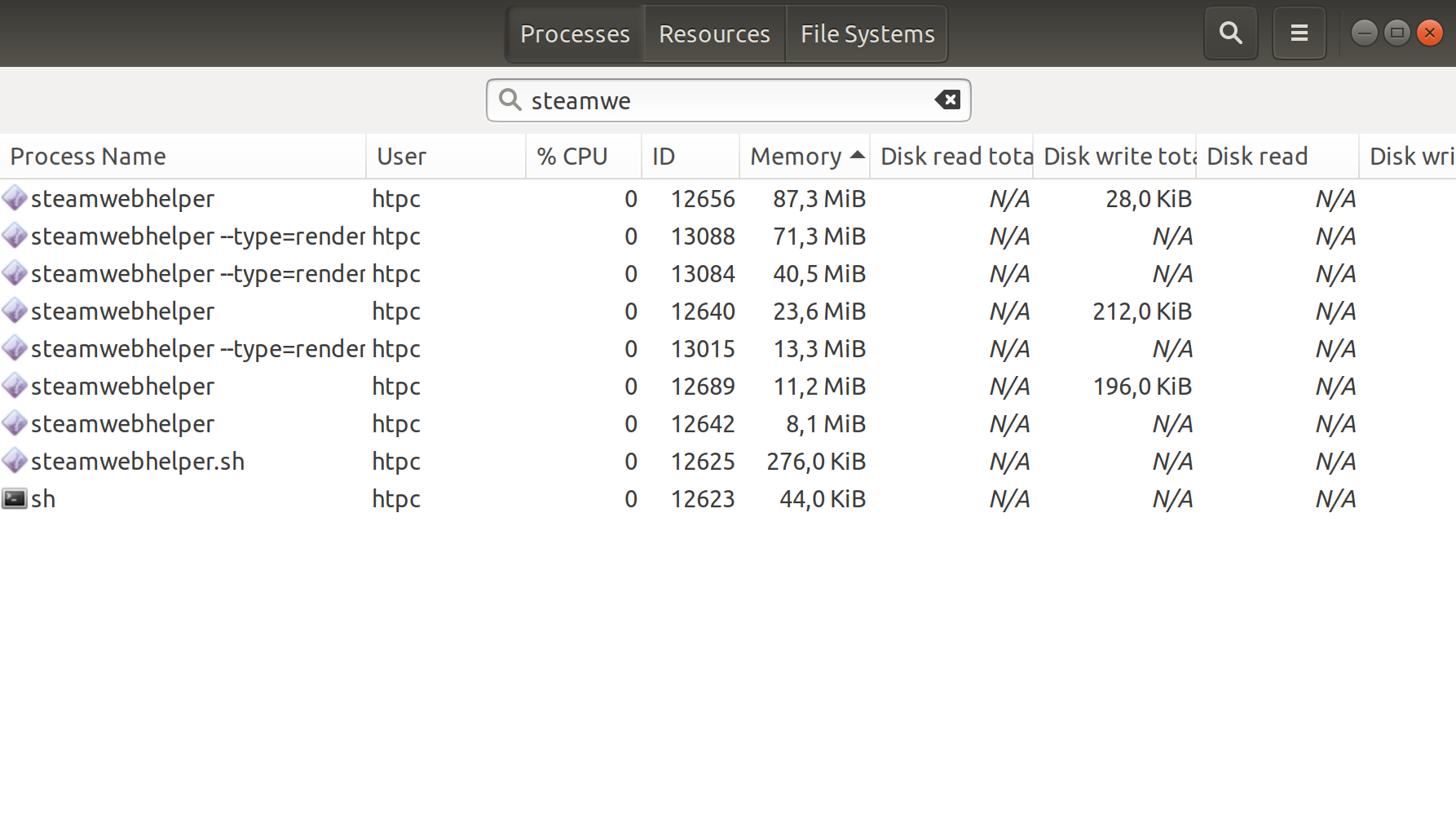
New interface is totally web based. Consumes too many resources, spawns http clients and network connections. I launch with —no- browser and use a game shortcut for launch. Otherwise steam web helper procs spawn.
just found this and going to try for old interface.
Launch Steam with parameters: "-no-browser +open steam://open/minigameslist"
People are acting like steam is supposed to cater to 40-60 year olds or richer people with families like a large number of people on these forums are. Steam has to compete with Origin and Epic so it has to cater to kids also. Don't like it? Don't use it. Need to deal with change, that's just how life works.
It is a place to launch your games, not a freaking car that you just bought. (Not you personally, of course.)No, you're right, there is absolutely no reason to cater to people who have money to buy lots of games, what a dumb idea!People are acting like steam is supposed to cater to 40-60 year olds or richer people with families like a large number of people on these forums are. Steam has to compete with Origin and Epic so it has to cater to kids also. Don't like it? Don't use it. Need to deal with change, that's just how life works.
Launching no browser nothing not even the game list is there now so obviously it’s more web based. And if you don’t think steamwebhelper procs aren’t slowing your FPS down, think again. Don’t bring up gmail. It’s not relevant.Steam interface has always been web-based. It's just that now it's modern. Not sure how much more resources it takes. As for requests, that is how the modern web works. Just loading gmail spawns at least 150 requests for data alone. That excludes images, styles, scripts and whatnot. Used to be all that was hidden because the server was doing a lot of it behind the scenes.
Launching no browser nothing not even the game list is there now so obviously it’s more web based. And if you don’t think steamwebhelper procs aren’t slowing your FPS down, think again. Don’t bring up gmail. It’s not relevant.

This isn't all my games. This is roughly 1/3rd of my games.Yeah, I remember those days. I stopped trying to keep all my games installed years ago. Initially just to keep to games I am actually playing, later on I moved all games to SSD so kept numbers down for a while. If I have more than a few games installed I end up jumping around too much.
This isn't all my games. This is roughly 1/3rd of my games.
It's also a collection of games from 4 different launchers, all set to launch through steam because it previously was the only launcher that was small enough to make sense on my desktop. I keep the rest minimized because they were too fucking big and unweildy.
Also yes, jumping around is the point. I don't want to wait to download a game if I want to play it, and I also don't want to delete and redownload games as that's unnecessary.
These all fit on a single, SSD cached hard drive and I still have room to spare
Everyone plays things differently.
You appear to be right. There are a few more steam associated processes. That's without a game running
View attachment 196781
People are acting like steam is supposed to cater to 40-60 year olds or richer people with families like a large number of people on these forums are. Steam has to compete with Origin and Epic so it has to cater to kids also. Don't like it? Don't use it. Need to deal with change, that's just how life works.
seems like a lot of people around here hate change...old Steam looked dated and had a 90's UI...it now looks modern and clean...sure there are issues but overall it's a big improvement
anyone else having issues where leaving steam open now just makes windows randomly act like it's loading something in the background?
One weird thing I've noticed is that some games have recent news and displayed on their page and others don't, it's not a issue of whether there's recent news because one game that doesn't show any had 2 or 3 news items from the last week listed before the update.
I can't speak for everyone but I think a lot of people are annoyed that UI/UX seems to take a backseat these days to whatever look the designers are going for. Graphic designers make horrible and sometimes even unusable interfaces if you let them just like UI designers make butt ugly interfaces if you let them, the only thing worse is to leave it to the back end programmers that will often somehow make one that's both ugly and unusable(but easy to tie into, lol).
For years there was a push towards minimalist interfaces(partially because of mobile interface design influences) that often buried or even removed useful features, this is part of a newer push to the other extreme with lot's of clutter and shinies. It's not all bad but I think there's more bad than good as well as some truly baffling decisions like using a font that makes the game list harder to read or replacing several useful interface formats with the new one instead of just adding it as a option. Heck make it the default option for all I care as long as they leave the others.
I haven't had that issue but if I scroll through a list of about 20 games in the new tiled window it nearly pegs a fully boosted core on my 2700x and when I scrolled through it before removing all the shelves it was lagging my PC enough to make the cursor skip. I suspect it's downloading large images for the tiles and then resizing them on the fly as it loads them but almost has to be more than that for how resource intensive it is. The other thought I had is that might be screwing with DPC latency since my PC doesn't usually lag like that even for heavy spiked loads.
I get no lag at all browsing in tile mode..maybe because I dont have more than maybe 50+ games?
For me the whole experience is smooth, and I'm on a much lesser CPU than you are (Xeon 1620)
I like it. Looks more modern and was due for an upgrade.

I just opened Steam for the first time in a few weeks, and actually like this layout. And people are complaining that its no longer just a single spaced text list of games? Christ, people will bitch about everything - and I want to slap them all, either one at a time, single file; or just all together, like in one shot.
I just opened Steam for the first time in a few weeks, and actually like this layout. And people are complaining that its no longer just a single spaced text list of games? Christ, people will bitch about everything - and I want to slap them all, either one at a time, single file; or just all together, like in one shot.
View attachment 196812
Oh, a wise guy. Well tell me wise man... could they make it so it doesn't take 10-30s to draw/redraw the library screen every time I refresh/click/maximize window (from taskbar)? Its not just those with lots of games installed and not based on system specs.
Perhaps I'd also like to be able to go back to my list view instead of being forced to see the damn grid view. WIth its pointless little icons on the left with cruddy font for game titles or the new grid panel that is worse than the old one for giving you decent info. The new "home screen" with its new "shelves" would be tolerable if I could turn them all off. Even with small icons, the non gpu accelerated UI option and low bandwidth mode they still can't draw the screen fast and even when I move the mouse around to force the refresh faster it will usually leave one corner not drawn for another 10-30 seconds. I can't click on the new home button or its search bar when the damn program can't draw them properly.
TLDR: How hard is it to keep in a minimalist/small option available like before and even more so, how hard is it to code a UI that isn't slow as molasses. At least for me it doesn't seem to be using more cpu cycles, maybe 250mb more ram that usual with more steamwebhelper.exe's active.
https://preview.redd.it/njmd5n413yv...bp&s=8b3329ccc8f29894ae85173714dcd7ad5a9dcab5
Video explaining the problem on refresh/draw:
You have two choices, deal with it or ditch your games and use someone else's launcher instead. Seriously, do you think Gabe worries about the gamers, when his company has not made a new game in at least a decade? Oh well, I am fine with the new interface and it works very smoothly, not sure what the problem is for other.Oh, a wise guy. Well tell me wise man...
Yeah, I mean, there are things that can be improved. I'll give you guys that. It's not perfect, but at least it's some progress.
I mean, it has been like 10 years of Steam 125MB updates every week and this is the FIRST TIME anything significant has changed.

Knew someone was going to post that shot. I meant recently, certainly it has been a long time since a major revamp.