UnknownSouljer
[H]F Junkie
- Joined
- Sep 24, 2001
- Messages
- 9,041
Follow along with the video below to see how to install our site as a web app on your home screen.
Note: This feature may not be available in some browsers.

Hey guys, first time posting some photos in this thread for me. Have a bunch of photos I want to share and hear some honest critique on.
Thanks!
Alright, I'll give it a go. I generally prefer to be brutal and straightforward so, take my critique with a grain of salt.
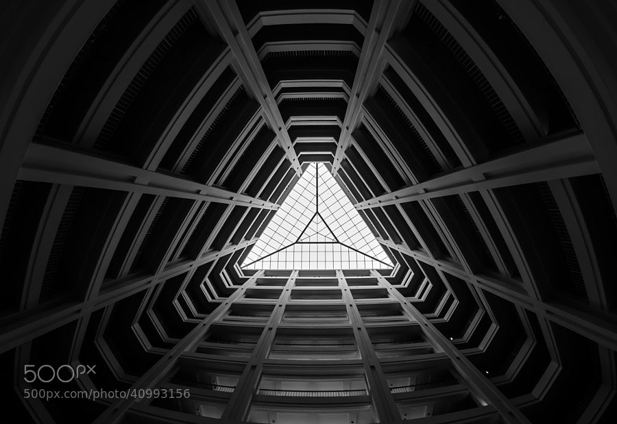
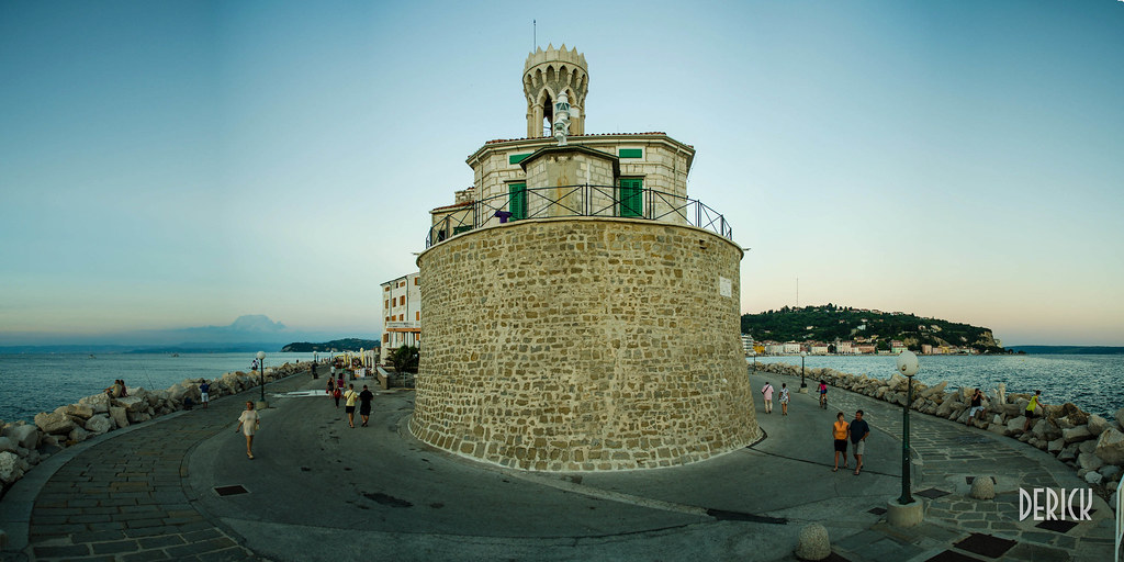
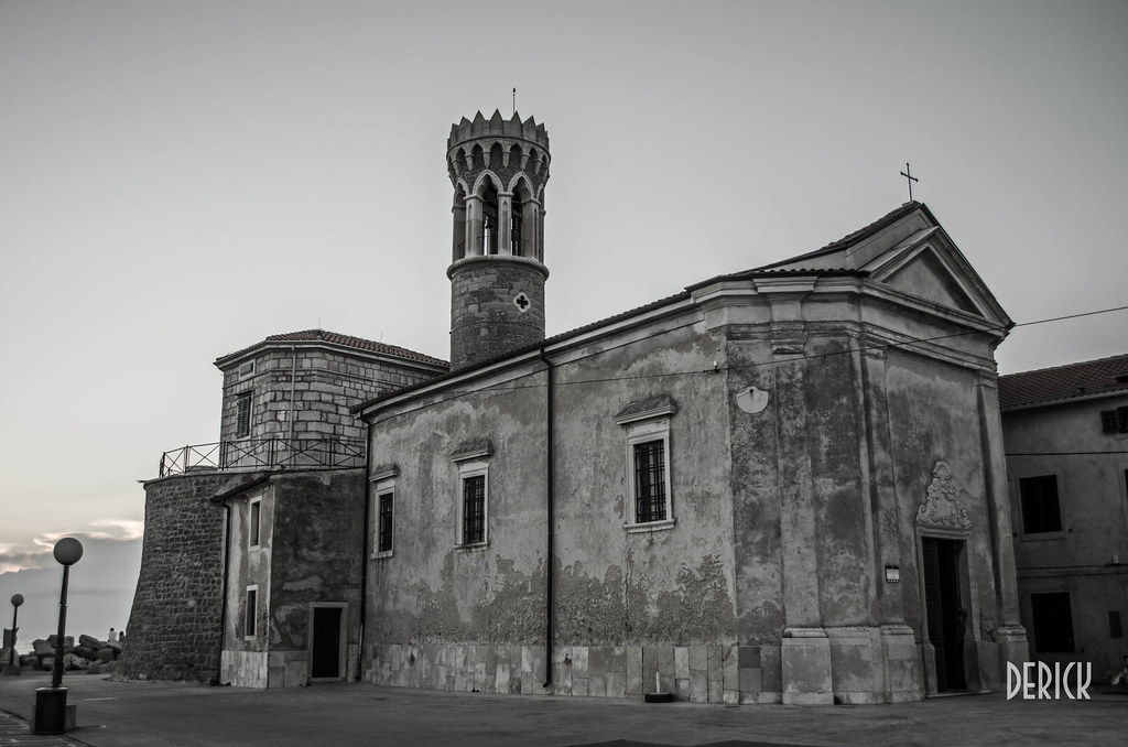
The first image is really lacking a strong subject matter. You used a wide angle which emphasized the foreground, but there isn't anything in the foreground that draws interest to the eye. It appears to be a small rock built structure. Which is part of the problem, I have no idea what the structure is. I can draw certain things from inference, like the fact that you're at the end of a point, and I can see you were going for some level of symmetry, but like I said, it's not particularly interesting to look at.
If you had another chance to shoot it again, I would recommend moving to the left or the right and perhaps getting a view down one of the lanes on either side. Maybe there isn't anything there, but it looks like there is a line/row of houses. That might have been a more interesting point of interest. Another option would have been to focus more on the foreground structure and trying to show the viewer what it actually is.
This is generally a good pic. Jay Patel (and many others) basically say "follow the light". If the light looks good, it will generally make everything else look good. Such is the case here. I probably don't need to tell you that if it was midday and nothing was going on this shot framed exactly the same way would probably look unremarkable. Such is the power of excellent light.
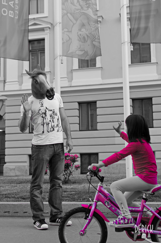
This is obviously a more whimsical and odd sort of image. You choose to use selective color. Here are some notes about that.
If you choose to use selective color, you should have a really good reason why, as anything that is in color when everything else isn't will draw the eye immediately. This works very well when there is only one subject in the frame. The problem is there are two subjects in this frame, the girl and the man with the horse head. So I find myself looking at her, and not really looking at him despite him being, probably, the more interesting thing to see. There is another issue as well, the flowers also draw my eye because of the selective color so I have a tendency to want to see them also rather than the man with the horse head.
I'm not a particular fan of this image, but if you wanted to continue to show it, I'd either move it directly to b&w, or keep it in color as I don't see a way to use selective color to great effect here.
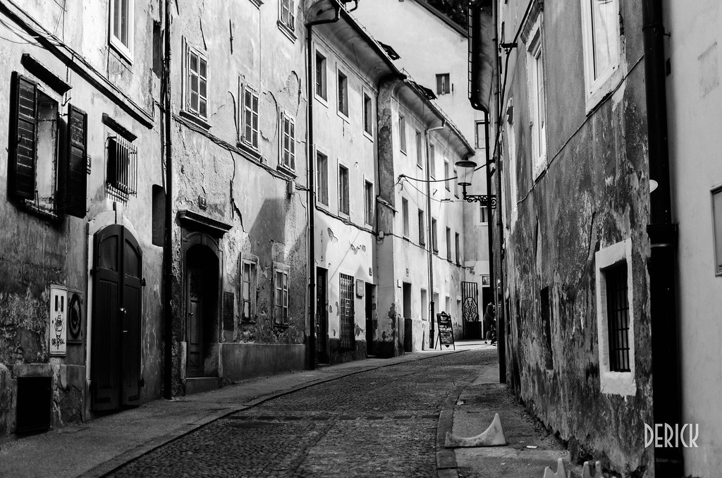
This is generally a nice picture in Europe or wherever it's shot. It reminds me of some of Cartier-Bresson's work but without a personal element. It's a pretty strong image. I think it could have been even stronger if you would have managed to capture someone going about their daily lives in the shot. A bicyclist or a woman walking, etc. (Yes, I see the person way back there, but she's not close enough to help this image). People always add context to the frame. I used to try and shoot around people (not sure if that's what you did here), but more and more I've been finding that images are generally more powerful with people... so long as it's not a crowd.
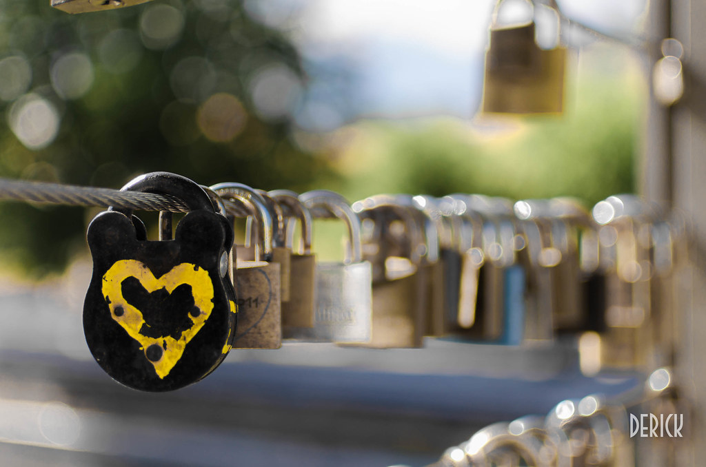
Abstract shot of locks is abstract shot of locks. Kind of cute I suppose with one being different at the front. But I'll be honest, this image doesn't do anything for me. Sort of reminds me of micro stock photography.
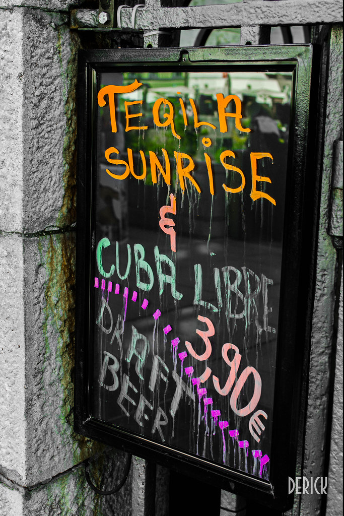
An image of a sign. Not sure what there is to say here. You captured it well I suppose, but when I try to think of the purpose of this shot I struggle. For you personally it might have meaning, but for anyone else, it's unremarkable. Certainly no one would want to print this and hang it in their house.
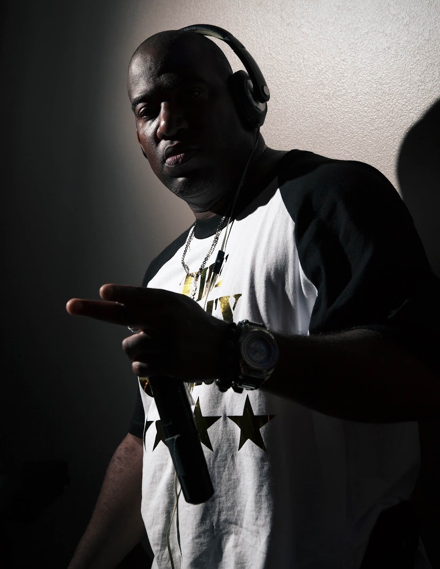
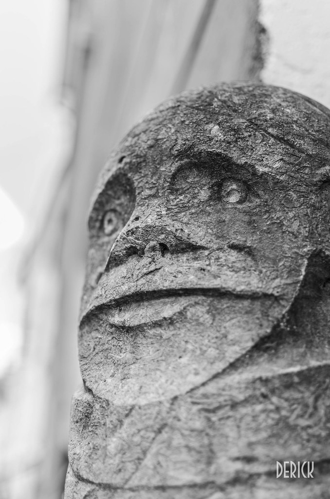
This is framed well and shot well. Of course I'm not sure what the context is behind it, but it does look interesting and it does draw the eye. I generally like this one, but at the same time, I'm not a fan of your name of it. Despite seeing the joke.
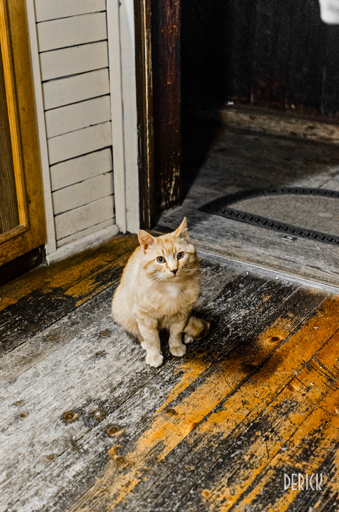
The internet is for sharing pictures of cats. Meme satisfied... It's clean. The selective color here almost doesn't look like selective color at all. For this you choose yellow and the cat. It looks cute and perhaps is good practice, but this image doesn't do anything for me. People's pets generally don't. The animal would either have to be exotic or have to be doing something particularly interesting. If you can shoot the decisive moment of a cat really showing an extension of its personality, that would work better.

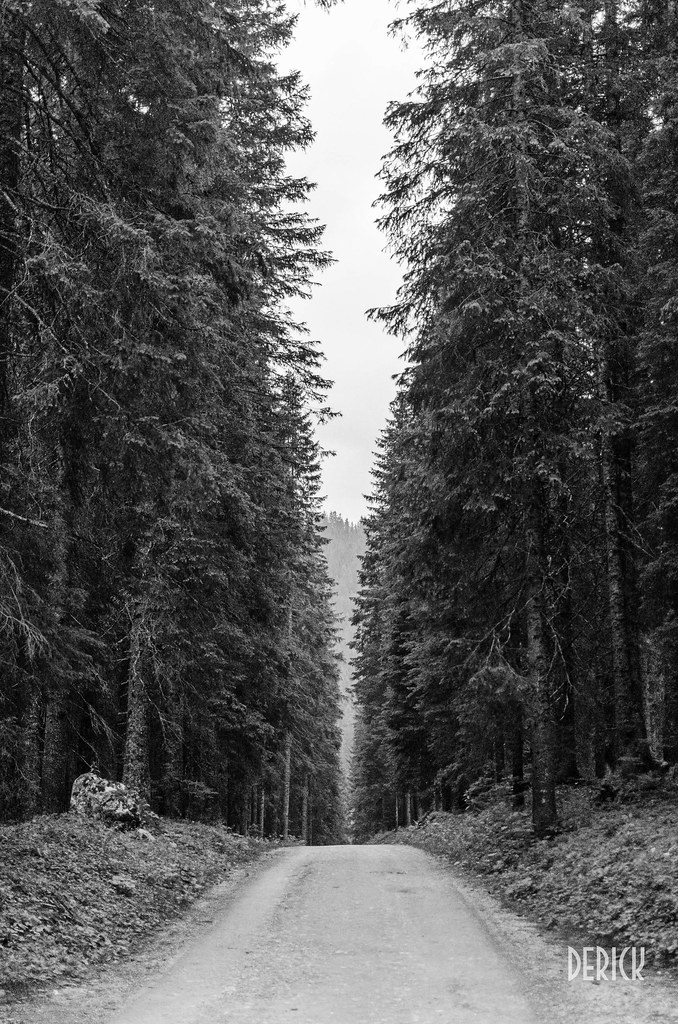
This is probably the most different image you have in this set (although I don't think these images really go together in generally). It looks really bleak. If that's what you were going for, it works well. I might try playing with the contrast and midtones a bit more. It looks awfully grey without a lot of differentiation. That could've been what you were going for though I suppose.
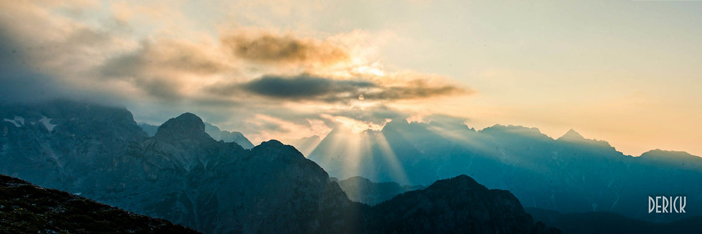
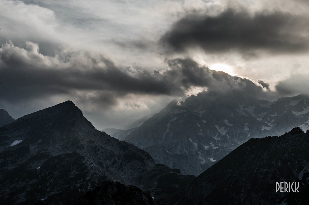
This image is a lot like the other image of the mountains and clouds above. It's generally shot well with excellent lighting, which more or less makes the photo. I think the muted tones really play in your favor for this particular shot.
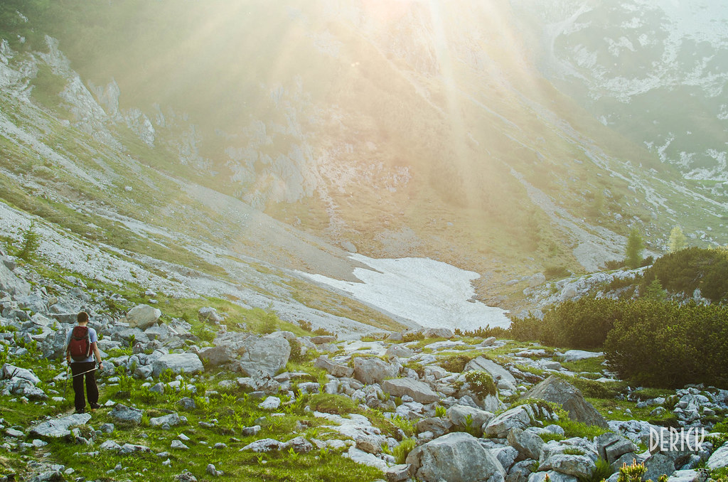
This is generally a nice image. Good composition with the hiker on the far left of the frame with his path of walking towards the right. Shooting into the sun worked generally well for this shot, but I think you over-saturated the greens. Generally having a light source into the camera makes things less saturated and contrasted. I generally prefer to not try to "correct" against this as I think it looks more natural.
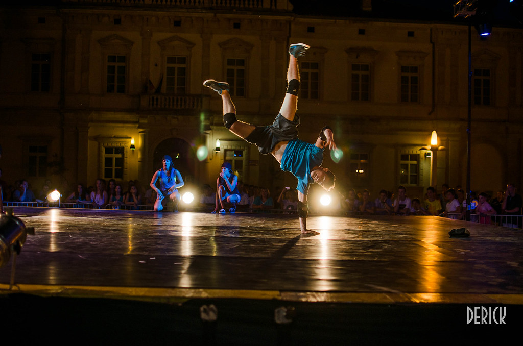
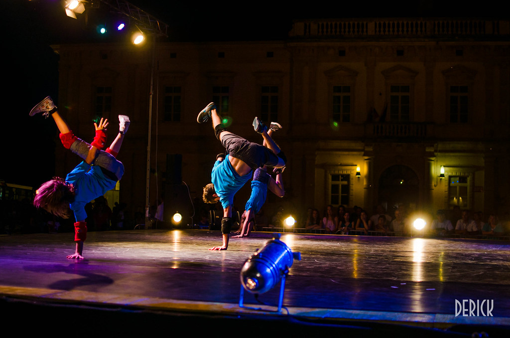
These two dance shots I'll take at the same time. I know you were trying to hit these at the apex of their movement to try and get the most dynamic image, but I'll be honest, it's just not there. I'm not opposed to shots of dancers (in fact, I would say shots of dancers in general are fantastic as you can see very interesting positions of the human form) but these seem drab. The well saturated colors make sense here so I think the pallet is okay, but both of these images feel like they just missed that pop.
I also note that both of these images look remarkably similar. Yes I know one has one person and the other has multiple-people but they are more or less in the same position. If you wanted to continue using these in your portfolio (not certain if you do...) then I would choose one or the other and not use both.
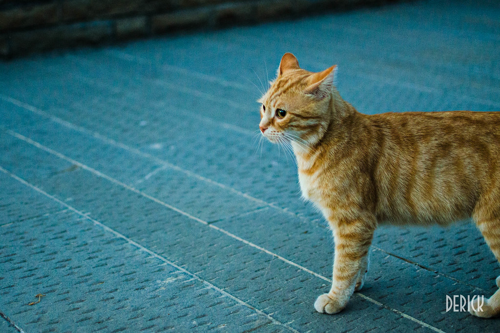
Another shot of a cat. Cute enough, shot lower this time. I like the color of the floor and the cat itself. But again, nothing interesting to see here.
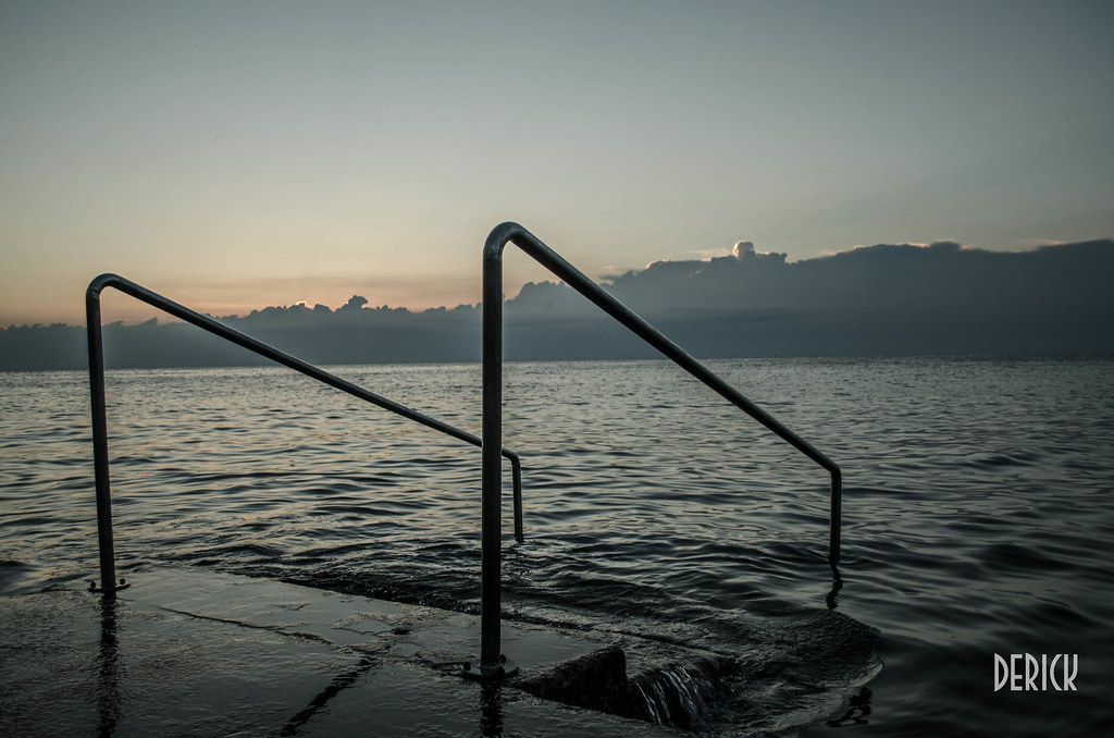
This one I'd say the subject matter isn't framed well. The dock nor the sunset seem to be well composed. I'd either do higher up and looking down on the dock, or perhaps more to the side and shoot across the dock, or if you want the sunrise I'd have the bars framed to the far right or far left of the frame and have the eyes drawn more towards the background.
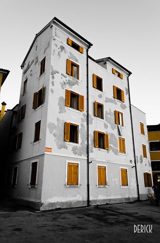
This image works a lot better than any of your previous for selective color. You really intensified this orange to the point of looking very synthetic though. If that's the color of orange it was in person, I'd be very surprised.
My only other major note is the same one that I said about the girl and the man with the horsehead. The selective color draws the eyes. I'd ONLY have the shutters orange and get rid of the color from the rest of the frame. There is no reason to have the stripes on the right or the chimney on the left as well as that part of the building on the left orange. I think that will help strengthen the image.
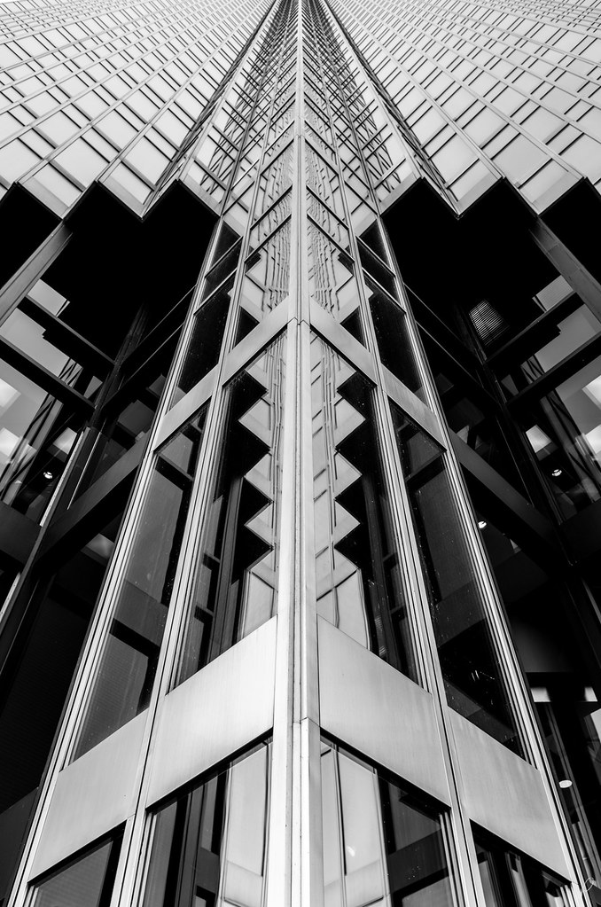
This is a nice enough building, but this angle doesn't seem quite right. It might have been better to get a focused shot of the door, straight on. Or a straight on shot of the profile, or some other detail shot. I can't really say much more without being there, but suffice it to say, this one is missing an interesting or dramatic angle.
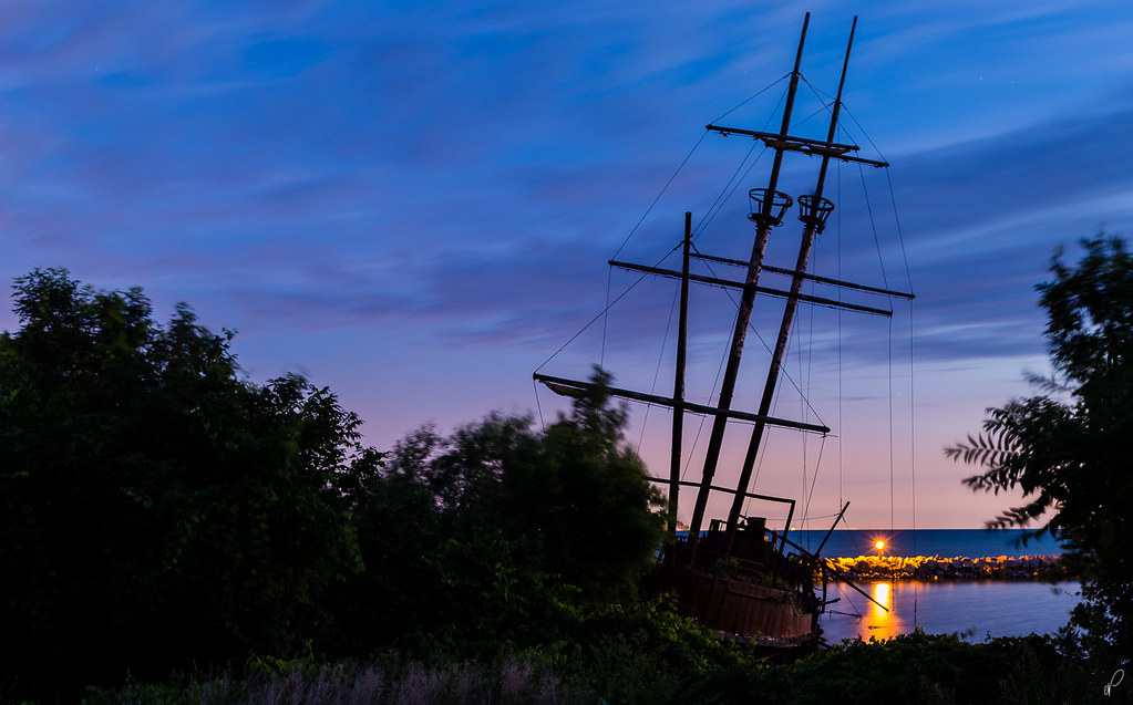
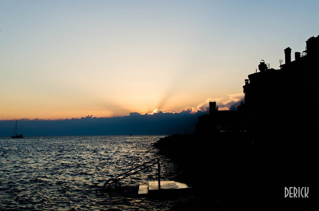
The silhouette of the buildings to the right is nice, and I also like the sun and the clouds. I'm less of a fan of the bars on the dock, the water, and the boat. The bars on the dock I don't think you can do much with, although they just draw my eye, and don't look particularly attractive. The water and the boat don't look too interesting or dynamic. I think this image might look better with a different crop, perhaps cutting 1/3 off the bottom and having just a hint of water with the sunset, silhouettes and the boat. That will help the boat which seems two dimensional play in your favor.
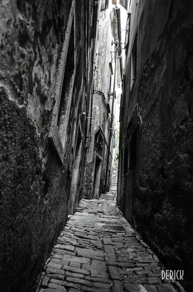
Another nice enough image of some city streets. Not sure why most of it is b&w but you left green all the way down the middle. I'd get rid of that and move it straight to a pure b&w conversion. Selective color should be used sparingly at most. It's cliched and played out, which is why I made my advisements earlier. Otherwise I think the image looks interesting enough.
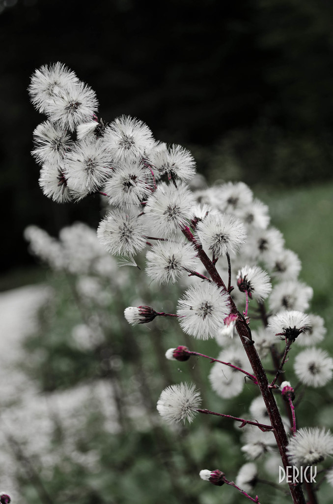
The macro/flower fans will probably like this one. At least the flower subject isn't one I see often so that is a definite plus. Past that though, flowers like cats on the internet don't do much for me. Someone else might appreciate this one much more though.
Well, I hope my comments were/are useful.
cheers!
How do you like the EOS m darktiger? I was thinking about pulling the trigger on the $249 deal but I want to see what the new one does, If a leak I found is right it should be out on July 31. The $249 deal is over anyway.
What cameras do you like that are more pocketable(doesn't have to fix in a pocket.)? I love my dslr but I would like to have something that I can't take everywhere, and not freak out if someone broke into my car.


Unless you have a huge library of Canon lenses that you're itching to use on a mirrorless camera, you'd be much better off with one of the entry level m4/3 bodies. The EOS-M has no real advantage over any other mirrorless system to justify the purchase.
Thanks. Indeed, Chicago does look a little different without Sears/Willis Tower, but in a way, the unique look is... well, uniqueGreat photos! I think the second one would be perfect if you could see the sears tower a little more. Chicago isnt chicago without sears. I love how you could see the fountain on the first one. I miss chicago, such a sexy city.
Any reason why you didnt use a lower ISO?
Now, if I could only get a sky like in POTN's pics (kudos for the pics, btw. Awesome shots, amazing atmosphere!) here in Chicago, I would be a very happy camper ^Ha, That's awesome! Is it yours or did you just stumbled upon him in the wild?
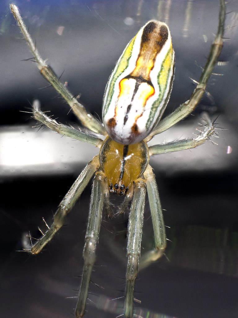
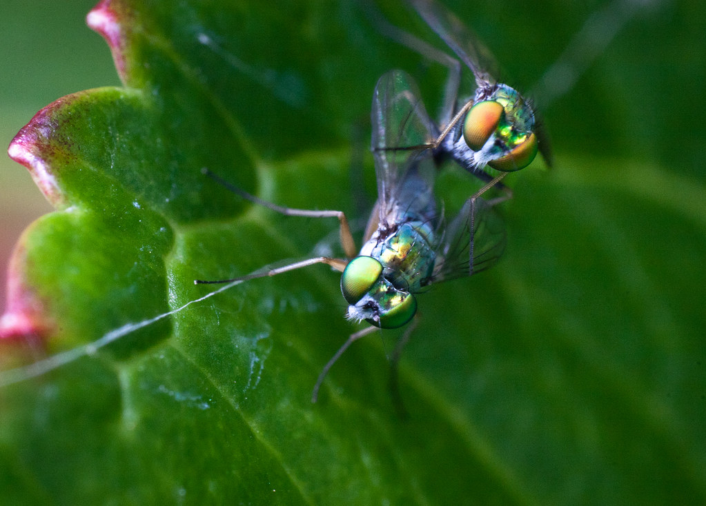
^^Lots of good bug shots there! What lens are you using for those?
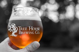
it looks classy as hell. i would drink that beer just on viewing this pic.
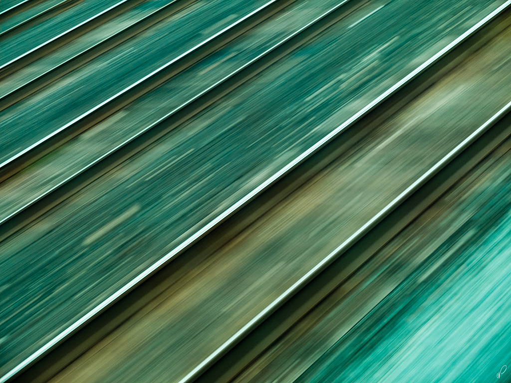
Cool photo how was that done? Was the Green/Blue tint added after to some parts?
. I wanted to try a slower shutter speed, but the train wasn't that smooth for me to pull it off.
http://ravaged.gibhut.com/6D/AZThread20130723/IMG_8536_e_smaller.jpg[/IM G]
[IMG]http://ravaged.gibhut.com/6D/AZThread20130723/IMG_8553_smaller.jpg