HP LP2475w (Possible new IPS)

Does this get loaded automatically at reboot? Or do I need some additional software to do this. Is there a way to display what profile is loaded to confirm it's the one I want?
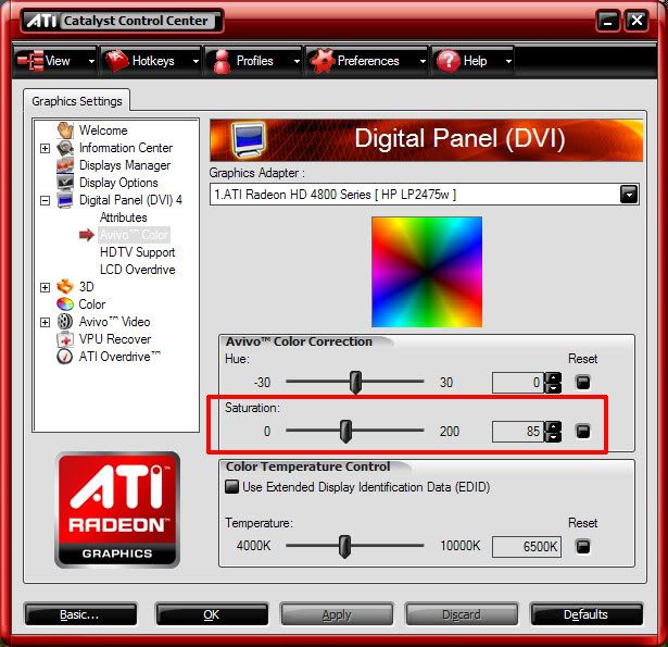
Click "run" and type "msconfig" then hit ok, in the startup tab their needs to be a loader. For example I use Basiccolor and I can see that loader which loads my profile.

In the advanced settings of display properties is a tab called color management, their you can see which profile is your default.

Can you upload your profile? I dont have a calibrator and am checking out other profiles.
 
I went back to the Apple store and sat down with the 23" Cinema displays and decided for sure that I could not live with their "sparkle matte" screen. I've now ordered my LP2475, will be available friday afternoon or saturday morning.

Ok, so I have just received mine

Quick notes:

1. Stand Base/Foot is massive - Disappointingly ugly but not not end of the world. Dell screen was better looking in general.
2. Top of Display is hotter than the Dell 2408WFP I had. Especially right hand side.
3. Neon cartoonish reds/greens as like Dell 2408WFP - Will buy calibrator after testing your posted icc profiles - thanks guys.
4. No contrast shift - Gotta love IPS panels.
5. No gradients, or weird pink/green colors.
6. 1 hot pixel top right hand corner - will try run that program to try brake it in.
7. LCD Matte finish much nicer than Apple Cinema's "sparkle" effect syndrome.
8. No cable management is stupid.

In reponse to:

"PawelPawlak n00bie, 6 Months
Hello. On my monitor - right side of display seems a little bit brighter than left (best seen on white background). Is it normal for LP2475W? - I`ve heard that some Apple Displays on LG.Philips panels have same thing. Also there is some backlight bleed - but not much."

Yes I had 7 iMac's (Aluminum & Glass Models) which had the color/ light gradient as you described. They use an earlier H-IPS panel. However my LP2475W is fine. I do miss the iMac screen - absolutely gorgeous... pity.


Any questions just ask... Im a Mac user so please keep that in mind =)
 
Recieved mine yesterday. It's awesome.

No vertical bar, no dead pixels.

I actually like the stand. I can't understand how someone can say that a stand is ugly/nice - to me that's like saying a cable is ugly/nice. But Dell's stand definitely creates more "lightweight" image), on the upside HP's is more practical.

 
5. No gradients, or weird pink/green colors.
I'd really like to get to the bottom of this, and establish whether some (or even most) of these panels are free of this effect. I realize a completely uniform panel is a big ask, especially in a mass-market model, but it does seem as though some are a lot worse than others.

Sorry to be a pain, but any chance you could double-check with an all-white background at various brightness levels, and also with 115,115,115 grey, and confirm there's no left-to-right colour variation at all?
 
A completely uniform panel is very hard to produce, and uniformity can vary from panel to panel. Most LCD panels are not perfectly uniform. That's why professional displays have digital uniformity correction. If you really want color uniformity, you'd be better off getting the NEC 2490 or 2690.

Also, the faint vertical bar is actually a common manufacturing "anomaly" with the 24" H-IPS panels. I've seen it myself. Not all panels have it, but it's a crapshoot. Some even have more than one. Chalk it up to LG manufacturing quality I guess. I haven't seen or heard of this happening with the 25.5" H-IPS panels.
 
Sorry to be a pain, but any chance you could double-check with an all-white background at various brightness levels, and also with 115,115,115 grey, and confirm there's no left-to-right colour variation at all?
I don't know whether my panel doesn't have the issue or I just can't notice it, but you can take a look at my photos here:


First, it's all white panel shot at brightness 10, 50 and 100. Each brightness is shot with different shutter speeds (1/25, 1/50, 1/200) just to be sure. Then I've done the same for 115 gray.
 
I don't know whether my panel doesn't have the issue or I just can't notice it, but you can take a look at my photos here:
OK, many thanks for doing that, nothing obviously unusual there, at least as far as it's possible to tell. :)

Probably just a case of taking each sample on its own merits, and not getting too obsessive about relatively minor imperfections...
 
Damn, I've spent 18 months waiting for a suitable monitor to come along at the right price, and I thought I'd found it in the LP2475w. But I got mine yesterday and I'm not happy with this colour shift (pink cast on the right).

To be honest I didn't notice it until I read about it, but I now find it really rather annoying. Furthermore, the reason I spent as much as this on a monitor in the first place was to get high colour fidelity for editing my digital photos for web and print output. I don't see the point in having a monitor that can be calibrated to have extremely low deltaE values if it has a significant deltaE across its own screen!

I don;t really know what to do. If I could exchange it for one without this problem I would; I really like the screen otherwise. Lukasmach's pictures seem to suggest his doesn't suffer from this problem; not perfectly uniform but at least no colour shift. But there seem to be enough others with the same issue that I could potentially end up sending 5 of the things back before giving up, by which time I would have spent a FORTUNE in shipping. Also, I'm not certain the retailer will agree that it is faulty, my housemate couldn't even see the problem himself!
 
... the reason I spent as much as this on a monitor in the first place was to get high colour fidelity for editing my digital photos for web and print output. ...

"as much as this"

Hmmm. $650 US is the bargain basement bin price range for what you describe. If you're serious about wanting something to fit that use you'll need to be looking at prices over $1000. (And throw in another chunk of change ranging from $300 to $1500 for color calibration hardware and software.)

Some models supporting "high colour fidelity":
NEC 2490WUXI-BK or -BK-SV or the LCD2690WUX (with larger gamut)
EIZO CG240W, CG241W, or come December the CG242W

You'll see that these monitors range from $1100 to about $2300.
 
Lets conclude my unit.
-Minor backlight bleed;
-Left half of the screen little bit darker than right (on white background);
-Two faulty subpixels (not visible from normal working distance);

Are this average "cons" for LP2475w?

Is there any sense to exchange it for another new unit (4 days left to make this decision).

Regards.
 
I ordered one to replace a Dell 2005FPW which has served me well.

Being in California, I didn't find a better deal than PC Connection @ $630.84 with no tax and free ground shipping. You have to search on the Part number (KD911A8) to find it in their catalog. It's a little disconcerting that it nowhere says "LP2475W", but I've been ordering from PC Connection since 1992 and their customer service has never let me down.

I looked at FuturePowerPC ($642 w/shipping), Provantage ($650), Bottom Line Telecommunications ($660 w/shipping... have ordered CPUs from them in the past), PC Superstore and CostCentral, which are eerily similar ;) (~$673 w/tax), Compsource ($675 w/tax), sparco ($680 w/tax+shipping), and even Penguins Express ($719.6 tax+shipping). Any other vendors that came up in pricegrabber or froogle had higher base prices than $631.

Of course, I paid about $600 for my Dell 2005FPW a few years ago. :p

Good sleuthing Argentum. I never could find this monitor at PCConnection or I'd have bought there too. Indeed, not easy to find!
http://www.pcconnection.com/IPA/Shop/Product/Detail.htm?sku=8973000

I didn't pay Calif. tax at Sparco so my total was $631.79, very close to what you got. PCConnection charges tax to some states but not Calif: Orders shipped to Alabama, Connecticut, Illinois, Massachusetts, New Jersey, New York, North Carolina, Ohio, Pennsylvania, Tennessee, and Texas are subject to sales tax.

Mine will arrive via FedEx on Wed...
 
"as much as this"

Hmmm. $650 US is the bargain basement bin price range for what you describe. If you're serious about wanting something to fit that use you'll need to be looking at prices over $1000. (And throw in another chunk of change ranging from $300 to $1500 for color calibration hardware and software.)

Some models supporting "high colour fidelity":
NEC 2490WUXI-BK or -BK-SV or the LCD2690WUX (with larger gamut)
EIZO CG240W, CG241W, or come December the CG242W

You'll see that these monitors range from $1100 to about $2300.

I am well aware that I could potentially spend a lot more than I have done, but the LP2475w is still well over double the price of the cheapest brand-name 24" monitor available (it's about £440 here btw, equivalent to US$805). An LCD2690WUXi is £705, which although I can afford, I cannot justify buying. Besides, the LP2475w fully meets my definition of "high colour fidelity", it just seems to sadly also come with an annoying foible. To be honest, I would rather have a monitor which could calibrate to a maximum dE of 1 that is uniform across the panel than my LP2475w which can apparently calibrate to a max of 0.5 but which has an annoying and clearly visible defect. It's a bit like having a CRT which someone has placed a loudspeaker too close to one side of.

Something that *really* pisses me off is that I might well be willing to stretch to a 2490WUXi, which would probably be the ideal solution, but you can't get it in Europe, along with most of the other really interesting units I read people raving about on these kinds of forums.
 
Do they have a good return/exchange policy in case something is wrong with the monitor?

Second that on PCConnection.com's service. If I run into any defects, would I be dealing with HP instead of the seller? And I know buying from HP direct, the warranty is 3 years. Is it the same from resellers?
 
I'd really like to get to the bottom of this, and establish whether some (or even most) of these panels are free of this effect. I realize a completely uniform panel is a big ask, especially in a mass-market model, but it does seem as though some are a lot worse than others.

Sorry to be a pain, but any chance you could double-check with an all-white background at various brightness levels, and also with 115,115,115 grey, and confirm there's no left-to-right colour variation at all?

Ok so after using it for a few hours straight and time for it to heat up, I recant my statement and conclude mine also has a "minor" gradient left to right BUT It is nothing compared to the horrible 24" Aluminum iMac's I owned. Also this is my first LCD to ever have a defective pixel. I dont know whether its a "sub pixel" or what ever but it stays on white. Is only noticable on black and dark backgrounds. I dont know if it warrants being replaced.

Firefox and Camino are awesome once color management is enabled ;)

I watched some DVD's and played a quick round of Unreal 2004 (all I could find at the time) and they were fine. Games and movies were very watchable.
 
Also this is my first LCD to ever have a defective pixel. I dont know whether its a "sub pixel" or what ever but it stays on white. Is only noticable on black and dark backgrounds. I dont know if it warrants being replaced.
Check it against pure red/green/blue images and see if it changes color. If it's just blue that's stuck it will disappear on a blue background, if it's say blue and red then it will become red on a blue background (or disappear on magenta), etc. If it is a whole stuck pixel then HP's policy allows for an exchange.
 
Ok so after using it for a few hours straight and time for it to heat up, I recant my statement and conclude mine also has a "minor" gradient left to right BUT It is nothing compared to the horrible 24" Aluminum iMac's I owned.
I guess a moderate amount of brightness variation is to be expected in any LCD panel, particularly a large widescreen one, but I think it's the colour shift (if it's there) which is less easy to ignore. I don't see it on my Dell 2707WFP, although the panel is slightly dimmer at the left and right extremities.

For what it's worth, my friend insists he can still see nothing wrong with his LP2475W - he says I'm being a "pussy" (his words), and that I'm just jealous because his monitor is better than mine. Having seen them side-by-side, I have to admit there's some truth in this, at least as far as overall image quality is concerned...
 
So what are other owners thoughts on the HP's text representation ?

It's not that it isn't sharp. I can't seem to put my finger on what exactly is wrong. But something is off with the text. It's very straining on the eyes.
Have had other 24" 1920 x 1200 don't recall seeing a problem. :confused:

Also I find the "screen door effect" more pronounced on this monitor than previous ones I have owned.
 
Ok, I did a second calibration, this time using Basiccolor. I noticed that Basiccolor created a profile that ended with*.icm. Eye-One Display 2 created one called *.icc, what is the difference? Next I installed and enabled the Firefox 3 browser color managaement add-on and loaded the calaibration profile I created. Then I opened MS Internet Explorer 7 (not color aware) on one half of the display and Firefox 3 (color management enabled) right next to it on the other half of the display. Oddly enough I actually prefer the look of the IE screens! Colors are more saturated but I like it so I am just going to continue using IE.
Monitor really looks great once calibrated. No defects at all found so far. Definately glad I choose this model. The only other one I would consider would be the NEC 2490.
Current settings after calibration:
Brightness 10
Contrast 80
R 241
G 228
B 242
Luminance 120 cd/m2
Black point .2
6500K
2.2 gamma
 
So what are other owners thoughts on the HP's text representation ?

It's not that it isn't sharp. I can't seem to put my finger on what exactly is wrong. But something is off with the text. It's very straining on the eyes.
Have had other 24" 1920 x 1200 don't recall seeing a problem. :confused:

Also I find the "screen door effect" more pronounced on this monitor than previous ones I have owned.

Absolutely no problems that I can see, and I look at small fonts all day whilst coding.
 
of course I have enabled cleartype.

And of course I sit close. I have to sit close to see the text ;)

I found a couple of owners who agrees with me. So I might not be so crazy.

I sit about 40cm from screen and screen door effect is very noticeable.

It's actually as if the screendoor effect makes the text harder to read:rolleyes:
 
Some objective overscan testing results. Everything was done through the analog outputs on my 8800GTSv2 with desktop scaling in the nvidia control panel set to full. These images are all Fill to Aspect, One to One looked the same but at actual pixel size. Sorry about the crappy cell phone pictures, but you get the idea.

Component 1080i:


Component 720p:


Component 480p:


Composite 480i:


For component sources it's not actually overscanning but hard cropping. You can't see it in the pictures but the entire screen is not being filled, there's a black border around the outside where the remainder of the image is being covered up. Composite is being overscanned and fills to the top/bottom of the screen. I see no distortion on any input unless it's set to Fill to Screen which stretches to 16:10.

Other notes:
  • 576i/p are supported, as well as 480i over component
  • Image Control is unlocked for PC over DVI if the resolution is below native, though no Dynamic Contrast is available
  • Brightness/Contrast/Color settings are remembered for each input
  • Aggressive comb filter for dot crawl, eliminates it on static images but a moving object across a static image (e.g. mouse on desktop) will noticeably corrupt surrounding pixels; not a problem on full screen motion
of course I have enabled cleartype.

And of course I sit close. I have to sit close to see the text ;)

I sit about 40cm from screen and screen door effect is very noticeable.
Don't just enable ClearType, use that page or download the power toy so you can tune it to look better. I had to retune mine for this monitor, the settings aren't going to be the same on everything.

No wonder you notice the interpixel space, 40cm is way too close :eek: I have to sit at twice that distance to be comfortable, do you normally wear glasses?
 
I sit about 40cm from screen and screen door effect is very noticeable.
40cm seems very close for prolonged use - if you really have to sit that close in order to use the monitor, I think you might have a vision problem. My own eyesight's not the best, but I could read this forum quite comfortably at around 1m without changing the font size.

Try backing up in stages to about 80cm or more, and let your eyes slowly refocus each time... don't strain though, and if you're still having problems I think a trip to the optician might be in order.

Having said that, I do agree that the HP's text isn't absolutely the sharpest I've ever seen.
 
Hi guys!

I've been following this thread for quite some time now and decided to go for the HP LP2475W. I picked it up a few days ago and everything looked nice while setting up, no dead pixels and so on. I noticed the colorshifting and as it turns out, so have many others. I can't say it's not an issue, but since I don't do any color critical work this is probably something I can live with it as I understand it's a downside of these "cheap" panels, because when they are as large as 24" difference in colors etc are more easily spotted near the edges than on let's say an 17" 4:3 AR LCD.

The actual problem, which annoys me most, is I play a lot of FPS games and when I tried to play some CS:S I instantly noticed some vertical "flickering". I turned on the vertical sync, and it helped somewhat but I can still see it. Not the whole time but every once in a while. This flickering didn't appear when playing on the exact same rig with a 17" LCD @ 75Hz. I also tried Crysis but it didn't seem to have the same problem. This same weird "flickering" also appears on some scenes in movies. (Example: Planet Earth Pole to Pole 1080p -> around 50 sec mark when the camera goes between two mountains).I assume it's down to some settings but I can't find out what to tweak.

I'm running on: Intel E8400, 9800GX2. I've got firmware version GIG 032, the latest Nvidia drivers. I've also installed the HP monitor drivers/display assistant and I'm running LUT loader for a icc-profile snatched from this forum.

All help highly appreciated
 
40cm seems very close for prolonged use - if you really have to sit that close in order to use the monitor, I think you might have a vision problem. My own eyesight's not the best, but I could read this forum quite comfortably at around 1m without changing the font size.

Try backing up in stages to about 80cm or more, and let your eyes slowly refocus each time... don't strain though, and if you're still having problems I think a trip to the optician might be in order.

Having said that, I do agree that the HP's text isn't absolutely the sharpest I've ever seen.

Yeah I wear glasses. But I kind af like sitting really close :) and thanx for agreeing that HP's text isn't the sharpest around. I mean if you have to compensate using cleartype tuning etc. that surely indicates a problem.

nick8571:How bad would you rate the text shapness comapred to other screens you have used ?
 
nick8571:How bad would you rate the text shapness comapred to other screens you have used ?
It seemed a bit less sharp than my Dell 2707WFP (a surprise this, considering the lower pixel pitch), and definitely less sharp than practically any notebook I've used (perhaps less surprising). Not exactly poor or blurry as such, just, well, different. Better than a 2407WFP though, experience of which led directly to me getting the 2707WFP, thinking (incorrectly as it turned out) it was the pixel pitch which was causing my eyestrain.

I did wonder if it was a characteristic of the H-IPS screen, but I've used a Dell 3007WFP-HC before (S-IPS), and the text on that was awesomely sharp, even though the AG coating had clearly been spread on with a plastering trowel.

I remember reading somewhere here that TN panels often actually have better text quality than either *VA or *IPS, although I'm not sure if that still holds true.
 
redox, this is just a guess, but do you have your LCD vertical refresh rate set to 75 Hz? If so, try 60 Hz. My understanding is that when an LCD is set to 75 Hz it simply drops every fifth frame that the video card sends to the monitor. Your standard LCD can't actually display 75 Hz, so 60 Hz should possibly look smoother.
 
I mean if you have to compensate using cleartype tuning etc. that surely indicates a problem.

No it doesn't, if you read into how ClearType works you'll realise why different displays need different settings (doubly so for a wide-gamut monitor). If you look at the following image:

Wikipedia_ClearType.png


you'll notice that several colours (and shades thereof) are used to generate the cleartype effect (browns, blues etc.), this is because our eyes are a lot more sensitive to changes in intensity than colour. I believe that the probem some people are seeing is on a wide-gamut display the colours used to make up the cleartype rendering will be much more saturated and therefore your eye will start noticing that there's a change in colour and the effect is ruined.
 
So what are other owners thoughts on the HP's text representation ?

It's not that it isn't sharp. I can't seem to put my finger on what exactly is wrong. But something is off with the text. It's very straining on the eyes.
Have had other 24" 1920 x 1200 don't recall seeing a problem. :confused:

Also I find the "screen door effect" more pronounced on this monitor than previous ones I have owned.


I know exactly what the problem is on my new LP2475w that may be responsible for what you are describing... a manufacturing defect whereby the convergence is off (resulting in red pixel shift to the left in my case.) This leaves a red fringe on all high-contrast verticals, such as windows edges and text. It is highly annoying and makes me dizzy looking at it. Such a shame really, since overall color, brightness, contrast and viewing angles are superb. I checked mine with a simple test pattern of white linear boxes and white pinpoints on a black background. This defect is really odd for a flat panel screen since the technology really should do away with convergence problems (old CRTs had this problems when the RGB "guns" where not properly aligned.) Is anybody else seeing this problem? (I ruled out possible problems with power, dvi cable and graphics card by swapping things out with my cheap old Samsung which does not display this defect and is razor sharp.)
 
Text sharpness is another side where wide gamut bites us from. Described in the first review of the Dell 2408.
Calibration will not help get rid of WG, but it can do something.
Also at least 120% dpi is necessary for perfect text.
 
I know exactly what the problem is on my new LP2475w that may be responsible for what you are describing... a manufacturing defect whereby the convergence is off (resulting in red pixel shift to the left in my case.)
In addition if you look closely enough the far right edge is actually blue. I have to get really close to see this effect though (my eyes barely focus at that distance), and it's no more separated than any other LCD I've seen. It may be exaggerated because the wide gamut makes red stand out more from black, but I don't see it on text after tuning ClearType.
 
Question re Wide Gamut for a fairly noob

I have a several year old LG panel and am looking for an upgrade, to do general usage + photo editing + some multimedia (dvd movies etc). I like the idea of the quality of the NEC 2490 panel but don't like the very limited inputs. For something this expensive I'd like HDMI and some other modern inputs to hookup some multimedia devices. I'm drawn to the HP given IPS panel and inputs. I don't mind geting a hardware calibration device if necessary, but once calibrated I do want something usable for photo editing and multimedia and general usage. I have a dual boot computer (XP pro/ Vista 64) but generally use XP pro and paint shop pro X2 for editing and Acdsee for photo organization, internet explorer for web. Would this wide gamut issue be a problem for me in photo editing (after calibration) or general use or media?

I've read most of this thread and as much others as I can find on this panel but don't see a clear answer. Thanks
 
Text sharpness is another side where wide gamut bites us from. Described in the first review of the Dell 2408.
Calibration will not help get rid of WG, but it can do something.
Also at least 120% dpi is necessary for perfect text.

Wide Gamut doesn't have anything to do with poor convergence. Wide gamut is actually a good thing if you can calibrate and control the colors to match the color space you want to represent. All wide gamut means is that you can reproduce more colors than a typical display. If a wide gamut display is not calibrated properly, your colors may look garish and unreal. I used a Spyder3 to calibrate my display... the color is actually fairly good once calibrated.

The problem with the LP2475w, at least in my case, is that the red pixels are shifted to the left and the blue is shifted to the right... they are supposed to line up exactly upon each other (and on Green) to reproduce white... that's how RGB works. 255 Red + 255 Green + 255 Blue = White. If these colors are not aligned properly, you get a fringe or ghost of color along edges of high contrast areas, such as a white line on a black field. This fringe of color basically makes certain things like high contrast type "vibrate" and seem out of focus. My old, cheap Samsung 19" and my old Apple Display do not have this problem.
 
In addition if you look closely enough the far right edge is actually blue. I have to get really close to see this effect though (my eyes barely focus at that distance), and it's no more separated than any other LCD I've seen. It may be exaggerated because the wide gamut makes red stand out more from black, but I don't see it on text after tuning ClearType.

In my case, the pixel shift is very noticeable on my LP2475w... just looking at the white linear border in this forum reveals the problem... the line looks out of focus with a red tint on the left side... it also has a blue tint on the right, but the blue is less noticeable. On my two other flat panel displays, there is no detectable pixel shift... the white line is clean with no color fringe. This is just wrong. I believe it is a manufacturing defect or an engineering/design mistake.
 
To say the text issues is a result of wide gamut is bullshit. You can just desaturate the colors in ATI control panel. It has no effect on the text

Here is an image to check for the convergence problem on your display. View it at 100% size. Looking at the white dots in this image, I can distinctly see red pixels on the left of these white dots when viewed on the LP2475w, but not on my other flat panel displays.

http://www.rezolutionstudios.com/public/convergence_test.jpg

Thanx for the test image. However I can't seem to see any of the defects you refer to :confused:

For the wide gamut concerned I made a couple of comparison photos. Using the ATI control panel saturation control.

desktop.jpg


100 saturation (default):
1-1.jpg

85% saturation:
2-1.jpg
 
To say the text issues is a result of wide gamut is bullshit. You can just desaturate the colors in ATI control panel. It has no effect on the text

Problem is, that desaturates all colours, so the cleartype settings will still need tuning to look optimal (you should use the tuning app on all monitors to get the best out of cleartype as it is really a hack that depends on the nuances of human perception to work properly, and as each monitor is slightly different and each person has different perception you never get a one size fits all).
 
Problem is, that desaturates all colours, so the cleartype settings will still need tuning to look optimal (you should use the tuning app on all monitors to get the best out of cleartype as it is really a hack that depends on the nuances of human perception to work properly, and as each monitor is slightly different and each person has different perception you never get a one size fits all).

Sure and I did. But no amount af cleartype tuning seem to make it that much better ;)
 
Back
Top