- Joined
- Aug 20, 2006
- Messages
- 13,000
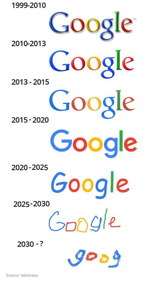
Would you agree with these guys on the aesthetics of the new Google logo? One designer isn’t afraid to state what many thought—that it’s “child like.” What I do like about the logo is how well it scales, particularly down.
The result definitely is an improvement from a design standpoint. It is cleaner and more modern using a custom sans serif instead of the the old quirky serif typeface. My one complaint is that the typeface is so friendly that it, with the primary colors, looks almost child like. The old serif added some gravitas which you could argue one of the world's biggest brands does need.
The result definitely is an improvement from a design standpoint. It is cleaner and more modern using a custom sans serif instead of the the old quirky serif typeface. My one complaint is that the typeface is so friendly that it, with the primary colors, looks almost child like. The old serif added some gravitas which you could argue one of the world's biggest brands does need.