What is Microsoft doing?

jyi786

Supreme [H]ardness
Joined
Jun 13, 2002
Messages
5,758
It seriously seems that they are doing their best to destroy their bread and butter: Windows and Office.

I know there are tons of hate threads about Windows, and I ignore it; I bought Windows 8 and Office 2013. Matter of fact, just bought Office today and installed it........and it's a complete disaster. And not for the reasons everyone complains about, but something way more fundamental and basic:

FONT RENDERING IS HORRIBLE.

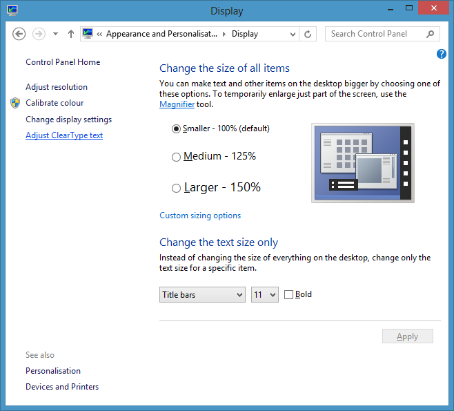
It's so painful to read, seriously. I included a screenshot of text. It's hard to convey, since screenshots (JPGs, PNGs, and compression) tend to smooth things out; it's a lot worse when looking at the programs directly on your screen.

2a2e80.jpg


I read that this is due to Microsoft is getting rid of ClearType, and rendering fonts in Office half ClearType, half grayscale.
http://www.istartedsomething.com/20120303/cleartype-takes-a-back-seat-for-windows-8-metro/
http://blog.quppa.net/2012/07/17/office-2013-further-evidence-of-the-demise-of-cleartype/

Everyone has their opinion on Microsoft's new direction. I am one who tends to test everything thoroughly before I make a decision on whether or not it's a good product; I actually liked Microsoft's new direction with their Office suite.

But something as basic as text?!??!! If I open a program and the text makes my eyes bleed, what the heck does that say about what they are trying to do? These are productivity suites for crying out loud! Are they really trying to alienate their user base in going after tablet trash, or are they truly just ignorant and lost their way? This is a complete disaster.

I have no choice but to go back to Office 2010 until they can fix this issue. I can't be productive if something as basic as text is uncomfortable to read. Not to mention that I absolutely cannot recommend Office 2013 to my clients (I'm a SharePoint dev) until this has been fixed.
 
wtf; cleartype is pretty awesome (although I guess it might not work so great with your pixels sideways, but).

I'm pretty sure that Microsoft's corporate strategy is currently: "try to be Apple" (witness them removing options, locking down devices, building a chain of stores; watch for them to stop selling their OS to other manufacturers in the future!). The problem is Microsoft doesn't make a very good Apple, and they're a few years late to pretend to invent things (also pretending they invented things they were on the forefront of 10 years ago is a little bit too obvious!)

Well, they had really better be careful, because that type of strategy is going to blow up in their face.

Here's another example, which shows what I'm describing better than my screenshot does.
http://answers.microsoft.com/en-us/...8/ed053d17-b525-4e09-bdbc-de91114d975c?page=2
PNBpG.jpg
 
Why doesn't everyone experience this issue? I am picky on font rendering, and I definitely do NOT see what you see, or your screen shot shows, in either word, outlook, or any of the Windows 8 UI.
 
I didn't get this problem in Windows 8 but I definately see what you are talking about in those screenshots. Not sure why it is doing that to you - it's almost as if it's a resolution issue as stupid as that sounds o_O I know it's not, everything looks to be in proportion but the only time I had text like that was when I had a video card that just refused to do standard resolution, ended up one close to the monitor's natural res but not quite. Ended up looking just like that.
 
wtf; cleartype is pretty awesome (although I guess it might not work so great with your pixels sideways, but).
I think that's probably it: tablets can be used in any orientation. ClearType degrades non-gracefully in half the available orientations on a tablet.

Tablets, tablets, tablets, tablets, tablets.
 
I think that's probably it: tablets can be used in any orientation. ClearType degrades non-gracefully in half the available orientations on a tablet.

Tablets, tablets, tablets, tablets, tablets.

Well, this should be easy for Microsoft to develop a workaround for. Offer different font rendering options instead of ramming a single render type by default down everyone's throat. If ClearType degrades, offer the option to enable/disable it!
 
But then people will say my [Insert name of that Windows RT thing here] looks like crap, its nothing like desktop windows... I'm getting an iPad.
 
Well, this should be easy for Microsoft to develop a workaround for. Offer different font rendering options instead of ramming a single render type by default down everyone's throat.
I don't disagree.
 
But then people will say my [Insert name of that Windows RT thing e] looks like crap, its nothing like desktop windows... I'm getting an iPad.

Again, another easy fix. Office can detect if the OS is Windows RT, and disable by default. It's not really rocket science. Just can't believe Microsoft would overlook such a basic thing.
 
MS bread and butter is not Windows and Office, that is just one side of the house that is trying to be more like Apple at the moment (for consumers).

The other side is their enterprise software and solutions...which has a ton of revenue tied to it for MS (not only in licensing, but in support and services).
 
Again, another easy fix. Office can detect if the OS is Windows RT, and disable by default. It's not really rocket science. Just can't believe Microsoft would overlook such a basic thing.

But the same could be said of the main OS. Notice there's no touchscreen and disable all the touchscreen focused "optimizations". But they said they wont do that because "fuck you". :D

I think the sooner they admit they made a mistake the better. The faster they can go back to doing stuff right. Whoever is in charge and the people below all need to go on to other things...
 
The other side is their enterprise software and solutions...which has a ton of revenue tied to it for MS (not only in licensing, but in support and services).

And that is slowly being eroded by products like Google Enterprise, Salesforce, Oracle eBusiness/JDE, etc. It seems like more and more, the only reason you need Windows is to be able to open up a web browser.
 
And that is slowly being eroded by products like Google Enterprise, Salesforce, Oracle eBusiness/JDE, etc. It seems like more and more, the only reason you need Windows is to be able to open up a web browser.

Depends on your organization, we are dropping products from places like Oracle and IBM for MS alternatives.

It goes both ways....
 
MS bread and butter is not Windows and Office, that is just one side of the house that is trying to be more like Apple at the moment (for consumers).

The other side is their enterprise software and solutions...which has a ton of revenue tied to it for MS (not only in licensing, but in support and services).

This is true, but then again, the same holds true for enterprise. Imagine deploying Office 2013 to an enterprise, and text rendering is screwed from the start. Do you really think that organization is going to put in their budget whatever Microsoft recommends is the best screen for them to use so that Office can just look right?

Wrong.

They are going to force Microsoft to fix it. And if Office 2013 does get widespread enough that organizations start deploying it enterprise wide, I'm going to guarantee you that someone is going to tell them that they better fix it.
 
It's hard to convey, since screenshots (JPGs, PNGs, and compression) tend to smooth things out

Just so you know in the future, PNG doesn't smooth anything out, it's completely lossless image compression, making screen grabs of text in particular not just sharper, but also smaller in size.
 
I've not noticed this issue at all on my Windows tablet with Office 2013, everything looks nice as expected.
 
They are going to force Microsoft to fix it. And if Office 2013 does get widespread enough that organizations start deploying it enterprise wide, I'm going to guarantee you that someone is going to tell them that they better fix it.

I doubt that, but I also doubt that MSO2K13 is going to get deployed on even a decent scale, enough to cause the amount of grumbling that would be required to get them to own up to and try to fix something like this.

The fact is, the current product cycle is all about Metro. Home users are mixed on Metro, but I can't see businesses actually adopting anything that not only relies on, but FORCES Metro.

Just so you know in the future, PNG doesn't smooth anything out, it's completely lossless image compression, making screen grabs of text in particular not just sharper, but also smaller in size.

Correct. PNG's are also uncompressed/lossless whereas JPEG dumps every 8th pixel (or something like that) prior to compression and is a lossy format.
 
This is true, but then again, the same holds true for enterprise. Imagine deploying Office 2013 to an enterprise, and text rendering is screwed from the start. Do you really think that organization is going to put in their budget whatever Microsoft recommends is the best screen for them to use so that Office can just look right?

Wrong.

They are going to force Microsoft to fix it. And if Office 2013 does get widespread enough that organizations start deploying it enterprise wide, I'm going to guarantee you that someone is going to tell them that they better fix it.

I will say there are more issues than just this in Office 2k13, and we will not be moving to it anytime soon unless they fix quite a few things for the enterprise and integrations ;)
 
Correct. PNG's are also uncompressed/lossless whereas JPEG dumps every 8th pixel (or something like that) prior to compression and is a lossy format.

Thanks for that. I could have sworn there was a PNG-24 that allowed for compression and such, but I guess I was wrong. :D

Just to ensure I wasn't doing anything wrong, I did a fresh clean install of Win 8 Pro and Office 2K13 on a VM. Same old; fonts look like they are half resolution.
 
Thanks for that. I could have sworn there was a PNG-24 that allowed for compression and such, but I guess I was wrong. :D

PNG is compressed, but it's lossless compression, so you get exactly what you put in. On the topic of screenshots though, when you take a screenshot, the screen might be re-rendered with cleartype off (or other settings changed) and then go back to normal; cause Microsoft is tricky like that.
 
You can adjust how the ClearType looks. It's very display dependant. In my case Windows got it right form the start (or maybe I did adjust it, can't remember) but fonts looks really nice on my screen.
fontb4ud8.png


Also, using jpg to take windows screenshots like these is big fail. Png is really suitable for this type and almost in every case offers smaller size than high quality jpg yet superior, lossless quality. Also optimizing png helps a lot. Above shot was 27 kb large png but abload apparently re-encodes the images and that results in tiny bit larger image png than the optimized original. Same image as highest quality JPG (100% quality, no chroma subsampling, progressive) using XnView as encoder would result in 182,43 kb large file. That's almost seven times larger yet lossy.
 
Last edited:
You can adjust how the ClearType looks. It's very display dependant. In my case Windows got it right form the start (or maybe I did adjust it, can't remember) but fonts looks really nice on my screen.
fontb4ud8.png

I went back and tried ClearType in Win8 + Office 2k13. The ClearType affects all the text INSIDE the program (coded), but has absolutely no effect on text that you are typing, which is the problem.
 
Guys, I solved it.

I can't believe how ridiculous this is. In order to fix it, I literally had to play ClearType lottery. Here's what I found out, and how I was able to figure it out...

I went back onto my Win8 Pro VM after reading some documentation on ClearType, DPI settings, and their effects on monitors. After playing with the DPI settings, I found it strange that I would change ClearType settings, reboot the computer, and the text would look completely different. Both written text and program text. After about 100+ reboots, here are my findings:

1. ClearType doesn't apply itself 100% when you click Apply. It only applies itself to the text "around" a program, and not text that is typed. You have to log off and log back on for the full effect. Thank goodness I have an SSD.
2. ClearType is very picky about your monitors, and will piggyback settings off your primary monitor. Even though it purports to allow you to set options to your liking for BOTH monitors, this is not true. Case in point? Set ClearType for your initial monitor; you will have 4 steps. When the program goes to the next monitor, it will have only 3 steps. Why the disparity? Because it's piggybacking on one of the steps for the primary monitor (wasn't able to figure out which one). Obviously, what looks good for one monitor will not for the other, but Microsoft apparently never got the memo (doesn't common sense apply here???:rolleyes:), so you'll have to find a compromise.
3. DPI settings are borked in both Windows 8 and 7. When changing DPI settings, if you choose a custom DPI, Windows automagically (notice the spelling) checks the box for "Windows XP style DPI scaling". You'd never know it was on if you didn't go back in to custom DPI settings and turn it off. I don't know exactly what the difference is, but I can tell you that with that OFF things look better.
4. Don't even think about turning ClearType off. If I thought in my OP it was bad, it is even worse with ClearType off. Looks (and feels like) someone is throwing shurikens in your eyes.

It looks a whole lot better now, in all Office 2013 applications. Granted, Office 2010 still takes the cake, but now Office 2013 is usable.

Why would someone have to go through such hell to figure this kind of thing out?
 
I personally never liked ms fonts anyway. I hope they know what they are doing.
 
Back
Top