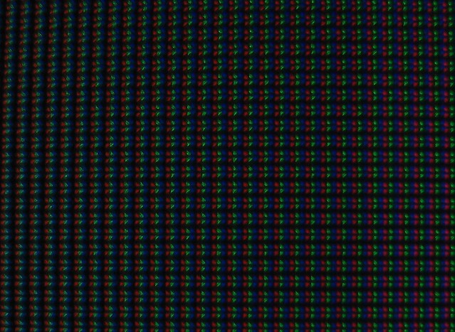
Which one is better for text: Ultrasharp IPS+AG or glossy IPS?

resal

n00b
Joined
Nov 14, 2011
Messages
6
Hi all,

I am planning to buy a new monitor and I am mainly deciding between these two:

Dell Ultrasharp 2412M: IPS + Antiglare coating
Dell ST2220T: Glossy IPS

What I am looking for is a monitor with the best text rendering (clear and good contrast) as I study a lot of papers/ write a lot of code on and also I don't have the best eyes . I don't use my desktop much for multimedia or gaming. I think the Ultrasharp line is great but I read somewhere that glossy screens, while reflective, can give the best contrast. However today I worked a bit with an iMac (which has a glossy IPS screen as the Dell 2220T, a bit brighter though) and honestly I wasn't that impressed with it. Maybe I am expecting too much!

Which one do you recommend? I am more leaning towards Ultrasharp + Cleartype font (subpixel hinting in Linux).
 
Thanks. I didn't know about SA850 at all and it seems interesting. I guess it is the good for text because of technology (PLS) + semi-glass coating. However it is a 24" with 1920x1080 resolution.. maybe that affect text resolution.

I forgot to mention that I usually work at night so the room is pretty dark and reflective screen is not an issue.

EDIT:
I noticed that SA850 24" is 1920x1200 and ~$550 and SA650 24" (not PLS) is 1920x1080 and ~$300. SA850 Looks really good but unfortunately over my budget. I can afford $350 at the most.
 
Last edited:
There is no contrast improvement from glossy. It's just a psychological perception of improved contrast that some people get, as they're having to look through various reflections on the screen.

The main advantage with glossy is that there's no anti-glare coating - which can make solid areas "sparkle" with crystalline multicolour grain. Some people can't help but see this everywhere - and it tends to affect whites the most, so if you're reading black on white, maybe you will be distracted by it.

If your current display is matt, and you don't know what I'm talking about, I'm sure you'd be fine with the U2412M. The Samsung displays tend to have lighter AG, if you can only afford the SA650 then you'd have to weigh things up, vs the lost resolution. I assume you'll be running the screen in portrait? Personally I have no problem with the AG on the U2412M for reading/coding, and only notice it when I'm specifically looking for it.
 
AG coatings make the edges of text characters appear poorly defined. That makes text harder to read. If you really don't care about multimedia, then a glossy TN monitor will save you some money and give you razor sharp text. The color differential from the top of the screen to the bottom of the screen on TN panels makes color correcting photos a real problem. Believe me, I've tried it. But everything else works fine. The latest TN monitors are much better than the monitors of a few years ago. You won't usually notice the color differential unless you look for it.

Regardless of the panel type you choose, a glossy screen will definitely give you more readable text.
 
Thanks zechs3.

Wagoo, thanks for sharing your experience. You are right and (unfortunately) I know what you are talking about! I had a TN monitor for a year (an ASUS full HD) and I sold it because I couldn't get the fonts as clear as my VAIO laptop (not HD but glossy). Then I found out it was due to the type (TN) and the AG coating. I am hoping that AG coating on an IPS monitor wouldn't be as distracting as on a TN monitor..

Tonight I also found out that these two Dell monitors use almost exactly the same panel which is kind of relief and narrows the decision down to mainly AG coating... I am gonna order one of them soon and will write about my experience.
 
Thanks TheArtCher. Yea I think that heavy AG coating will make text to be rendered poorly. However I wish I knew how "heavy" it is on the Ultrasharp one.

No I don't do much multimedia-related stuff. But I didn't know that there are glossy TN panels... Do you know a good one off the top of your head?
 
I find Cleartype or anti-aliased text is affected more than non-ClearType or "aliased" text by the rougher anti-glare coating of matte LG-IPS panels.

Glossy will be more similar in definition to the top half of the photo, which is a Samsung S24A850, and the Dell U2412M is the bottom half of the photo:

agversusagshowdown20111.jpg
 
Thanks 10e. In the bottom picture the AG coating shows graininess however it seems it has more contrast! Maybe the setting of the two monitors were different.

I ended up ordering Dell ST2220t last night. I'll write about my experience soon.
 
the best monitor for text reading are A-MVA and cPVA (that is MVA too, even if it have P in name) so if U will find text too small (c'mon 22" 1080p :eek:) then consider BenQ BL2400PT (A-MVA) and Samsung F2380MX or Samsung 2333T (both cPVA). Both monitors have nice semi-glossy finisth (BenQ hit's perfection there) and both are one and only 3000:1 displays that make letter more contrasty and clear as U can get today on any monitor :cool:

text on IPS + hard AG looks like crap compared to those VAs. Maybe glossy IPS will be better but I fear it still have AG but have also glossy touch glued sensor on it. I have such setup on my phone and it doesn't look very sharp... :mad:

ps. those VAs are very cheap, especially 2333T. Also cPVA have perfect pixel structure for text - no screen door effect can be seen at all at distance normally monitors are used!
 
+1 for apple cinema, I saw one today and it suweeeeeet. Colors on an ips are so much nicer. Like the difference between a Monet painting and an Andy Warhol.
 
Thanks 10e. In the bottom picture the AG coating shows graininess however it seems it has more contrast! Maybe the setting of the two monitors were different.

I ended up ordering Dell ST2220t last night. I'll write about my experience soon.

They were set at the same brightness, but it's true the U2412M has better contrast than either of the Samsung SA850 variants.

The ST2220T should be good for this. Let us know what you think.

the best monitor for text reading are A-MVA and cPVA (that is MVA too, even if it have P in name) so if U will find text too small (c'mon 22" 1080p :eek:) then consider BenQ BL2400PT (A-MVA) and Samsung F2380MX or Samsung 2333T (both cPVA). Both monitors have nice semi-glossy finisth (BenQ hit's perfection there) and both are one and only 3000:1 displays that make letter more contrasty and clear as U can get today on any monitor :cool:

text on IPS + hard AG looks like crap compared to those VAs. Maybe glossy IPS will be better but I fear it still have AG but have also glossy touch glued sensor on it. I have such setup on my phone and it doesn't look very sharp... :mad:

ps. those VAs are very cheap, especially 2333T. Also cPVA have perfect pixel structure for text - no screen door effect can be seen at all at distance normally monitors are used!

Only when they use the normal ||| pixel structure, not that mish-mash of half-lit pizza slice shaped things rotated 90 degrees common in the PVA/MVA panels. They switched to normal ||| straight pixels with C-PVA.

The old S-PVA pixel structure gave text an anti-aliased and fuzzy look IMHO like the following macro shot of the S-PVA panel in the 2709W I took years ago. This is of a 50% gray.

2931786612_08bbb57489_z.jpg


And here is the older A-MVA panel in the BenQ FP241VW I had versus the NEC LCD2690WUXi-BK:

2672173433_fb51b73d8b_b.jpg
 
Thanks everybody!

I got my Dell ST2220t today and I've been working with it for several hours now (mainly on opensuse 12.1). My initial impressions so far:
1- It is a nice monitor. It comes with VGA cable+touch USB cable+sound connection. No DVI.
2- Text definitely looks better on this compared to my old Asus monitor. Sharp with very good contrast. I played with the text rendering options (hinting+anti-aliasing) and I am happy with the result. I think this monitor provides the text sharpness that I was looking for.
3- Touch screen worked out of box on both windows 7 and linux. The two finger touch is apparently not working on linux. Probably I need to change some configuration files.
4- The default monitor configuration is really good and I didn't change it.
5- There doesn't seem to be any dead pixel. I tested it briefly though.
6- As others mentioned it before colors look really nice. Now I understand what people were saying about black color being displayed well on an IPS monitor. It is nice.
7- The screen is similar to the Apple cinema display in my opinion. The Apple's one is a bit brighter though which probably gives it an edge when it is in a bright environment. However it's much more expensive.
8- I got this monitor for $350 in total. But Dell seems to have relatively frequent deals on this monitor (the last one was apparently 3 weeks ago for $250).
9- The reflective screen doesn't bother me much. I have a desk lamp on and I notice the reflexes mostly when I am looking for them or when the desktop background is dark.

I will write about the eye-strain once I work with this monitor for few days.
 
Last edited:
Back
Top